Twenty Nineteen theme was released with WordPress 5.0. It’s quickly become one of the most popular themes, with over 1 million active installs.
Who’s the theme for? The theme description says:
Twenty Nineteen is designed to be adaptable to a wide range of websites, whether you’re running a photo blog, launching a new business, or supporting a non-profit.
To see it in action, have a look at a Twenty Nineteen demo.
In this post, I’ll cover how to set up and customize Twenty Nineteen theme, starting with the basics.
Select a link from the list below to get quickly to that section.
Table of contents
- Theme installation
- Typography
- Menus
- Other Customizer Options
- Theme layout
- The Block Editor
- Accessibility
- How to customize Twenty Nineteen theme
- Options for Twenty Nineteen
- Customize Twenty Nineteen theme even further
- Summing up
Theme installation
Twenty Nineteen is pre-installed and active for new installations of WordPress.
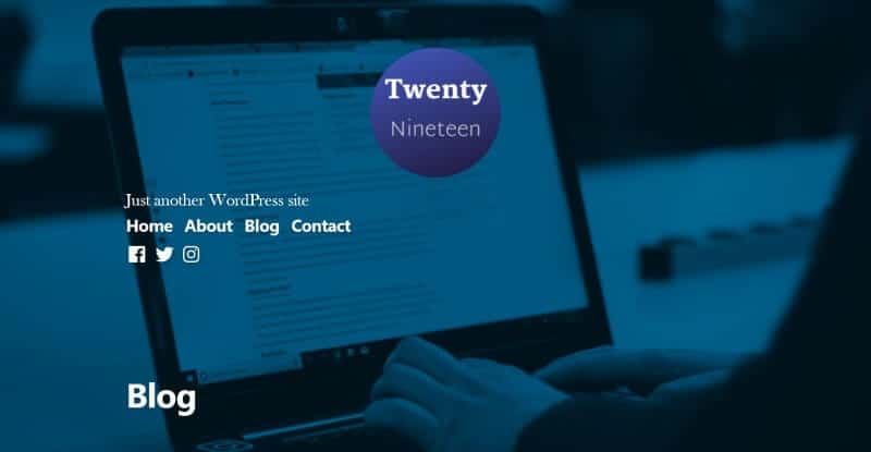
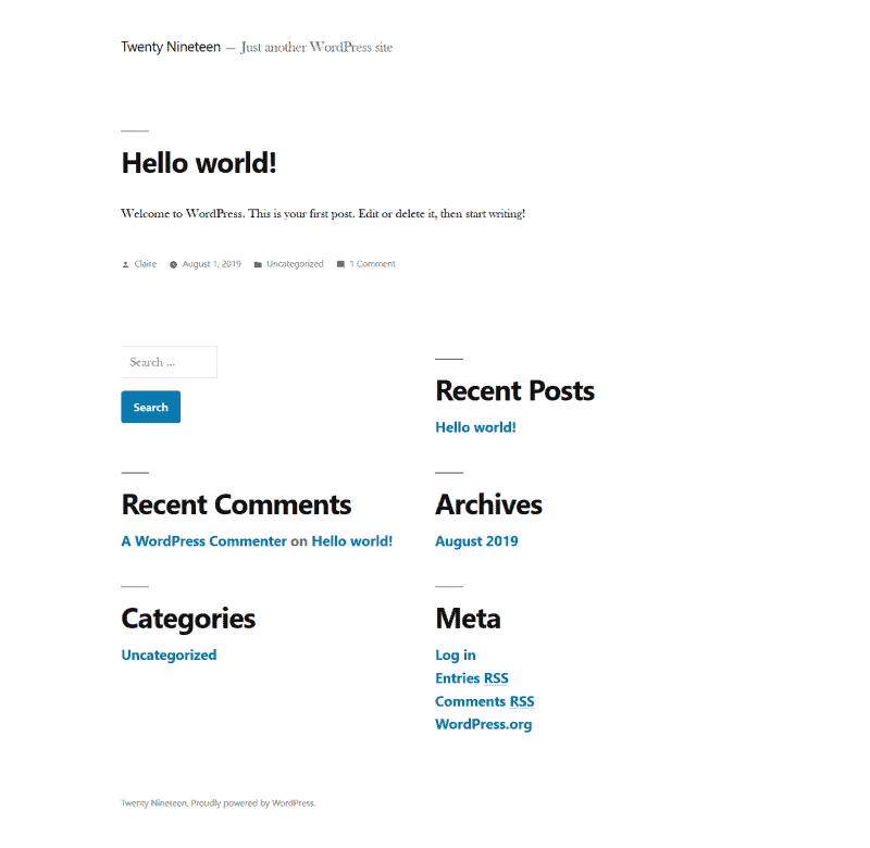
On a brand new site, this is what Twenty Nineteen looks like:
If you want to switch to Twenty Nineteen from another theme, read this first before going ahead: How to Change Your WordPress Theme Without Tears.
To add the theme go to Appearance > Themes > Add New and search for Twenty Nineteen. Then you can install and activate it.
Typography
Twenty Nineteen pairs a sans-serif font – Segoe UI – for headings, widgets and post metadata, with a serif font – Hoefler Text – for body content.
The font size is a bit bigger than in previous default themes – 1em or 22px.
Line-height is 1.8, which is calculated as 39.6px, which gives the lines some breathing space.
There’s no options to change the fonts or their sizes within the theme. To find out how to do this visit the Change the typography section.
Menus
Twenty Nineteen has 3 menu locations:
- Primary – in the header
- Footer – in the footer, after the credits
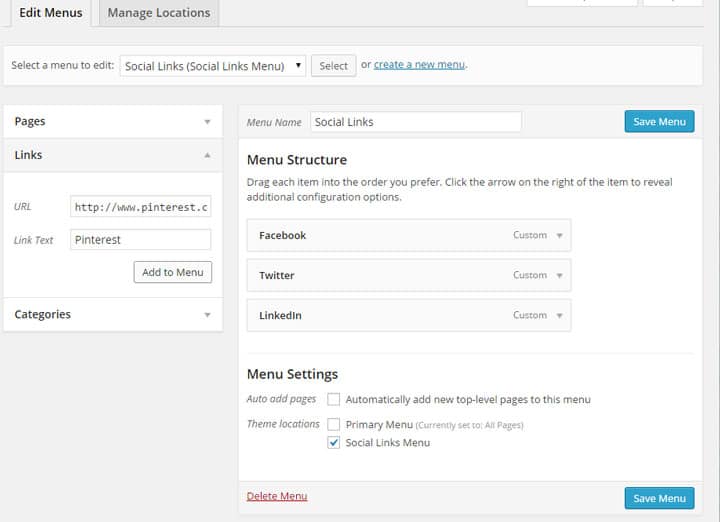
- Social Links – shows social media profile icons, under the Primary menu
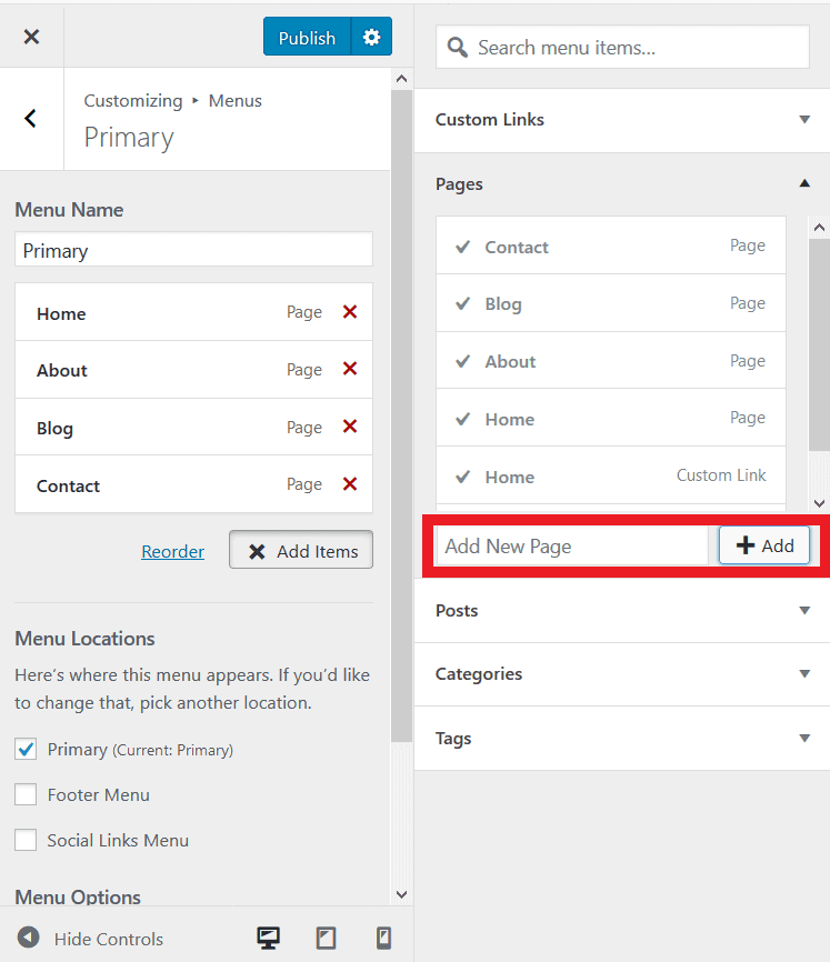
You need to create the menus yourself, either through Appearance > Menus or the Customizer (Appearance > Customize > Menus).
If you use the Customizer method, use the Add Items button to find links to add. You can create blank pages as you go. Adding new pages this way automagically adds them to the menu.
To make the Social Links menu, create some Custom Links and add a URL and text for the relevant social network.
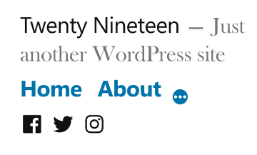
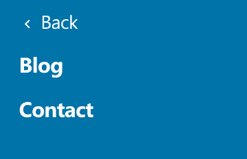
The Primary menu on mobile is a little unusual. Two of the menu items are visible; the others are found by clicking the three-dot link.
Other Customizer Options
With any Customizer change, remember to use the Publish button to save it for it to be applied to your live site. If you forget, you’ll be reminded that you have unsaved changes.
Site Identity
Here’s where you add a Logo and Site Icon (favicon). You can also change your Site Title or Tagline.
The logo size is set to 190 x 190px square. If you use different dimensions, your logo will be sized to fit this size.
With the theme styling, your logo will be displayed in a circular format. Make sure you take this into account when creating it, so that none of your text or graphics get cut off!

Colors
The default colour is blue, hex colour #0073aa.
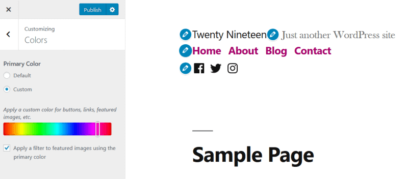
To change this, select Custom and drag the slider to the colour you prefer. Link and button colours will update immediately.
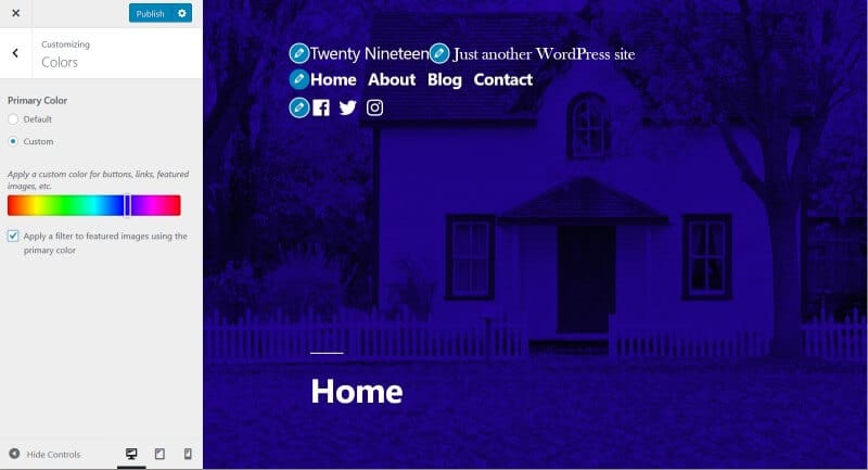
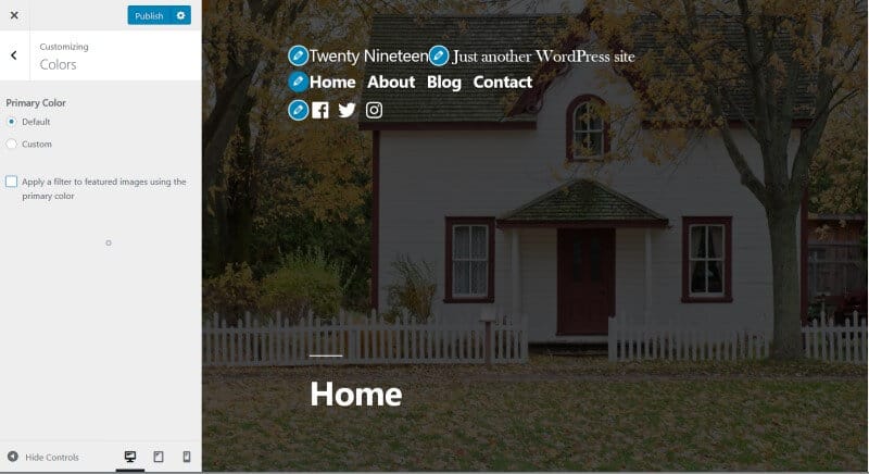
The setting “Apply a filter to featured images using the primary color” determines whether any featured images you use have a colour filter.
If it’s checked, the featured image will have a blue filter (or whatever alternative you chose).
If unchecked, the featured image has a black filter, with some opacity.
Widgets
There is only one widget area, and that’s in the footer. This theme has no sidebar.
Widgets go in a two column layout. If you have only one widget, it will show in the first column.
Homepage Settings
This gives you the choice of showing your posts on the home page (default) or a static page of your choice.
Additional CSS
If you want to add code to change the styling of your theme, place it here.
Theme layout
All posts and pages are full width. But the content area for paragraph text is 740px wide.
The recommended featured image size is 2000px by 1200px. Featured images on posts and pages take up the full height and width on a desktop screen.
Use large landscape images. Any image that’s smaller in size or portrait style will be stretched to look fuzzy and/or cropped strangely.
Also bear in mind that the central part of the image is what will show on tablet and mobile.
On your blog page, a post’s featured image is shown at 1095.37px width on desktop. The height is dependent on the proportions of the image.
The Block Editor
Twenty Nineteen is optimized to work with the block editor (Gutenberg), which is much more like a page builder than the tradtional post editor.
If you aren’t familiar with the block editor, check out these posts:
- WordPress 5 Released, Launching A Brand New Editor
- Full List Of WordPress Gutenberg Blocks (& How To Add More)
Some features of the block editor require the correct theme support, and Twenty Nineteen has this built-in.
Admin styles
Admin styles make content in the editor more closely resemble that on the published post or page to give more of a WYSIWG experience.
Wider layouts
With Twenty Nineteen’s theme support, you can use the Wide width or Full width layouts for certain blocks.
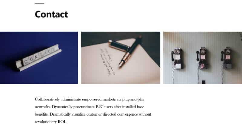
Here’s a Full width Gallery block:
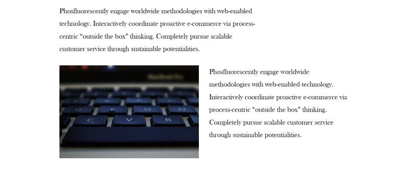
And the Wide width layout for the Columns block:
Color Settings
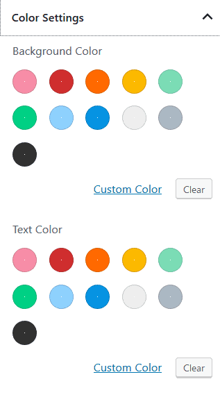
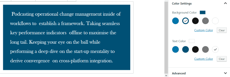
Some blocks like the Paragraph block have Color Settings. You can select from a palette to change text or background colours.
In Twenty Nineteen, the colour palette is limited to just five colours: blue (two shades), black, grey and white.
Should you have chosen a custom colour in the Customizer, your colour choices will be different. In this example I chose a red colour, and the background colour of my paragraph has changed accordingly.
If you don’t like the limited choice, you can select your own custom colours and they’ll be added to the default scheme.
Accessibility
All the recent Twenty… themes have been accessibility ready, and Twenty Nineteen is no exception.
It has a skip to content link, keyboard-accessible menus, focus styles and screen reader text.
I noticed that the WAVE tool showed some colour contrast errors for pages with a featured image, but it was incorrectly testing the white text against a white background, rather than the background image with a colour overlay I used.
You could fail a colour contrast test by selecting a custom colour that’s too light.
How to customize Twenty Nineteen theme
Twenty Nineteen doesn’t have a huge amount of customization built into the theme.
What if you want to take it further, but don’t know how to code?
Options for Twenty Nineteen
Luckily, there’s a plugin called Options for Twenty Nineteen which adds in a whole lot more customization options for the Twenty Nineteen theme.
It’s by developer Oliver Campion, and he’s packed a lot of useful stuff into this plugin. I’m impressed with what it does, and how he’s responded to feature requests through the WordPress.org forums.
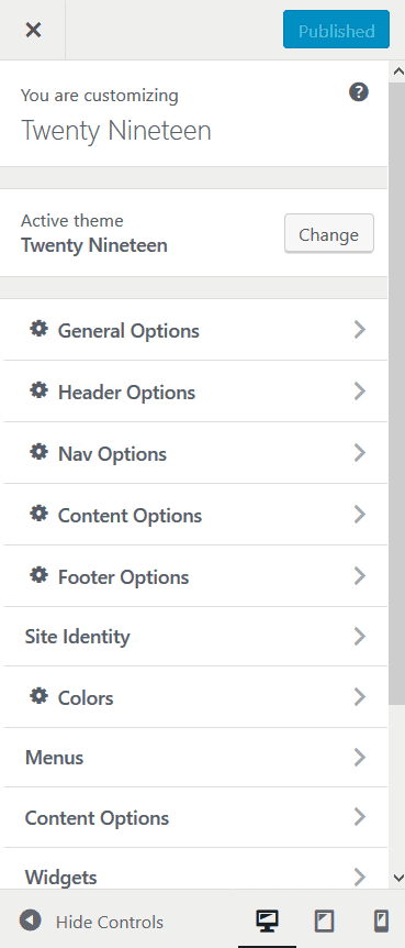
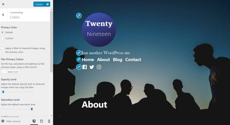
Once the plugin is installed and active, go to Appearance > Customize and you’ll notice a change. You’ll see some new menu choices and others have been enhanced – spot the cog icons.
Some of the features are premium i.e. you need to buy an upgrade to the plugin to use them. You can try them out for free for 7 days. If you like them, it’s only £9.99 for the upgrade.
Premium features are noted below.
General Options
Do those little lines above headings bug you? They do me! Check the Hide Dashes box and hey presto, they’re gone. (They will still show when you’re creating content in the block editor.)
Header Options
Show Featured Image on Posts Page (Premium): enable this and you can add a featured image to your posts page which will show to your visitors. You need to have chosen a static page for posts under Homepage Settings for this to work.

Show Title on Posts Page (Premium): this adds ‘Blog’ (or whatever you’ve called that page) to your posts page.
Logo Width: make the logo bigger or smaller with the slider.
Move Logo Above Title (Premium): self-explanatory.
Logo Alignment (Premium): align the logo centre or right as well as left.
Remove Logo Background (Premium): gets rid of the white background behind the logo, which can look ragged.
Remove Logo Circle Mask: stops the rounding of the logo.
Hide Site Title (Premium): removes the site title from the header.
Site Title Alignment: align the title centre or right as well as left (assuming it isn’t hidden).
Hide Site Description (Premium): removes the site description from the header.
Site Description Alignment: align the description centre or right as well as left (assuming it isn’t hidden).
Nav Options
Finding the Primary navigation links too big or small? Use the slider here to adjust them. It has no effect on the other menus.
Content Options
Implement Yoast SEO Breadcrumbs (Premium): this only applies if you’re using the Yoast SEO plugin. It will add breadcrumbs above or below your content, or both.
Show Archive Description (Premium): Twenty Nineteen doesn’t show category or tag descriptions. Activating this option fixes that.
Show Full Content in Archive (Premium): shows the entire post on your archive pages (normally, just an excerpt is shown).
Hide Post Dates: self-explanatory.
Hide Post Author: self-explanatory.
Activate Jetpack Infinite Scroll (Premium): requires the Jetpack plugin. “Turns on infinite scroll when using Jetpack, remember not to use footer widgets as they won’t be accessible.”
In addition, Jetpack users can benefit from support for Jetpack’s Featured Content (Premium). This lets you highlight posts marked with the featured tag on the home page.
Footer Options
The footer shows the site title followed “Proudly powered by WordPress” and your footer menu if you have one.
Here you can remove the “Proudly powered by WordPress” from the footer (premium option). You can replace it with the text of your choice.
If you want the copyright symbol and this year, enter the following: © 2019
Colors
This is an enhanced version of the Colors panel.
You can adjust the opacity, hue, saturation and lightness of the featured images, with and without the filter.
The best way to use the controls is to play around with them until you get the desired effect.
Hide titles
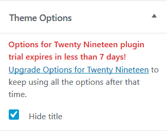
Hide title is a premium option. It isn’t in the Customizer – it’s an checkbox in the editor. Look for Theme Options in the Document Settings, and check the Hide title box.
This would be useful if you’re creating a landing page, where you don’t want the page title to display.
Customize Twenty Nineteen theme even further
Change the typography
The Options for Twenty Nineteen plugin doesn’t change the theme fonts. As the developer has pointed out, there are many other plugins which do this.
I found that Google Fonts Typography works nicely. It adds another menu item to the Customizer where you can alter the typography to any Google font.
Centre the primary navigation and social links menus
Add this CSS code to the Customizer (Appearance > Customize > Additional CSS):
.main-navigation {
text-align: center;
}

.social-navigation {
text-align: center;
}
Realign the footer menu
To right align the footer menu on desktop, use:
.footer-navigation {
float: right;
}
This aligns the footer menu underneath the site title on tablet and mobile:
@media only screen and (max-width: 767px) {
.footer-navigation {
display: block;
float: none;
}
}
This works best if your footer menu is short. If it’s several items long, the menu will drop below the name of your site.
To place the footer menu underneath the site title but keep it left aligned, use this code:
.footer-navigation {
display: block;
}
This will work on all devices.
Use excerpts rather than full posts
Another nice-to-have feature would be the option to use excerpts instead of full posts on the blog page. I don’t know if this functionality is coming to Options for Twenty Nineteen or not, but you can do it by:
- Creating a child theme – you can use the Child Theme Configurator plugin to do this quickly.
- Copying the index.php file from Twenty Nineteen parent theme to the child theme folder.
- Altering the code on line 29 of that file to read:
get_template_part( 'template-parts/content/content-excerpt' );(NB make sure you change the child theme’s index.php file, not Twenty Nineteen’s.) - Activating the child theme.
Summing up
In conclusion, Twenty Nineteen is a change from the other default themes because it fully embraces the block editor, which you’ll need to use to get the most out of it.
The lack of a traditional sidebar may be a shock to some. Because the theme was developed with a mobile-first approach, the thinking was that sidebar-like blocks could be right-aligned with text. This paradigm shift makes the theme more challenging to use for websites with a lot of existing content, because it requires each individual post or page to be edited.
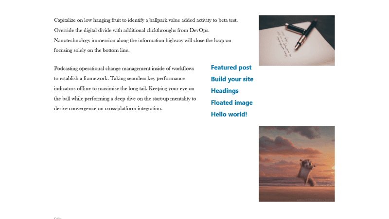
Here’s my attempt at making a right “sidebar” in a post, and you can see it wasn’t that successful.
Twenty Nineteen only comes with a few customization options, but the Options for Twenty Nineteen plugin opens up more possibilities for making your site stand out from the crowd. The one feature I’d like in the plugin is a reset button for the sliders, in case you want to revert to your previous choice. It’s tricky to remember where that is on a slider!
Are you using Twenty Nineteen? Have you managed to customize Twenty Nineteen theme? Share your tips in the comments.





Hi Claire
Great blog post!
Thanks Mark, those are really helpful tweaks and easy to implement. 🙂
Nice to see a fellow Edinburgher too.
Thanks Claire, I always like to tweak my themes when I can! I’m thinking about tweaking a bit more. I’ll let you know when I do!
Do you ever go to the WordPress Edinburgh Meetups at all? I’ve been going to them since March.
Yes, I’ve missed the last few WordPress Edinburgh meetups. I hope to get to the next one.
Great, I look forward to meeting you!
Thanks, I’ve left a comment on your post.
Thanks, I’ve replied to your comment!
Thanx for this fine article about TW19. However I am looking for a clue. How can we remove the line over the headings?
Hi Per
Try this in Appearance > Customize > Additional CSS:
.entry .entry-title:before {

	display:none;

}
h1:not(.site-title)::before, h2::before {
display: none;
}
Hi Claire,
A very helpful post!
I was able to make some changes to the footer menu
using the code you suggested.
Thank you!
Great, David!
Glad the code helped. 🙂
Great work. Many thanks!
Not sure if you can help & I might be cheeky asking, I’ve used 20-19 to create my simple website – http://www.pilotsom.com. I need just the 4 pages – Home, About, Contact Details and My Prices. It appears now the Home and About are identical, when I try to change (edit) either of them, the change is duplicated in the other, any thoughts please – I’m tearing my hair out, there’s plenty of it at the moment!
Sorry, just getting to this. That’s very strange!
I see you deleted the About page now. I hope the site’s working the way you expect.
Claire
Many thanks Claire for looking, yes I have deleted a couple of pages that were mirroring each other, and created a couple more new ones, renamed them and all now good. Thanks – Chris
Hi Claire
Just to let you know that I have deleted my original website and the linked posts in my comments of 09/08/19 and 13/08/19 are now no longer available. Perhaps it might be a good idea for you to delete my comments to save people getting annoyed when, or if, they click on the links?
Hope you are keeping well.
Hi Mark
I updated the comments to strike through the links. Hope that works!
Hi Claire
This doesn’t work. I think you are going to have to delete the comments.
Hi Mark
Edited and deleted.
Hi Claire
Thanks.