With version 5, the block editor – aka Gutenberg – has brought a shift in creating content in WordPress.
Gutenberg blocks are now the building bricks of posts and pages.
But how many are there, and what do they do?
What this post covers
- Adding and configuring blocks
- Block styles
- Text
- Media
- Design
- Layout Elements
- Widgets
- Embeds
- Adding new blocks with plugins
Note that in this post I’ve used screenshots of blocks for illustration, rather than the blocks themselves.
Adding and configuring blocks
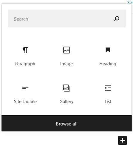
You use the Add block button – with the plus icon – to add a new block.
Commonly used blocks will appear at the top of the list.
A few blocks are “plug and play” but many have further configuration options. These may be:
- within the block itself (e.g. adding a caption)
- via buttons in the Components Toolbar above the block
- through Block Settings in the sidebar.
If you can’t see the Document/Block Settings sidebar, make sure you have toggled on the cog icon, which is at the right of the Editor top bar. The cog should show as white on dark grey.
Block styles
Blocks display using styles from your theme.
Changing theme will affect how blocks look in the editor and on your site.
Some themes are optimised for use with the Block Editor: look for themes on WordPress.org with the Wide Blocks layout and Editor Style feature. Or do a Google search for “Gutenberg ready themes”.
In the examples below, I’m using the Chosen theme.
Text
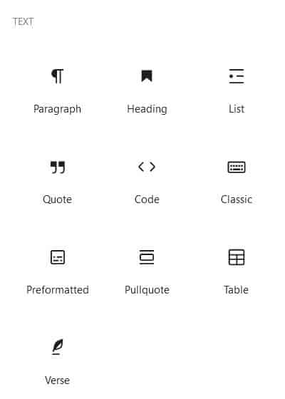
Paragraph
Paragraph is the default for a new block. Pressing the Enter key when you are in one creates a new paragraph block.
Some of the buttons that were in the old post editor have moved to their own blocks, notably:
- Lists – now added via the List block
- Blockquotes – now added via the Quote block
- Insert Read More tag – now added via the More block
- Horizontal line – now added via the Separator block
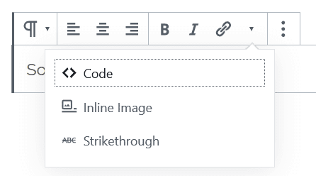
Toolbar buttons include: align text (left, right or centre), bold, italic, link.
There are hidden buttons under the arrow for Code, Inline Image and Strikethrough.
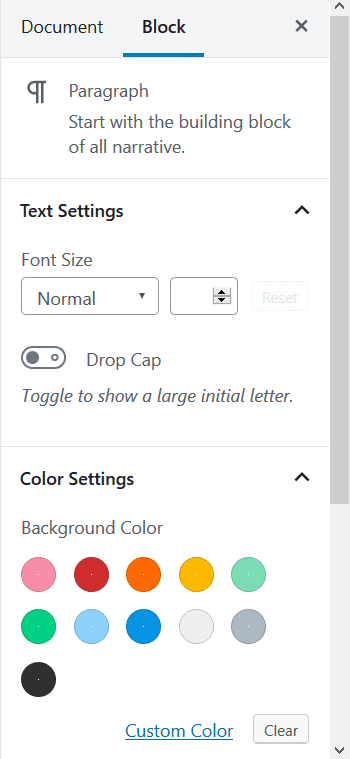
Block Settings include: set font size, drop cap, change text and background colours.
Heading
Headings for your posts and pages go in heading blocks.
The default is an H2. Why H2? Because the post or page title is a Heading 1, and that means the first subheading should be a Heading 2.
Toolbar buttons include: change heading level (only from H1-H4), bold, italic, link.
Block Settings include: change heading level, change heading alignment.
List
Adding a list will start an unordered list. Pressing the Enter key adds a new list item.
Toolbar buttons include: unordered list, ordered list, outdent list, indent list.
Quote
Quotes and citations go in this block. The quote is written first with the citation underneath.
The display will depend on the theme you use.
Toolbar buttons include: text alignment, bold, italic, link.
Block Settings include: change style from Default to Large.
Code
One for the geeks, this block shows code snippets without running them.
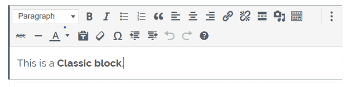
Classic
This is the Classic Editor as a block; the buttons are identical.
If you install the TinyMCE Advanced plugin you can set an enhanced version of the Classic block as your default block, instead of the Paragraph block. The relevant setting is Make the Classic Paragraph or Classic Block the default block (hybrid mode).
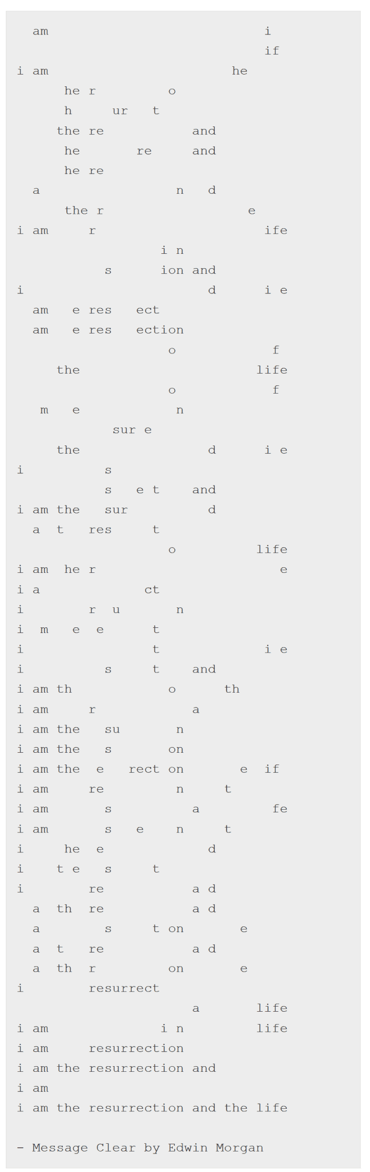
Preformatted
Preformatted text is displayed exactly as written, with all spacing and tabs preserved. It’s usually shown in a monospaced font.
See how this works in the example below – the spaces matter!
Toolbar buttons include: bold, italic, link.
Pullquote
The Pullquote is a snazzier version of the Quote block, with different formatting.
Toolbar buttons include: text alignment, bold, italic, link.
Block Settings include: change style from Default to Solid Color.
Table
The Table block is to add simple data tables.
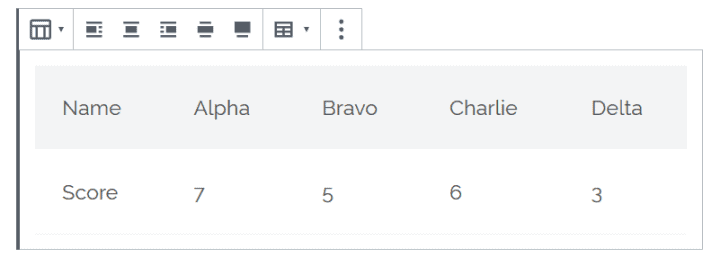
I don’t recommend using this block if you wish to create an accessible table as it does not add the right markup for good accessibility.
Toolbar buttons include: table alignment, add and delete rows and columns, bold, italic, link.
Block Settings include: change style from Default to Stripes, make table cells fixed width, change background colour.
Verse
This is basically a Paragraph block to add poetry to.
The block is supposed to allow you to add extra spacing, similar to the Preformatted block.
However, I found that this worked in the editor but not on the post.
Toolbar buttons include: text alignment, bold, italic, link.
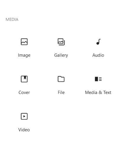
Media
Gutenberg blocks for media files.
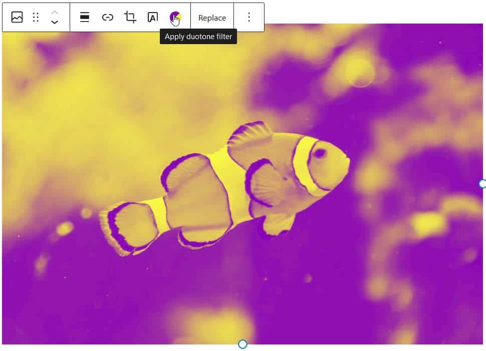
Image
The block for a single image.
Toolbar buttons include: image alignment, edit the image.
Block Settings include: add/edit alt text, change image size/dimensions. control whether the image links to anything.
As of WordPress 5.8, you can add a duotone filter to images.
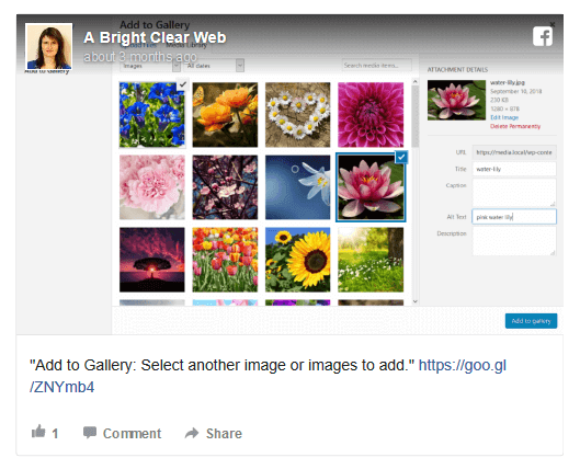
Gallery
Gallery blocks are for multiple images arranged in columns and rows.
You can add captions by clicking on an image and then typing in the Write caption area.
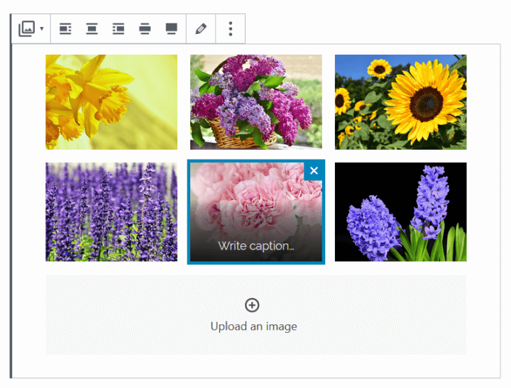
Block Settings include: choose number of columns, crop images, link images to the files or attachment pages.
Audio
Adding an audio file embeds a player into your post or page.
The audio file is not playable in the editor, but is so when the post is previewed or published.
Do add a caption to make it obvious what the audio file is!
Toolbar buttons include: align player, edit audio.
Block Settings include: autoplay, loop, preload.
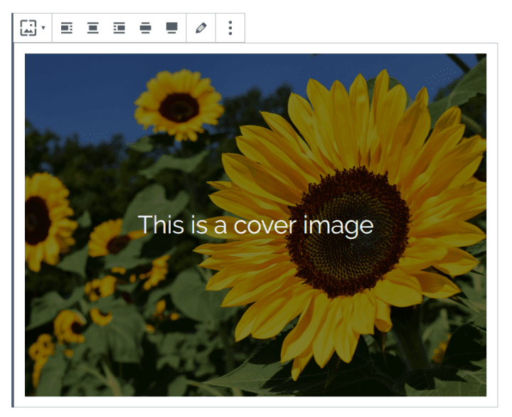
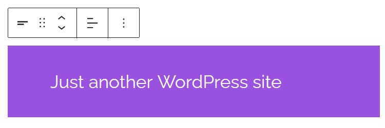
Cover
Not the most obvious name, perhaps. A cover image is a large image with an semi-opaque overlay and text on top.
Toolbar buttons include: align image, edit media.
Block Settings include: fixed background, focal point picker, overlay colour, background opacity.
File
A link to a downloadable file e.g. a Word document with a Download button.
You can edit the link to the file by typing direct. This doesn’t change the filename.
Media & Text
This block arranges an image or video next to some text in a two column layout.
Use the Stack on Mobile setting to make a one column layout on mobile.
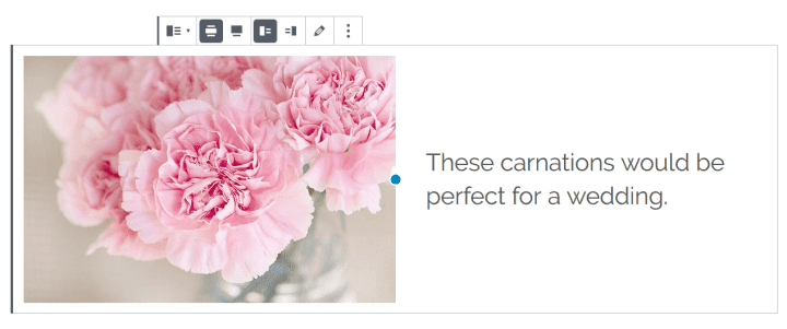
Toolbar buttons include: wide width, full width, show media on left or right, edit media.
Toolbar buttons include: change alignment.
Block Settings include: autoplay, loop, muted, playback controls, preload, poster image.
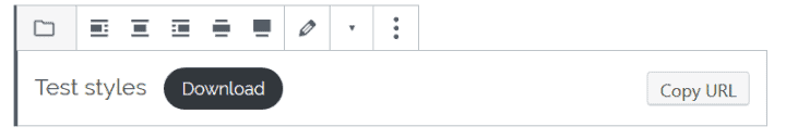
Toolbar buttons include: align link and/or button, edit file.
Block Settings include: control the link, show/hide the Download button.
Video
If you paste in a URL from a video hosted from e.g. YouTube, the block becomes a YouTube embed block.
This block is intended for videos uploaded to the Media Library.
Design
Buttons
Using this block adds a call to action button (actually a link styled to look like a button).
You can edit the button text and add a URL that the button goes to when clicked.
Toolbar buttons include: change alignment, bold, italic.
Block Settings include: change style from Default to Outline or Squared, change text and background colour.
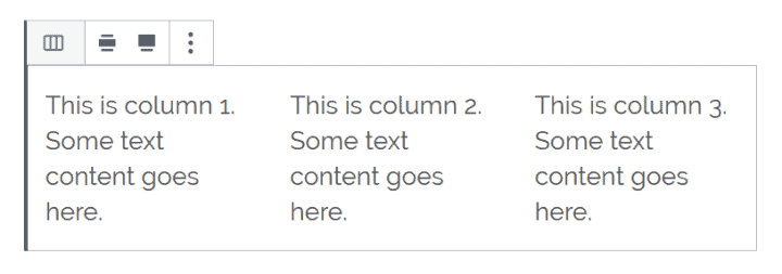
Columns
The Columns block provides two equal width columns to enter content. You can have as many as 6.
Content goes in Paragraph blocks, but you can change this to other block types.
This block a bit fiddly to work with; adding or editing columns is not as easy as with a page builder.
Toolbar buttons include: change alignment to wide or full width.
Block Settings include: increase number of columns up to 6.
Block Settings include: stack on mobile, change background colour.
Group
The Group block is a container for related blocks.
More
This adds the Read More tag to a post. Learn more about the Read More tag.
Only one of these can be added per post. The option to add the More block is disabled afterwards.
Block Settings include: hide the excerpt on the full content page.
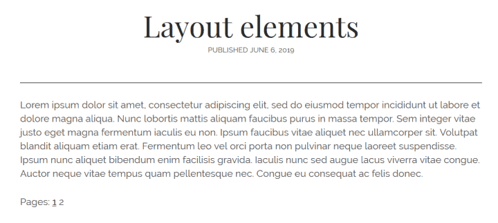
Page Break
A Page Break splits a post into different pages.
The block underneath the page break will be the start of a new page for your visitor. They need to click through to the next page to view the following part of the post.
You might see this or use it on tutorial-type posts consisting of steps, with each step on a new page.
Separator
This adds a short horizontal line to a post.
Block Settings include: change the separator style to a wide line or three dots.
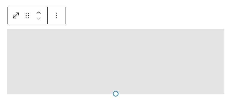
Spacer
The spacer block adds space in between other blocks for aesthetic reasons.
You can adjust the height of a spacer by dragging the blue dot up or down.
Block Settings include: change the spacer height in pixels.
Site Logo
Inserts the site logo within a post or page.
Block Settings Include: show the logo rounded, change logo width, link logo to home page.
Site Tagline
Adds the site tagline.
Block Settings Include: change font size and colour.
Site Title
Adds the site title.
Block Settings Include: change font size and colour.
Archive Title
Adds an archive title e.g. a category archive.
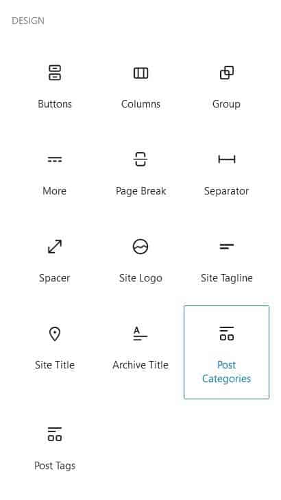
Post Categories
Adds the current post’s categories as clickable links.
Post Tags
Adds the current post’s tags as clickable links.
Widgets
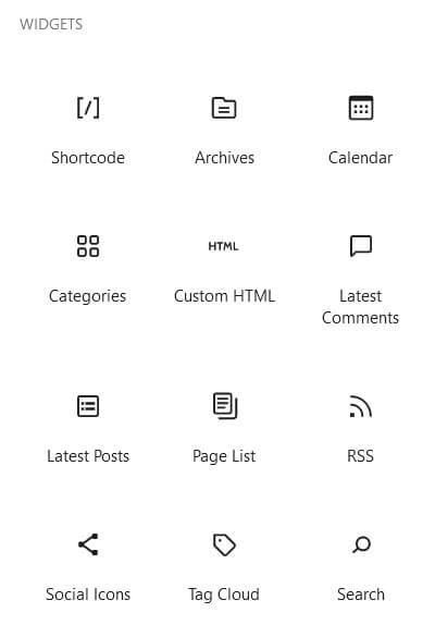
Widgets used to be confined to widget areas, commonly the sidebar or footer.
Now the block editor has opened certain widgets up to being added to posts or pages. The list of widgets below correlates well with those in the Appearance > Widgets section: others such as the Custom HTML widget are blocks in their own right.
The widgets I couldn’t find equivalent blocks for are:
- Meta
- Navigation menu
A word of caution: most of these apart from the shortcode widget are probably best used in widget areas. Why would you add your latest comments in the middle of another post? It doesn’t make sense. (Though now I’ve said that, I’ve just discovered the Chosen theme doesn’t have widget areas!)
Furthermore, none of these widget blocks have titles, so if you need a title for one you should add a Heading block above it with the appropriate wording.
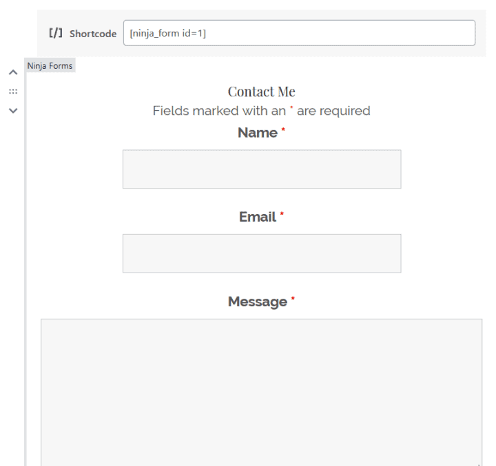
Shortcode
Shortcodes are shorthand pieces of code created in themes or plugins which execute some functionality.
In a number of cases they are being replaced by blocks.
For example, a form created by Ninja Forms can be added via a shortcode, or via the Ninja Forms block.
Shortcodes won’t show their content in the editor, but will display it on the published post or page.
In the example below, both the shortcode and Ninja Forms block create a Ninja Form, but the form only renders in the editor with the latter block. (On the published post, the form fields are left aligned rather than centre aligned. I suspect this is an issue with the Chosen theme.)
Archives
Shows the months you’ve written posts as a list.
Block Settings include: change archives to a dropdown list, add the number of posts.
Calendar
A calendar display of your posts.
Custom HTML
If you can write HTML you can add it to the Custom HTML block.
Categories
Your post categories in a list.
Block Settings include: display as dropdown, show hierarchy, show post counts.
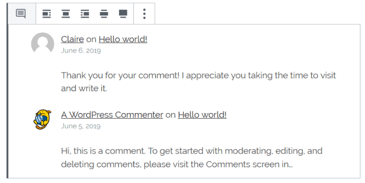
Latest Comments
Your latest comments, up to five. Comments are not shown in full.
Block Settings include: change number of comments shown; display avatar, date or excerpt.
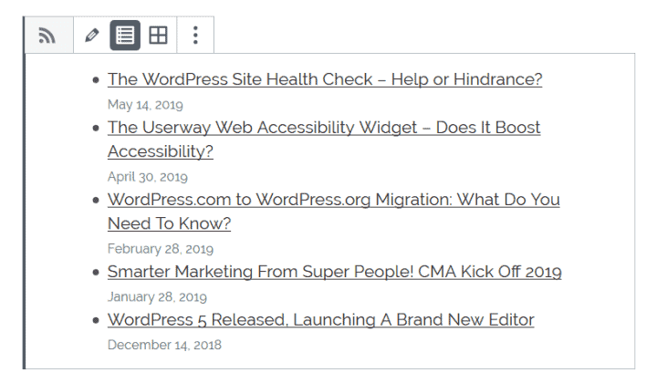
Latest Posts
Your latest posts as a list.
Block Settings include: change post order, filter by category, change the number of posts displayed, show post date.
Page List
A list of your site’s pages.
RSS
This widget adds the latest posts as seen in an RSS feed. It is handy if you want to link to the latest posts from another source.
Add the RSS feed URL (usually something like https://website.com/feed/).
You can display the posts as a list or in a grid.
Block Settings include: change number of items; display author, date or excerpt.
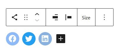
Social Icons
Icons linking to your social media profiles.
Block Settings include: add icons, change size and alignment.
Tag Cloud
Tag clouds show a conglomeration of your tags. The most used tags will appear larger in size than the least used.
If you haven’t created any tags or assigned them to posts the block will say “No terms to show”.
Block Settings include: change taxonomy, display post count.
Search
Add a search widget to your post or page.
You can change the name from Search and add placeholder text if you wish.
Embeds
Embeds are links to other sources which add some kind of player or rich content rather than a plain text link.
There are many varieties of Gutenberg blocks for embeds.
Here’s the list:
- Embed – a general block for all types of embed.
- YouTube
- WordPress
- SoundCloud
- Spotify
- Flickr
- Vimeo
- Animoto
- CloudUp
- CollegeHumor
- Crowdsignal
- DailyMotion
- Hulu
- Imgur
- Issuu
- Kickstarter
- Meetup.com
- Mixcloud
- ReverbNation
- Screencast
- Scribd
- Slideshare
- SmugMug
- Speaker Deck
- TED
- Tumblr
- VideoPress
- WordPress.tv
Not all embeds are created equal! The type of URL that can be embedded depends on the service.
For example:
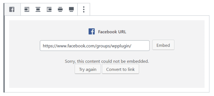
- Facebook page – NO
- Facebook group – NO
- Facebook post – YES (but only shows in the post, not in the editor)
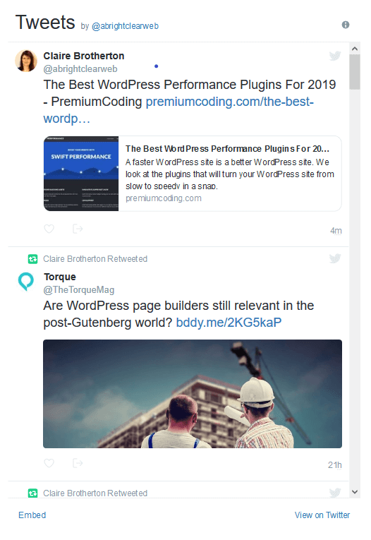
- Tweet – YES

- Twitter Timeline – YES
- Twitter Hashtag – NO
If a URL can’t be embedded you will see a “Sorry, this content could not be embedded.” message.
In addition, Embed blocks tend not give you any control over the styling of the embedded content.
Adding new blocks with plugins
If there’s still not enough blocks for your liking you can now add even more with plugins.
Many Gutenberg blocks plugins boast a collection of blocks.
Some are souped-up versions of the standard blocks and others are new.
New blocks provided include:
- Accordion
- Call to Action
- Info Box
- Price List
- Table of Contents
- Team Member
- Testimonial
You might find one of these plugins has a block type that saves you from needing a dedicated plugin for the same feature.
Remember though that if you use a plugin to create blocks and deactivate or delete it later, your blocks may not show properly, or at all.
Spectra – WordPress Gutenberg Blocks (formerly known as Ultimate Addons for Gutenberg)
Spectra – WordPress Gutenberg Blocks is a very popular block plugin with currently over 400,000 installs.
The plugin makers recommend their own Astra theme for use with Gutenberg.
Version tested: 2.0.13
Number of blocks: 31
Read more about the Spectra plugin.
My favourite blocks are:
Post Grid
A prettier version of the Latest Posts block with a good number of styling options.
To get the most out of it, add featured images to your posts.
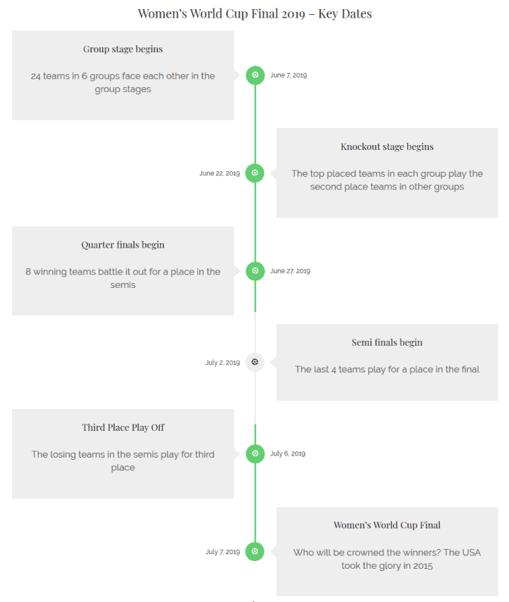
Content Timeline
I haven’t seen a block like this elsewhere. It’s perfect for showing any events over a time period.
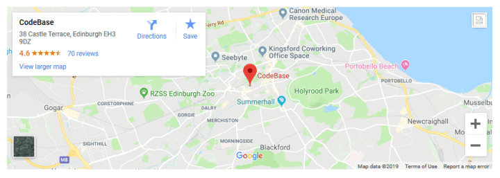
Google Map
Thank you plugin developers! They have taken care of the requirement to have a Google Maps API key to insert a map.
This saves you the bother of signing up and having to pay charges if you use a lot of maps. 🙂
As there are limited controls, the block is best for simple maps.
Atomic Blocks – Gutenberg Blocks Collection
Atomic Blocks – Gutenberg Blocks Collection has over 20,000 installs.
They also have their own theme, called Atomic Blocks theme.
Version tested: 1.8.1
Number of blocks: 14
My favourite blocks are:
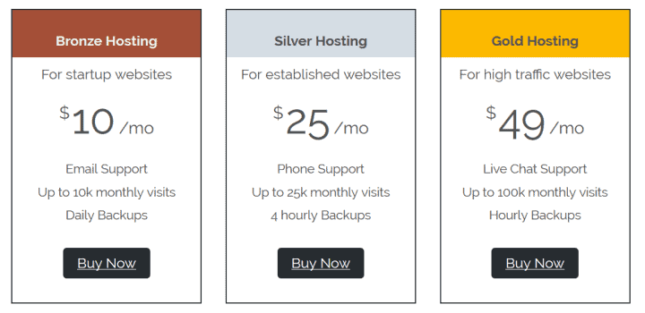
Pricing
A pricing table for different tiers.
It would be nice to have a “most popular” label to add to a tier.
Testimonial
I like this one as you can add an image to the testimonial as well as customising the text size, text alignment and colours.
Gutenberg Blocks and Template Library by Otter
Gutenberg Blocks and Template Library by Otter has over 10,000 installs.
One notable feature of the Otter plugin is that you can add animated effects to blocks.
Version tested: 1.2.3
Number of blocks: 12
My favourite block is:
Plugin Card
One for the geeks, but it gives a quick lowdown on any WordPress plugin.
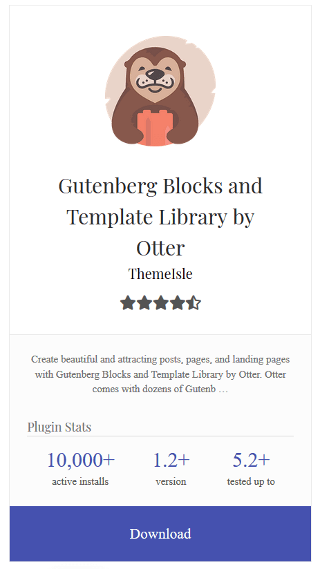
I would prefer a link to the plugin’s page on WordPress.org rather than a direct link to the zip file, though.
It would be nice to have some Block Settings, too.
Stackable – Gutenberg Blocks
Stackable – Gutenberg Blocks has over 10,000 installs.
Stackable also have their own eponymous theme which they will send you if you join their email list. In addittion, they have a premium version with more block layouts and features. Stackable Premium demo.
Version tested: 1.15.4
Number of blocks: 23
My favourite blocks are:
Count Up
This block animates statistics for a fun effect.
Feature
Show off product or service features in this multi-column block. Add another block below to make a grid.
Ghost Kit – Gutenberg Blocks and Templates Collection
Ghost Kit – Gutenberg Blocks and Templates Collection has over 1,000 downloads.
The paid Ghost Kit Pro offers extra features like icon packs and gradient backgrounds.
Version tested: 2.4.2
Number of blocks: 19
My favourite blocks are:
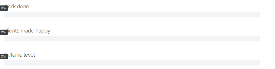
Progress
Progress bars to show off your skills.
Shows your Instagram feed and data. You need an API key to use it.
Ultimate Blocks
Ultimate Blocks has over 1,000 installs.
Version tested: 2.0.0
Number of blocks: 18
My favourite blocks are:
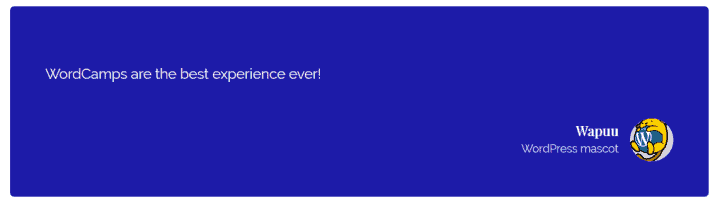
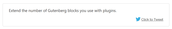
Click To Tweet
This creates a quote which is tweetable by clicking the link. Your Twitter username can be added to the tweet text.
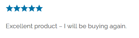
Star Rating
A block to use for rating products or services. You can set the number and colour of stars.
I fixed a display bug in the Chosen theme in the screenshot below – the stars were vertically aligned originally!
The Review block is similar and has schema markup enabled, which is good for SEO.
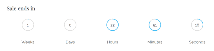
Countdown
This countdown timer is ideal for time-limited events like promotions. You can add a message to show when the timer has gone down to zero like “Sorry you missed out!”
Summing up
Now that the block editor is established and developers are creating their own blocks, I’m seeing the potential to build some cool stuff. Some block developers have put together ready-made website layouts to put sites together quickly.
Choosing the right theme is important for working with blocks to get the most out of them.
Have you embraced the world of Gutenberg blocks? Have you tried any of the plugins I mentioned? Leave a comment and let me know.
Blimey Claire this is amazing!
I had worked out how to use the blocks I want/need but had not had the time to sit & explore all the features now available.
Fantastic resource
thank you
Thanks Susie! Hope you can see the potential of the block system now.
Thanks for this! Excellent resource which I can come back to.
Thanx a lot for this comprehensive post.
Have you tried Kadence Blocks (https://www.kadenceblocks.com/)?
They are my favorite collection, especially the Row Layout block, and while scrolling I was looking forward to reading your opinion, but they weren’t mentioned
Hey Peter, thanks for reading.
No, I haven’t tried Kadence Blocks – I didn’t come across that one. But it looks like it’s worth trying out.
I like the range of layouts and it looks easy to change the column widths.
Worth knowing also that the Gutenberg plugin v 6.0 has improved layouts and flexible columns. I’m not sure when this is coming to Core, though.
Thanks for sharing this tutorial. Can you also please guide me how can I create a block template? I am doing the same using this resource https://wpitech.com/create-wordpress-gutenberg-block-templates/ but it’s giving an error and I am having some programming lines in front end. This is the code
add_action( ‘init’, function() {
$args = array(
‘public’ => true,
‘label’ => ‘News’,
‘show_in_rest’ => true,
‘template_lock’ => ‘all’,
‘template’ => array(
array( ‘core/paragraph’, array(
‘placeholder’ => ‘Breaking News’,
Hi James
Sorry for the late reply.
I just tried the code you mentioned on WPITECH’s site, and it worked as expected for me.
Did you perhaps miss out a bracket or a curly brace when you copied the code?
I would leave a comment on that post if you’re still having problems.
There are more tutorials on the same topic here:
Greetings of the day, your content about the List Of WordPress Gutenberg Blocks has been given clearly. And also you had added more details about Adding and configuring blocks, Block styles, Text, audio and videos which are very easy to understand and learning. Keep sharing like these stuffs!!!