
Why would you need accessibility testing tools?
I attended a breakfast briefing on the Top 10 tips for Improving Accessibility on Wednesday 8 March.
Not sure what accessibility is? Read my introduction to accessibility post, which gives an overview.
Basically, by being mindful of accessibility you make your site content attainable by everyone. That includes people with temporary impairments – eyestrain, injuries, stress, fatigue – as well as disabled people.
Gayle Whittaker of User Vision gave us pointers on making our sites more accessible, and shared a number of tools which help check the accessibility of your web pages.
All of these tools are free, except perhaps the last.
Here is a list of the accessibility testing tools and a little about how they work.
1. NVDA screen reader
NVDA is an open source screen reader.
Screen readers are used by blind and partially sighted people to access the Web and other computer applications.
It’s available for Windows only.
NVDA can take some getting used to! It’s controlled by the keyboard. The “NVDA” key (Insert by default) is used in conjunction with other keys to navigate.
WebAIM’s site has a list of NVDA keyboard shortcuts, and an article on evaluating accessibility using NVDA.
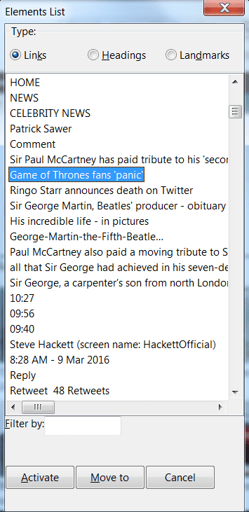
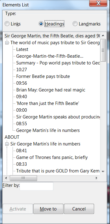
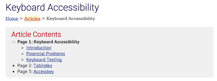
The NVDA + F7 shortcut brings up the Elements List which is a window showing the links, headings and landmarks for a page. From this list the user can select an item on the page they want to hear about.
It’s important that the headings and links are ordered well and meaningful, else the user won’t know what to choose.
Watch Graham Armfield demonstrate NVDA in this video from WordCamp Edinburgh:
2. Colour Contrast Analyser
Developed by the Paciello Group, Colour Contrast Analyser is available for Windows and Mac.
Colour contrast issues can affect the visually impaired and colour blind, but also people looking at a screen in direct sunlight. Ever found it hard to read light grey text on white? I know I do.
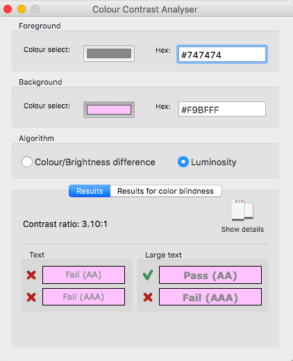
CCA compares the foreground and background colours of elements on a page and lets you know the degree of contrast between them. It evaluates the colours according to the WCAG 2.0 colour contrast guidelines (geeky read) and shows you if the colours pass or fail the test.
You can select a colour by either typing in its hex code in the Hex box. Alternatively, click on the Colour select bar to open up a colour picker to sample the page.
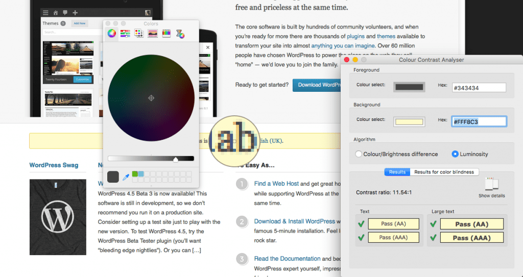
Sampling colour is easy for flat background colours, but harder for foreground colours. If it’s text, it tends to pixellate and it’s hard to see what the exact colour is. I prefer to use Developer Tools to get the colour code.
Under Luminosity, the display will show the contrast ratio for your two colours.
You’ll get green ticks if they pass the contrast test.
You may find that a colour combination passes WCAG compliance level AA but not AAA.
Larger text can also pass the test where smaller text would not.
You can also check the contrast for different types of colour blindness with this tool, and see how the colour combo would look to those users.
3. Keyboard
 One of the simplest testing tools, using the keyboard you can simulate the effects of motor disabilities.
Anyone who has difficulty moving a mouse might use the keyboard instead.
To test, simply press the TAB key to navigate forward through links and interactive elements like buttons on a page.
Shift + TAB moves you backwards on the page.
Buttons can be clicked on by pressing the ENTER key.
What you want to look for is obvious focus on an element, i.e. the user can see what’s selected.
This could be done by:
- An outline on an element
- A different colour / background colour for the element
WebAIM use both: a link highlighted with the keyboard shows a dotted outline, a yellow background and a red link colour.
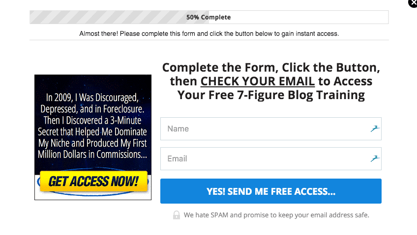
Check that you can navigate to all the parts of a page, including video controls and pop-ups, and don’t get stuck in a loop you can’t get out of.
I tried using the keyboard to navigate the form fields and button on this pop-up, and couldn’t manage it. It’s just not possible.
4. Web browsers and extensions
You can test for various accessibility features in browsers using their in-built tools, and also extensions and apps.
Built-in browser features
Zoom
Using CTRL+ (CMD+ on a Mac), zoom the page up to 200% bigger and see what it looks like. This is how someone with poor vision might see your page.
Make sure that the text is legible and there are no overlapping items.
Turn off style sheets
In Firefox, go to View > Page style > No Page Style. See if the content is shown in a logical fashion. Is the important information first?
Developer Tools
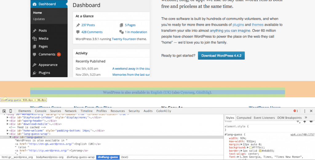
All browsers have some form of developer tools. You can access them by clicking on any element in a web page, right clicking and choosing Inspect.
You can use Developer Tools to inspect the code on a page. It’s like x-ray vision. 🙂
Here I can see – amongst other things – the background colour and font size for text in a specific area on the page:
Add-ons extend Developer Tools for Chrome:
The ColorA11y add-on does a similar job to CCA.
Accessibility Developer Tools does a page audit of accessibility issues.
Browser extensions
WAVE toolbar (Chrome, Firefox)
The WAVE Evaluation tool is a Chrome add-on which gives visual feedback about your site’s accessibility.
The WAVE tool won’t pick up every issue, but it’s a good starting point.
I tested the AXA Life Insurance page, which has 4 errors according to the tool.
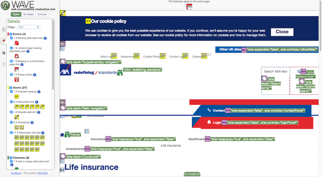
The errors WAVE found were:
| Error | What it means | Meaning to users |
|---|---|---|
| Missing alternative text | There is an image lacking an alt attribute. |
A user with vision loss cannot glean the meaning of the image. |
| Linked image missing alternative text | A Twitter button has no alt text. |
Visually impaired users can’t tell that the link leads to Twitter. |
| Missing or uninformative page title | The <title> element is missing on the page. |
The user might not grasp the purpose of the page. |
| Empty button | The button for the search box is missing a value attribute. |
The user might not realise that the button is to submit the search form. |
These are all simple things for a web developer to fix.
Alerts are not so critical as errors but are worth addressing too.
Some examples of alerts are:
Text that looks like a heading not marked up as a heading. Headings should be coded using <h1> to <h6> tags, not given a bigger font and/or made bold. Use <h3>Special offers</h3> and appropriate CSS, not <strong><span style="font-size: larger;">Special offers</span></strong>. Read advice on writing good headings and how they benefit your SEO.
Redundant links. Links in close proximity which lead to the same destination. Tedious for keyboard or screen reader users to navigate! This can often happen with blog post titles which are links and have excerpts. The “Read more” link leads to the same post.
Suspicious link text. “Click here” or “Read more” links are not meaningful out of context. The link text needs to be rewritten, or in the case of a “read more” blog link, it’s possible to append the post title to the link and hide it for sighted users with CSS.
Accesskeys present. Access keys are meant to help disabled people as keyboard shortcuts for page sections, but are now discouraged from use. Read this post to see why: Why Access Keys Are Mostly Useless for Accessibility Purposes.
Redundant title text. Links should not look like this: <a title="About us" href="/about/">About us</a>. The title attribute duplicates the link text, and is unnecessary. WordPress 4.2 actually removed the Title attribute in the editor when adding a link, for this reason. Otherwise the same text can end up being read out twice by screen readers.
You can also view pages without styles and get colour contrast data with WAVE.
Web Developer extension (Firefox, Chrome, Opera)
The Web Developer extension has many useful tools built in – almost too many!
It’s developed by Chris Pederick.
From his site you can download Web Developer for the various browsers.
The tools are grouped by various types:
- Disable – disable the cache, JavaScript, colours and other things.
- Cookies – disable cookies, including third party ones.
- CSS – view and disable stylesheets.
- Forms – auto-complete forms and change their operation.
- Images – see the page without images and show useful information about them.
- Information – display different types of HTML elements.
- Miscellaneous – show ruler, magnifier etc.
- Outline – draw a border round different types of HTML elements on the page.
- Resize – change the window size and view responsive layouts.
- Tools – validation tools.
- View Source – show the page source code.
- Options – even more options and help.
Some of the Images attributes are shown here – alt text, file size, width and height.
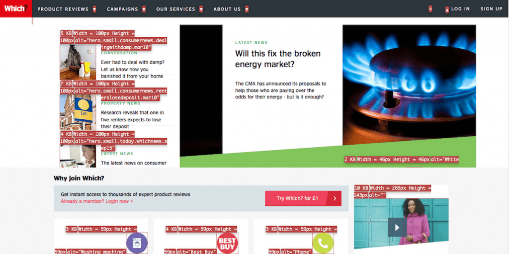
In this case there is alt text, but it isn’t well composed.
alt="House with To Let sign" would be more meaningful than alt="hero.small.consumernews.renterslosedeposit.mar10".
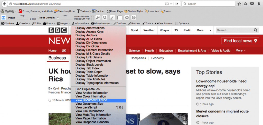
The Document Outline lets you see the heading structure for the site to see if it follows a logical order.
It’s accessed through Information > View Document Outline. Screenshots are from Firefox.
Here’s an example:
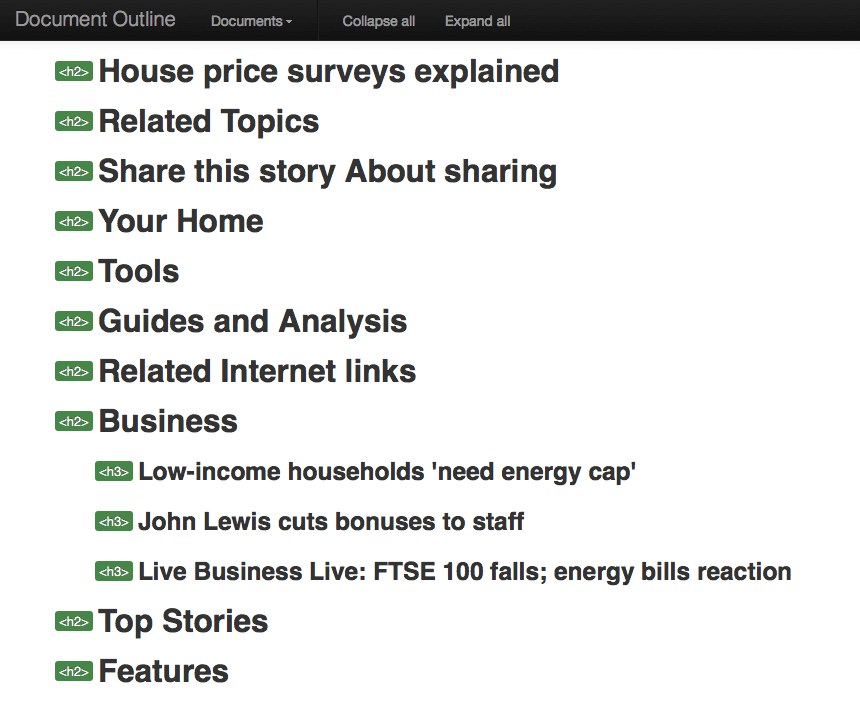
This looks okay. What you wouldn’t want to see is something with duplicate Heading 1s, missing headings or the order mixed up. Read more about HTML heading structure.
5. Human beings!

These are the most powerful accessibility testing tools there are.
Human beings are free to use if you can get them to volunteer! The intended audience for a site are the best people to audit it.
Manual checking of content can pick up on errors which automated tools can’t, such as:
Does the alt text for an image make sense? I learned that it’s not necessary to add alt text for an image which already has a caption, or if it’s sufficiently described in the surrounding text. In this case, the image should have a null alt attribute. i.e. alt="".
Does link text make sense out of context? “Buy Now” won’t help a partially sighted person to know what they’re buying.
Do forms work as expected? What happens if you submit them with missing data? Are the error messages clear enough? These need to be tested manually.
I hope this post gives you an overview of accessibility testing. How does your site do? Let me know in the comments.

Using the standard browser zoom tool won’t fully show you how a site will perform at 200% zoom. Browser zoom scales everything so this is not true test. It’s best to use a text zoom tool such as No Squint (Firefox extension) – set to text only zoom – which only zooms the text and not the container elements. This will provide vastly different results. It also checks the success criteria as specified (“text can be resized without assistive technology up to 200 percent without loss of content or functionality”).
Thanks Mark for pointing that out re:zoom – it means a lot to get a comment from an accessibility expert.
I’ve just looked up NoSquint and it says it’s no longer maintained, but they’ve recommended an alternative extension called ZoomPage. Have you used that one?
No Squint may no longer be maintained but it still works. It’s the best tool for the job.
Hello Claire, I totally agree with the information shared in this blog. No doubt, Web accessibility tools make things easier with better coverage. However, for me accessibility testing guidelines, accessibility compliances like ADA. WCAG, Section 508 are something which every expert should know and follow.