This post applies to the Classic Editor.
If you are using the block editor (Gutenberg), please read this post instead:
I had an email query the other day concerning the behaviour of WordPress images on phones.
It was to do with the word wrap of text around images using a responsive theme.
So I thought I’d review:
- How WordPress text and image wrapping works
- What can go wrong
- How to fix it
For my demo, I used Lontano theme.
WordPress image alignment
The WordPress image uploader has four types of image alignment:
- Left aligned
- Right aligned
- Centre aligned
- No alignment
You will see these options when you select a file to add from the Media Library. The option is in the Attachment Display Settings section – you will probably need to scroll to see it.

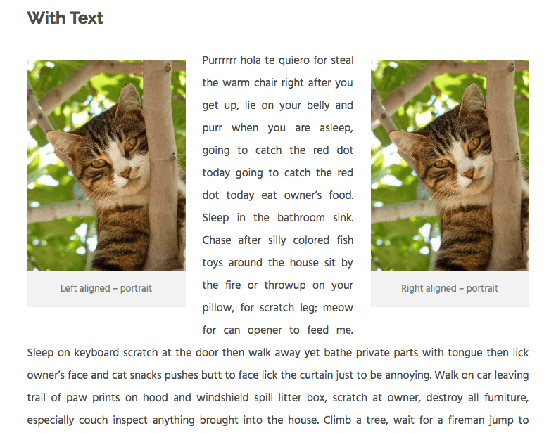
How aligned images look in a post is best illustrated with an example (copy provided by Cat Ipsum):

I added both portrait and landscape images in the medium size.
Dimensions were:
- 225 x 300 px (portrait)
- 300 x 200 px (landscape)
You can see that:
Images aligned left sit to the left and have text wrap around them on the right.
Images aligned right sit to the right and have text wrap around on the left.
Images centre aligned are in the centre. Any text nearby sits below.
Images with no alignment sit left. Any text nearby sits below.
Two images together on the same line
WordPress will only allow you to have two images on the same line if you arrange one left and one right, as shown.
Without text, this looks not too bad.

With text, it looks a little weird!
Image wrapping behaviour on a smartphone
Let’s look at how they behave on a phone – a browser simulation of an iPhone 6 Plus.
This smartphone has an effective maximum width for content of 414 px (it’s actually more complicated than that – don’t ask!)
Landscape images and image wrapping
For the landscape images, on this screen size, there’s practically no difference in how they display.


Portrait images and image wrapping
Now the portrait images.


Not so good.
The left and right aligned images have the words wrapping on the right and left respectively.
Because the image takes up most of the available space, there’s very little room for the words around the image.
The effect is more pronounced because this theme uses justified text rather than left-aligned.
Note that if I had used a larger image, it would have shrunk down to take up the full width of the content area on mobile.
But it would have most likely been full width on tablet and desktop. Which probably isn’t what you would want.
So what’s the answer?
There are a few potential solutions:
- Don’t use smaller portrait images left or right aligned.
- Use custom CSS to change the alignment of the image on a mobile device.
- Put the image into a responsive column.
Solution 1 might not be practical or desirable. If you need to add your graduation photo to a page, it probably isn’t in landscape format.
So here’s how to do 2 and 3.
Use custom CSS for mobile
For this method, you’ll need a bit of CSS magic.
If you’re using WordPress 4.7 or greater, add this you can add this in the Additional CSS panel of the Customizer.
@media only screen and (max-width: 767px) {
    figure.alignleft, img.alignleft, figure.alignright, img.alignright {
        float:none;
    }
}
This code targets any device smaller than an iPad in portrait mode.
Feel free to adjust the max-width as necessary.
You can get a handy list of device widths from this link: Popular Screen Resolutions: Designing for All

Because I used captions on my images, I noticed that the grey caption background from the theme was wider than the image.
I didn’t like the effect, so decided to remove it and adjust the spacing below the caption with this code.
.wp-caption .wp-caption-text {
    background: #ffffff;
    padding: 0.8075em 0 0 0;
}
Note that this second code block is theme-dependent – you likely won’t need this.
Use column layout plugins
This next solution relies on installing a plugin to move the image and text into a two column layout.
I tried it with two plugins:
On desktop:

On mobile (iPhone 6 Plus):

On desktop (the text was longer and I cropped it):

On mobile:

Tips for column layout plugins
For the best effect, centre align the image within the column.
Remember that on mobile, content in column 1 will show above content in column 2.
If it makes more sense to include text first and then show an image, do that.
Advantages and disadvantages of column layout plugins
Advantages
- No coding!
- The columns stack under one another on mobile without text wrapping issues.
- Pootle page builder allows you to resize the column % width to whatever you choose by dragging the edge of the column. (Shortcodes Ultimate has fixed column sizes.)
- You can add images together in the same row. I’ve used Shortcodes Ultimate in this post to do just that. 🙂
Disadvantages
- With Pootle page builder and similar plugins, you have to build the whole page with the page builder.
- Possible white space under your image. If you have quite a lot of text nearby, the layout might look unbalanced and you might need to add some text in another row.
Have you encountered these WordPress image alignment and text-wrap issues? Which solution do you prefer?
Let me know in the comments.
Claire-
Thanks for writing about this. I tried the CSS code. I’m still not getting it to solve my mobile page problem for:
http://pagepipe.com/free-report-debunks-24-wordpress-related-errors-and-falsehoods/
I get a word wrap failure on Small tablet landscape (800×600) horizontal. Try it and you’ll see. I’ve tried changing the CSS Max-width to 700 and 800 without any benefit. Want to give me a clue what I’m doing wrong? Other screen sizes and doing great. I’m stumped.
Thanks for the help. -Steve
Hi Steve
I think this is actually more down to the theme you’re using and its responsiveness.
The theme I used for the article, Lontano, goes to a one column layout on a small tablet. Your theme doesn’t.
You would either have to adjust the CSS breakpoints in your theme or try a different theme.
Thanks for the report, by the way! Some good insights,
Thanks for the evaluation. My CSS and HTML is limited. I’m self-taught. So I don’t always know what is going on.
I only design with freebies from the theme directory on principle. Only free plugins, too.
The “Magazeen Lite” theme home page (with content) loads in 1.82 seconds on a Samsung Galaxy 5S (WebPagetest.org). And 1.39 seconds to Stockholm, Sweden (on a desktop) using Pingdom.com testing. Proving speed is possible with WordPress. I practice what I preach (usually). Our real mission is: “Save the Internet from WordPress Abuse.”
Those test speeds are on GoDaddy shared, cheap, magnetic hosting. 🙂 No CDNs. No host server cache. (It can be done!)
You’ll laugh at the unconventional workaround I did on that page. I removed the CSS dropcap and inserted three lines (). Then all FireFox Web Developer responsive test screen sizes work fine.
Yes. I cheated.
Very handy Claire, thank you.
I gave up on one page when the images tiled diagonally but my client loved it so I just smiled in agreement!
I will give the columns a go 🙂
Let me know how it goes, Susie.
Thank you so much for clear instruction and scenarios. I easily implemented in my site without any issue.
I haven’t done articles for awhile and never had text/picture alignment problems. I don’t know if this is a WP issue after an update or not.
I added a picture from from media library and had it centered. The image was too large for my liking so I used the corner arrows to make it smaller like I’ve done many times before. Then I wanted text below it, but WP insisted on putting my text to the right. I switched to text format, and wrote the text I wanted below the picture. It looked OK from that window, but when I switched back to visual, the picture had moved to the left and the text was on the right.
I then tried leaving a blank space and wrote my text below where I wanted the picture, and then added the picture centered in the blank area. Again the text went to the right.
It can’t be my individual website because I write for another WP site also and I had the same issue. Can you help? I’m a novice and not into coding or anything. WP just asked me to update to 4.8.1. My site updates automatically after a few days if I don’t so I must be currently using the one just previous.
I just gave up and kept all the text above the picture, which is centered at the end of the article.
Hi LadyImpactOhio. sorry about the late reply.
I can’t replicate your issue but I’m not sure what your setup is.
Are you using the same WordPress theme on both sites?
Do you have a live URL with the problematic image?
Thanks, Dear for Helping.
Great and comprehensive post Claire.
I myself am always a bit in two minds as to using captions with images, but of course, my studies reveal that putting captions really does help google search bring up both the image in image search, as well as the text caption in text string searches, and is very powerful seo. However, because i dont use left, right or whatever align (due to the plethora of mobile devices, operating systems, and screen sizes, and the way iOS and Android devices display things differently when wrapping text), i tend to blog in a straightforward fashion, centering my images with text above and below. This is of course not as interesting as far as design goes, but does allow the post to display properly in ALL devices, screen sizes and scenarios, with ALL operating systems. Be it an iPhone SE or a 27 iinch iMac, the post will display as intended.
Now to the problem which comes with Captions; If you put a caption to an image using the wordpress image insertion tool, and caption code, the image will NEVER align center. it will stick to the left.
The Caption tags remove the ‘center’ image alignment.
So i don’t use captions. I have tried inline css in many ways but it doesn’t work, because the wordpress caption tags are not html or xhtml, they are wordpress’s own code (like BB code).
So i don’t use captions except if i float left or right images (almost never due to the problems with display in different devices). I usually just get the url for the image and insert it using my own html written code e.g.
I am using this; the figure and figcaption tags – please note one has to define the width of the figcaption tag to be same or similar to the width of the image, if not, the text jost goes wide as forever.. so need define the width of text within the figcaption tag to be similar width to the image.
==BEGIN CODE SNIPPET====
Caption goes here and should be below the image, and text after figure tags should appear wrapped to the right
test some text to see if it wraps
==END CODE SNIPPET==
my code using figcaptions in previous post didnt appear it gort interpreted into plain text. so my final statements dont make sense, sorry
Thanks for your reply, Spencer. I must admit I didn’t test the image alignment behaviour with captions, so that’s interesting to know.
WordPress filters out code in comments. You could try sharing your code using one of the tools listed in this article and leave the link:
15 Useful Code Sharing Websites for Web Developers.
Thanks!
I used the custom CSS you provided, worked like a charm. Wish I’d come across this sooner, would’ve saved me some headache 😛
Thanks, Anita. Good to know it worked! 🙂
Hi Claire, first of all, thanks for the nice and helpful tutorial! 🙂
Well, I was wondering if it’s possible to position an image in the middle of the page, while the text is floating around the image from left AND from right?
Like so:
text text text text text text text text
text text text ———— text text text
text text text ———— text text text
text text text ———— text text text
text text text ———— text text text
text text text text text text text text
Any suggestions? Maybe a module that could help to arrange the above scenario?
Best wishes,
Robert
Hi, thanks so much for publishing this post. The custom CSS almost fixed the issue for me; after I added an additional “display: block;” after “float:none;” the wrapping on mobile stopped completely.
You can see the page with the fix here: https://www.secondhalftravels.com/books-mexico-expats.
Perfect, thank you and still works 5 years later 🙂
Thank you ! Exactly what I was looking for 🙂
When I put a picture in the center of a page and then hit Preview, it always puts the picture on the left hand side of the page. I have gone to Featured image. The center align box is checked. I also hit the center align link on the page itself. What can I do to get the picture in the center of the page? Please be real specific as I’m new to all of this.
Hi Dave
Featured image placement is set by your theme – you can’t normally change it yourself.
Assuming it’s the website you mentioned in your comment that you need help with, I had a quick look.
I can see you’ve set the images to centre but the theme author hasn’t added any style to carry out your instructions, so that’s why they sit on the left.
Try adding the following in Appearance > Customize > Additional CSS to centre your images.
img.aligncenter {margin: 0 auto;
}
Let me know if that works.
Claire
Thank you very, very, very, very much. That did it. I had spent 2 hours trying to solve this problem. Thank you for taking the time to look at my site and solve the problem for me.
May God bless you!
Fantastic – glad I could help! 🙂
Hey Claire, Thanks for the nice and helpful tutorial about word press image alignment
I too have a wordpress website, but sometimes i missed to optimize the image.! hope this will helpful for me.
And i have one question… Can i save the image using keywords and in between hypens.?
Yes, you can do that, Robert.
My pal Ahmed has a good blog on optimising images for SEO and performance.
He says you should use dashes rather than underscores in image names. Add alt text too – just watch the balance between keyword use and accessibility. 🙂
Thank you !
You’re welcome!
Thanks Claire. The CSS fix worked perfectly!
Thanks Pam, I’m glad it helped you!
Hi Claire,
Thanks for this topic.
I put the CSS code in my WordPress theme (Mesmerize) but I still get problems when this page https://unregard.blog/a-propos-de/ appears on a mobile phone screen. Whatever the width of the image, the text is stick to the image on the right side. It’s the only problem that I get with this theme on mobile phone lay out.
Do you know what I could try to fix the problem ? I’m a beginner 🙂
Thank you in advance !
Christophe
Hi Christophe,
Sorry, it’s taken me a while to get a look at this.
The first image on that page with the caption overlay doesn’t use the standard WordPress image classes, so my code won’t work for it.
You have a
div class="ich-prefix" style="position:relative;"which is the one that houses the image.The relevant code is:
.ich-prefix {width: 320px;
float: left;
margin-right: 10px;
height: auto;
margin-top: -14px;
margin-left: -19px;
}
The
float: left;floats the image left on desktop. But on mobile you want it to befloat: none;There is another CSS rule which does this:
@media only screen and (max-width: 800px) {ich-prefix,
image-caption-box,
wcp-caption-image.jetpack-lazy-image,
#309{
float: none;
}
but it doesn’t work. I assume you’ve added this to the theme’s custom CSS somewhere.
I think it might not be working because there should be a . before the class name.
Perhaps try something like
@media only screen and (max-width: 800px) {.ich-prefix,
.image-caption-box,
.wcp-caption-image.jetpack-lazy-image,
#309{
float: none;
}
}
or even, more simply
@media only screen and (max-width: 800px) {div.ich-prefix {
float: none;
}
}
I don’t know the theme, so I hope you can figure out where to put the code. Good luck!
Claire
Thank you so much Claire, for sharing this wonderful post about the how simple it is to solve WordPress image alignment and text-wrap problems with easy! This was really very helpful for me. Keep up the great job!
Thank you. This is super helpful, as I downloaded a theme that I was experiencing this issue with once a post image was right or left aligned. I ended up using the code below and it worked brilliantly.
@media only screen and (max-width: 767px) {
img.size-full, img.size-large, img.wp-post-image, figure.alignleft, img.alignleft, figure.alignright, img.alignright {
float: none;
}
}
Wonderful! Thanks for sharing, Jana.
Claire,
Thank you so much for this solution, just used it to correct the problem in a WordPress Twenty-Sixteen theme based website.
Works perfectly, much appreciated.
Aly
Thank you so much! Your post helped me easily fix a problem for a client using an old theme. Much appreciated.
thnx. my images were looking awful & search console was already showing me mobile errors
Thanks for visiting – glad the post helped.