• Skip to content
  • Skip to footer
A Bright Clear Web

A Bright Clear Web

A Bright Clear Web - Simple, effective, accessible websites

  • Home
  • About
  • Websites
  • Writing
  • Learn
  • Blog
  • Contact
You are here: Home / Archives for responsive

responsive

8 Current and Emerging Design Trends For 2016

Posted: April 1, 2016 Updated: September 5, 2019 by Claire Brotherton
6 Comments

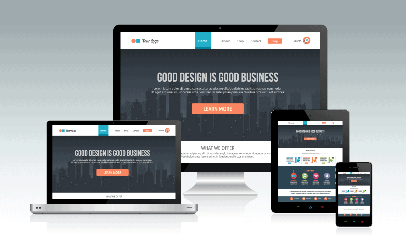
Design is constantly changing and evolving as new trends come and go yearly. That couldn’t be more true in the web design field where the ease of sharing and iterating makes design change move exponentially faster. Every year it’s fun to take a look at what happened with design in the previous year, and what’s […]

Category: Websites Tags: design, responsive, web design

5 Helpful Plugins for a mobile-friendly WordPress site

Posted: April 15, 2015 Updated: January 4, 2018 by Claire Brotherton
5 Comments

Mobile-friendly – what’s that? Since November 2014, Google has labelled certain websites ‘mobile-friendly’ in search results. A site is deemed mobile-friendly if: The text is readable on a mobile device such as a smartphone or tablet Software such as Flash is not used No zooming or horizontal scrolling is required to view the content Links […]

Category: WordPress Tags: mobile friendly design, mobile web, plugin, responsive, SEO

WordPress Page Builders Compared

Posted: February 20, 2015 Updated: January 4, 2018 by Claire Brotherton
14 Comments

This is Day 18 in the 30 Day Blogging Challenge. You can read Day 17’s post here. There are now many page builder plugins for WordPress, which allow you to construct elaborate page layouts in a drag and drop manner. So why use one, and which one is right for you? Why use a WordPress […]

Category: WordPress Tags: 30 day blogging challenge, page builder, responsive

Thoughts on the WordPress Twenty Fifteen theme

Posted: January 16, 2015 Updated: September 9, 2020 by Claire Brotherton
7 Comments

WordPress 4.1 was released last month, and along with it the Twenty Fifteen theme was launched. I’ve had a look at it to see what it can do. First impressions Twenty Fifteen has some passing resemblances to the previous theme from the WordPress.org team, Twenty Fourteen, with a left sidebar and widget area. But the look […]

Category: WordPress Tags: accessibility-ready, mobile friendly design, responsive, theme, twenty fifteen

How can I get my site to look good on a mobile?

Posted: February 3, 2014 Updated: June 26, 2019 by Claire Brotherton
6 Comments

When designing a new website, it is important to remember that your site’s audience may browse on a number of different devices. These could include: a large screen internet-enabled TV a widescreen desktop monitor a laptop screen a tablet a smartphone What does this mean for the user? If web pages are not created with […]

Category: Websites Tags: mobile, mobile friendly design, mobile web, responsive

Subscribe to Blog via Email

Enter your email address to subscribe to this blog and receive notifications of new posts by email. Read my privacy policy.

potted cactus and laptop with code

Footer

Categories

  • Accessibility
  • Blogging & Content Marketing
  • Business
  • Personal
  • Software & Tech
  • Websites
  • WordPress

Top Posts

  • How To Create WordPress Excerpts And Include Links In Them
  • How To Solve WordPress Image Alignment And Text-Wrap Problems
  • Improve Your Divi Website's Reach With Divi Accessibility
  • How To Set Up And Customize Twenty Nineteen Theme
  • Registering a Domain Name with GoDaddy - Step by Step

Let’s Be Social

  • E-mail
  • Facebook
  • LinkedIn
  • Twitter
Copyright © 2014 -2025 A Bright Clear Web
  • Privacy and cookies policy
  • Site map