When designing a new website, it is important to remember that your site’s audience may browse on a number of different devices. These could include:
- a large screen internet-enabled TV
- a widescreen desktop monitor
- a laptop screen
- a tablet
- a smartphone
What does this mean for the user? If web pages are not created with a variety of screen sizes in mind, you can end up with a site that looks great on on a monitor, but does not scale down well on a tablet or smartphone.
Issues that can occur when surfing the web on a smaller screen are:
- The content may be crammed into a tiny area. This makes the text illegible, and forces the user to zoom in to read it.
- Text may overlap with other text or pictures.
- Links or linked images may be close together, and it may be difficult to select the correct one with big fingers.
- The user may have to scroll horizontally to read the words.
Why is mobile web browsing important?
Because it is increasing year-on-year. In December 2013, it was estimated that 20% of web pages globally were viewed on a mobile device. According to Ofcom, Scots are increasingly adopting mobiles or tablets to browse the web. One in two Scottish adults owns a smartphone, while a quarter have a tablet. In some parts of the world, such as Africa, it is said that the mobile web is the web, as internet-enabled phones are cheaper to acquire and are much commoner than laptops.
 Another growing trend is e-commerce on mobile websites. According to a recent article in Internet Retailing, it is the rise in the use of tablets and smartphones for accessing the web that has driven recent growth in online sales. If you sell anything online, you cannot afford to ignore this section of your market.
If that hasn’t convinced you. here’s a beautifully presented infographic showing the rise of mobile in 2013.
So, I just need to create a separate site for mobile, then?
Maybe, maybe not. Take a look at the BBC website, then look at their site on a mobile device. You’ll see that there are some differences. The header and the footer look similar, but for the mobile site:
- In the main page content, instead of scrolling left or right for more articles, the links are all on one page.
- There are fewer pictures and links, and their positions vary.
- The weather is on the top left hand side, under the city, rather than further to the right of the city.
- The sections Most popular, What’s on and Explore are missing.
The mobile version’s code is different from the desktop site, so it shows different components. This is achieved with some quite complex coding, which detects what you are browsing on, and serves up the appropriate content. This approach makes sense in a number of contexts:
- You don’t want your users to be downloading and viewing big graphics on a tablet or phone, wasting time and bandwidth.
- You want to change the order of information presented to people looking at a smaller screen.
- You want to simplify the amount of textual information shown on a mobile view.
Respected usability consultant Jakob Nielsen says that a mobile website provides a better experience for users. But not everyone agrees. The main drawback with such a site is that it can take more time and effort to implement, and many people lack the resources to achieve this.
Responsive design to the rescue…
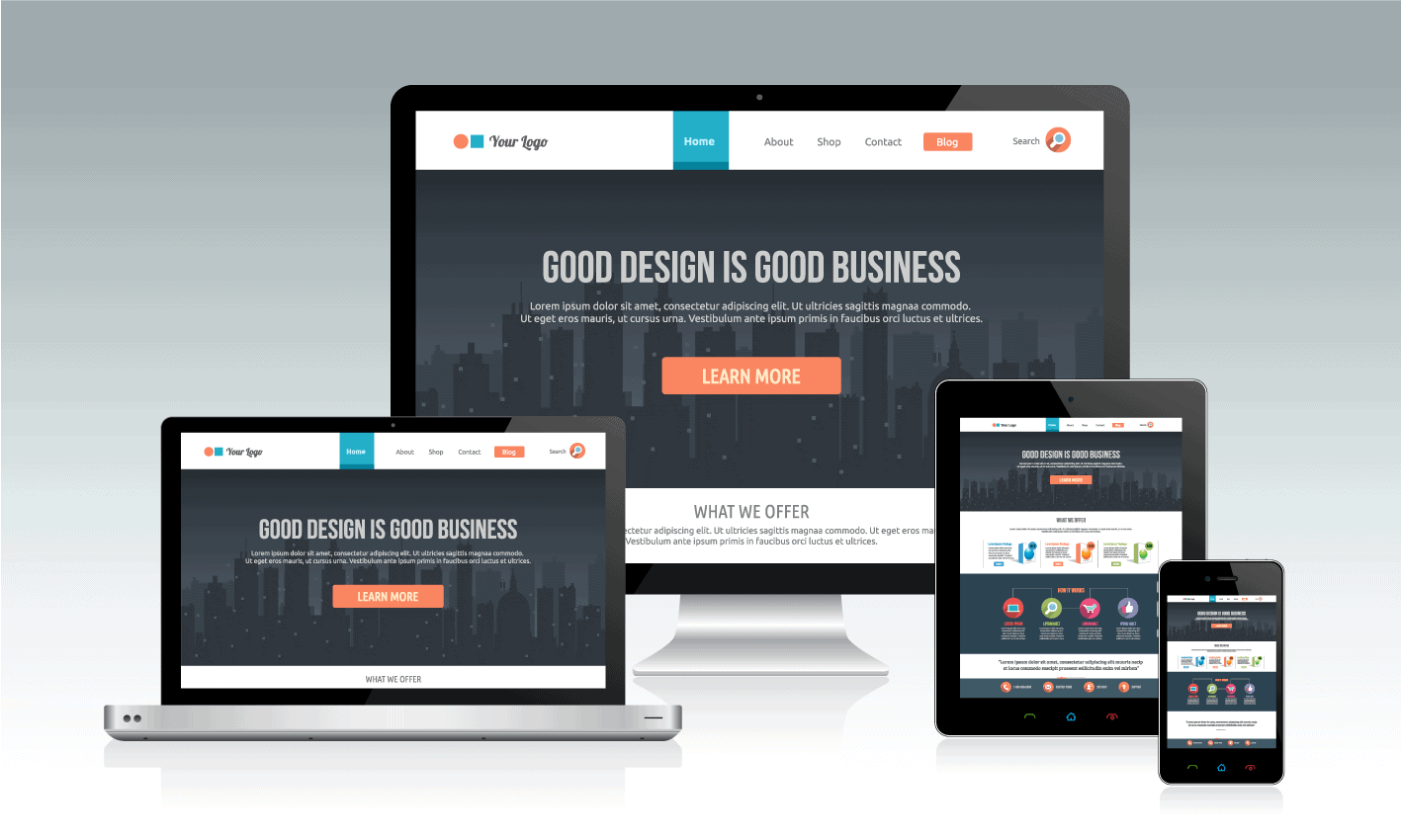
There is another solution to the problem. Responsive web design means that the same code is used for each web page, but the page adapts fluidly depending on the size of the screen. In essence, the designer sets up rules that specify a different look for the page at different screen widths. The flow of the page changes as the screen width contracts. Below you can see a scaled down image of the blog page of this site on a mobile phone. Notice how the right sidebar moves below the page content. The logo, social media icons and menu are all centred. The ‘Let’s Connect’ heading above the icons is hidden.

This is made possible due to the (geek alert!) use of media queries, part of the CSS3 style sheet specification. Both portrait and landscape views have to be considered in creating an adaptable layout.
CSS frameworks make it easier for web developers to build a responsive layout. Bootstrap is one of the best known ones.
OK, so if I have a WordPress site, will it adapt to mobile?
Not necessarily – it depends on the theme used. A theme is the code that controls the appearance and design of a WordPress site. Many older themes are fixed-width, as they were designed before smartphone and tablet use became commonplace. This means that these themes are perfectly designed for a desktop view, but on a smaller screen, you may end up with frustrated users.
It’s usually a fool’s errand to try to modify such a theme to be mobile responsive (believe me, I’ve tried!) Much better to search for a mobile friendly theme and customise it to your needs. A popular choice in the WordPress theme repository is called – surprise, surprise- Responsive, by CyberChimps. There are many other free themes – just search for one tagged ‘responsive-layout’.
If you care about your phone- and tablet-using visitors, it pays to design a site which looks good and works well on a mobile device from the start.

Bootstrap may be the best known, but do you think it is the best?
Hi Chris
Thanks for your comment.
I’m not sure how good Bootstrap is as I haven’t yet built a website using it or used a Bootstrap-based WordPress theme. Have you got experience of it?
Claire
some yes, i think its all down to designers preference, in a perfect world i would be HTML all the way…. but then have you ever tried to explain over the phone to a client how to edit that!! ha ha
Hi Claire, great article. Is it ok to quote some it of (referencing you and your company of course) in an article I’m writing about the way in which people view internet content please?
Sure thing, Christina – just add a link back, thanks. 🙂