
Mobile-friendly – what’s that?
Since November 2014, Google has labelled certain websites ‘mobile-friendly’ in search results.
A site is deemed mobile-friendly if:
- The text is readable on a mobile device such as a smartphone or tablet
- Software such as Flash is not used
- No zooming or horizontal scrolling is required to view the content
- Links are not placed too close together
Google provide a Mobile Guide with more information.
As you may be aware, the days are counting down to a change in Google’s mobile algorithm on April 21st. This has implications for SEO. Sites which are mobile-friendly will receive a boost in mobile search results, and sites which are not may drop lower.
I don’t know if my site is mobile-friendly or not – how can I check?
Go to Google’s Mobile Friendly Test page, enter the URL of your site and click the Analyze button.
If all is good, you will get a message saying your site is mobile friendly.

If not, Google will give you a warning and display links to follow for further advice.

So what can you do if your WordPress site is not mobile-friendly?
 You might think that it doesn’t matter to you, and if your site visitors primarily visit from the desktop, you might be right – for now. But mobile usage has risen hugely in recent years. According to Ed Akehurst’s post, smartphone users set to exceed 2 billion next year. Can you really afford to lose out on those mobile visitors?
A switch to a responsive theme, or a redesign to create a responsive site may be the best solution in the long run. Responsive means that your site responds to changes in device width to show an optimally sized version of your website for the device you are using.
But in the short term, a quick solution to making your site mobile-friendly is to use a WordPress plugin to display a mobile-friendly version of your website.
There are a number of them in the WordPress plugin repository, and I’ve reviewed five of them.
I created a test site using the Twenty Ten theme, which is not responsive by default, and imported the Theme Unit Test Data. I then tried each plugin out one by one to see what effect it had on the mobile view.
Most of the screenshots shown below are taken from Browserstack, using an Phone 5S running on iOs 7, except where otherwise indicated.
The Mobile-Friendly Plugins
1. Wiziapp
Wiziapp offers a choice of mobile theme for your website. There are also options to create a native mobile app for your site, but these cost money.

Advantages:
- 7 themes to choose from, resembling mobile apps.
- Customize the header with an image.
- Select foreground and background colours.
- Choose what info is displayed for posts and pages.
- Add a home screen icon.
- You can change the default menu.
Disadvantages:
- Adverts are displayed by default, unless you pay $49/year to remove them.
2. Any Mobile Theme Switcher
The Any Mobile Theme Switcher plugin detects the device used and serves up the mobile theme requested. The screenshots below are taken from a Samsung Galaxy S4 mini, showing the Twenty Thirteen theme on mobile.

Advantages:
- You can select a different theme for each device (iPhone, Android, Blackberry etc.)
- Option to add a link to the footer to the desktop version.
- Pro version available with QR code and compatibility with W3 Total Cache (free download).
Disadvantages:
- Mobile themes to use are from the default themes (Twenty Thirteen etc.). So if you use one of them, you might as well dispense with the plugin and use it your default theme.
- A different theme for each device might confuse your visitors.
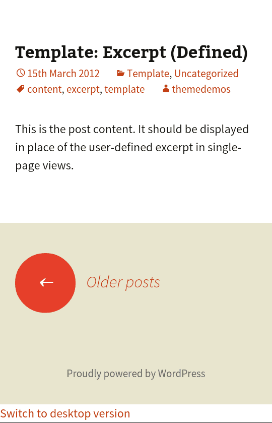
3. WP Mobile Edition
WP Mobile Edition provides a mobile theme with colour and menu options.

Advantages:
- Choice of 8 colours for the theme.
- You can add menu items to the top (Home, Navigation, Categories, Search, Blog Index, Contact).
- Add logos, social links and ads.
- Creates a custom post type – Mobile Pages. You can create your own mobile page and use it as your mobile homepage.
- Add your own custom code.
Disadvantages:
- Only one theme available (mTheme-Unus). Other themes are in development and are listed as “coming soon”.
- The blog index and contact icons will throw 404 “page not found” errors if selected and you haven’t created the appropriate page.
- The icons to switch between desktop and mobile are very close together.
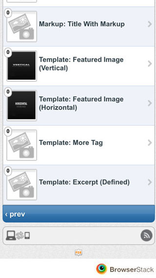
4. WP Mobile Detector Mobile Plugin
The WP Mobile Detector Mobile Plugin can distinguish between a feature phone and a smartphone and will load a suitable mobile theme.


Advantages:
- Choice of 7 default themes.
- Some themes have jQuery effects such as collapsible menus.
- Images and advanced HTML aren’t displayed for older devices, saving time and bandwidth.
- Tracks statistics on your mobile visitors (number of visits, device, IP address).
Disadvantages:
- The Pro version – which offers more customization options – is pricey.
- I’m a bit suspicious of a plugin that orders me to set file permissions for the plugin folder to 777 – that could represent a security risk. Plus most folk will have no clue what that means anyway. 🙂
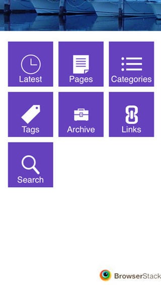
5. WPtouch Mobile Plugin
WPtouch provides a lightweight mobile theme for your website.
Advantages:
- You can change the site title if you choose to for the mobile version.
- Add your own custom code.
- Switch between mobile and desktop views
- Theme preview mode.
- Option for a featured slider.
- Choose the number of blog posts listed and what info is displayed.
- Choose colours, typography and add a logo.
- Customize menus, and drag and drop icons to display on your menus.
Disadvantages:
- Only one default theme – The Bauhaus theme. The rest are available in the Pro version.
- Many customizations and other features (e.g. mobile ads) are only available in the Pro version.
Overall, the main disadvantage of using these plugins is that the mobile versions of pages are not so likely to resemble the desktop versions. This could create problems if you want a uniform user experience. People might be surprised if your desktop and mobile sites looked vastly different. Which is why I would still advocate a responsive design.
What do you think of these plugins for a mobile-friendly WordPress site? Do you use one of them, or have you got a responsive design? Which is better?
I’d love to hear your thoughts; please comment below.

This is a really awesome list of plugin essentials. After the new updates of google mobile friendly plugins became essentials.
Thanks for your comment, Meerab. Glad it helped. 🙂
You might want to check out the new Mobile Friendly Twenty Ten Plugin, from Placeix.com
Thanks – I haven’t heard of this one.
Thanks a lot for this useful information!