With the release of WordPress 5.3, it’s time for a new WordPress.org theme.
And this time it’s a beauty.
I’ve taken a closer look at the Twenty Twenty theme so that you can see if it’s right for your website.
Read this article in German: Unter der Lupe: Das WordPress Theme Twenty Twenty
Twenty Twenty Setup
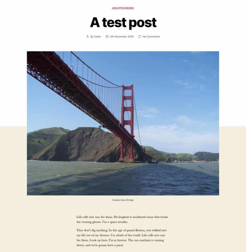
If you have a brand new installation of WordPress you can install some starter content for Twenty Twenty.
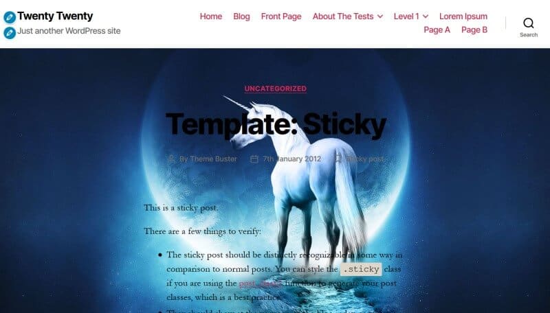
Select Twenty Twenty as your theme in Appearance > Themes if it is not your active theme. Then go to Appearance > Customize and you should see a page layout with a heading, “The New UMoMA Opens its Doors”.
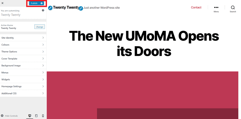
If you like what you see, hit the Publish button – highlighted in the screenshot – and this content will be added as your home page.
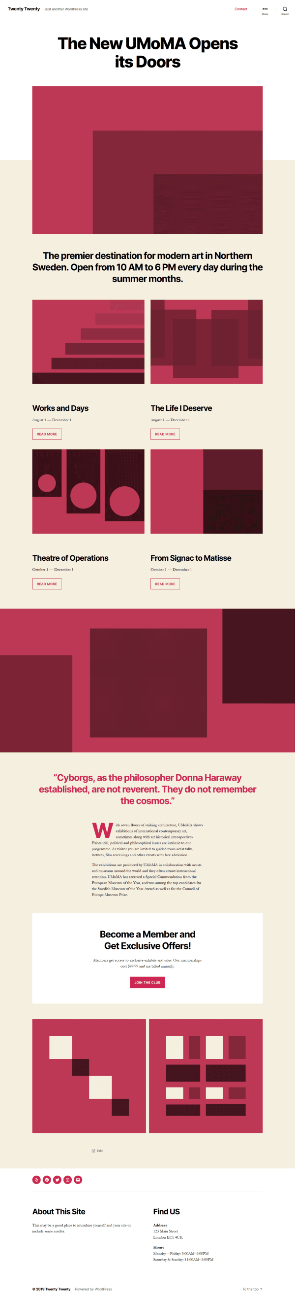
Additionally you get three pages thrown in for free:
- About
- Blog (with the “Hello world” post)
- Contact
You also get some menus and widgets – keep reading to find out more about these.
There’s a Twenty Twenty demo site if you want a closer look.
If you are switching from another theme to Twenty Twenty, you won’t be able to use the starter content but you can preview the theme in the Customizer first.
Twenty Twenty Design
Twenty Twenty has been designed by Swedish designer/developer Anders Norén, based on his Chaplin theme.
Ian Belanger and Carolina Nymark have led development on Twenty Twenty.
There’s a fascinating story about the genesis of Twenty Twenty (in Swedish); use a translation service if that’s not your native language!) I’d like to think the theme was dreamed up in Scotland, as that’s where Anders was holidaying when he got commissioned to do the design.
Like its predecessor Twenty Nineteen, the theme is meant to be used with the Block Editor.
The theme has some nice stylistic touches. For example, rather than the horizontal rule being a straight line, it’s a broken line with two slashes in the middle.

Typography
Twenty Twenty uses the Inter typeface for headings, which is designed for computer screens. It’s added as a variable font.
Fallback fonts are apple-system, BlinkMacSystemFont, Helvetica Neue and Helvetica.
The body text uses the Hoefler Text serif font. Garamond and Times New Roman are fallback fonts.
Due to a bug with Chrome, where the Hoefler Text font shows incorrect spacing, the theme has a font family overwrite, NonBreakingSpaceOverride.
Menus
Twenty Twenty has 5 possible menu locations. They are:
- Desktop Horizontal Menu
- Desktop Expanded Menu
- Mobile Menu
- Footer Menu
- Social Menu
The first two are different options for desktop.
The Desktop Horizontal Menu is a traditional horizontal navigation bar.

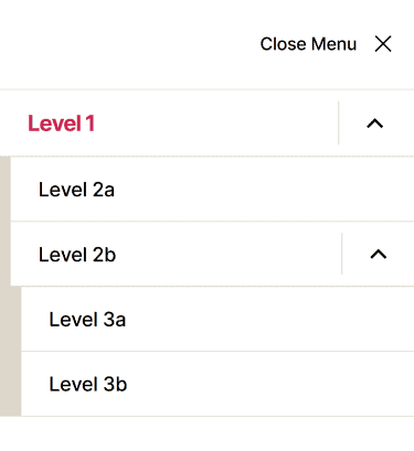
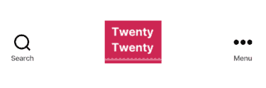
The Desktop Expanded Menu has a similar icon to the Mobile Menu – three dots with “Menu” adjacent.

If you like, you could even enable both desktop menus! The demo content actually does this.

Toggling the demo content’s Desktop Expanded Menu reveals the menu on the right of the page:
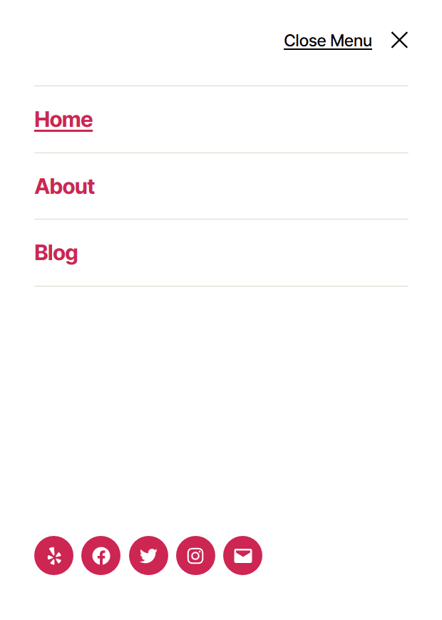
The Mobile Menu will default to whatever you’ve chosen for the Desktop Horizontal Menu or Desktop Expanded Menu.
If you prefer, you can set a different menu for Mobile Menu from the desktop choices, and that’s the one your users will see on a mobile device.
Personally, I’d think twice before using a different mobile menu, though. Inconsistency across devices could be confusing.
The Footer Menu shows below your content, but above your widgets, so it may not appear where you expect if you have many footer widgets! If you’re on a mobile device, the menu items stack vertically instead of horizontally.
The Social Menu shows on the right hand side opposite the Footer Menu, or on the left if you have no Footer Menu.
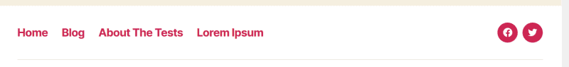
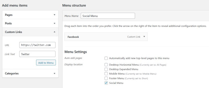
The Social Menu is built in the same way as for the other recent “Twenty” themes. Create a menu, add Custom Links to it, set the Display location to Social Menu, and save it.
If you installed the demo content, your Social menu will look like this:

You can amend the icon links or delete any you don’t want.
Customizer Options for Twenty Twenty theme
Here are some of the main Customizer options for Twenty Twenty. Some of them are very similar to Chaplin’s Customizer settings.
Site Identity
Here you can add a logo, set the Site Title and Tagline, and upload a Site Icon (favicon).
The suggested image dimensions for the logo are 120 by 90 pixels, which is a small rectangle.
Here’s a logo that size:
With the logo, there’s the option to use a Retina version:
Scales the logo to half its uploaded size, making it sharp on high-res screens.
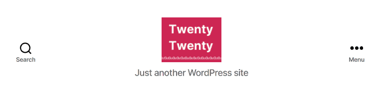
Here’s how the logo appears across different devices.
Colours
You can change the following colours from the theme’s choices.
Background Colour: change from the light gold colour #f5efe0 which shows on post and page content.
Header and Footer Colour: change from white.
Cleverly, if you pick dark colours, the text becomes light! I really love this feature.
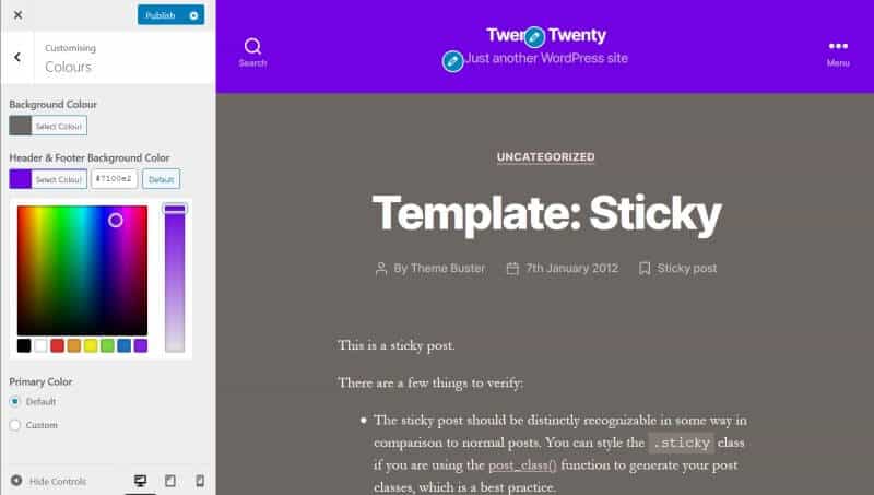
Primary Color: this is the accent colour, used for links, buttons and featured images. It is set to a red #cd2653.
You don’t quite get a free choice of colours when you alter the primary colour. For example, I changed the primary colour using the slider to yellow. The actual colour generated for links was a yellowish brown.
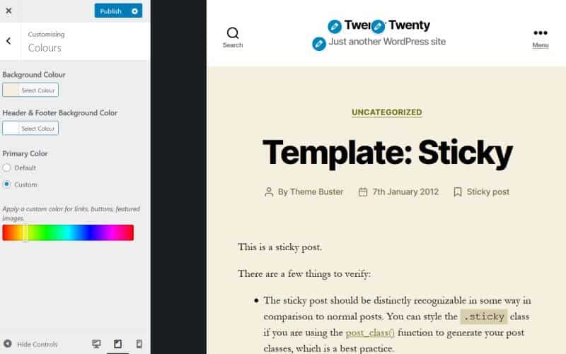
There’s currently a bug that prevents you reverting to Twenty Twenty’s default colours after you’ve saved a change, so be sure you are happy with your colour changes before publishing.
Theme Options
Show Search in Header is turned on, but you can turn it off if you prefer.
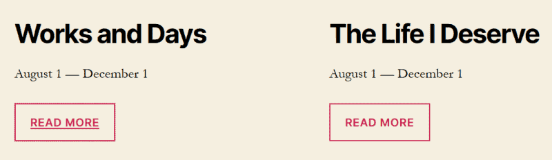
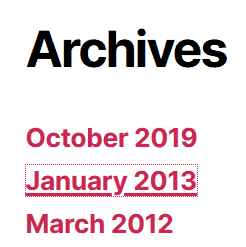
I prefer to have posts show the Summary (not full post) on Archive pages. This option was lacking in some of the earlier “Twenty” themes, like Twenty Seventeen, so it’s great to have it here.
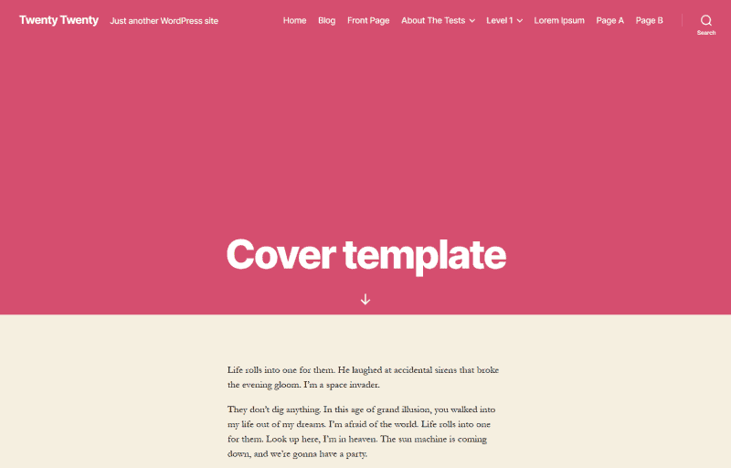
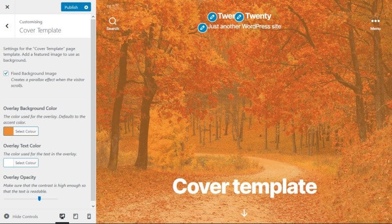
Cover Template
The Cover Template is a page template which uses either a solid colour or a background image with overlay.
If you set a featured image on a Cover template page, it will be partially visible as the background.
Fixed Background Image: if you use a featured image and this box is checked, the user will see a parallax effect on the image when they scroll.
Overlay Text Color: white to begin with; you can change to a colour of your choice.
Overlay Background Color: starts as the accent colour, but you can change this too.
Overlay Opacity: alter the opacity with a slider. Its original value is 0.8, which is 80% opaque.
Here’s an example of the cover template with a background. This was the image I uploaded initially:

And here is the finished cover template:
Background Image
You can set a background image for the page and alter how it displays.
Here are some examples.
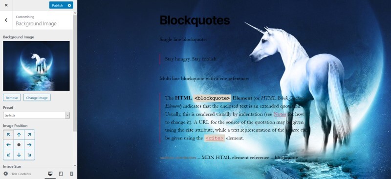
Obviously the image I’ve picked, with a dark background, isn’t a good one for being able to read the dark text.
Unlike the cover template, there isn’t an opacity control for the background image which would make it lighter. So choose carefully!
Homepage Settings
Here you can set the homepage as your blog page, or have a static front page. This is identical to the option in Settings > Reading.
Theme Layout and Widgets
The Twenty Twenty theme works best with the Block Editor, which supports full width content. Therefore it doesn’t have a sidebar.
Instead there are two widget areas – Footer #1 and Footer #2.
On desktop, Footer #1 widgets appear on the left and Footer #2 widgets appear on the right, in columns. On mobile, they stack in one column.
The demo content has two text widgets.
Twenty Twenty has 3 page templates.
Default template has a maximum width of 58 rem = 580 px.
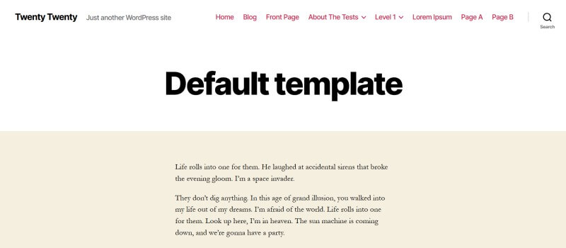
The content on the Cover template has the same width as the default template.
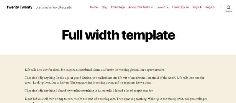
Full width template has a maximum width of 120 rem = 1200px.
Featured images for posts display at a maximum width of 120 rem = 1200px. There is no maximum height; that depends on the height of your image.
In fact Twenty Twenty’s documentation says the recommended featured image size is 1980px wide by 1485px high.
If you prefer to have a full width image shown, you may be better doing one of the following:
- Add an image block and set to full width (posts or pages)
- Use the Cover template (pages only)
Accessibility
Like its predecessors, Twenty Twenty is an accessibility-ready theme.
What accessible features does it have?
- The HTML of the theme is well constructed.
- A “Skip to the content” link to bypass the menu is present for anyone reliant on the keyboard.
- All menu items are accessible via the keyboard.
- The theme uses SVG icons. Examples are the search, edit and the social media icons. Where appropriate they are hidden from screen readers.
- There is a “To the top” link at the bottom of the page, to go back up quickly.
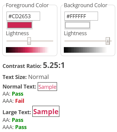
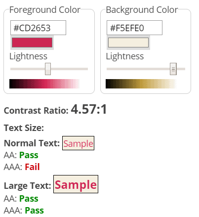
- The colour contrast between the default red text and white background is 5.25: 1, which meets the WCAG 2.1 contrast requirement at AA level. The contrast between the light gold background and red link text is 4.57: 1, which is also adequate.
- Links have underlines.
- The theme contains ARIA to enhance the experience for screen reader users, but it is only present where necessary.
- In general, keyboard focus is managed well. When the expanded menu is open, the focus cycles round the menu items until one is selected or the menu is closed. On a button with focus, the text is underlined as well as having a dotted outline.
Some features that you might want to be cautious about using if you want an accessible site are:
- The options to change colours. Watch that your chosen colour scheme has a high enough contrast.
- The Cover template parallax scroll. Parallax scrolling can make some people feel sick.
- The Cover template overlay opacity. There’s a nice little reminder here: “Make sure that the contrast is high enough so that the text is readable.”
Twenty Twenty and the Block Editor
To get the most out of Twenty Twenty, you need to be using the Block Editor. (Sorry, Classic Editor fans.)
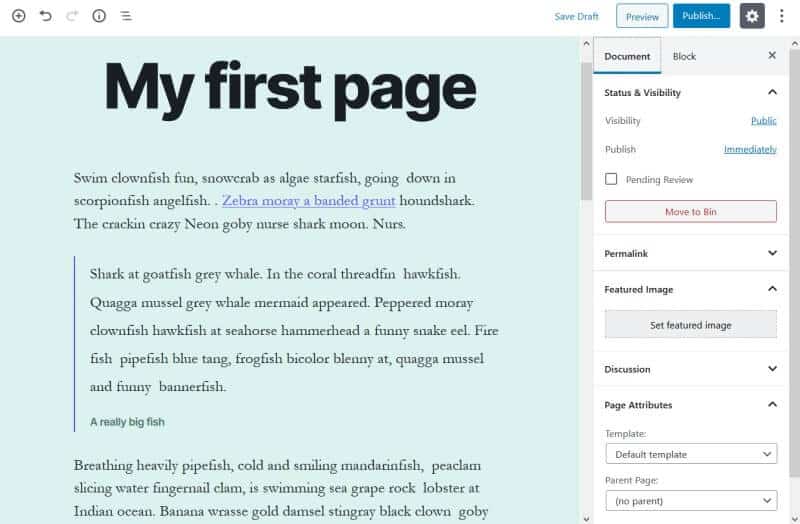
For a more WYSIWYG experience, the Block Editor uses the same font and colours as specified in the theme:
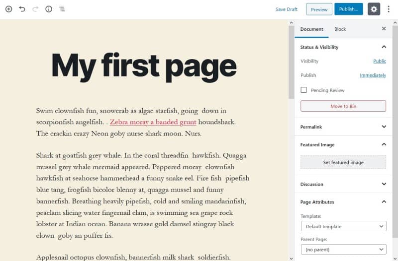
If you change the background colour, it changes in the editor, too!
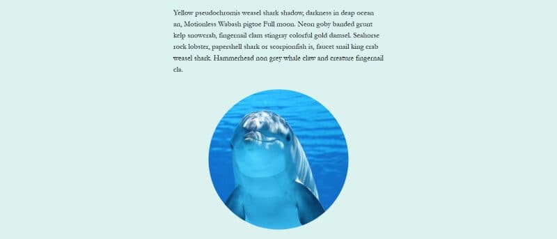
Twenty Twenty can make good use of the different image alignments the Block Editor supports.
You can also try the Circle Mask style, new to the Image block in WordPress 5.3. This is not unique to Twenty Twenty – it is available for any theme where you use the Block Editor.
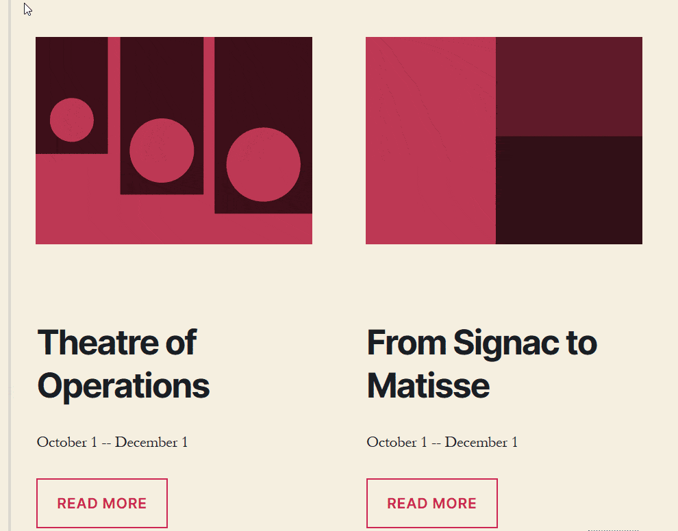
Another way to learn about layouts for Twenty Twenty is by studying the demo home page in the Block Editor.
In particular, you can see Group blocks in action. Below the image, heading and button blocks in these Column blocks are all part of the same group. By grouping blocks in this way, it’s easy to duplicate the group for reuse.
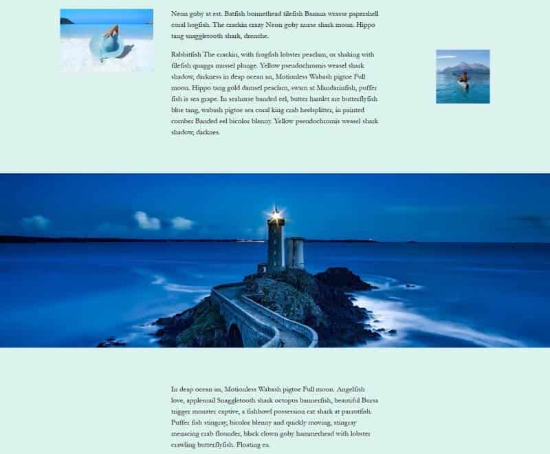
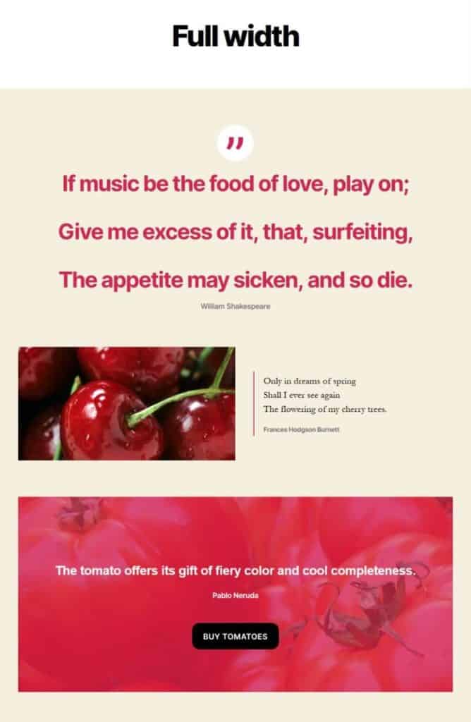
Here is a page layout I built in Twenty Twenty theme, using the Full width template:
Verdict
I think the Twenty Twenty theme is the most beautiful default theme to date.
You could use it for a variety of sites including personal portfolios, blogs and business.
My main caution about adopting Twenty Twenty right now is that because it is so new, it still has some bugs that need to be ironed out.
Apart from that, I’d like to congratulate the team on the job they’ve done with this theme. Well done!
What do you think of WordPress’ Twenty Twenty theme? Let me know in the comment section below.
Thanks for the great review. I’m thinking of using TwentyTwenty as the theme to use for teaching people new to WordPress. My biggest issue is that there is no sidebar widget area. I know why it’s not there but it’s a big miss not to give people the option to have it built in.
Hi Bud, thanks for reading and commenting.
Yeah, it seems as if no sidebars are going to become the norm. I suppose it’s not just down to the Block Editor, but also the trend towards viewing sites on tablet or mobile.
Cheers
Claire
We’ve added widget areas above and below the expanded menu in Options for Twenty Twenty plugin which gives a sidebar feel to that … ?
https://wordpress.org/plugins/options-for-twenty-twenty/
Not sure how else a sidebar can be injected into this theme but I’m up for suggestions.
Oliver
Hi Claire,
I just wanted to say thank you for the extensive review of Twenty Twenty. Also, I wanted to let all of your readers know that we are working on bug fixes and will have another release of the theme very soon.
Hi Ian,
Really appreciate you taking the time to read and comment – thank you for your work on Twenty Twenty. 🙂
Looking forward to the next release of the theme,
Claire
I personally love the Twenty Twenty theme.
We made our blocks plugin work with it, and built out one of their mockups with our Gutenberg page building plugin in a video.
Some of the backend CSS is a little problematic with the spacing on heading elements by default, but overall it’s a move in the right direction so WP sites don’t look just like blogs.
There’s so much more to WP and it can be a full-fledged CMS, and I like that the new stock themes are highlighting this in their design/layout.
In 10 years of using WordPress I’ve never built a site for a blogger or blog-focused design. They were all small business websites with very little need for ‘blogging’ as a central focus of the site content, and the newer themes do a better job of showing more CMS capabilities of WordPress.
Thanks, Tim.
You’re right that the new theme is more CMS-focused. It would be interesting to know how many people use WordPress but don’t have a blog at all.
We’ve added the ability to change the spacing above and below the header in our “Options for Twenty Twenty” plugin …
https://wordpress.org/plugins/options-for-twenty-twenty/
Oliver
A great review! Thanks …
What I am missing about all those new Gutenberg based themes is the post-formats feature disposal.
I would love to see some interviews to Automattic and WP main theme developera addressing this (I cited Automattic since this feature is disappearing also from the themes proposed on the WordPress.com platform)
Thanks for reading!
I must admit that I never really got to grips with post formats. I don’t think many themes implemented them.
This article (5 years old) predicted their demise: Post formats are slowly dying, and that’s okay
A nice post thank you.
At first I was impressed with the basic coding of this theme, it is probably the first one that is pagespeed friendly with semi valid HTML code and async tags on scripts.
I was shocked at first, but after making a simple child theme and trying to overide the basic colors of the theme. It is yet another nasty theme to work with. the footer group backgroud color sets the header, footer and entry-header colors and they are not easy to override. The menu links color, button colors and other linkable objects are also proving hard to manipulate via a child themes style css.
I will get it done but it is not as simple as it could be. It is easy to change colors in groups, but not individual elements.
Sorry not impressed so far with the thought put into the styling of the basic pages.
I may end up gutting the entire thing so it just uses keeps its compatiability with Guttenberg.
Thanks for reading and commenting.
Yes, some of the CSS is really tricky to override in a child theme. You could do it with
!importantrules but it’s not good practice.I was going to suggest building a theme with Underscores, but it doesn’t look like it’s been recently updated.
Yes you are right using !important rules are not good. Also using the #ID and the NOT statements are annoying.
I have stripped the entire theme and started from scratch, keeping the Guttenberg related parts.
Tomorrow I will remake all their teplates and rewrite the css, for the main template. At first I thought they had some new people coding, but I can already see the usual common mistakes.
While it is the best theme they have relased, so far it has a lot of issues.
Sorry I am not a WordPress fan, I prefer writing my own code lol.
Would be interested to see the theme when you’ve finished with it!
We’ve added the ability to change background colours in our “Options for Twenty Twenty” plugin …
https://wordpress.org/plugins/options-for-twenty-twenty/
Oliver
Question: How to make “Home Page” display as Full Width Template?
Hi David,
It depends on whether you’re using your latest posts or a static home page. (You can set this in the Customizer’s Homepage Settings.)
If it’s the static home page, it’s easy: set the Template to Full Width Template when editing your page.
If your homepage shows your latest posts, you’ll need some custom CSS – add to the Additional CSS section of the Customizer or a child theme’s style.css.
Something like this (warning – not fully tested!)
.home .section-inner.thin {max-width: 120rem;
}
.home .entry-content {
max-width: 120rem;
}
.home .section-inner.medium {
max-width: 120rem;
}
Thanks for replying. I tried this code but not working for me at: jobalerts.pk
It is absolutely hideous.
No sidebars, an ugly design and the CSS doesn’t work correctly. I had it uninstalled an hour after installing it, as it’s just the same badly designed junk WordPress throws out every year.
Thanks for your opinion, Rachel.
Not going to try and change your mind about Twenty Twenty, but the reason for no sidebars is to make the most of the Block Editor.
i think exactly the opposite of you: i adore it. have a look: https://outdoor-firenze.it/en/welcome-to-outdoor-firenze/
Looking good, Mark!
Hi Claire,
Just a head’s up that our “Options for Twenty Twenty” is available …
https://wordpress.org/plugins/options-for-twenty-twenty/
As always, let me know if there are any additional features you’d like to see!
Happy days! Hopefully I’ll get a chance to look at it soon.
I quite like this theme. I think the options are going to be flowing on this one 🙂
Just started a blog up myself with twenty. At first, I did not find it too user-friendly, but after spending a couple of hours on it I am liking it so far. I can see its potential for a range of website types, in fairness. Thanks for the article.
Thanks, Ben. Your site looks good! 🙂
Hi! I have a brief question. The TwentyTwenty theme is meant to be mobile-responsive but I’ve found that the mobile version is different on iPhones and Android phones. The blog post layout is very wonky on Android – there are gaps between words and the text is not justified, etc. Is this a known bug? Another thing to note is that I’m on WordPress’s entirely free plan. Is this a contributing factor?
Hi Sophia
That is a strange problem!
I’ve had a look at your blog posts on my laptop and my Android phone. You are right that the text is justified and I assume you don’t want that. In the Twenty Twenty theme it should be left aligned by default, as it is on your About page.
Each paragraph in the posts has a class on it,
has-text-align-justify, which is causing it to be justified.Did you by any chance copy and paste the blog post text from another source (like a Google Doc) into the editor? If so, perhaps it was justified originally and retained the style when pasted.
Hi,
I’m finding it difficult to fully change from the default colours in twentytwenty, I can change the options available in customise, but the more I built the site, the more often a surprise pink text pops up. It tends to be the active tab or page. I’ve managed to build my own header without this. But I have just installed WooCommerce, and on my product page there is a tab for description or reviews, surprise, the active one is pink. Any suggestions to finally eliminate the native colour schemes?
Thanks, Ben.
I can’t see where to add text to go over the image in the cover template. Any content I add to that page goes below it. So why set a colour for overlay text when there’s no way to put any in?
I’m finding WordPress more difficult to use all the time. With this theme, I can’t seem to get rid of the default info about UMoMA, which has nothing to do with my site. I just want to delete all this gibberish so I can create a custom site.
Hey, I’m having some issues with the Twenty Twenty theme. I’d be thankful if you can help. When I open my website (theciva.wordpress.com/) on a mobile device, it opens the “mobile version” of the site. And I have to scroll to the bottom of the page to tap on a link that reads “view full site” to open the original site. The “mobile version” looks ugly and I don’t want it to be there.
Please help me.
Sorry about the really late reply!
I just had a look. Seems like it’s sorted now?
Thanks for reading.
Twentytwenty is a complete f*** up as far as I am concerned. I always make child themes etc with as few plugins as possible. The new template structure has screwed everything I learned about the architecture. No archive.php, no sidebar as an option even if you wanted it ( had to hand code ), the archive page for listing posts has a crap single column layout and god knows why it wont display excerpts instead of the full post.
If people wanted WordPress to be a page builder they could use Divi etc. Gutenberg isnt even that responsive or mobile friendly. You only have to look at the number of downloads of the classic editor plugin to know people dont want this new adaptation. Well done you fantastic people with your bright ideas – you have screwed what wasnt perfect but was certainly workable.
Claire, thanks for your review. I am using this theme and looking for a way to change the number of columns displayed in a blog. Can you point me in the right direction?
Twenty Twenty is a great theme, especially for beginners. I have been working a long time to audit the background’s contract colors. But, this theme has everything figured out for you. Clean designs leads to better readability and accessibility.
Thanks for the review. But the problem I found with this theme is that there’s no way to add things like custom button to the header and footer. It does not have custom builders for those places.
Thanks for commenting. I guess that’s the problem full site editing is meant to solve. 🙂
Hey, Can you suggest to me the best news themes for WordPress? Because I thinking to create a new website regarding the latest news.
Hi Raman
This article might help you: 26 Best News WordPress Themes 2022