Someone recently asked me about how accessible the Beaver Builder page builder is.
Beaver Builder is a very popular page builder for WordPress that lets users drag and drop content – in the form of modules – to assemble their own sites. It’s aimed at both non-technical users and web professionals.
Beaver Builder’s team have made some strides towards accessibility. On their knowledgebase, Beaver Builder have an article about accessibility which mentions ways they have improved the accessibility of their plugin. They also make some good suggestions for authoring accessible content.
But I wanted to check the plugin for myself. Or more accurately, the finished content created using Beaver Builder.
Contents
- Beaver Builder: Free vs Paid plugin
- Callout with Icons and Icon Group
- Forms
- Carousels (Sliders)
- Accordion
- Conclusion
Beaver Builder: Free vs Paid plugin
Beaver Builder is free to download from WordPress.org, but I soon discovered that the free version is pretty limited.
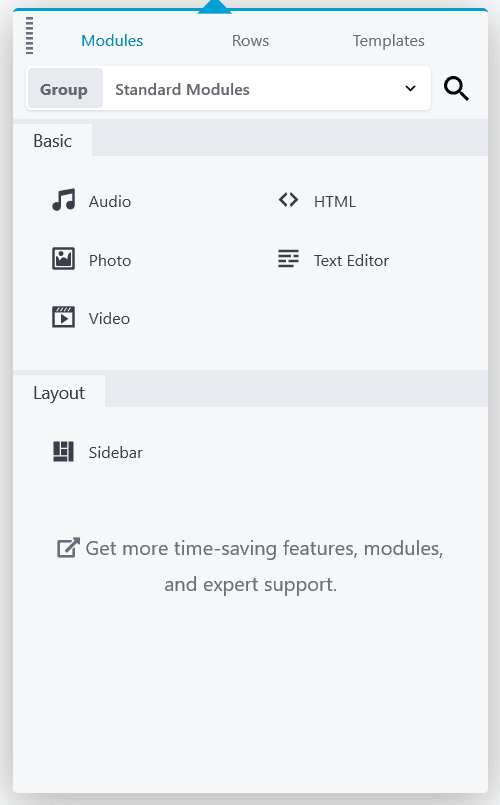
Fortunately, Beaver Builder provide a demo site for trying their premium product, which I took advantage of.
The paid version has more modules, and lets you put sites together quickly using pre-designed templates.
I tested content using the following templates:
- Subscribe landing page template
- Biz landing page template
- FAQs content template
In particular, the modules in these templates I checked for accessibility were:
- Callout and Icon Group
- Subscribe Form and Contact Form
- Slideshow and Testimonial
- Accordion
Note that Beaver Builder has several more modules which I didn’t test this time round.
I tested the accessibility of the generated content via the following methods:
- Navigating via the keyboard simulates a motor disability i.e. someone who cannot use a mouse.
- The NVDA screen reader simulates a visual impairment i.e. someone who relies on the page content being read out to them. NVDA works best on Firefox. I used Firefox 70 on Windows 10. Screen reader users also use the keyboard, but in a slightly different manner.
- VoiceOver screen reader on Mac OS Sierra, with Safari browser.
Callout with Icons and Icon Group
Icons can be used in a few different contexts:
- Unlinked icon next to unlinked text. Here the icon performs a purely decorative function.
- Linked icon without accompanying text. Examples are previous/next or social media links.
- Linked icon alongside linked text.
Beaver Builder uses icons from Font Awesome, Foundation and WordPress Dashicons.
1. Unlinked icon next to unlinked text
On the Subscribe template, in the “Here’s What You’ll Learn” section Callout modules are used.

Each callout has a heading 3 and an icon to the left of the heading, with some lorem ipsum text below.
This was the icon markup for one of the icons:
<span class="fl-icon"><i class="fa fa-picture-o" aria-hidden="true"></i></span>
The aria-hidden="true" attribute hides the icon from screen readers. This makes sense because the icon is truly decorative and doesn’t add any meaning.
The reasoning behind the use of aria-hidden is as follows:
Some versions of assistive technologies will announce CSS generated content, as well as specific icon fonts. The announcement may be redundant, inaccurate, and/or meaningless.
Testing with NVDA on Firefox
The headings for the callouts showed in NVDA’s Elements List. This is a quick way for screen reader users to find content on the page quickly.
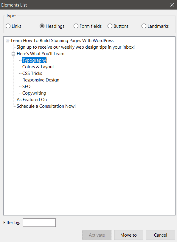
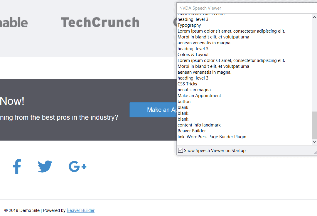
However, when I used the Down arrow to read down the page, NVDA read out one of the callouts as:
heading level 3
Colors & Layout
blank
Lorem ipsum dolor sit amet, consectetur adipiscing elit. Morbi in blandit elit, et volutpat urna
aenean venenatis in magna.
Testing with VoiceOver on Mac
As I expected, the headings showed up in the Headings list.
If I read out the full callout using the Down arrow to navigate, VoiceOver read “New line” before the heading.
Findings
Although the aria-hidden attribute should work to hide the icons, something is still causing the screen readers to read out “Blank” or “New line”. It’s not a great user experience for screen reader users as they may wonder if they are missing something.
2. Linked icons without accompanying text
The Subscribe landing page template has an Icon Group with the social media icons.

Beaver Builder’s accessibility page says:
Icon and Icon Group modules: The link has added ARIA attributes that relate the link to the icon and any accompanying text.
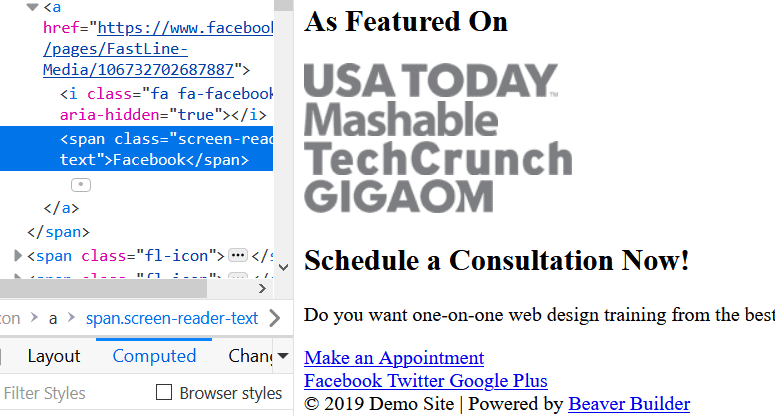
This was the code for a single icon in the icon group:
<span class="fl-icon">
<a href="https://www.facebook.com/pages/FastLine-Media/106732702687887">
<i class="fa fa-facebook" aria-hidden="true"></i>
<span class="screen-reader-text">Facebook</span>
</a>
</span>
Testing with NVDA on Firefox
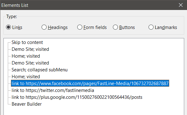
The links to the social profiles show up in NVDA’s Elements List.
When navigating down the page with the Tab key, however, NVDA read each icon as…
Blank
I created an icon group of my own, and I got the same result. Why?
Here’s part of my code:
<span class="fl-icon">
<a href="https://www.instagram.com/" target="_self" aria-label="link to https://www.instagram.com/">
<i class="fi-social-instagram" aria-hidden="true"></i>
</a>
</span>
Here aria-hidden="true" is used again. But because this linked icon doesn’t have accompanying text, we need a way to tell a screen reader user what it represents. That’s what the aria-label is for. But it isn’t always read out.
I got the same result when using the Down arrow key to navigate the page, except that “blank” was only read once.
Testing with VoiceOver on Mac
When using the Rotor, which performs a similar function to the Elements List, the social media links showed up in the Links list.
Similar to the result with NVDA, when I used the Tab key to navigate VoiceOver ignored the social links and went from the Make an Appointment button to the Beaver Builder link.
Findings
This time the icon meaning should be hidden with aria-hidden. But because they are links, their destination should be announced via the aria-label. Here we have some inconsistency, with the aria-label only read out when using the Elements List or Rotor.
Some of the code is redundant. Since NVDA and VoiceOver already announce links, the ‘link to’ in the aria-label is redundant. The target="_self" tells the link to open in the same window or tab, but that’s default browser behaviour anyway.
Plus reading out a URL is just clunky.
It would be better if the aria-label text just read the name of the social network e.g. Facebook. But there’s no way for the user to set their own text for this with the Icon Group module controls.
There are a couple of other problems:
Firstly, Steve Faulkner notes that:
For symbols in interactive elements
aria-hidden=truedoes not work robustly due to the way Firefox supportsaria-hidden.
Secondly, aria-label doesn’t work consistently if the page needs to be translated – particularly relevant if your browser of choice is Firefox or Safari.
An alternative way to include the meaning of the icon if you don’t want visible text is to use a special class for screen readers:
<span class="fl-icon">
<a href="https://www.facebook.com/pages/FastLine-Media/106732702687887">
<i class="fa fa-facebook" aria-hidden="true"></i>
<span class="screen-reader-text">Facebook</span>
</a>
</span>
Reference: the screen reader text class
(In fact, the Accordion module uses a class like this called sr-only.)
Using this method, if the site’s CSS is turned off or doesn’t load, the text will still be visible as a link. This is not the case with an aria-label.
3. Linked icons with linked text
I couldn’t find an example of these on the templates I tried, so created some linked icons with linked text using the Callout module. I used the Link option for the module and entered a URL.
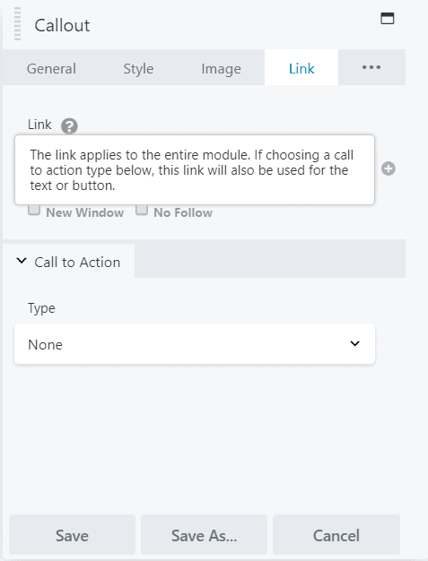
This was the result:

This is part of the code that was generated for the first callout:
<div class="fl-callout fl-callout-left fl-callout-has-icon fl-callout-icon-left-title">
<div class="fl-callout-content">
<h3 class="fl-callout-title">
<span class="fl-icon">
<a href="https://www.wpbeaverbuilder.com" target="_self" aria-label="link to https://www.wpbeaverbuilder.com">
<i class="fas fa-star" aria-hidden="true"></i>
</a>
</span>
<div id="fl-icon-text-" class="fl-icon-text fl-icon-text-empty">
<a href="https://www.wpbeaverbuilder.com" target="_self" class="fl-icon-text-link fl-icon-text-wrap">
</a>
</div>
<span>
<a href="https://www.wpbeaverbuilder.com" target="_self" class="fl-callout-title-link fl-callout-title-text">5 star ratings</a>
</span>
</h3>
<div class="fl-callout-text-wrap">
<div class="fl-callout-text"></div>
</div>
</div>
</div>
If you look carefully, you’ll see that there are actually three separate links (<a> tags). The first is for the icon, the second has an empty link with no content and the third one has the text.
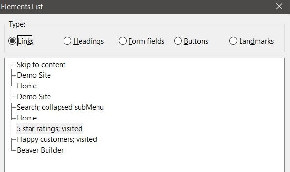
The good news was that NVDA on Firefox showed my links in the Elements List both as Links and also as Headings.
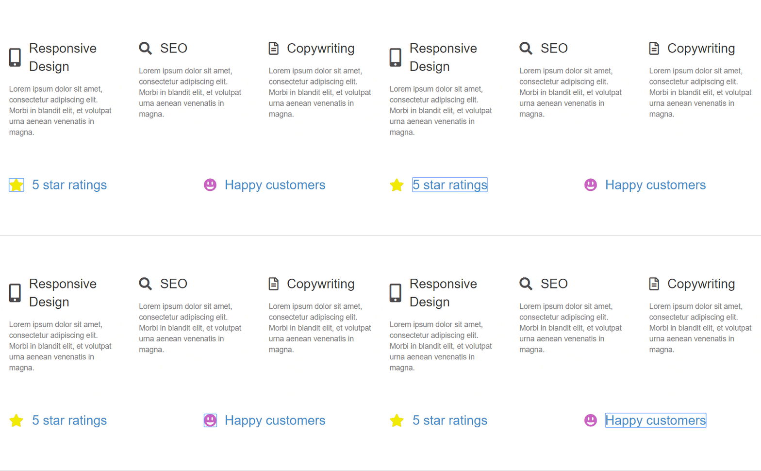
What was the experience as a sighted keyboard user? The second link has a wrapper <div> that’s set to display: none; which takes away its interactivity. But that still leaves two links to tab through for each element, where there really should be one.
Here’s what my experience was like on Chrome browser. Notice the blue outline as I navigate through the icons and links.
Better icon accessibility
I would suggest the following:
- Consider having the option to use SVGs rather than icon fonts to display icons. SVGs are more accessible than icon fonts, though they have less browser support.
- If an icon has meaning, and there is no visible text accompanying it, allow the user to set some alternative text of their choice for it.
- If there is an icon plus text and both are linked, wrap them both in a single
<a>tag.
For point 3 the code could be as simple as this for an icon font display:
<a href="https://www.wpbeaverbuilder.com/">
<span class="fas fa-star" aria-hidden="true"></span>
5 star ratings
</a>
Font Awesome’s accessibility page also has some suggestions for icon accessibility. The only part I’d argue with is using the title attribute as a tooltip.
Forms
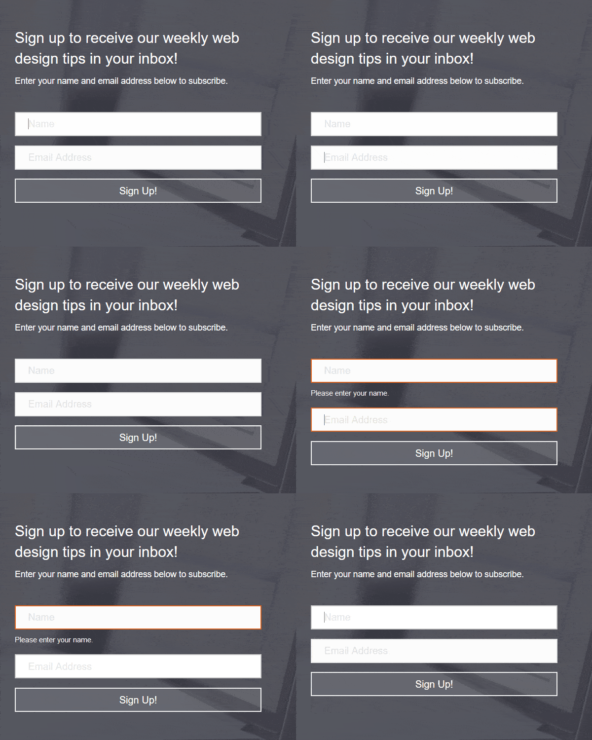
The Subscribe form at the top of the Subscribe template is simple enough, with input fields for a name, email address and a sign up button.
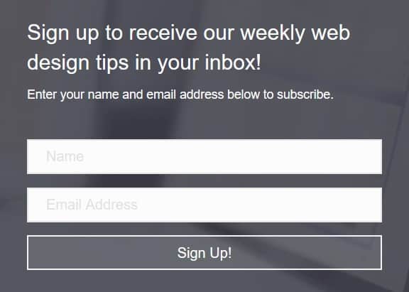
Is it accessible, though?
Form placeholders
The first problem with this form is that it has no visible labels. Sure, there is placeholder text, but it’s difficult to see because it is light grey. As such it fails the to meet the minimum colour contrast required to make it accessible.
Another issue with placeholder text is that when you begin typing in the box, it disappears. This might matter less for a short form with few fields but it’s still potentially confusing for anyone with cognitive issues.
The HTML 5 spec says about placeholder text:
The placeholder attribute should not be used as an alternative to a label.
Nielsen Norman Group argue that placeholder text is harmful for the reasons highlighted above (and others!)
Do the forms have labels?
If there’s no visible labels on the Subscribe form, perhaps they have been hidden with CSS style? Let’s look at the code for the inputs.
<div class="fl-form-field">
<input type="text" name="fl-subscribe-form-name" placeholder="Name" aria-label="name">
<div class="fl-form-error-message">Please enter your name.</div>
</div>
<div class="fl-form-field">
<input type="email" name="fl-subscribe-form-email" placeholder="Email Address" aria-label="email address">
<div class="fl-form-error-message">Please enter a valid email address.</div>
</div>
No, there are no form labels there. If there were, they would also need to be associated with the right form control. The code might look something like this:
<label for="fl-subscribe-form-name">Name</label>
<input type="text" name="fl-subscribe-form-name" id="fl-subscribe-form-name">
Here the for attribute value of the label must match the id attribute value of the input.
With a visible label, the aria-label="name" is redundant, as is the placeholder.
True, the aria-label does announce the form field as “Name” to a screen reader user.
But by using native HTML code it’s not necessary to add ARIA. Screen reader users get the form field value from the label and sighted users can see what the field is for.
Regarding form accessibility, Beaver Builder say:
Contact Form and Subscribe form modules: The input tag for each field has an added id attribute that connects the input to the label for that field. This meets the requirement that form fields have the proper labels associated with them.
We’ve just seen that isn’t true for the Subscribe form.
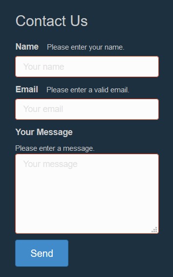
However, the Contact Form module does get this right. It uses visible labels above the form fields (though it still has sucky placeholders).
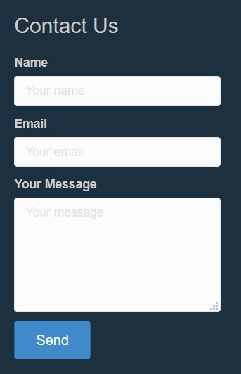
This is the code for the email field of the contact form. You can see the connection between for and id.
<label for="fl-email">Email</label>
<span class="fl-contact-error">Please enter a valid email.</span>
<input type="email" id="fl-email" name="fl-email" value="" placeholder="Your email" />
Can you add or edit labels?
Returning to the Subscribe form, the module controls do not let you add or edit labels. You can only edit the placeholder text for the name and email fields.
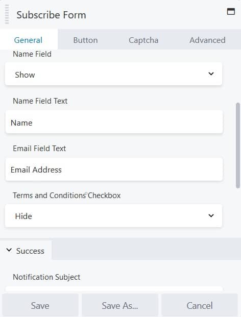
I would argue that the labelling of the controls is ambiguous as they say, “Name Field Text” and “Email Field Text” when they mean the placeholder content.
Submit button
Now, what about the Subscribe form’s submit button? I would expect that to be an <input type="submit"> or a <button> element.
Here’s the code…
<div class="fl-button-wrap fl-button-width-full fl-button-left">
<a href="#" target="_self" class="fl-button" role="button">
<span class="fl-button-text">Sign Up!</span>
</a>
</div>
Result? It’s neither. It’s a link with an aria-role of button.
This is not ideal because:
- We already have two HTML elements which can do the job of a button, without having to turn another one into a button.
- The “button” lacks the custom code needed to make it behave like a button.
What do I mean by the second point? Buttons differ from links in that both can be activated by the Enter key, but buttons can also be activated by the space bar. Unless some additional Javascript is added to an element with a button role, it won’t be triggered by pressing the space bar.
This is a pain for anyone who relies on the keyboard to complete forms. Pressing space on the button will scroll down the page instead, and the form will go out of sight!
The Contact Form’s submit button also has the same issue.
(The Google Map on the Biz template has buttons that can be used with the space bar, but they have been implemented by Google.)
Required fields and error handling
There’s one more issue with the forms that affects users, particularly screen reader users.
If the Subscribe form is submitted with missing data, there are warnings that name and email fields are required.
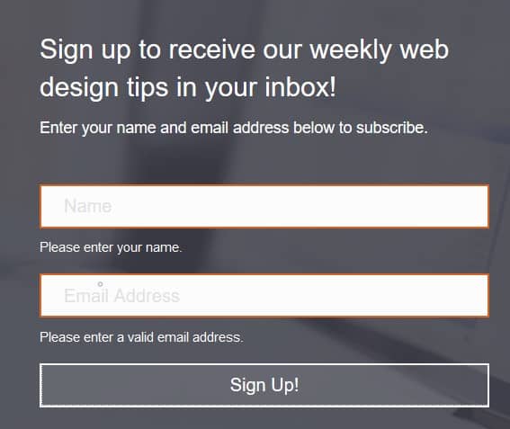
You might think, “That’s obvious – the instructions above the form say: ‘Enter your name and email address to subscribe!’”
But it’s quite possible that a screen reader user will not read the whole page in order. So they may miss the form instructions.
If the form fields had user-editable labels the “required” instruction could have been added there. The input field could also have a required attribute so the form couldn’t be submitted until that field was filled in correctly.
The Contact Form has a similar problem. Although this form has labels, the controls don’t let you modify them to indicate if fields are required.
Furthermore, when the Subscribe form is submitted with missing data, there’s no audible message to a screen reader user to say that there was a submission error, and what the problems were.
As a sighted user I could see that the error messages disappeared when focus was put back on the form fields with the Tab key – which is terribly confusing!
Better form accessibility
The issues I’ve highlighted mean that both form modules – but the Subscribe form module in particular – have limited customizability and accessibility.
To have an accessible Subscribe form in Beaver Builder you may be better off pasting in code from your email subscription service to an HTML module.
CSS Tricks have an article on adapting the MailChimp subscribe form to make it more accessible.
Deque’s blog offers help on marking form fields as required.
Adam Silver, author of Form Design Patterns, has good advice on creating accessible forms.
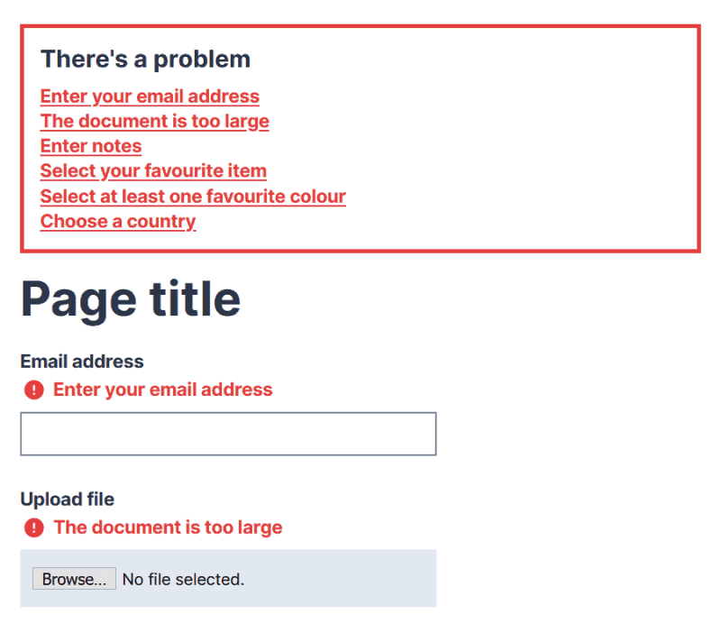
Good practice is to make a programmatic link between the form field and its error message via the same id and the aria-describedby attribute.
For example:
<label for="fl-email">Email</label>
<span class="fl-contact-error" id="email-error">Please enter a valid email.</span>
<input type="email" id="fl-email" name="fl-email" value="" aria-describedby="email-error" />
You could also have an aria-invalid="true" present for any invalid input fields.
Carousels (Sliders)
In the Biz template there are a couple of carousels using two different modules. The first is the Slideshow module, used for images. The second is the Testimonials module.
I had a look at carousel sliders in an earlier post. They do pose accessibility challenges.
Both sliders in the Biz template are set to autoplay, which is distracting for some people.
Slideshow module
The image slider uses the Slideshow module and has images only. It was completely ignored by the NVDA screen reader when reading down the page using Firefox.
There’s a setting in this module for a Control Bar. I set this to Buttons.
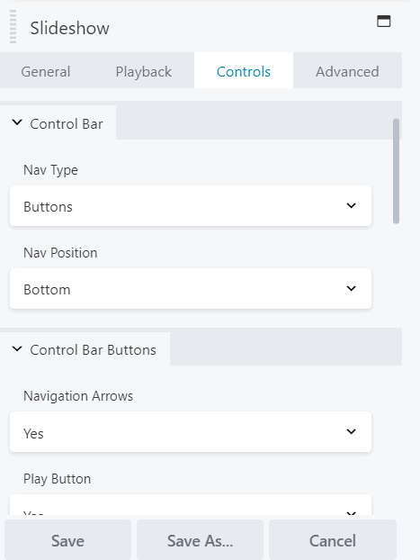
A bar appeared at the bottom of the slider with some buttons (i.e. links) that users could interact with.

The control bar would help a sighted keyboard user to navigate through the slides – though the tab order wasn’t intuitive.
However, the controls wouldn’t be much use to someone with a visual impairment relying on a screen reader, because there was no text content on the slides to access.
Testimonials module
The testimonial slider uses the Testimonials module. It has 2 testimonials that autoplay, and buttons to go back or forward.
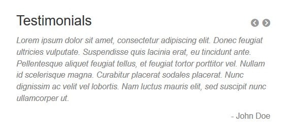
When the testimonials are read out or tabbed through the link to the next testimonial comes first. This is confusing because the previous link comes first in the visual order.
But in the code, the next link is before the previous link: it’s just styled to show afterwards.
<div class="fl-slider-next" role="button" aria-pressed="false"></div>
<div class="fl-slider-prev" role="button" aria-pressed="false"></div>
Again, there’s the same problem with the role="button", in that the space bar doesn’t trigger the movement to the next testimonial.
Also, the aria-pressed attribute present would be more appropriate for a toggle button.
Using NVDA and Firefox, this was what was read out for the two testimonials:
Next testimonial.
visited link
toggle button pressed
Lorem ipsum dolor sit amet, consectetur adipiscing elit. Donec feugiat ultricies vulputate. Suspendisse quis lacinia erat, eu tincidunt ante. Pellentesque aliquet feugiat tellus, et feugiat tortor porttitor vel. Nullam id scelerisque magna. Curabitur placerat sodales placerat. Nunc dignissim ac velit vel lobortis. – Jane Doe
Lorem ipsum dolor sit amet, consectetur adipiscing elit. Donec feugiat ultricies vulputate. Suspendisse quis lacinia erat, eu tincidunt ante. Pellentesque aliquet feugiat tellus, et feugiat tortor porttitor vel. Nullam id scelerisque magna. Curabitur placerat sodales placerat. Nunc dignissim ac velit vel lobortis. Nam luctus mauris elit, sed suscipit nunc ullamcorper ut. – John Doe
Lorem ipsum dolor sit amet, consectetur adipiscing elit. Donec feugiat ultricies vulputate. Suspendisse quis lacinia erat, eu tincidunt ante. Pellentesque aliquet feugiat tellus, et feugiat tortor porttitor vel. Nullam id scelerisque magna. Curabitur placerat sodales placerat. Nunc dignissim ac velit vel lobortis. – Jane Doe
Previous testimonial.
visited link
toggle button not pressed
Lorem ipsum dolor sit amet, consectetur adipiscing elit. Donec feugiat ultricies vulputate. Suspendisse quis lacinia erat, eu tincidunt ante. Pellentesque aliquet feugiat tellus, et feugiat tortor porttitor vel. Nullam id scelerisque magna. Curabitur placerat sodales placerat. Nunc dignissim ac velit vel lobortis. Nam luctus mauris elit, sed suscipit nunc ullamcorper ut. – John Doe
Lorem ipsum dolor sit amet, consectetur adipiscing elit. Donec feugiat ultricies vulputate. Suspendisse quis lacinia erat, eu tincidunt ante. Pellentesque aliquet feugiat tellus, et feugiat tortor porttitor vel. Nullam id scelerisque magna. Curabitur placerat sodales placerat. Nunc dignissim ac velit vel lobortis. – Jane Doe
You can see that both testimonials got read out, twice. It got quite irritating!
Worse, NVDA would read both testimonials out when the slider moved to the next one and I was trying to do something else on the page, like complete the contact form.
Better slider accessibility
My number 1 tip would be: don’t use sliders! But if you must, turn off autoplay and don’t add too much text.
Beaver Builder’s developers could also consider having the Previous button before the Next in the tab order and allowing the buttons to be activated by the space bar.
Accordion
Accordions have a list of items. Each item has a hidden panel underneath which is revealed when the user toggles the item control. On toggling the control again, the panel is hidden once more.
An accordion module example with 13 items is found in the FAQs template. Toggling a question reveals the answer.
I decided to create a simpler accordion with 3 items.
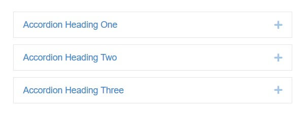
The accordion code
Beaver Builder wraps all accordion items in a <div> with role="tablist".
Below is the code for my first item. The other two were identical with ‘one’ changed to ‘two’ or ‘three’.
<div class="fl-accordion-item">
<div class="fl-accordion-button" id="fl-accordion-5db0a6f42162e-tab-0" aria-selected="false" aria-controls="fl-accordion-5db0a6f42162e-panel-0" aria-expanded="false" role="tab" tabindex="0">
<a href="#" id="fl-accordion-5db0a6f42162e-label-0" class="fl-accordion-button-label" tabindex="0" aria-controls="fl-accordion-5db0a6f42162e-panel-0">Accordion Heading One</a>
<a href="#" id="fl-accordion-5db0a6f42162e-icon-0" class="fl-accordion-button-icon" tabindex="0" aria-controls="fl-accordion-5db0a6f42162e-panel-0"><i class="fl-accordion-button-icon fl-accordion-button-icon-right fas fa-plus"><span class="sr-only">Expand</span></i></a>
</div>
<div class="fl-accordion-content fl-clearfix" id="fl-accordion-5db0a6f42162e-panel-0" aria-labelledby="fl-accordion-5db0a6f42162e-tab-0" aria-hidden="true" role="tabpanel" aria-live="polite"><p>This is the secret content of panel one.</p>
</div>
</div>
There’s quite a lot of code here, so let’s try to unpick it a bit.
Within the <div class="fl-accordion-item"> we have some other elements.
Accordion button
The first is this <div>:
<div class="fl-accordion-button" id="fl-accordion-5db0a6f42162e-tab-0" aria-selected="false" aria-controls="fl-accordion-5db0a6f42162e-panel-0" aria-expanded="false" role="tab" tabindex="0">It has these attributes:
aria-selected="false": this is intended to show if a tab has been selected in a tabpanel. If the value were true, it would be selected. Unfortunately, in this implementation I didn’t observe the value change, so the attribute seems superfluous.aria-controls="fl-accordion-5db0a6f42162e-panel-0": links this div to another panel with an id with the same value. Accessibility specialist Heydon Pickering is not a fan of aria-controls: “It’s poorly supported, does very little, and does what it does when it does badly.”aria-expanded="false": indicates that this element is not expanded i.e. is collapsed. When the panel is toggled open, the value will be true.role="tab": makes the div behave like a tab.tabindex="0": adds this element to the tab order so that it can receive keyboard focus.
Accordion heading
Next we have what I’ll call the accordion heading, marked up as a link:
<a href="#" id="fl-accordion-5db0a6f42162e-label-0" class="fl-accordion-button-label" tabindex="0" aria-controls="fl-accordion-5db0a6f42162e-panel-0">Accordion Heading One</a>Here’s what its attributes are for:
id="fl-accordion-5db0a6f42162e-label-0": should link with another aria-controls attribute with the same value, but I couldn’t find one.class="fl-accordion-button-label": used for styling.tabindex="0": as before, but unnecessary this time as links can already receive keyboard focus.aria-controls="fl-accordion-5db0a6f42162e-panel-0": as before.
Accordion icon
Next up is the plus icon, which indicates that the section is expandable. When it is toggled, it changes to a minus icon:
<a href="#" id="fl-accordion-5db0a6f42162e-icon-0" class="fl-accordion-button-icon" tabindex="0" aria-controls="fl-accordion-5db0a6f42162e-panel-0"><i class="fl-accordion-button-icon fl-accordion-button-icon-right fas fa-plus"><span class="sr-only">Expand</span></i></a>The attributes are:
id="fl-accordion-5db0a6f42162e-icon-0": doesn’t associate with another aria-controls.class="fl-accordion-button-icon": used for styling.tabindex="0": as before, and not needed here.aria-controls="fl-accordion-5db0a6f42162e-panel-0": links to the panel content, which has the same ID.class="fl-accordion-button-icon fl-accordion-button-icon-right fas fa-plus": the plus icon itself.class="sr-only": this reads out the text Expand to screen reader users only.
Accordion hidden content
Finally, the panel with the content that’s hidden initially:
<div class="fl-accordion-content fl-clearfix" id="fl-accordion-5db0a6f42162e-panel-0" aria-labelledby="fl-accordion-5db0a6f42162e-tab-0" aria-hidden="true" role="tabpanel" aria-live="polite"><p>This is the secret content of panel one.</p>This <div> has the following attributes:
class="fl-accordion-content fl-clearfix": used for styling.id="fl-accordion-5db0a6f42162e-panel-0": links to the aria-controls of our panel title div and icon wrapper link.aria-labelledby="fl-accordion-5db0a6f42162e-tab-0": associates labels with objects, similar to form labels and inputs.aria-hidden="true": hides this element from screen readers (until the panel is opened). Reference: How aria-hidden works.role="tabpanel": designates this div as a tabpanel.aria-live="polite": this is used to read new content in a dynamic region. I don’t think it’s needed in this instance.
How a screen reader interprets the accordion
This is how NVDA on Firefox read out my accordion. I used the Tab key to navigate and did not attempt to expand any of the panels.
document
tab control
Accordion Heading One Expand tab selected collapsed 1 of 1
Accordion Heading One link
Expand
link
tab collapsed
Accordion Heading Two Expand tab selected collapsed 1 of 1
Accordion Heading Two link
Expand
link
tab collapsed
Accordion Heading Three Expand tab selected collapsed 1 of 1
Accordion Heading Three link
Expand
link
tab collapsed
This is me expanding Heading Two, after the heading is first announced.
Action indicates the action I take on the keyboard.
A Note is my explanation of what happens.
Accordion Heading Two Expand tab selected collapsed 1 of 1
Note: no visible focus
Action: Enter pressed
Accordion Heading Two Collapse tab selected expanded 1 of 1
Note: Content revealed, NVDA announces that the tab is now expanded, minus symbol changes to plus
Action: Tab pressed
Accordion Heading Two link
Note: visible focus on the heading link
Action: Tab pressed
Collapse
link
tab expanded
Note: focus is on the minus symbol
Action: Down arrow pressed
This is the secret content of panel two.
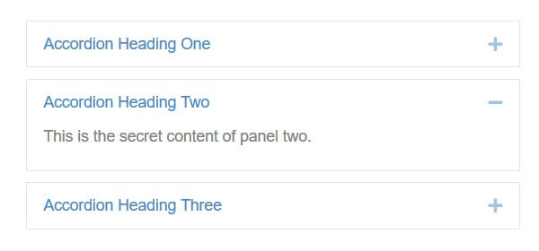
VoiceOver on Mac behaves a little differently. When a heading is expanded, the panel content is read out, though the focus remains on the heading.
What problems are there with Beaver Builder’s accordion implementation?
Firstly, the tablist ARIA role is better suited for an actual group of tabs, like this:
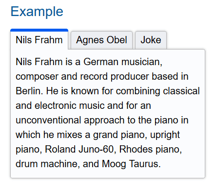
Note that W3C’s accordion design pattern and W3C’s accordion example do not use a tablist.
A screen reader user might expect to use the left and right arrow keys to navigate a tablist. If they try that, either nothing will happen or the name of the control they’re on will be spelled out one letter at a time.
Secondly, there are three focusable elements which can open the panel with the text below:
- A
<div>which is hidden but can still receive focus as it hastabindex="0". - The accordion title text link.
- The icon link.
This means that a keyboard-only user must tab three times through each accordion title before getting to the next. Worse, they can’t even see the focus on the first one.
This analysis by the WAVE tool on Firefox shows the 3 tab stops for each of the accordion sections.
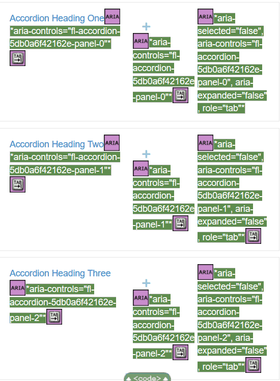
It would make much more sense to have one control that expands or collapses the content below.
Thirdly, the code is unwieldy. As I’ve pointed out, some attributes are unnecessary.
Accessible accordion examples
There are examples of accessible accordions elsewhere which I think would make a better basis for Beaver Builder’s Accordion module.
Here are a couple I like.
Scott O’Hara:
Graham Armfield:
Both work with keyboard only and screen readers. The main difference is that Graham’s moves the focus to the panel when it is opened.
Conclusion
People love page builders like Beaver Builder because they are so easy to use. Just drag and drop the modules on screen into rows and columns and you can create a functioning web page very quickly.
Many page builder users aren’t technical, so are reliant on the Beaver Builder developers to help them create pages with accessible content.
I applaud the Beaver Builder team for making an effort with accessibility. Most plugin authors don’t understand what accessibility is, so don’t bother.
It’s just disappointing that the Beaver Builder modules I tried were not as accessible as they could have been. It would only take a little more work to adjust the user settings and the code output to improve them.
I hope that Beaver Builder accessibility will be improved in the future, as it’s a well respected plugin with a large user base.
With thanks to Graham Armfield for his help with this post.


Wow, what an informative post Claire. It got me thinking about accessibliity in other builders and templates that as a non-tech user I simply trust.
Is there something we should look for when using builders and templates that helps us know if a web page will be accessible if we use that particular plugin or theme? Thanks.
Hi Tracey-Jane
You can use an accessibility ready theme as a starting point, which will have some accessible features built in.
Once a page is built, you can test it with some accessibility testing tools. They don’t catch every issue, but are a start.
If something is flagged as inaccessible that was built with a page builder, you’d be best contacting the plugin developer about the problem, and asking if they can fix it in a future release.