
The hunt for an accessible slider
I have to admit this is a strange post for me to write, as I don’t like sliders!
So why pen this post? To help others who do use sliders, who might not have factored accessibility into the decision.
I will attempt to highlight some of the accessibility problems with using sliders and how you might fix them.
What is a slider?
A slider (or carousel) shows a group of items one at a time.
Typically, WordPress sliders will show a set of background images with text overlaid on top. Sliders usually have buttons to navigate to the next or previous slide. Sometimes they have indicators which show which slide in the sequence you are on and the total number of slides. Individual slides may also have links or buttons to other destinations.

Website owners are attracted to using sliders for a number of reasons:
- They are eye-catching, primarily on large screens.
- They’re handy for displaying related images e.g. different views of a product.
- They save space.
However, if implemented badly, a slider can:
- Slow down your site, if your images haven’t been properly optimized.
- Hide important information that visitors may miss.
- Hurt conversions if a call to action is not discovered.
What are the requirements for an accessible slider?
An accessible slider has some requirements to meet the WCAG 2.1 AA accessibility standard. Here is a rundown of what I was looking for:
| Requirement | Who benefits? |
|---|---|
| The slider content should be legible i.e. text is not too small or a difficult to read font. | All users, particularly those with some vision loss or a cognitive impairment like dyslexia. |
| Contrast between any text and its background should be adequate. | Users with sight loss or those viewing the slider under certain conditions e.g. bright sunlight. |
| The slider should be able to be operated via the keyboard. | Sighted keyboard users and screen reader users. |
| Keyboard focus is obvious. | Sighted keyboard users who need to see which focusable element is the current one. |
| Controls should be labelled appropriately for screen reader users. | Screen reader users who cannot see the content need to be informed of what the controls do. |
| Any changes in the slider should be communicated. | Screen reader users in particular need to know if they have moved to a new slide. |
| If the slider autoplays, there should be a pause control. | Users who have difficulty reading the text before the next slide appears, or users who are distracted by moving content. |
| Any text on the slider that could be seen as a heading is marked up as a heading. | Screen reader users, as they can use headings to navigate. |
| The slider is zoomable up to 400%, and the text alone up to 200% without losing any information. | Users with low vision who need to zoom in the page to be able to read it. |
Are there accessible slider plugins for WordPress?
Looking through the WordPress.org plugin directory I found a couple of potential candidates.
Both of these sliders are described as accessibility ready. Accessibility ready is a label applied to WordPress themes indicating that the basic theme structure has been built in an accessible manner, but whether the end product is accessible depends on the content added.
Unlike themes, there isn’t a defined accessibility ready tag for WordPress plugins. For plugins that call themselves accessibility ready I read the term in a similar way as for themes: that the plugin has been coded to support accessibility, but the accessibility of the output also rests on the way the user that installed and configured that plugin.
Configuring the sliders
For documentation on the sliders go to:
Rather than go in-depth into slider configuration, I’ll point out some of the options that make the slider more accessible.
Theme, text and images
I decided that the format of my slide text would be a heading followed by some body text.
I used images from Pixabay and text from Coffee Ipsum.
Sliders work best on full width pages, so I used the Themelia theme which has a full width layout option. It also happens to be an accessibility ready theme.
SEO Slider
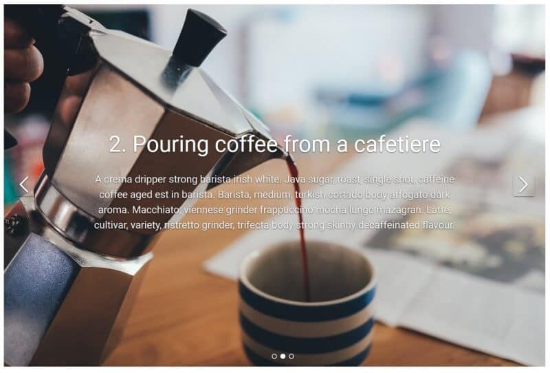
In the slider settings a new slider is set to autoplay. I disabled autoplay for better accessibility.
There is an adjustable overlay for the slider. The overlay adds a transparent background colour which darkens the original image slightly for better contrast. To begin with I left it at its default value, which is a shade of grey.
background-color: rgba(10,20,30,0.2);
The default text colour is white.
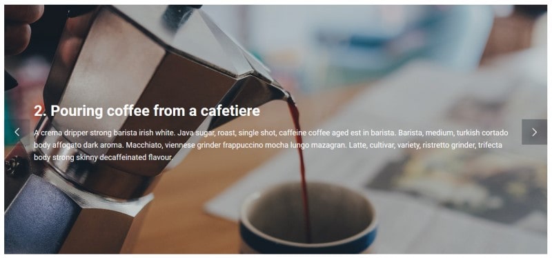
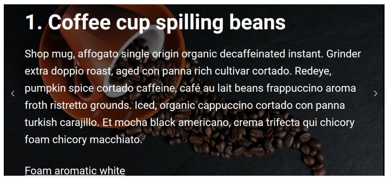
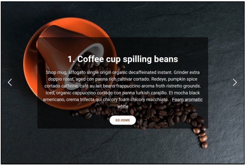
Here’s how the slides in my finished slider looked:


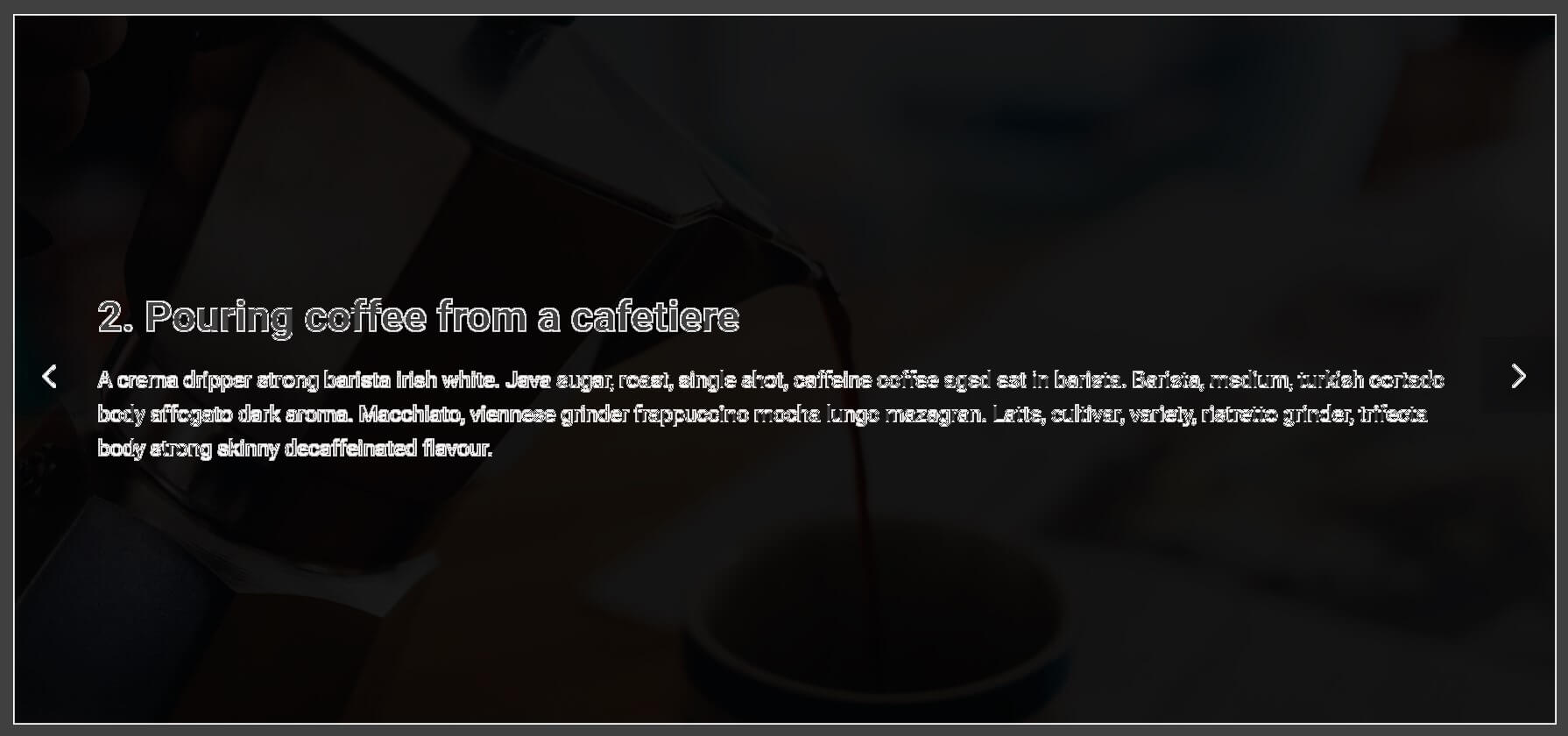
Serious Slider
Serious Slider had a different way of inputting content. I assumed that the slide title would output as a heading, so I added the slide text in the box for content.
In the slider settings I largely kept the default options but I changed the following:
- Bullets and Navigation – from Appear on hover to Always visible
- Autoplay – from Enabled to Disabled
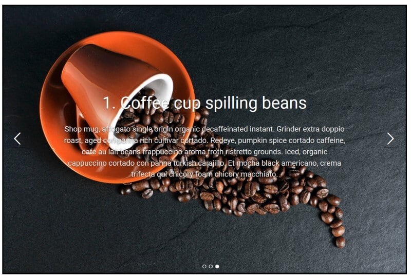
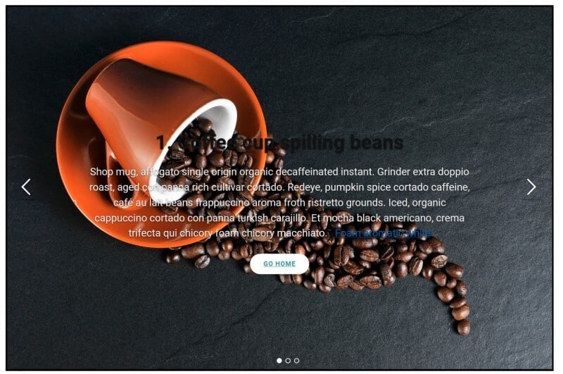
This was my finished slider:

Testing the sliders
To test the sliders for accessibility I used a combination of methods:
- Inspecting the code with browser developer tools.
- The Color Contrast Analyzer for Chrome. This add-on for Chrome allows you to see the colour contrast between text and background. Unlike many other tools it works with image backgrounds. (The only disadvantage of this extension is that it’s no longer updated.)
- Keyboard navigation, using the Tab key to move forward, and Shift + Tab to move back between links or buttons.
- The NVDA screen reader.
How did they fare?
SEO Slider
Text legibility
The slider font size and font family appeared to be inherited from the Themelia theme.
Heading font size: 1.953em / 35.15px
Slider text font size: body 1.125em / 18px
Font family: Roboto, Helvetica, Arial, sans-serif
The text was certainly large enough to be read, and clear with a sans-serif font, but did it meet contrast requirements?
Colour contrast
I analysed the text on one slide against WCAG 2.1’s colour contrast guidelines, level AA.
To meet the recommendations, small, non-bold text should have a contrast ratio of 4.5:1. Large text needs a contrast ratio of 3:1.
The Color Contrast Analyzer extension checks these ratios for text on a background by scanning the image and outputting a greyscale version. A white border round the text indicates that the text has sufficient contrast.
For normal text (4.5:1 ratio):
As you can see, because my slide background image had several light patches, most of the text didn’t have sufficient contrast with the background.
The heading is large text, so gets evaluated with the 3:1 contrast ratio:

You can see the outlines are a bit clearer, i.e. the heading is a bit more legible than the main slider text.
Keyboard operability
I could access the arrow keys with the keyboard to move the slides forward and back. (If Loop slider is unchecked, the Previous button is disabled on the first slide and the Next button is disabled on the last slide.)
Keyboard focus
Keyboard focus on the previous and next controls was not the best. When I focused on a control the background colour darkened slightly, but this was difficult to see, particularly if the slide image was already dark.

Labelling of controls for screen reader users
The previous and next button controls are read as “Previous” and “Next” to screen readers.
Changes to the slider state
When I activated the button for the next slide, NVDA did begin reading the content on the new slide.
However, after a plugin update [to version 1.0.10] and testing further with NVDA, the slide content was ignored completely by the screen reader. I wonder if the update broke something. I was unable to roll back to a previous version to check.
Pause control
Though I had autoplay disabled and didn’t require one, I couldn’t see a pause control option. With a bit more testing I discovered that movement is paused on mouse hover, but that’s not much help for keyboard only users.
Semantic markup
As I added the slider headings myself as Heading 2s, they followed on from the page’s title (a heading 1) as correct markup.
Zoom behaviour
There are a couple of modes of zooming: full page and text only. WCAG 2.1 has guidelines for both.
Text only zoom
Text only zoom is covered by Success Criterion 1.4.4 Resize text (Level AA): Except for captions and images of text, text can be resized without assistive technology up to 200 percent without loss of content or functionality.
Zoom Text Only is a feature on Firefox, for people who don’t want to zoom the entire page content, just text. You can resize text up to 300% bigger.
You can enable reading view in Edge for some web pages, which lets you resize text only.
Full page zoom
Full page zoom is covered by Success Criterion 1.4.10 Reflow (Level AA): Content can be presented without loss of information or functionality, and without requiring scrolling in two dimensions for:
- Vertical scrolling content at a width equivalent to 320 CSS pixels;
- Horizontal scrolling content at a height equivalent to 256 CSS pixels.
What does this mean in practice? It means that the page content should be viewable without issue at 400% page zoom.
Full page zoom is available on most browsers. On Firefox you can zoom up to a maximum of 300%. On Chrome, it’s up to 400% and on Edge it’s up to a whopping 800%.
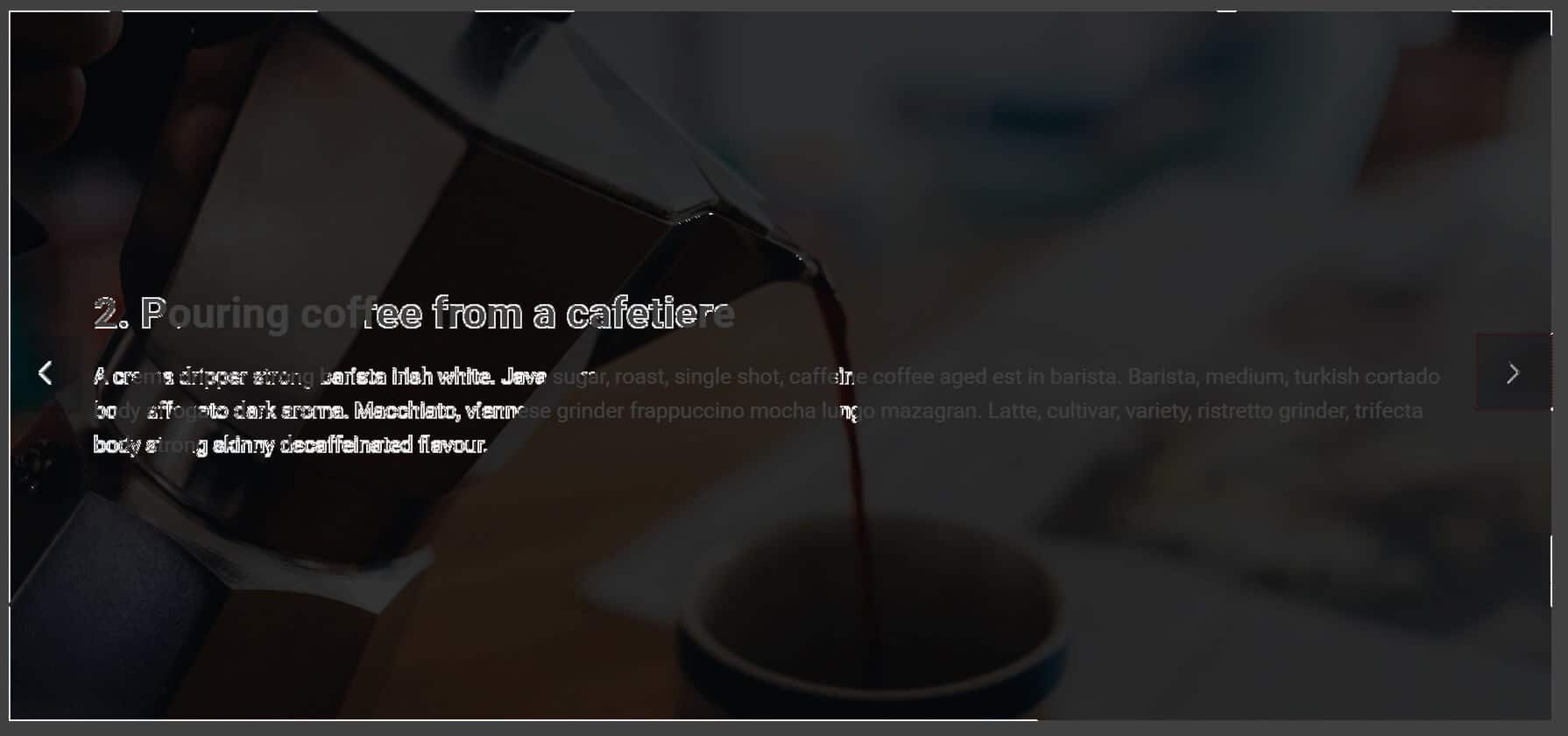
SEO Slider zooming
Zooming the page to 400% on Chrome the text was visible, contrast issues notwithstanding.
When zooming the text only on Firefox to 200%, all the text was visible.

If there had been more text or the zoom level higher, some of it may have spilled out of its container onto the white page background, where it wouldn’t have been seen.
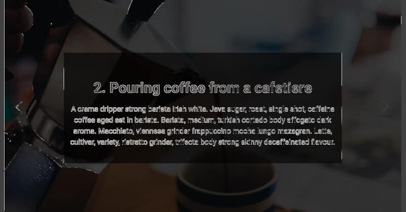
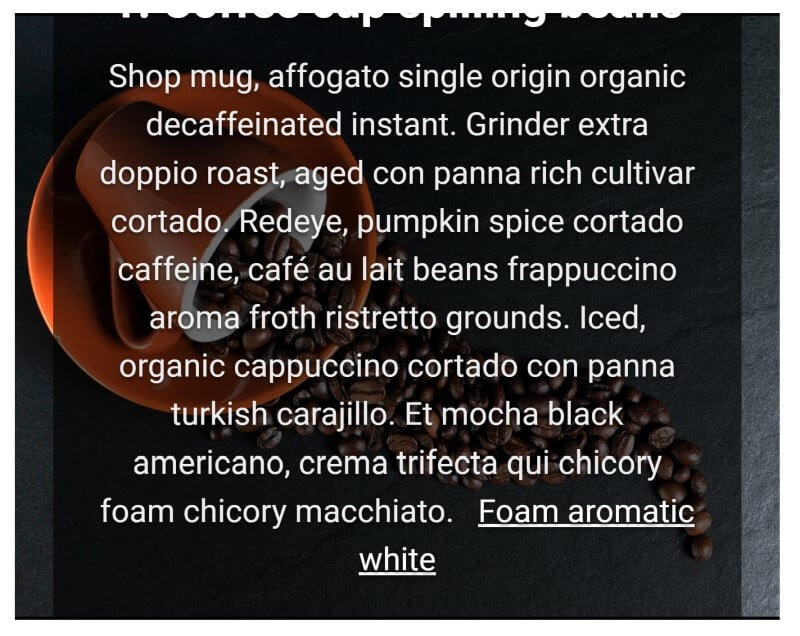
This is what happened for another slide at 300% text zoom:

Serious Slider
Text legibility
Heading font size: 3.1em / 52.7px
Slider text font size: 1.4em / 23.8px
Font family: Roboto, Helvetica, Arial, sans-serif
Again the text size and font was fine, but was the colour contrast up to scratch?
Colour contrast
Unfortunately not. The colour contrast for Serious Slider was also poor.
Normal text (contrast ratio 4.5:1):
Large text (3:1):

Keyboard operability
I was able to move forward and back through the slides with the arrow buttons.
Keyboard focus
The shadow round the arrow control was increased when focused upon with the keyboard, and the background lightened. This was a little bit easier to see than SEO Slider, but still quite a subtle effect.

Labelling of controls for screen reader users
The previous and next arrows were read as “Previous slide” and “Next slide”.
Changes to the slider state
When I activated the button for the next slide, it wasn’t clear that I had moved to a new slide as no content was read out.
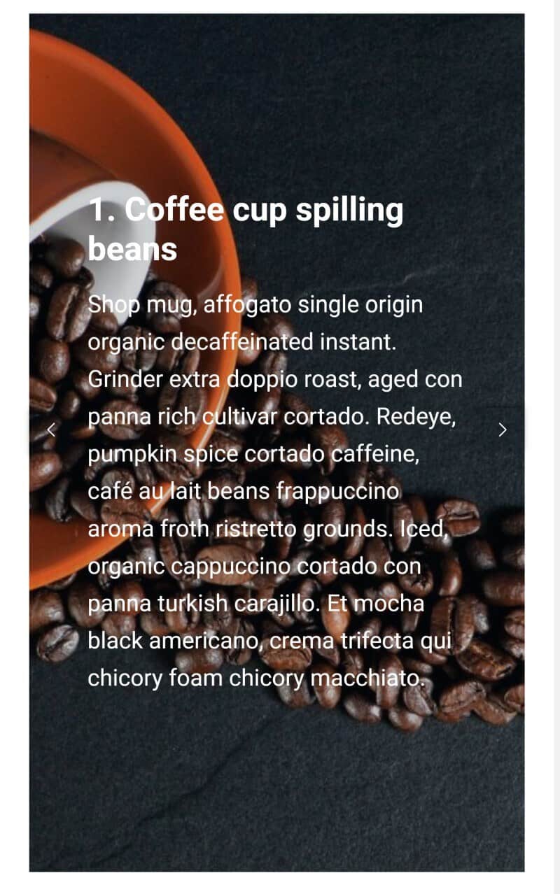
This is how NVDA read out the first slide:
graphic clickable
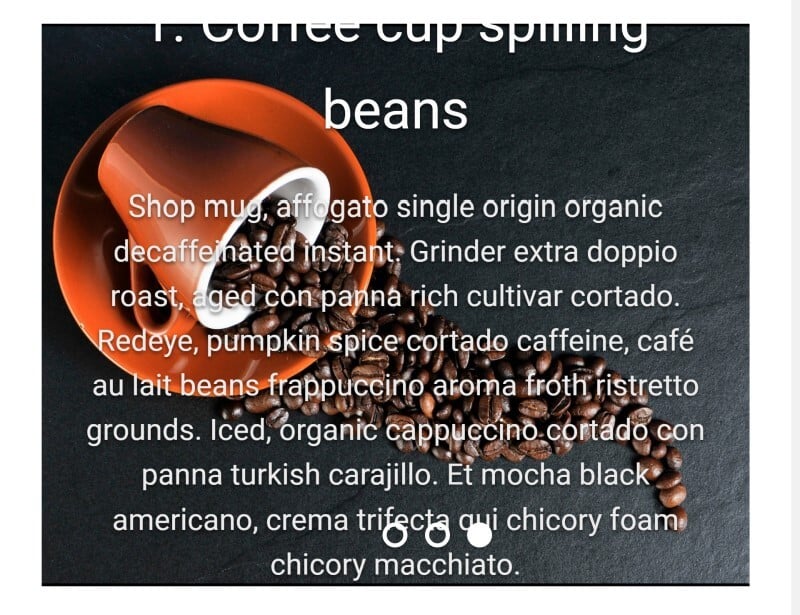
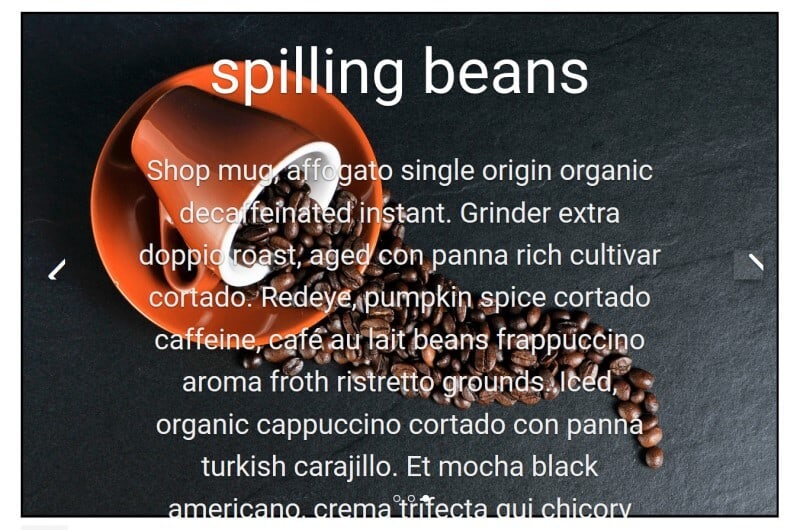
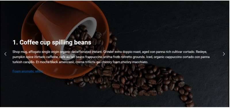
- Coffee cup spilling beans
list
- Coffee cup spilling beans
list
Shop mug, affogato single origin organic decaffeinated instant.
Grinder extra doppio roast, aged
list
con panna rich cultivar cortado.
Redeye, pumpkin spice cortado caffeine, café au lait beans
list
frappuccino aroma froth ristretto grounds.
Iced, organic cappuccino cortado con panna turkish
list
carajillo. Et mocha black americano, crema trifecta qui chicory foam chicory macchiato.
list
out of list
button
PREVIOUS SLIDE
button
NEXT SLIDE
It wasn’t obvious when I clicked the Next slide button that I had moved to a new slide.
Pause control
The only pause control was for mouse users, where pause is enabled on hover.
Semantic markup
I expected that the slide titles would be headings. Though the text was bigger, making them look like headings, they weren’t headings.
Instead, this was the markup:
<div class="seriousslider-caption-title"><span>1. Coffee cup spilling beans</span></div>
The problem here is that the use of a <div> and <span> would not give a screen reader user any notification that this text is meant to be a heading. It also means that the user can’t jump to the heading from their screen reading application.
It would be helpful if there was a control for the slide title so it could be shown as a heading of the user’s choice (H1 to H6).
Zoom behaviour
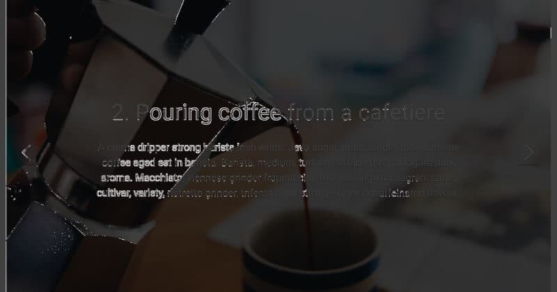
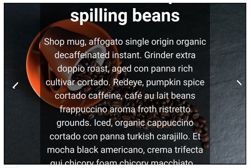
Zooming the page to 400% on Chrome most of the text was visible, except for the first part of the headline. The slider arrow controls disappeared and the slide indicators covered the text.
Zooming the text only on Firefox to 200% the slide indicators were only partially visible, and the text was cut off at the top and bottom.
Further modifications and accessibility testing
After my initial tests, I decided to see what I could do to make the sliders more accessible.
I also decided to add a link to each slider. Serious Slider also has the option to add a link styled as a button, so I tried that too.
My approach was to change what I could in the plugin settings, and if that didn’t work as desired, to add appropriate CSS.
SEO Slider
I darkened the overlay colour for better contrast.
Visually the end result wasn’t too bad, but my link was blue and unreadable.
I added some CSS to fix this:
.slick-slider-1752 a {

color: white;

}
This code changes the link colour for the slider with ID 1752 to white. (The number is in the slider shortcode.) The reason I chose this approach was that if I wanted to have another slider with lighter image backgrounds, I would want a darker link colour for that one.
The contrast had improved when tested with Colour Contrast Analyzer (normal text evaluation):
One downside with the darker overlay was that I couldn’t see the focus on the arrows very well, so I changed the focus style for them.
button.slick-arrow:hover,

button.slick-arrow:focus {

background-color: black;

outline: 2px dotted crimson;

}
I also changed my link outline colour to match that on the arrows:
.slick-slider-1752 a:hover, .slick-slider-1752 a:focus {

outline: 2px dotted crimson;

}
The tab order for the first slide was:
- Previous slide
- Link (Foam aromatic white)
- Next slide
This looks like an intuitive tab order for sighted keyboard users, as it follows the order of focusable elements from left to right. I’m not so sure about screen reader users’ preference.
When I tried 400% zoom on Chrome, I had a similar result to that of my first slider.
On Firefox with 200% text zoom the text on slide 1 only just fit:
Serious Slider
For improved semantics, I added the headings myself to the slider text box.
I also enabled the following settings:
- Hide Caption Titles – Hide Titles
- Caption Text Animation – None
- Height – 800px to 1000px
Problems
The Heading 2s inherited their colour from the theme and appeared black.
This was my CSS fix (again, the slider class number matches the number in the shortcode):
.cryout-serious-slider-192 .seriousslider-caption-text h2 {

color: white;

}
As for SEO Slider, the link was blue. I changed it, and added a focus style.
.cryout-serious-slider-192 .seriousslider-caption-text a {

color: white;

}

.cryout-serious-slider-192 .seriousslider-caption-text a:focus {

outline: 2px dotted crimson;

}
The white text still didn’t have enough contrast relative to the background. I couldn’t add an overlay over the whole slide as the HTML hadn’t been constructed for that. I was only able to add an overlay to the caption area.
Overlay:
.cryout-serious-slider-192 .seriousslider-caption {

position: absolute;

background-color: rgba(0,0,0,0.6);

padding: 20px;

}
I also wanted to hide the slide indicators as they were not keyboard accessible.
.cryout-serious-slider-192

.seriousslider-indicators {

display: none;

}
The contrast was improved, as seen here:
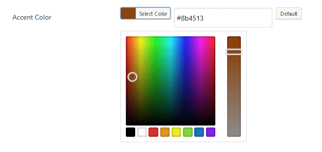
The default accent colour for the link styled as a button was a turquoise colour, #2D939F. Against the white background, that had a contrast ratio of 3.63:1, which is not high enough for text of that size.
I changed it to a brown #8b4513 for better contrast (7:1). That was done in the Accent Colour picker in the Appearance tab of the slider.
There wasn’t a focus style for this “button”, so I added this code, which affects any slider with the Light Style:
.seriousslider-light .seriousslider-caption-buttons a:focus:nth-child(2n+1) {

background-color: #8b4513;

border-color: #8b4513;

color: white;

}
I used the same previous/next button hover and focus styles as I used for SEO Slider:
.seriousslider-control:hover,

.seriousslider-control:focus {

background-color: black;

outline: 2px dotted crimson;

}
The tab order for the first slide was:
- Link (Foam aromatic white)
- Link (styled as button) Go Home
- Previous slide
- Next slide
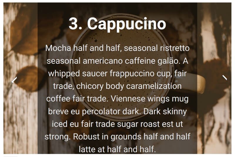
This was slide 1 of my finished slider:
My changes didn’t fix everything, however.
Here’s my first slide zoomed to 400% on Chrome. Despite increasing the slider height, you can see the text is cut off at the top, and the button link isn’t visible, which would be bad if this was an important call to action!
On Firefox using 200% text zoom, a similar thing happened. The previous and next buttons were partially shown.
I could just about get away with a 200% text zoom if the slide had less text and no links, though I still had the problem with the previous/next button visibility:
Verdict: was I able to make an accessible slider?
It’s hard to build an accessible slider, and I had to do some tweaking to these plugins to make the finished sliders more accessible. (I don’t think I could declare the slider content fully accessible.)
Visual contrast will depend to some extent on the images you select. I could imagine problems if you mixed up predominantly dark images with predominantly light images.
While you can change the colour of the text and background for each slider, you don’t have the fine-grained control to change it per slide. You have to choose light text on dark background or dark text on light for all slides in that slider.
Neither slider had a keyboard accessible pause control, something that’s essential if you wanted the slides to auto-advance.
The focus styles out of the box were not clear enough, in my opinion.
I couldn’t find a good workaround for the zoom issues. I had to conclude that sliders and zoom just don’t play well together.
This post by Sean Anteau illustrates the need for browser zoom media queries to solve this problem.
You could also use minimal text on the slides, so that it doesn’t “drop off” when it’s enlarged.
Ultimately, putting more than a few words on slides is going to be problematic for people who use very high levels of magnification. I asked a question about zooming on Twitter, and Jim Griesemer replied that he’d seen zoom up to 1200%.
https://mobile.twitter.com/JRGdesignworks/status/1179793605889626112
Have you managed to make an accessible slider for your WordPress site? I’d love to know what you used; please let me know in the comments.

My name is Saima, and I am a visually impaired person myself, after learning about web accessibility I have just started using wordpress, and your blog is really helpful, just wondering being a visually impaired person how can I identify the suitable color combinations? any idea?
These sliders are very limited in their accessibility features.
Yes, the next and previous buttons are accessible but what is their use if a screen reader user cannot perceive the content that is being shuffled in the slider.
The way it should work is when the next or previous buttons are activated, the content of the first or last frame/content item in the slide should be read to the screen reader user.
A screen reader user should perceive the content exactly like a sighted user. If the sighted user can see the content in the slider, this is precisely what the assistive technology needs to convey.