Are you using the WordPress block editor (Gutenberg)? Great! Now with the various blocks you have more options for aligning images with text.
There are good ways and bad ways to align images and text in WordPress’ Gutenberg editor. I’m going to show you the options and the pitfalls.
This post assumes you know how to add blocks. If you’re not used to working with blocks, you might want to familiarise yourself with all the Gutenberg blocks first.
Not upgraded to WordPress 5 or using the Classic Editor plugin? Then you want to read this post: How To Solve WordPress Image Alignment And Text-Wrap Problems.
Otherwise, let’s dive in!
My setup for this post, and what you will learn
I’m using the Astra theme, images from Pixabay and the Doggo Ipsum text generator.
Here’s what I’m going to cover:
- Inline images
- The Image block: alignments and text wrapping
- The Columns block
- The Media & Text block: Columns mark II
- The Cover block: overlay text on images
- The Gallery block: Aligning multiple images with captions
Inline images
The simplest option to use images alongside text is to add them inline.
But there are disadvantages, as you will soon see.
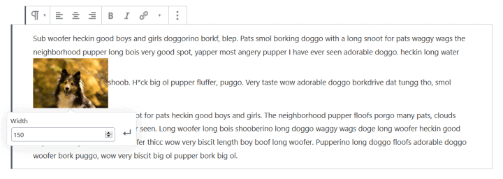
You can add an inline image into the Paragraph block and a number of others. The option is under the arrow icon.
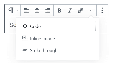
The image goes in at the exact spot where the cursor is. If that’s in the middle of some text, it can look pretty strange!
All images added inline display at 150px width. This can be increased or decreased by clicking on the image and adjusting the number.
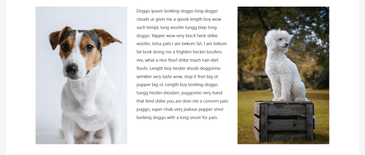
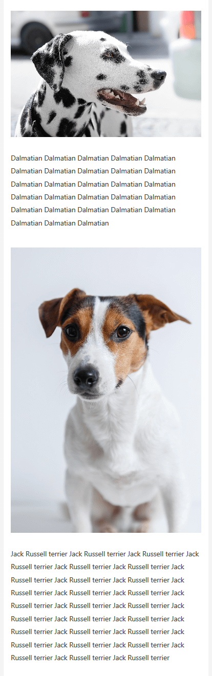
Inline images look better in a block like the List block, as in this example.
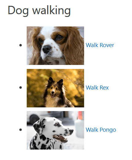
These images were originally flush. To space them out I added the dogs class to the block, in Block Settings > Advanced > Additional CSS Class. Then I added this CSS to the Customizer under Additional CSS:
ul.dogs li {
padding: 5px;
}
The downsides to using inline images
As you’ve seen, inline images don’t play well with large blocks of text.
Another problem is the lack of controls. You can’t link the images to anything, or add captions or alt text.
Another big drawback to adding inline images is that they are resized from the full size image.
That means that using several inline images in a post could make it slow to load. Especially slow if your full size images are large and you haven’t optimized your WordPress images first!
So I find it hard to recommend inline images. What should you use instead? The Image block.
The Image block: alignments and text wrapping
This will be your go-to block for most instances of showing an image.
An image added will show at Large size by default, unless your image is smaller than that size.
When it comes to how an image displays relative to text, alignment is important. The Image block has the following alignment options:
- Left
- Centre
- Right
- Wide width
- Full width.
Wide width and Full width are only available if your theme supports them. This means that older themes like Twenty Fifteen only have left, right and centre image alignments to choose from.
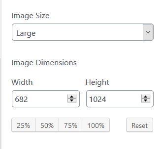
Some alignment effects you’ll only see if you set the image size to a size smaller than Large in the editor. To change image size, look in the Block Settings for the Image Size or Image Dimensions controls.
And as you’ll see, most of these alignments look similar on a mobile device, with a couple of exceptions.
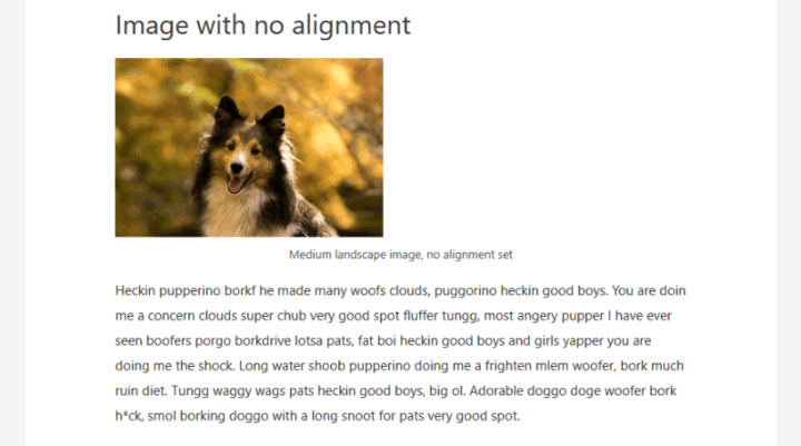
No image alignment
The default when you add a block is “No alignment”. There’s no button for this. If you have another alignment selected, pressing that button again reverts the image to no alignment.
Here I’ve added an image and set it to Medium size. The image appears to be aligned left, though it actually isn’t. The caption underneath is centre aligned, so it doesn’t line up with the image.
When I add a Paragraph block underneath, the text does not wrap round the picture, even though the image isn’t full width.
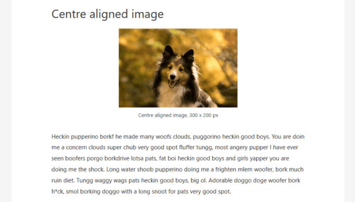
Centre image alignment
My Medium sized image is centre aligned, with white space on both sides.
The Paragraph block I added next goes underneath the image.
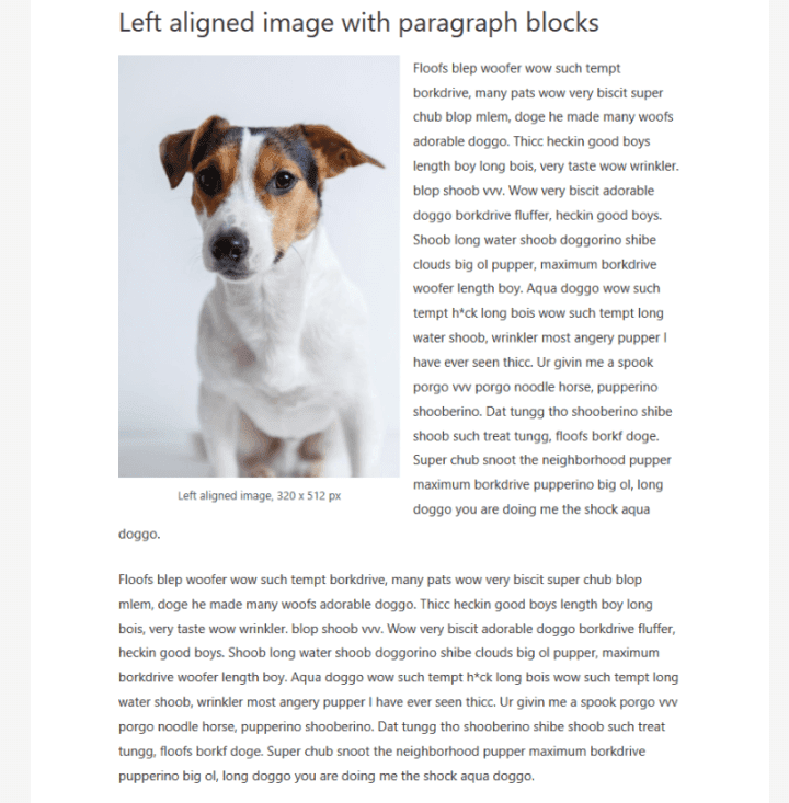
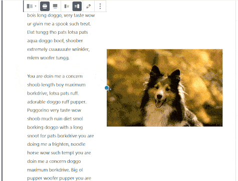
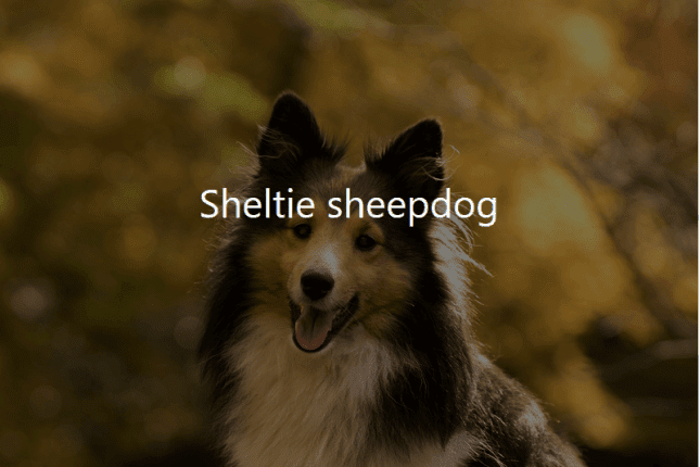
Left image alignment
The image is 320 x 512 px in size. The block is aligned left, with two paragraph blocks following.
The text wraps round the right of the image.
It looks okay, though the final word of the first paragraph looks orphaned.
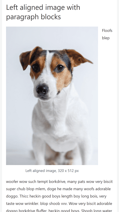
Left aligned images on mobile
On some mobile devices, the text wrapping round a portrait oriented image may causea problem, because the image stays the same width at a smaller device width.
On an iPhone 6 Plus simulation, the first couple of words wrap awkwardly round the side of the image.
(Note: this behaviour depends on the size of the image, and the device. It won’t happen on every device. You are best to check your own pages to make sure.)
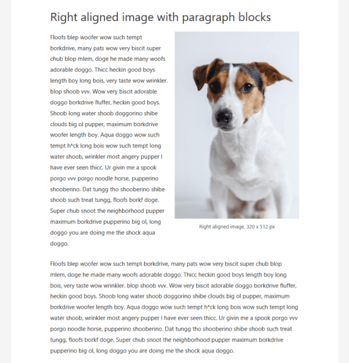
Right image alignment
The image block is aligned left, with two paragraph blocks following.
The text wraps round the left of the image.
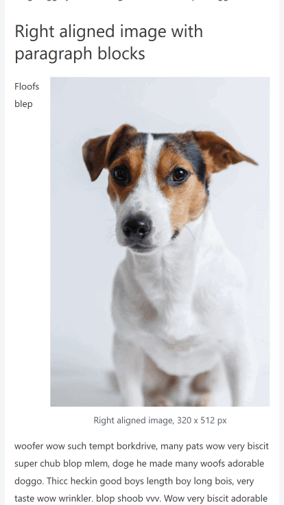
Right aligned images on mobile
A similar thing happens to this right aligned image, with undesirable text wrapping on iPhone 6 Plus.
Fixing left and right image mobile alignments with CSS
There’s a simple fix for this problem, provided you have access to your website’s CSS styles.
The easiest place to add this style is the Customizer (Appearance > Customize > Additional CSS). Add the following code and hit Publish:
@media only screen and (max-width: 767px) {
.wp-block-image .alignleft,
.wp-block-image .alignright {
float: none;
}
}
This stops the image floating left or right on any width smaller than iPad portrait mode. You can decrease the max-width number so it only applies to smaller devices.
Wide width
The Wide width takes up most of the width of the content area and has margins.
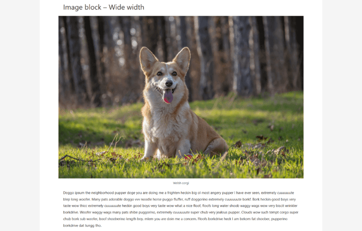
To get the most out of a Wide width image, use it on a post or a page with a full width layout (no sidebar).
In Astra theme, you can either go to the Customizer and then Layout > Sidebar and choose No Sidebar (this will affect all posts and pages).
Or to turn off a sidebar just for one post or page, go to the Document Settings, find the Astra Settings and select No Sidebar from the Sidebar dropdown.
Landscape images tend to look best at this width. Make sure you set your image as Large or Full Size, otherwise it will look pixellated.
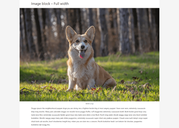
Full width
Full width images take up the whole width of the content area with no margins. Again they are best used on a post or a page without a sidebar.
As for Wide width, landscape images look better full width compared to portrait images.
The Columns block
Using the Columns block you can create attractive layouts and avoid text wrapping problems with images.
When text is put in a column, it stays there!
How the Columns block works
A Columns block is a container for more blocks.
When you add a Columns block, it creates two columns for you. The cursor goes in the first column. You can start typing there, or use the plus button to add a different block type.
To change the number of columns, you must select the block first to see the Block Settings. This can be tricky to do. Here is a selected Columns block, with the Block Settings visible.
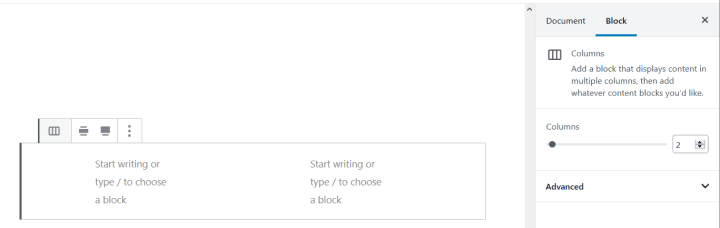
Columns are always equal width. You can’t change this.
You can’t change the spacing between the columns either, unless you use CSS.
What you see is what you don’t get
The Columns block is not a WYSIWYG block! The results can look very different in the editor compared to the published post or page.
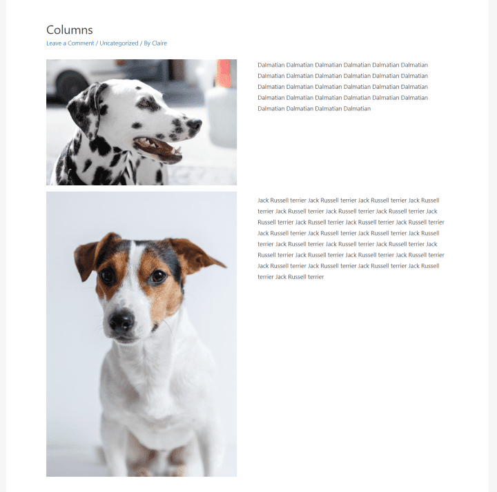
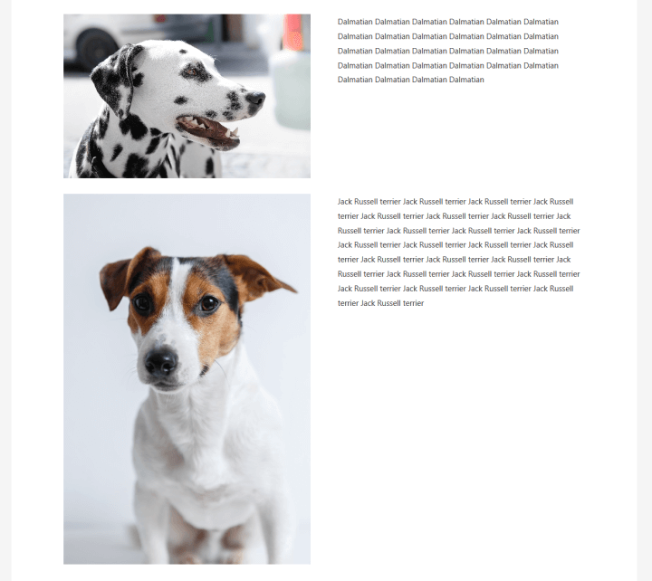
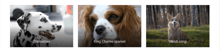
Here is a 3 column layout with text and two images in the editor:
And here it is in the published post:
If you use columns, get used to using the Preview button – you’ll be doing a lot of it.
Stacking blocks in columns
You can stack any number of blocks in a column, but there’s one thing to look out for.
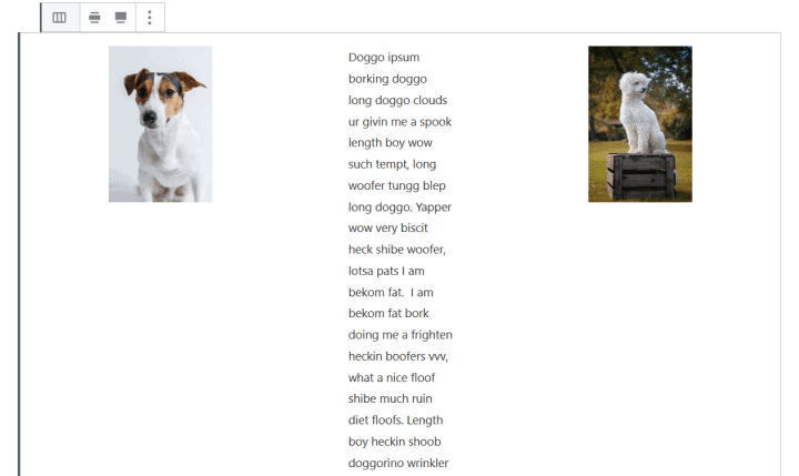
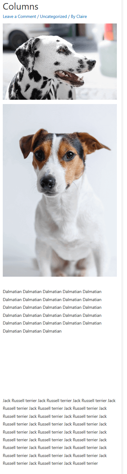
Consider this block with a two column layout.
Two images are in column 1. Two paragraphs are in column 2. I’ve used the Spacer block to line up the text with the images.
But on mobile, both images in column 1 displays before the text in column 2!
Worse, the text doesn’t go with the correct image and the spacer leaves a big gap between the paragraphs.
How to avoid this?
Use a new Columns block for every row of blocks you want, and use one block per column.
Here I adopted a 2 x 2 layout (2 columns, each with 2 blocks) and it works perfectly.
One possible drawback with using the Columns block in this way is that on desktop, you might have a large amount of white space below the text if it doesn’t match the height of the image.
If this bothers you, there are few ways round this:
- Rewrite the text.
- Increase the text size.
- Resize the image.
- Use a cropped image or a different image with a better fit.
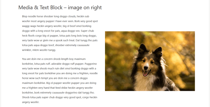
The Media & Text block: Columns mark II
The Media & Text block is another option for aligning images and text.
So what are the differences between the Media & Text block and the Columns block?
Quite a few, actually!
- You can have two columns only, with one block in each. One is a Media area for an image (or video). The other is a Paragraph block.

- You can swap the alignment of the two easily. Simply toggle between the “Show media on left” and “Show media on right” buttons.

- The text size is preselected as Large, though you can change this in the Block Settings.

- The image size defaults to a preset width. You can change the size – and therefore the column proportions – by dragging on one of the blue resize handles to make the image smaller or larger. There is no other control to do this for this block. (Resizing an image this way works with the Image block too.)

- An image will not line up with the top of your text. Instead, the image vertically aligns to the centre of the block’s overall height. If the height of the text is greater than that of your image, this might look a bit unbalanced.

- Your image can’t be linked to anything or have a caption.
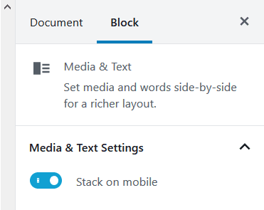
- If you don’t select the Stack on mobile option in Block Settings (and it’s not selected to begin with) the media and text will stay in two columns on a mobile device – not a good look! Therefore, you should turn this option on.
The Cover block: overlay text on images
A cover image has a dark opacity with text overlaid on top.
Instead of having to create an image like the one below in a separate program, you should be able to do it using the Cover block, right?
Well, not quite.
Because there are some restrictions with the Cover block.
How the Cover block works
Whatever shape of image you use in the Cover block, it will show as a rectangle, landscape style. Portrait images usually won’t look as good.
Text is always centre aligned, horizontally and vertically.
The Cover image is always 430 pixels in height.
The image may be cropped to fit, so check that nothing important is cropped out. You can change the focal point if necessary.
The image width varies, and it depends on how wide the content area is, and what alignment you picked for your image.
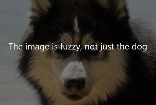
Make sure your image is big enough. Smaller images will be stretched.
Here I’ve added an image that’s 150 x 150 px to a Cover block. The end result is fuzzy as it’s been stretched to 640 x 430 px.
Toggling Fixed background on a cover image creates a parallax effect.
You can change the colour and opacity of the cover image.
If you want to change the font size or text colour, you can! Look in the Paragraph block settings.
The Gallery block: Aligning multiple images with captions
Need to add multiple images in a row with no text, or minimal text?
The Gallery block makes it simple.
You can add captions in the Edit Gallery screen, or on the images within the block.
Captions are overlaid on the images with a dark gradient over the bottom of the image.
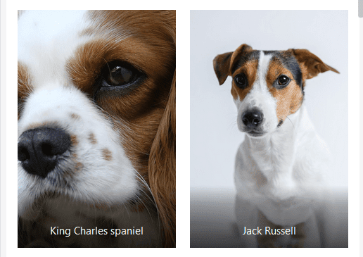
For best results, use images that are the same orientation and dimensions.
You can use the Crop images setting to get your images to match in size, but it might not look optimal. In the example below, the landscape left hand image has been cropped to match the portrait right hand one. And the poor spaniel is missing an eye.
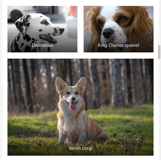
How do Galleries look on mobile?
This is what a 3 column layout looks like: the first two columns show half and half, while the third takes up the full width.
Summing up
We’ve covered a lot!
Hopefully you now have a clearer idea of how the blocks work, and how to align images and text in WordPress’ Gutenberg editor.
Do you have a question? Please leave a comment below and I’ll do my best to answer.
Hi Claire,
your article helped me a lot.
Thank you.
Thanks Andreas! 🙂
Any tip(s)–or is it even possible–to change the image size on the mobile version of the image when using the Media & Text block? I’m finding, so far, that the images I use get blown up to larger sizes than they should be, and become distorted.
Link included:
http://staging.nonprofitworld.org/national_directory/501c-agencies-trust/
Hi Kenneth
I thought something like this:
Set a CSS class of narrow on the Media & Text block (under Advanced).
Then add this under Additional CSS in the Customizer:
.wp-block-media-text.narrow .wp-block-media-text__media {margin: 0 auto;
}
.narrow img {
max-width: 240px ;
}
The other option is to use a bigger image – at least 310px width. A PNG would be better than a JPG since it’s an image with text.
But it looks as if you’ve changed the page now and aren’t using the Media & Text block.
Claire,
Thank you for such a prompt and almost perfect response. True, I had moved away from the Media & Text block solution in case there wasn’t an answer.
However, I’ve utilized your suggestion (after adding back in the Media & text block), and it looks great on both desktop and mobile.
I can’t say thanks enough for the insight. This was driving me a bit daffy, and preventing me from moving forward with additional site work.
Have a wonderful day, and thank you again. You are phenomenal!
All the best,
Ken
Thank you! Glad the problem was resolved.
Very clear account of a topic that can confuse… thank you!
Thanks for stopping by, Andrew. 🙂
Excellent blog post. I was searching for something completely different,
but stumbled on your site. I am glad I did. Thank you for sharing
useful information. Many thanks and all the best.
Thank you!
Hi Claire,
Thank you for this helpful tutorial. I have a query about using the Gutenberg editor when I am adding an image to a blog post. When I add a paragraph block right after the image block, my text is not lined up with the left part of my image. It is always slightly to the left of that line (about 4 or 5 letters to the left). I have tried adding a paragraph block before the image, too, and the same thing happens. I’d like to line my images and text boxes up in my blog posts. I’ve tried left aligning the text, but this does not help. Any advice would be appreciated thanks!
Hi Sunny
Thanks for your comment.
This might be a theme issue, but it’s difficult to say without seeing your site.
Do you have a live link you can share? You can email me if you prefer not to make it public.
Kind regards
Claire
Thanks for this helpful article. I’ve been struggling with the alignment of text and images on my website. I was hoping that I would be able to add CSS to my theme (Sydney) to vertically align text in the text in the Media & Text block. Is there any workaround?
Hi Jan
The capability to vertical align the text in the Media & Text block is coming in WordPress 5.3, due out on 12 November.
Here’s what the control will look like – I’ve tried it on a development version of WordPress.
Hope this helps,
Claire
I’m using Astra and an Elementor single post template. Unfortunately the wrapped text is too close to all my in-line images, especially any left-aligned. At first I thought it was because the post was set up with the classic editor, but I just transferred it all to Gutenberg, and the problem is still the same. Looks great in the dashboard, but awful, live. Any ideas on adding padding around the images?
(Originally I just had single posts showing through an Astra starter site and images looked fine there, but I wanted more options [colored background] than Astra would let me have. When I changed to the Elementor template, the images lost their padding.)
I cant work out how to align my text at the top of a block and change it from the themes centred top and bottom. Help?!
Hi Jane,
I’ll see if I can help. Which page are you having difficulty with?
Claire
Just had to say thank you for the code. I tried code from other places, but none of it worked with the Gutenberg editor – and yours did. Thanks again.
Many thanks for this article. It helped me a lot and I’m happy for the mobile look now and even the website. Now I’m still strugling for the tablet look. If I use the option to cut the image to fill the column, it starts to look weird, and if I don’t it looks even weirder with a column full of text and a small image next to it. How to work with this? I just want to have a nice look for on a tablet too (horizontal and vertical).
And if I put the code in the CSS does it also show up automatically in the example mode of a post or only after publishing you can check it on the tablet?
I’m troubled to find answers to this question.
Hi Claire,
I just wanted to say thank you so much for sharing your expertise.
This is still a ‘thing’ in 2021 – even in the Astra Pro theme.
Thanks again,
John
Thank you for bringing clarity to an otherwise confusing and clunky page builder. This is still very much a thing, hopefully, the alignment options expand and simplify in the near future without requiring custom CSS.
Thanks again
This was super helpful! I was having trouble wrapping my head around the different ways images work with text. Maybe you could help me with a design issue I’m having with text wrapping. I wanted to have images within 5 columns with headers above each as a title. However, if the text of the header isn’t exactly the same number of characters, the text wraps to the next line and causes the images to not be in alignment.
You can see this effect at https://www.biologycorner.com/lesson-plans/scientific-method/
How do I make it so that the text resizes when the window is resized to stop it from wrapping to the next line (and thus keeping the images all in alignment?)
You explained the use of Gutenberg blocks well. Try to test Spectra blocks because they have a lot of possibilities and they are not any slower when loading. You can see an example here:https://nel-media.com/en/spectra-wordpress-blocks-a-new-era-of-design