Released mid-2016, the Twenty Seventeen theme is still incredibly popular, with over 1 million sites using it.
One downside is that it comes with very limited customizations compared to other themes.
A while back I reviewed and liked the Advanced Twenty Seventeen plugin, but unfortunately it hasn’t been updated for 2 years, and it looks as if the developer has abandoned it.
So what’s an alternative?
I tried out the Options for Twenty Nineteen plugin a few weeks ago and was impressed by it. The good news is that Oliver Campion, its developer, has a companion plugin: Options for Twenty Seventeen.
Table of Contents
- Options for Twenty Seventeen
- Types of controls in Options for Twenty Seventeen
- General Options (5 Options)
- Header Options (25 Options)
- Nav Options (22 options)
- Content Options (37 options)
- Footer Options (12 Options)
- Theme Options (number of options varies)
- Options for Twenty Seventeen features that aren’t in the Customizer
- Overall
Options for Twenty Seventeen
Options for Twenty Seventeen is free to download from WordPress.org.
In all, this plugin comes with over 100 different customization options for the Twenty Seventeen theme. That should cover just about anything you’d want to change, with the notable exception of changing fonts – there are numerous other plugins for that.
The one catch is that a good number of the plugin options are Premium i.e. you need to pay for an upgraded version of the plugin to use them.
The good news is that you can try before you buy and unlock the Premium features for 7 days. If they work for you, the upgrade is £19.99. That’s a bargain for what would otherwise be hours of development work.
If you’re currently using Advanced Twenty Seventeen, you’ll need to deactivate it before deploying Options for Twenty Seventeen, as the two don’t play well together.
Types of controls in Options for Twenty Seventeen
Most of what this plugin does is fairly intuitive. You’ll find controls in the Customizer (Appearance > Customize) under various menu items.
There are a few different ways you’ll be asked to make your selections.
Slider controls are used for selecting from a range of values.
Radio buttons are for picking one value.
Dropdowns are used for discrete values.
Checkboxes are used for turning options on or off.
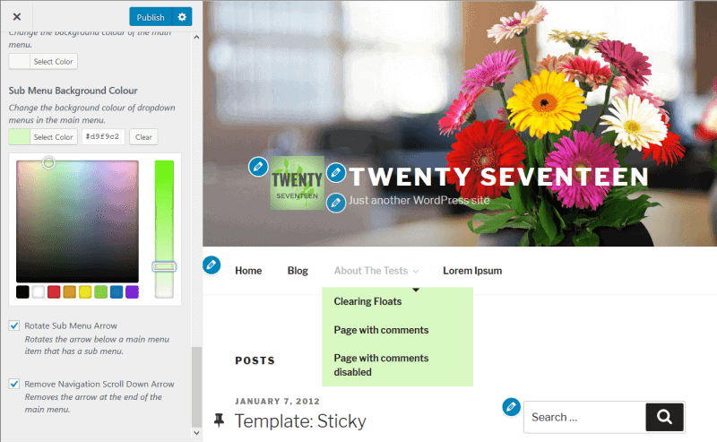
Colour pickers let you change a colour. If you have a particular brand colour you want to use, enter it as a hex code. The clear button removes your choice.
What follows is a run-down of all the plugin options.
Many choices are repeated for different elements, so I’ve grouped them in a number of places for brevity.
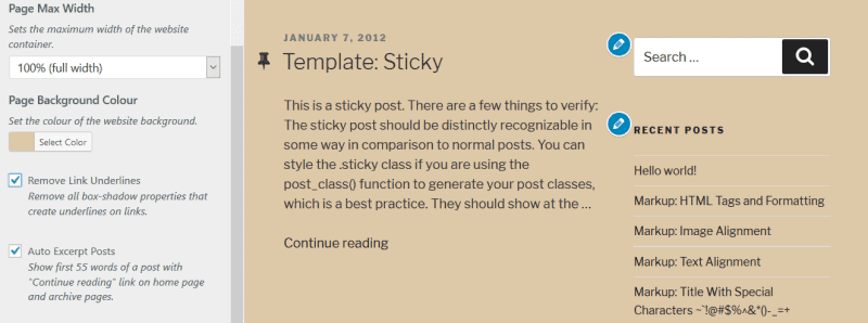
General Options (5 Options)
Page Max Width: Select from 6 maximum widths for the page.
The widths are:
- 100% (full width)
- 80em (1280px)
- 75em (1200px)
- 5em (1000px)
- 48em (768px)
- 25em (740px)
The default width in this case is 100%.
Here’s what a page with max width of 62.5em (1000px) looks like in the Customizer:
Page Background Colour
Remove Link Underlines: Twenty Seventeen uses thick link underlines, which aren’t to everyone’s taste. If you change the page background colour, you’ll also see that some link underlines show in white. This option removes all underlines from links. Note that if you do this, you might be making your site less accessible…
To replace the thick underlines – which are actually box-shadows – with regular underlines, try this code in Additional CSS:
/* Remove box-shadow from links - replace with underline */

.site-footer .widget-area a {
-webkit-box-shadow: none;
box-shadow: none;
}

.entry-title a,
.entry-meta a,
.page-links a,
.page-links a .page-number,
.entry-footer a,
.entry-footer .cat-links a,
.entry-footer .tags-links a,
.edit-link a,
.post-navigation a,
.logged-in-as a,
.comment-navigation a,
.comment-metadata a,
.comment-metadata a.comment-edit-link,
.comment-reply-link,
a .nav-title,
.pagination a,
.comments-pagination a,
.site-info a,
.widget .widget-title a,
.widget ul li a,
.site-footer .widget-area ul li a,
.site-footer .widget-area ul li a {
-webkit-box-shadow: none;
box-shadow: none;
}

.entry-content a,
.entry-summary a,
.widget a,
.site-footer .widget-area a,
.posts-navigation a,
.widget_authors a strong {
-webkit-box-shadow: none;
box-shadow: none;
text-decoration: underline;
}

.entry-content a:focus, .entry-content a:hover, .entry-summary a:focus, .entry-summary a:hover, .widget a:focus, .widget a:hover, .site-footer .widget-area a:focus, .site-footer .widget-area a:hover, .posts-navigation a:focus, .posts-navigation a:hover, .comment-metadata a:focus, .comment-metadata a:hover, .comment-metadata a.comment-edit-link:focus, .comment-metadata a.comment-edit-link:hover, .comment-reply-link:focus, .comment-reply-link:hover, .widget_authors a:focus strong, .widget_authors a:hover strong, .entry-title a:focus, .entry-title a:hover, .entry-meta a:focus, .entry-meta a:hover, .page-links a:focus .page-number, .page-links a:hover .page-number, .entry-footer a:focus, .entry-footer a:hover, .entry-footer .cat-links a:focus, .entry-footer .cat-links a:hover, .entry-footer .tags-links a:focus, .entry-footer .tags-links a:hover, .post-navigation a:focus, .post-navigation a:hover, .pagination a:not(.prev):not(.next):focus, .pagination a:not(.prev):not(.next):hover, .comments-pagination a:not(.prev):not(.next):focus, .comments-pagination a:not(.prev):not(.next):hover, .logged-in-as a:focus, .logged-in-as a:hover, a:focus .nav-title, a:hover .nav-title, .edit-link a:focus, .edit-link a:hover, .site-info a:focus, .site-info a:hover, .widget .widget-title a:focus, .widget .widget-title a:hover, .widget ul li a:focus, .widget ul li a:hover {
box-shadow: none;
-webkit-box-shadow: none;
text-decoration: underline;
}
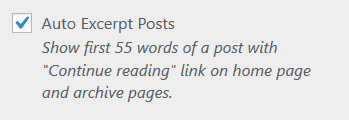
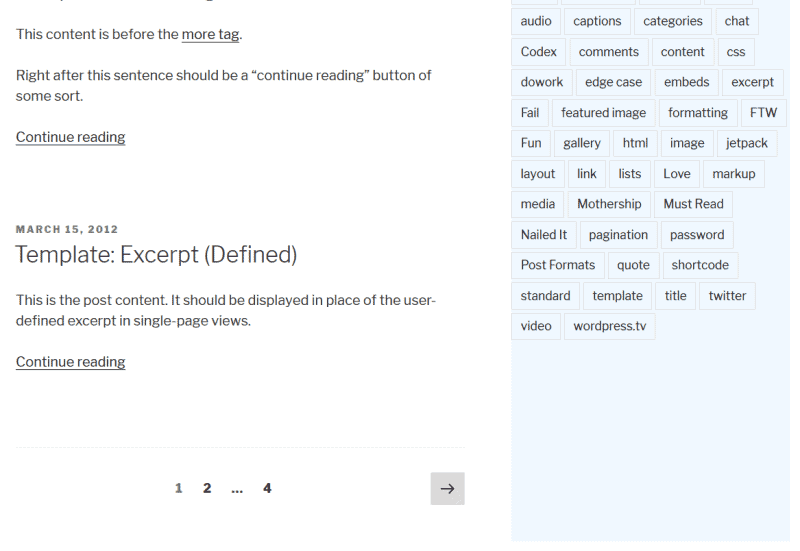
Auto Excerpt Posts (Premium): Shows only the post excerpt on home and archive pages with a “Continue reading” link. This really should have been built into the theme, in my opinion, so it’s useful to have it here.
Reset Tag Cloud Styling (Premium): The plugin adds new styling for the tag cloud with boxes round the tags. This removes boxes from the tag cloud and reverts to Twenty Seventeen’s tag style, which shows all tags underlined with popular tags in a larger font.
Header Options (25 Options)
Header Width: Choose the maximum width for the site title and site description to fit into. The choices are the same for Site Max Width.
Header Height (Premium): Change the header image height on the homepage only. Height ranges from 100% down to 0%, which will remove the header entirely, including your site name or logo. I recommend not setting it too low. Check how it looks outwith the Customizer too.
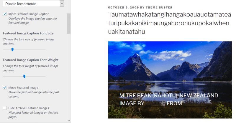
Use Featured Image as Header Image (Premium): Change the header image to the featured image you set for that individual post or page.
This is how the featured image shows on a single post, normally:
And this is what happens with this option turned on:
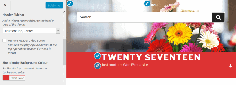
Header Sidebar (Premium): Add a sidebar to the header area above the site title and description and choose its position. Nothing will show until you add a widget to the sidebar.
Remove Header Video Button: Only applies if you are using a video header.
Site Identity Background Colour (Premium): Add a solid colour of your choice behind the site title and description.
Site Branding Alignment: Align the branding (site title and description) left, right or centre.
Remove Link Hover Opacity: Take away the opacity for the site title or logo on mouse hover.
Site Title Options
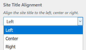
- Site Title Alignment (Premium): Align the site title left, right or centre.
- Site Title Font Case: None, Capitalize, Uppercase or Lowercase. Default is Uppercase.
- Remove Site Title Letter Spacing: Works well if you changed the site title font case.
- Site Title Font Size: Ranges from 0.875rem / 14px to 3.625rem / 58px. Default is 2.25rem / 36px.
- Site Title Font Weight: Change from thin (100) to very bold (900) with the slider. Default is 800.
- Site Title Colour
Site Description Options
- Site Description Alignment
- Site Description Font Case: Default is None.
- Site Description Font Size: Ranges from 0.5rem / 8px to 1.5rem / 24px. Default is 1rem / 16px.
- Site Description Font Weight
- Site Description Colour
Remove Header Gradient: Takes away the subtle grey gradient at the bottom of the header.
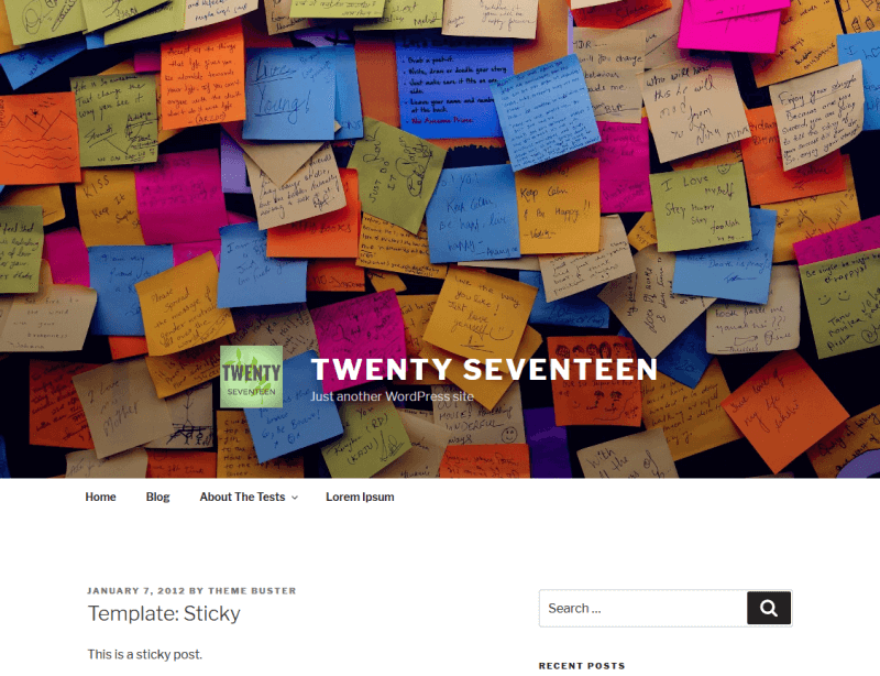
Remove Header Background: Removes the grey background from the header. You will see this better if you use the Full Cover Image option below.
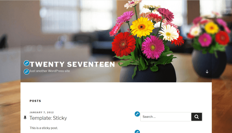
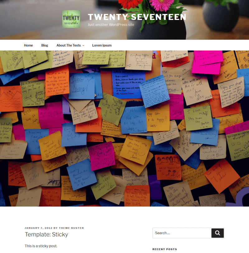
Full Cover Image: your cover image will cover the whole desktop screen. Your branding will show underneath, and the colour of your site title and description will be near-black (#22222).
This screenshot shows the full cover image, scrolled down a little so you can see the logo, site title and description underneath.
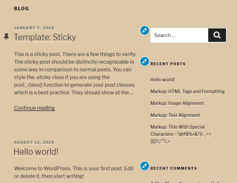
Here is the same, with both the background gradient and grey colour turned off.
True Parallax Cover Image (Premium): Enables parallax scrolling for your cover image. It won’t work if you enable the full cover image.
Slider Cover (Premium): Replaces the cover image with a slider. You must have one of the recommended slider plugins like Nivo Slider active. If you set the header height too low, it won’t show the whole image. You might have to do some tweaking to get the slider to look good.
Enable Nivo Captions (Premium): Overlays captions on your images if you use Nivo Slider.
Nav Options (22 options)
All these options change the Top Menu, not the Social Links menu.
Add Logo to Navigation Bar (Premium): Move or copy the Site Logo to the top menu, assuming one is set. Use it with the Navigation Logo Alignment setting to position the logo. (It went to the right hand side for me initially, sitting over the arrow in the menu.)
Animate Logo in Navigation Bar (Premium): You can animate it on all pages or just the homepage.
Move Navigation Bar to Top (Premium): Show the top menu on desktop at the very top of the page, above your cover image.
Fix Mobile Navigation Bar to Top (Premium): Same as the previous option for your mobile menu.
Navigation Bar Width: The options are the same as for Page Max Width.
Navigation Responsive Breakpoint (Premium): Change the breakpoint where the mobile menu shows. The minimum value is preselected i.e. the mobile menu shows only on smaller devices than iPad, portrait mode. If it’s pushed to the maximum the mobile menu will show on desktop, which I personally don’t like.
Remove Navigation Vertical Padding: There is 0.75rem / 10.5px of padding – this deletes it.
Navigation Hamburger Alignment (Premium)
Navigation Alignment (Premium)
Navigation font styling
- Navigation Font Case: Defaults to None.
- Navigation Font Size: Ranges from 0.75rem / 12px to 1rem / 16px.Default is 0.875rem / 14px.
- Navigation Font Weight
Navigation Logo Alignment (Premium): Automatically set to right.
Navigation Link Vertical Padding: Ranges from 2px to 31px. Default value is 1em / 14px.
Navigation link styling
- Navigation Link Colour: The theme preset is near-black (#222222).
- Navigation Current Page Link Colour: Default is dark grey (#767676).
- Navigation Hover Link Colour: This will also change submenu hover links as well, so you may need to adjust their background colour too.
- Navigation Hover Background Colour
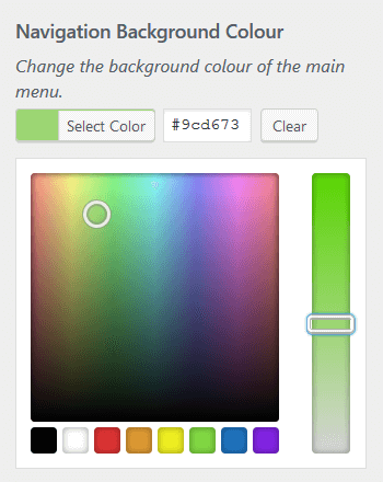
- Navigation Background Colour
- Sub Menu Background Colour
Rotate Sub Menu Arrow: Twists the arrow that shows in the submenu to face down.
Remove Navigation Scroll Down Arrow: Removes the arrow on the far right of the top menu on desktop (homepage only).
Content Options (37 options)
Content Width: The options are the same as for Page Max Width.
Page Sidebar: Adds a sidebar to your pages.
Hide Blog Sidebar for Mobile (Premium)
Match Content and Sidebar Height (Premium): This won’t make any difference unless your sidebar has a background colour. Changing sidebar background colour isn’t an option in this plugin – you’d need to add the code to do so in the Customizer’s Additional CSS.
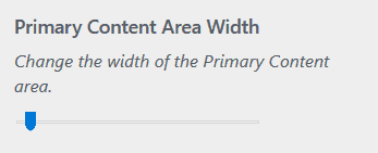
Primary Content Area Width (Premium): Widens the content area. If there’s a sidebar, it will get narrower.
Content Margin / Gutter (Premium): Reduce the margin between the content and sidebar. If decreased to the minimum value, the content may touch the sidebar.
Swap Content and Sidebar (Premium): The sidebar will switch from the right to the left. Applies to desktop and tablet. This is just a visual change: the tab order on the page will remain the same, with the content before the sidebar.
Implement Yoast SEO Breadcrumbs (Premium): Adds breadcrumbs if you have the Yoast SEO plugin active.
Featured Image options
Inject Featured Image Caption (Premium): Overlays captions on your featured images, if they have a caption set.
Featured Image Caption Font Size (Premium): Varies from 3.625rem / 58px to 0.875rem / 14px. Default is 2.25rem or 36px.
Featured Image Caption Font Weight (Premium)
Move Featured Image (Premium): Moves the featured image from above the post into the post content, under the title. The “Use Featured Image as Header Image” setting overrides this one.
Hide Archive Featured Images (Premium): Hides post featured images on archive pages.
Hide Post Dates (Premium)
Hide Post Author (Premium)
Content Padding Top: Reduce padding between the content and navigation from the theme’s 88px to 0px. Doesn’t apply to the home page.
Archive title (category/tag) settings
- Archive Title Alignment
- Archive Title Font Case
- Archive Title Font Size
- Remove Archive Title Letter Spacing
- Archive Title Font Weight
- Archive Title Colour
- Remove Category and Tag from Archive Titles (Premium)
Post and page title settings
- Post Title Alignment
- Post Title Font Case
- Post Title Font Size
- Post Title Font Weight
- Post Title Colour
- Page Title Alignment
- Page Title Font Case
- Page Title Font Size
- Page Title Font Weight
- Page Title Colour
Content link settings
- Content Link Colour
- Content Hover Link Colour
Footer Options (12 Options)
Footer Width: Same choices as Page Max Width.
Footer Background Colour
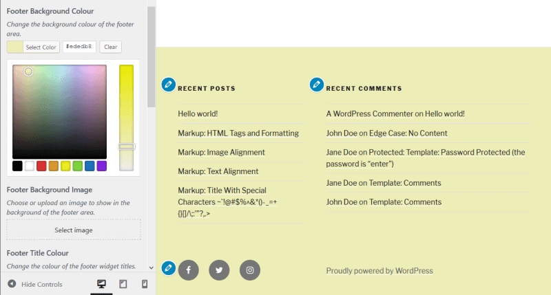
Footer Background Image (Premium): Shows a background image in the footer (including footer widgets, if you are using them). This option overrides a footer background colour if set.
While you can change the text and link colours, I would like to see the option to change the opacity of the image or add a semi-opaque overlay to make the footer content more readable.
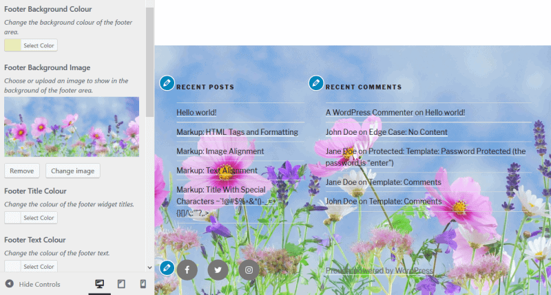
Footer colour options
- Footer Title Colour
- Footer Text Colour
- Footer Link Colour
- Footer Link Hover Colour
Footer Sidebars (Premium): Change from the usual 2 to 3 or 4 footer widget areas.
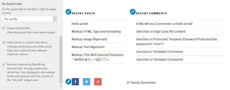
Fix Social Links (Premium): Moves the social links to the left or right of the screen on desktop. They will be partially obscured and visible on hover.
Square Social Links (Premium)
Add Colours to Social Links Menu (Premium): Changes the social icons to their respective main brand colours.
Remove Powered by WordPress: Very useful, and it’s a free option! You can replace it with content from the Site Info widget area. You should add a text widget there with the text you want.
Theme Options (number of options varies)
What you see here will depend upon your Homepage Settings. Note that some options are present in the theme already without Options for Twenty Seventeen active.
If you have set your homepage to show the latest posts
Page Layout: Enable 1 or 2 column layout on pages. This is built-in to the theme already, not added by the plugin.
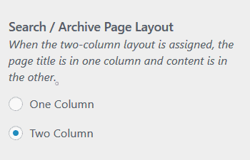
Search / Archive Page Layout (Premium): Enable 1 or 2 column layout on the search page and archive pages.
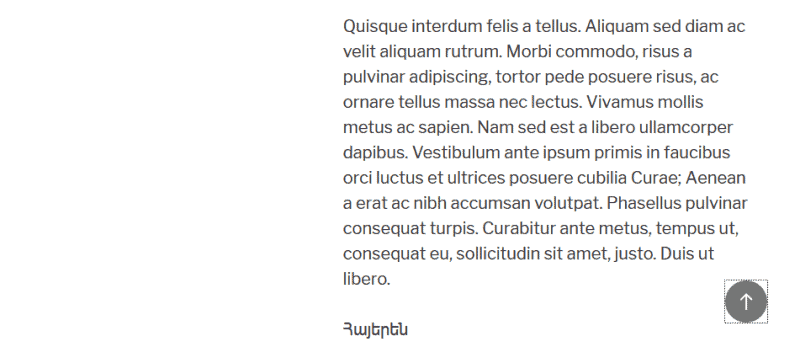
Back to Top Link (Premium): Adds a back to top link to posts and pages.
Fixed Back to Top Link (Premium): Fixes the back to top link to the bottom right corner of the screen on all devices. You must have the previous option active.
If you have set your homepage to show a static page
These options are already built into Twenty Seventeen:
- Page Layout
- Front Page Section 1 Content
- Front Page Section 2 Content
- Front Page Section 3 Content
- Front Page Section 4 Content
The following are added by Options for Twenty Seventeen:
Search / Archive Page Layout (Premium): One or two columns.
Front Page Sections (Premium): Change the number of sections from the default 4. You can have from 1-10. You’ll need to save, come out of the Customizer and re-enter to see your changes applied. Manage your sections below in the Front Page Section 1 Content etc. There will be extra dropdowns if you have added more sections.
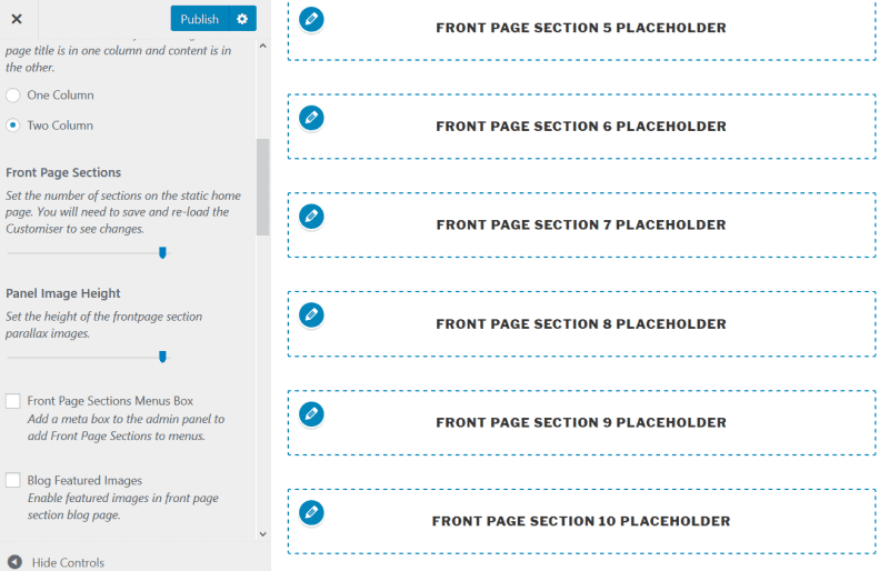
This is one instance where I think a number counter would be easier to use than a slider to change the number of sections.
Panel Image Height (Premium): Reduce the height of the featured images for your front page sections.
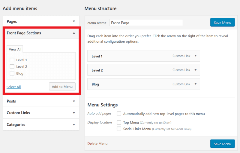
Front Page Sections Menus Box (Premium): Lets you add anchor links to your front page sections. Very useful if you are creating a one-page site.
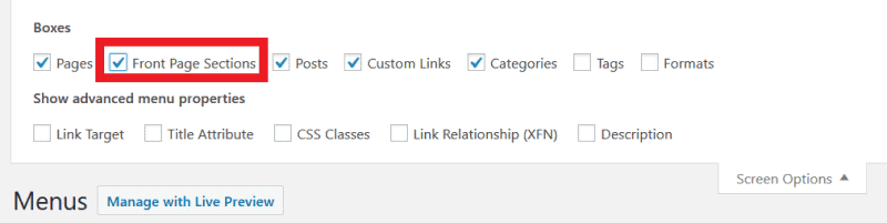
To use this feature, go to Appearance > Menus and check the Front Page Sections in Screen Options. Then you can add these sections to your menu.
Blog Featured Images (Premium): Shows a featured image for your blog page section if you have set one.
Parallax Off (Premium): Disable parallax or enable parallax or “true parallax” scrolling.
Back to Top Link (Premium)
Fixed Back to Top Link (Premium)
Front Page Section Back to Top Link (Premium): Adds back to top links for all front page sections.
Options for Twenty Seventeen features that aren’t in the Customizer
There are a few extra things the plugin does that are listed on its download page:
- Fixes jumpy parallax effect in IE11.
- Shortcode [social-links] to show the social network menu in your content.
- Automatically fix the YouTube full width, responsive and play / pause button bugs.
- Hide YouTube video until loaded (Premium).
- Pause YouTube video on user scroll (Premium).
Overall
Well done, you made it to the end. As you can see, this is an epic plugin. If you’re a Twenty Seventeen user, there’s not a lot that it won’t do.
While Options for Twenty Seventeen far outshines Advanced Twenty Seventeen, one choice the latter had that I liked was a Reset function. It would be handy to have something like this in Options for Twenty Seventeen. Sometimes if you’ve made a change and want to revert it, it’s hard to remember the default choice.
Are you a Twenty Seventeen user? How have you customized your theme?
Thank you very much for the information on how to set up the wordpress “Twenty Servente” theme using “Options for Twenty Seventeen”. I just gave up the paid template from Themeforest and I am testing your configuration on my website. I think that this way you can also get better results with PageSpeed Insights (Twenty Seventeen is very light).
Hi Serwis
Thanks for your comment, and I agree that Twenty Seventeen is lightweight compared to Themeforest themes!
Cheers
Claire
Hi Claire, love my Twenty-Seventeen. But don’t love the scroll down arrow I can’t seem to get rid of. Don’t need any navigation at all, really, although I do quite like the arrow up at the bottom. Only have one page. Can you advise please?