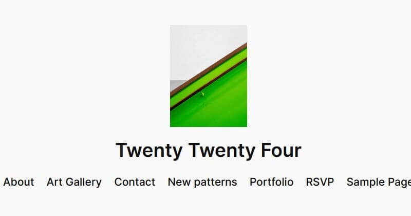
Twenty Twenty-Four theme is the latest in a series of default WordPress themes. This theme shipped with the release of WordPress 6.4 on November 7, 2023.
Twenty Twenty-Four is a block theme, meaning that it is composed of blocks and the whole of your site is editable.
The theme has proved popular, with over half a million active installs to date.
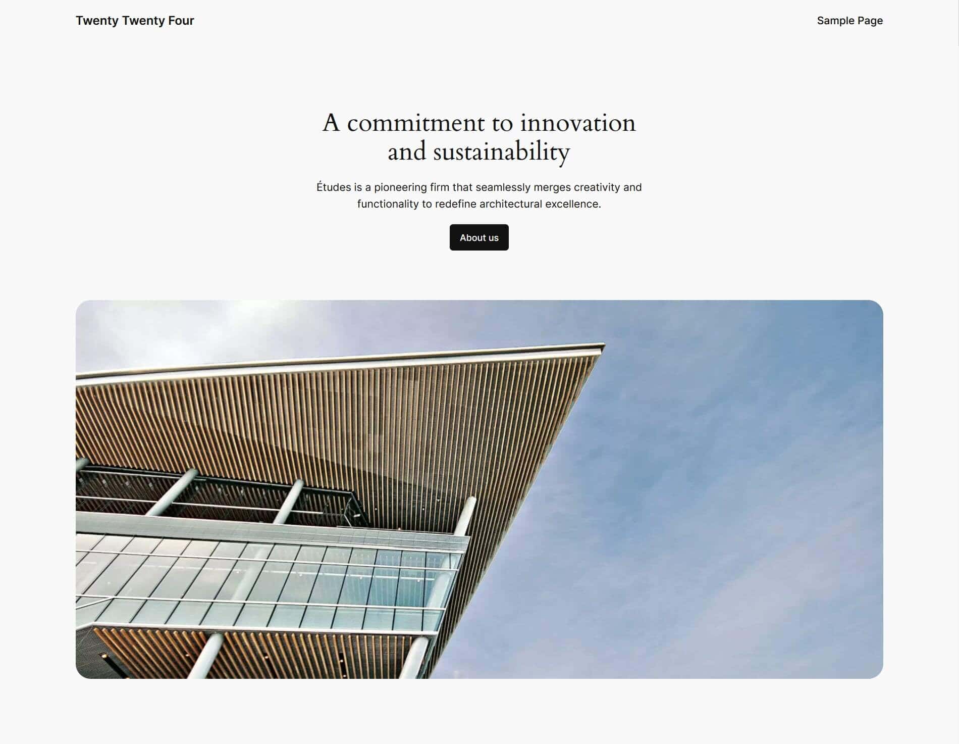
In this post, I’ll examine the Twenty Twenty-Four theme features and how to customize it for your own use.
Twenty Twenty-Four requires WordPress 6.4 and PHP 7.0 to run, ,so be sure that you have these in place before using it.
- Twenty Twenty-Four theme design
- Twenty Twenty-Four theme typography
- Twenty Twenty-Four theme menus
- Twenty Twenty-Four theme style variations
- Twenty Twenty-Four theme templates
- Twenty Twenty-Four theme patterns and template parts
- Twenty Twenty-Four theme accessibility
- Customizing Twenty Twenty-Four theme
- Summing up
Twenty Twenty-Four theme design
Twenty Twenty-Four was designed by Automattic’s Beatriz Fialho. The theme is designed to be a multipurpose one, for uses such as bloggers, business and portfolio sites.
It comes with eight colour schemes or style variations, eleven templates and 38 patterns. With this range of options you can build a wide variety of sites.
Twenty Twenty-Four theme typography
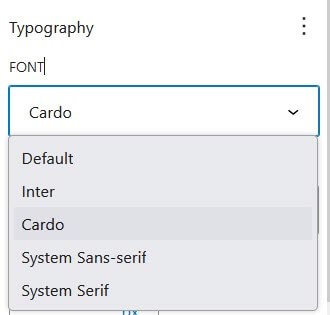
By default, Twenty Twenty-Four uses the Cardo Google font for headings, and the Inter Google font for body text. These fonts are hosted locally.

Alternative typography you can use is System Serif or System Sans-serif.
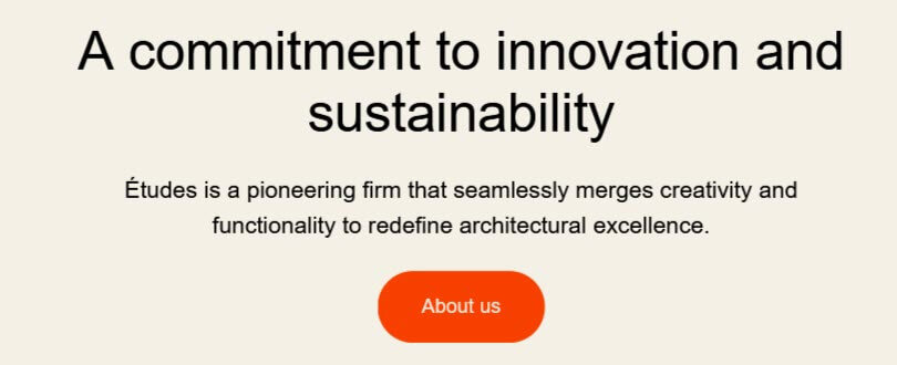
A few of the style variations use a different font pairing of Jost (for headings) and Instrument Sans (for body text).
Twenty Twenty-Four theme menus
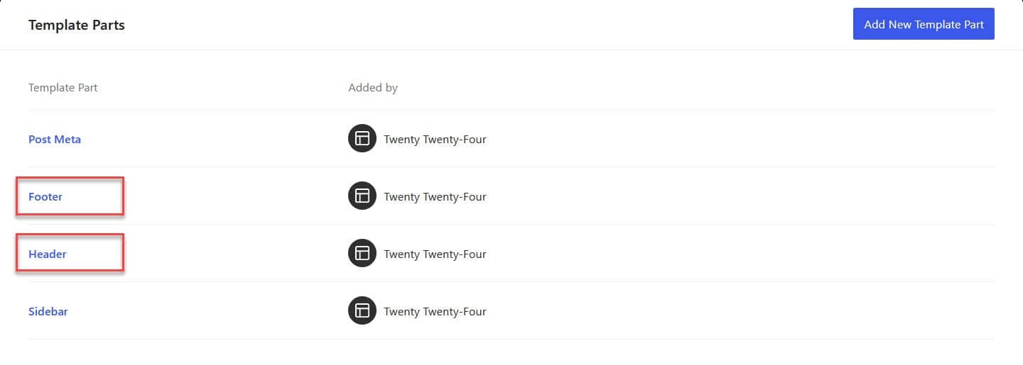
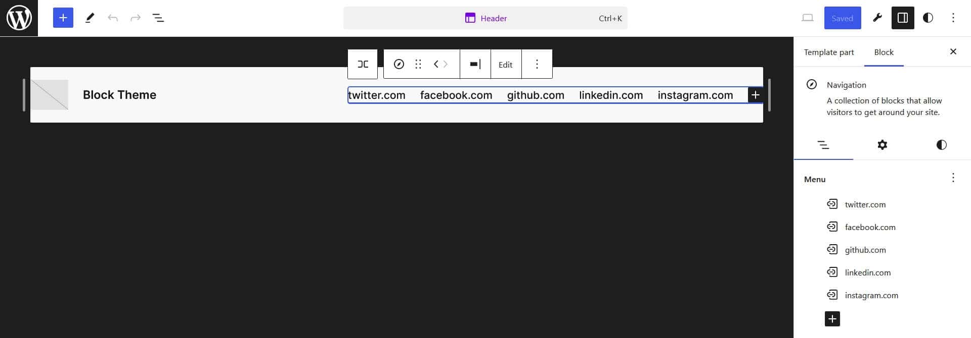
With block themes, you can insert menus any place you choose to on the page. That said, there are some default menus set in the header and footer. You can access these by visiting Appearance > Editor > Patterns > Manage all template parts and select Header or Footer.
By default, Twenty Twenty Four has one header menu:
And three footer menus:
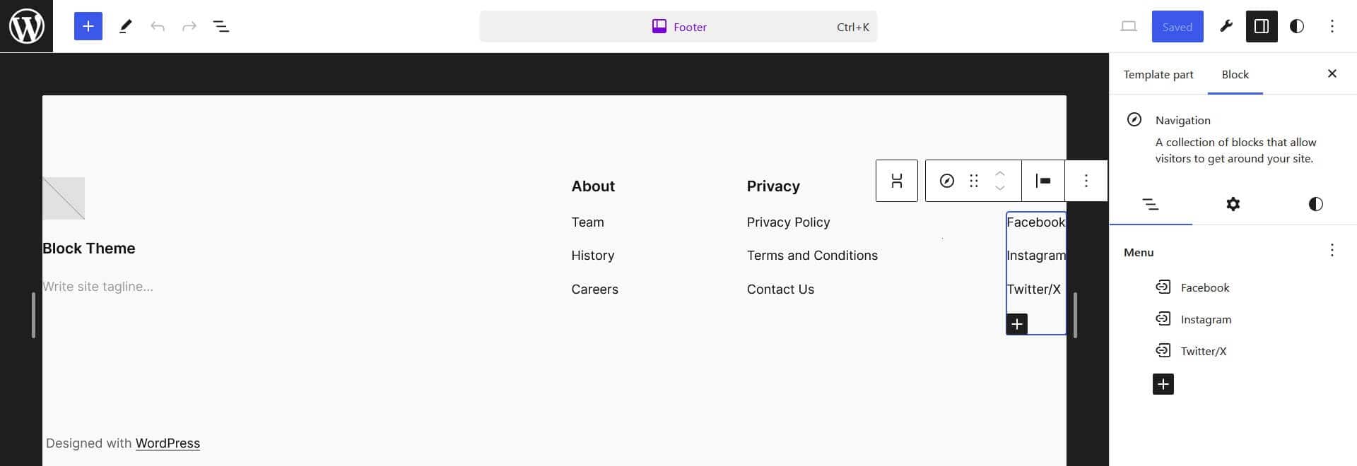
You can add items to the menus by using the + button, or edit existing items by clicking on them.
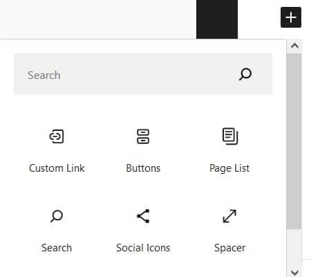
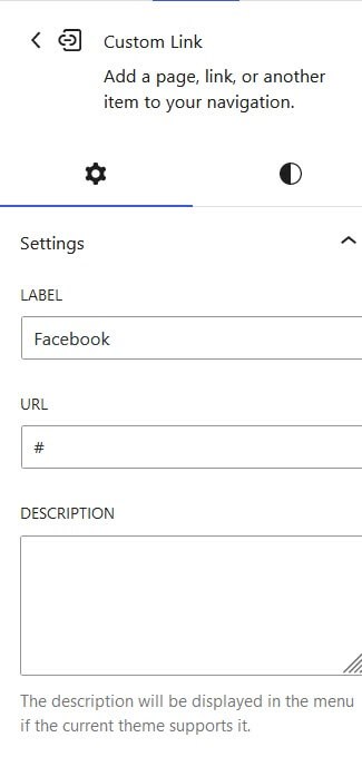
New pages will be added to your header menu by default when you publish them.
Twenty Twenty-Four theme style variations
Twenty Twenty-Four has eight style variations, which you can see and try out by navigating to Appearance > Editor > Styles.
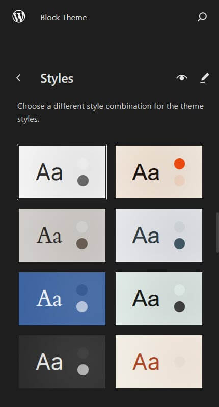
The styles are:
- Default – the default black and white style.
- Ember – an orange, black and cream style with sans-serif fonts.
- Fossil – a cream, tan and brown style.
- Ice – a white, grey and slate grey style with sans-serif fonts.
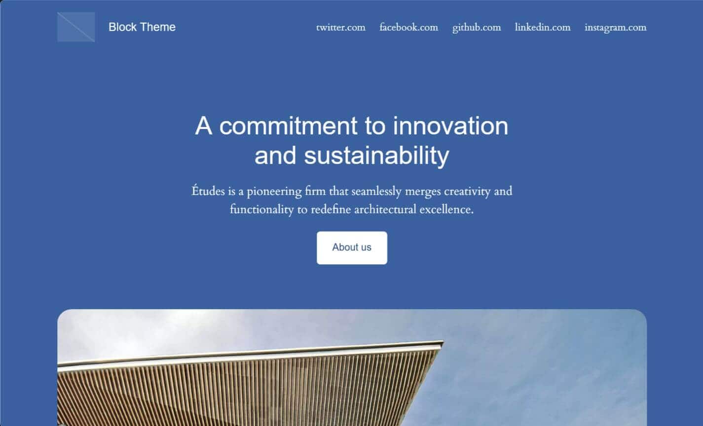
- Maelstrom – a style with different shades of blue.
- Mint – a pale green style with black text and sans-serif fonts.
- Onyx – a dark grey style with white text.
- Rust – an orangey red and cream style.
Twenty Twenty-Four theme templates
There are eleven templates in Twenty Twenty-Four:
- All Archives
- Blog Home
- Index
- Page No Title
- Page With Sidebar
- Page with wide Image
- Page: 404
- Pages
- Search Results
- Single Posts
- Single with Sidebar
All templates are editable, and provide for a wide range of uses. If you’re a traditionalist you’ll notice that there’s two templates with sidebars – a single post and a page. The Page No Title template is useful if you want to build a landing page and don’t want the page title at the top of the page.
By default the Blog Home template displays for the homepage, and it’s set to show the template for a business type of site. I’ll delve into changing this later on.
Twenty Twenty-Four theme patterns and template parts
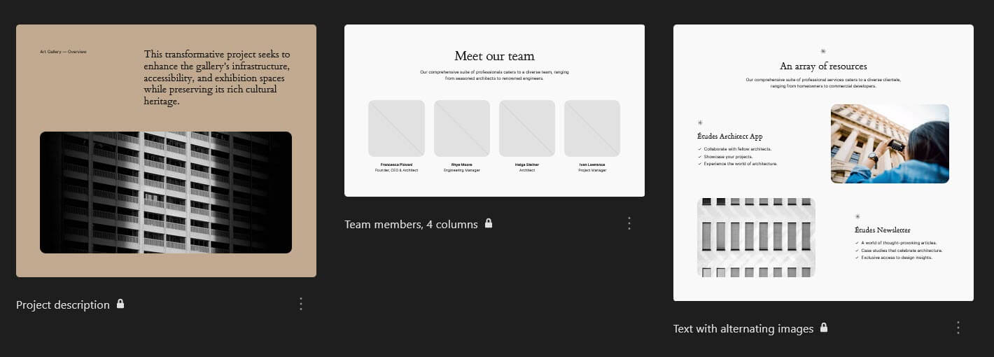
Twenty Twenty-Four offers an impressive 38 patterns for building your pages. These are grouped as follows:
About (8 patterns)
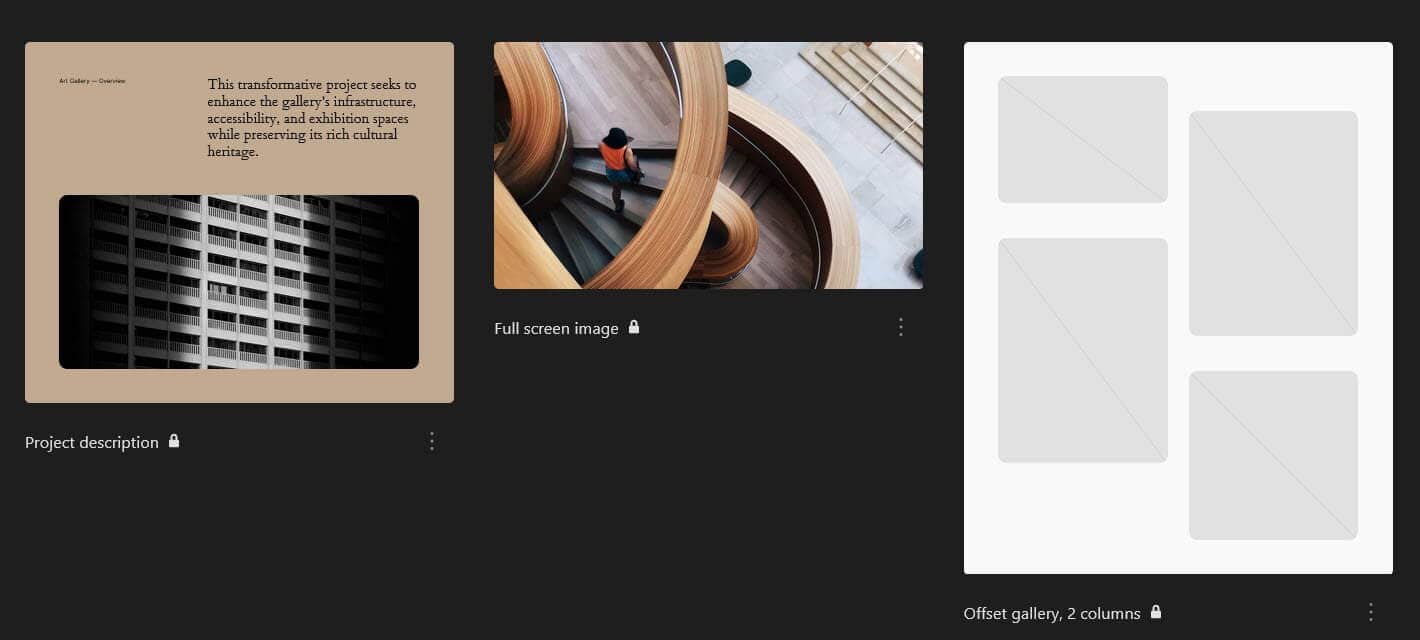
- Project description
- Team members, 4 columns
- Text with alternating images
- Centered statement, small
- Centered statement
- FAQ
- Feature grid, 3 columns
- Title text and button on left with image on right
Banners (5 patterns)
- Hero
- Project description
- Call to action with image on right
- Services call to action with image on left
- Title text and button on left with image on right
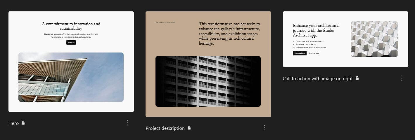
Call to Action (7 patterns)
- Hero
- Call to action with image on right
- Pricing
- RSVP
- Services call to action with image on left
- Centered call to action
- Newsletter landing

Featured (11 patterns)
- Hero
- Project description
- RSVP
- Services call to action with image on left
- Offset gallery, 4 columns
- Project layout
- Newsletter landing
- Portfolio project overview
- Centered statement
- FAQ
- Title text and button on left with image on right
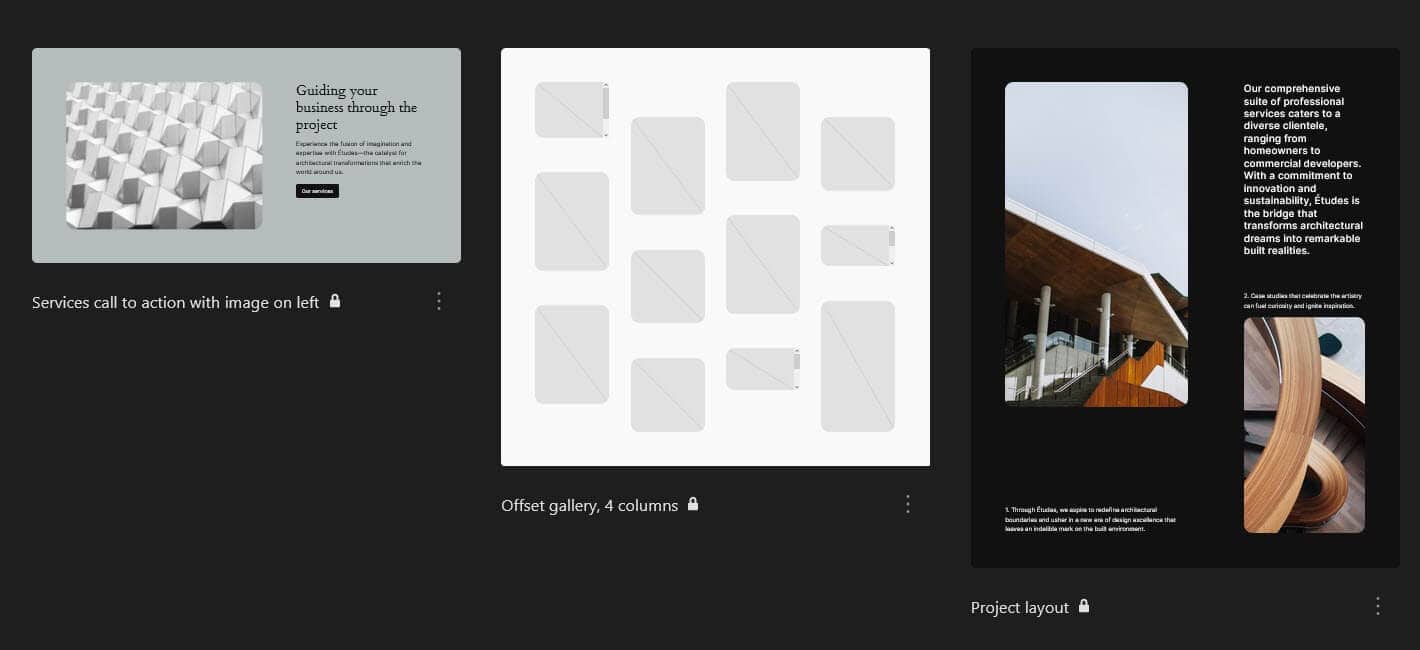
Footers (3 patterns)
- Footer with centered logo and navigation
- Footer with colophon, 3 columns
- Footer with colophon, 4 columns

Gallery (5 patterns)
- Full screen image
- Offset gallery, 2 columns
- Offset gallery, 3 columns
- Offset gallery, 4 columns
- Project layout
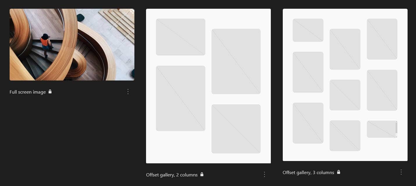
Pages (8 patterns)
These are ready-built patterns for pages, available for insertion when you create a new page.
- About
- Blogging home
- Business home
- Portfolio home image gallery
- Portfolio home with post featured images
- Newsletter landing
- Portfolio project overview
- RSVP landing
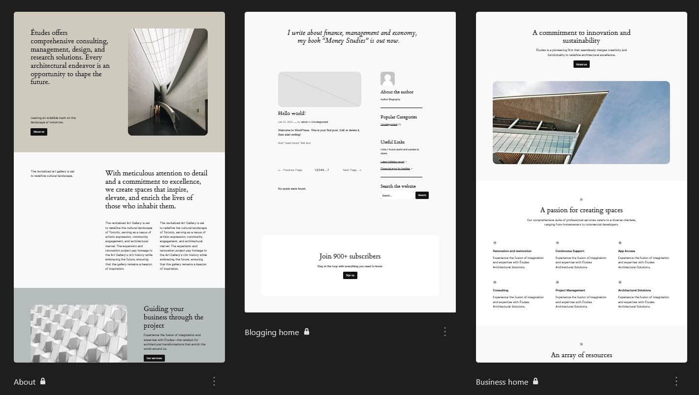
Portfolio (7 patterns)
- Project description
- Full screen image
- Offset gallery, 2 columns
- Offset gallery, 3 columns
- Offset gallery, 4 columns
- Project layout
- Project details
Posts (6 patterns)
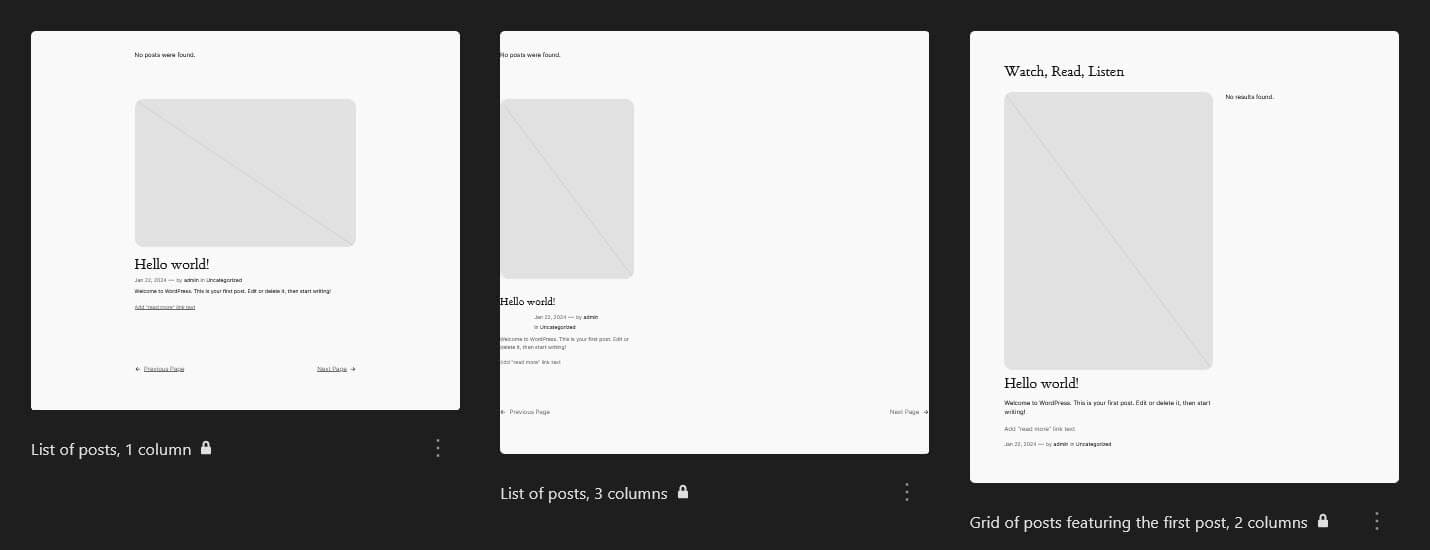
- List of posts, 1 column
- List of posts, 3 columns
- Grid of posts featuring the first post, 2 columns
- Posts with featured images only, 3 columns
- Offset posts with featured images only, 4 columns
- List of posts without images, 1 column
Services (2 patterns)
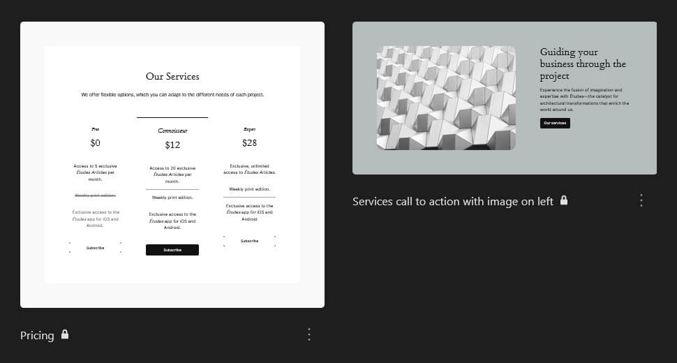
- Pricing
- Services call to action with image on left
Team (1 pattern)
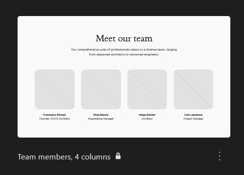
- Team members, 4 columns
Testimonials (1 pattern)
- Centered testimonial

Text (7 patterns)
- Centered testimonial
- Text with alternating images
- Centered statement, small
- Centered statement
- FAQ
- Feature grid, 3 columns
- Project details

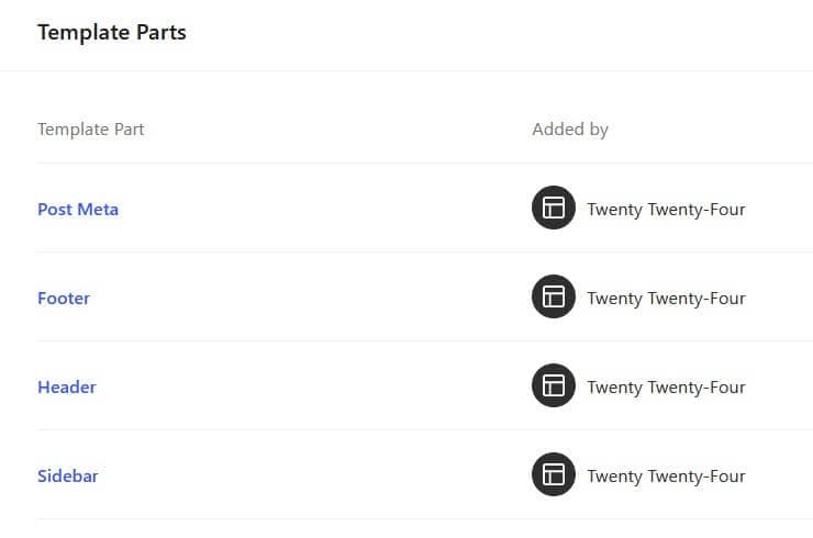
The template parts are also found under Patterns; they consist of the Header, Footer and two General template parts – Post Meta and Sidebar.
Twenty Twenty-Four theme accessibility
Because the Twenty Twenty-Four theme is block-based, much of its accessibility is tied to the accessibility of the block editor.
WordPress 6.4 made a number of accessibility improvements, including 17 fixes for the block editor.
Twenty Twenty-Four is labelled as accessibility-ready. This means that it has a level of accessibility built-in. The final accessibility of the theme depends on the content you populate it with.
Read more about the accessibility of block themes.
Link accessibility
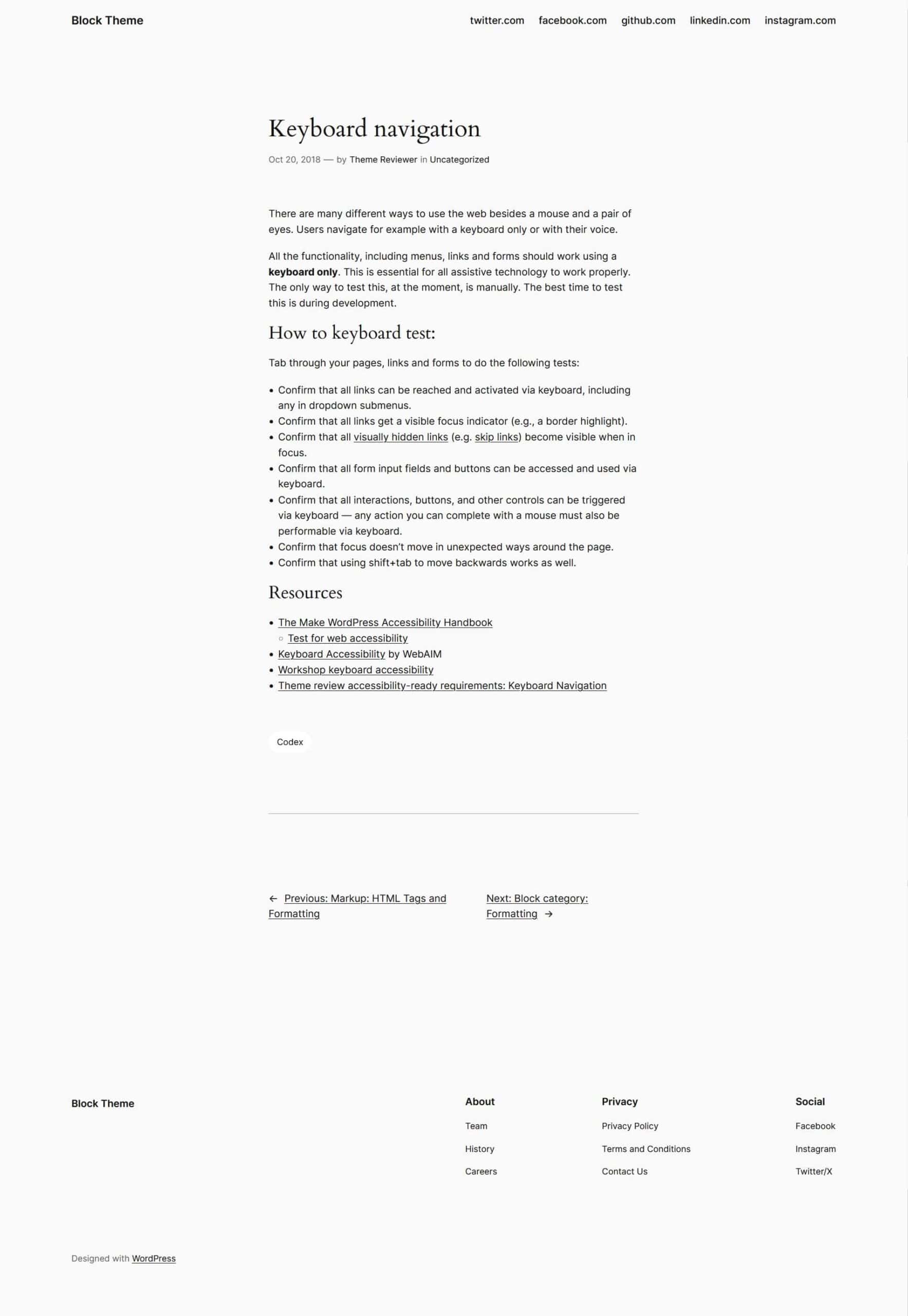
The theme is keyboard accessible, with a blue outline for the selected link on Firefox, and a black outline on Chrome.. There is also a skip to content link to skip past the header menu.

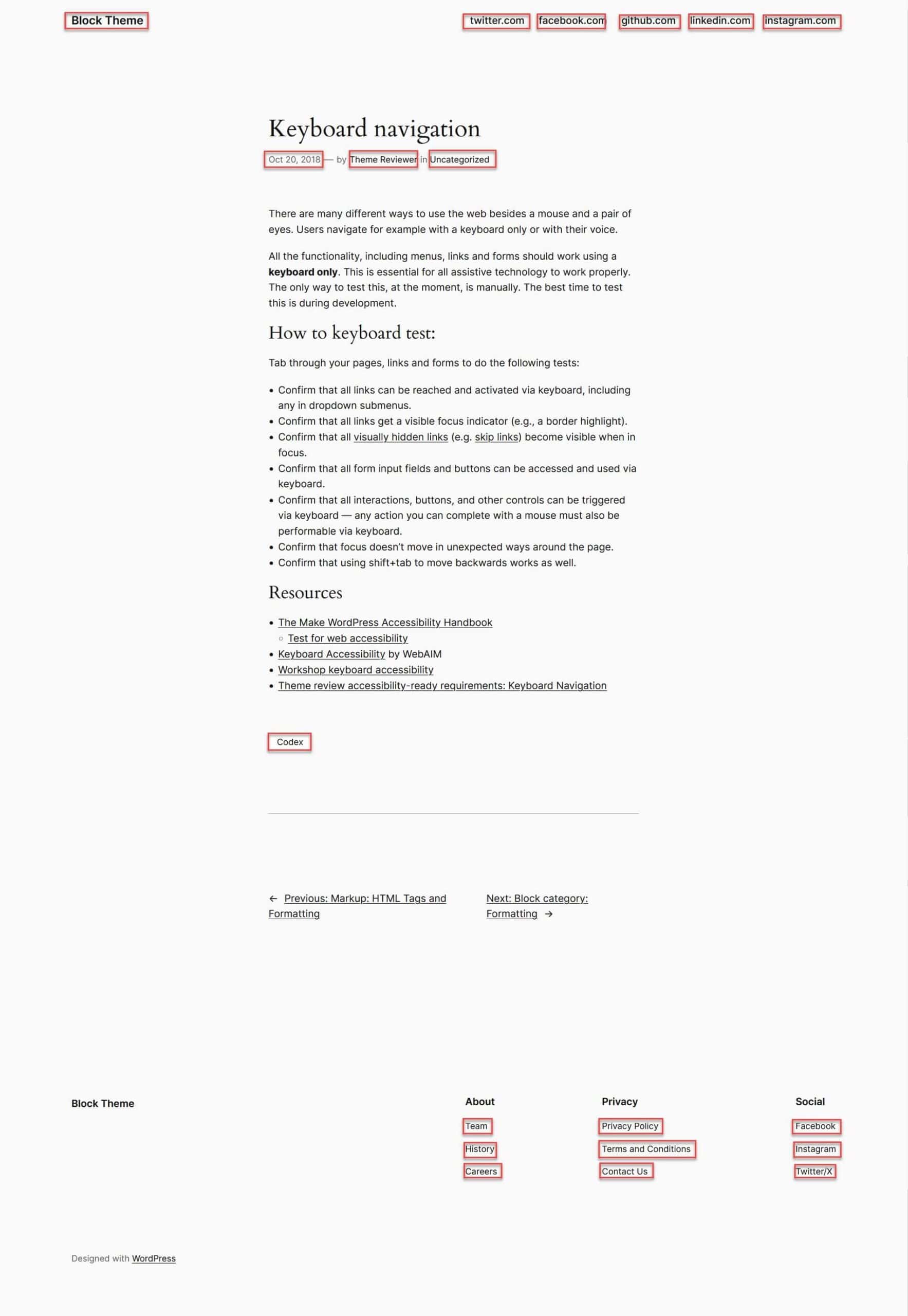
I’m in two minds about the practice of underlining links in Twenty Twenty-Four. Links in post or page body copy are underlined, but not those in the header or footer (they are underlined on hover). For the main navigation this is okay, but I find this inconsistency frustrating as not all the links, in the default theme, anyway, are visually distinct from the nearby text.
See the example below of a post. Can you tell where all the links are? It’s easy if they are underlined.
I’ve highlighted the less obvious links with a red outline. Did you spot them all? I think the post meta links (date, author and category) were the hardest to figure out.
Pattern accessibility
One other accessibility issue is with the FAQ pattern. Amber Hinds has pointed out that it isn’t accessible because it doesn’t use headings for the questions, and has called for an accessible pattern to be built. You can follow the FAQ pattern issue here.
Colour contrast of Twenty Twenty-Four style variations
I did some testing of the different style variations to see if they met the WCAG 2.1 criteria for colour contrast.
WCAG 2.1 level AA requires a contrast ratio of at least 4.5:1 for normal text and 3:1 for large text. WCAG Level AAA requires a contrast ratio of at least 7:1 for normal text and 4.5:1 for large text.
I tested the variations colour contrast for normal text and you can see the results below.
Default
#111111 & #f9f9f9 black text and light grey background = Contrast Ratio 17.93:1 (AA and AAA pass)
#111111 & #FFFFFF black text and white background = Contrast Ratio: 18.88:1 (AA and AAA pass)
#636363 & #f9f9f9 grey text and light grey background = Contrast Ratio: 5.7:1 (AA pass, AAA fail)
#a4a4a4 and #111111 grey text and black background = Contrast Ratio: 7.57:1 (AA and AAA pass)
Ember
#000000 & #F4F0E6 black text and tan background = Contrast Ratio: 18.45:1 (AA and AAA pass)
#000000 & #F6DECD black text and pale orange background = Contrast Ratio: 16.24:1 (AA and AAA pass)
#F4F0E6 & #FF3C00 tan text and orange button = Contrast Ratio: 3.12:1 (AA and AAA fail)
#FF3C00 & #F4F0E6 orange text and tan background = Contrast Ratio: 3.12:1 (AA and AAA fail)
Fossil
#1A1514 & #D6D2CE black text and light brown background = Contrast Ratio: 12.02:1 (AA and AAA pass)
#1A1514 & #E1DFDB black text and light brown background = Contrast Ratio: 13.58:1 (AA and AAA pass)
#FFFFFF & #65574E white text and mid brown background = Contrast Ratio: 6.93:1 (AA pass, AAA fail)
#65574E & #D6D2CE mid brown text and light brown background = Contrast Ratio: 4.61:1 (AA pass, AAA fail)
Ice
#1C2930 & #EBEBEF dark blue text and light grey background = Contrast Ratio: 9.91:1 (AA and AAA pass)
#1C2930 & #DCE0E6 dark blue text and pale grey background = Contrast Ratio: 11.24:1 (AA and AAA pass)
#37505d & #EBEBEF slate blue text and light grey background = Contrast Ratio: 6.42:1 (AA pass, AAA fail)
#FFFFFF & #37505d white text and slate blue background = Contrast Ratio: 8.5:1 (AA and AAA pass)
#96a5b2 & #1C2930 grey text and dark blue background = Contrast Ratio: 5.9:1 (AA pass, AAA fail)
#EBEBEF & #1C2930 off-white text and dark blue background = Contrast Ratio: 8.5:1 (AA and AAA pass)
Maelstrom
#FFFFFF & #38629F white text and blue background = Contrast Ratio: 6.14:1 (AA pass, AAA fail)
#244E8A & #FFFFFF blue text and white background = Contrast Ratio: 8.29:1 (AA and AAA pass)
#d5e0f0 & #FFFFFF light grey text and white background = Contrast Ratio: 1.33:1 (AA and AAA fail)
rgba(255, 255, 255, 0.63) or #FFFFFFA1 & #38629F grey text and blue background = Contrast Ratio: 3.5 (AA and AAA fail)
#FFFFFF & #244e8a white text and darker blue background = Contrast Ratio: 8.29:1 (AA and AAA pass)
Mint
#000000 & #e4efeb black text and mint green background = Contrast Ratio: 17.84:1 (AA and AAA pass)
#000000 & #F1FEFB black text and pale blue background = Contrast Ratio: 20.3:1 (AA and AAA pass)
#a4a4a4 & #000000 grey text and black background = Contrast Ratio: 8.32:1 (AA and AAA pass)
#353535 & #E4EFEB black text and mint green background = Contrast Ratio: 10.42:1 (AA and AAA pass)
Onyx
#f9f9f9 & #272727 white text and dark grey background = Contrast Ratio: 14.18:1 (AA and AAA pass)
#f9f9f9 & #303030 white text and medium grey background = Contrast Ratio: 12.53:1 (AA and AAA pass)
#b7b7b7 & #272727 grey text and dark grey background = Contrast Ratio: 7.44:1 (AA and AAA pass)
#909090 & #F9F9F9 grey text and white background = Contrast Ratio: 3.03:1 (AA and AAA fail)
Rust
#A62B0C & #F3F0E7 red text and tan background = Contrast Ratio: 6.2:1 (AA pass, AAA fail)
#A62B0C & #ECEADF red text and tan background = Contrast Ratio: 5.81:1 (AA pass, AAA fail)
Customizing Twenty Twenty-Four theme
When using the Site Editor, your customizations are saved to the database so that they don’t get overwritten when the theme is updated.
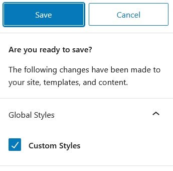
When you have made a change, the Save button will become active. Selecting it opens the Save dialog, which looks like the image below. It tells you what you have customized.
Change the homepage design
You may have noticed that the homepage uses the Business homepage, but if you’re creating another type of site, you’ll want to change that. Here’s one way to do it.
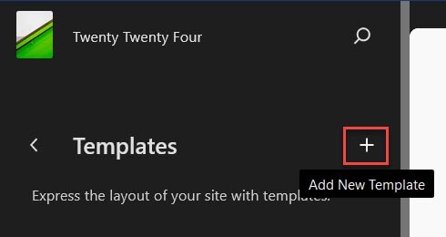
Navigate to Appearance > Editor > Templates and click the plus icon.
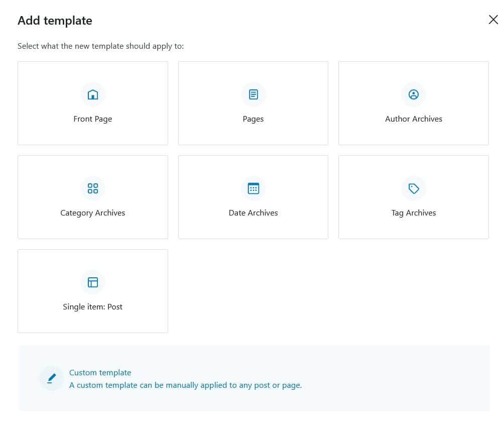
Select the Front Page template.
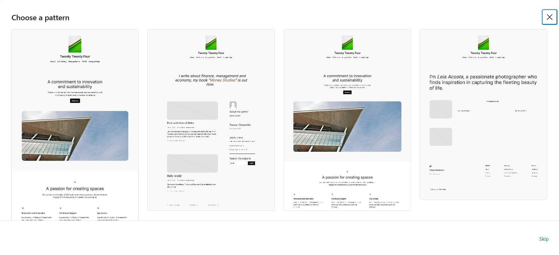
Choose a pattern. I’m selecting the Blogger template (the second one).
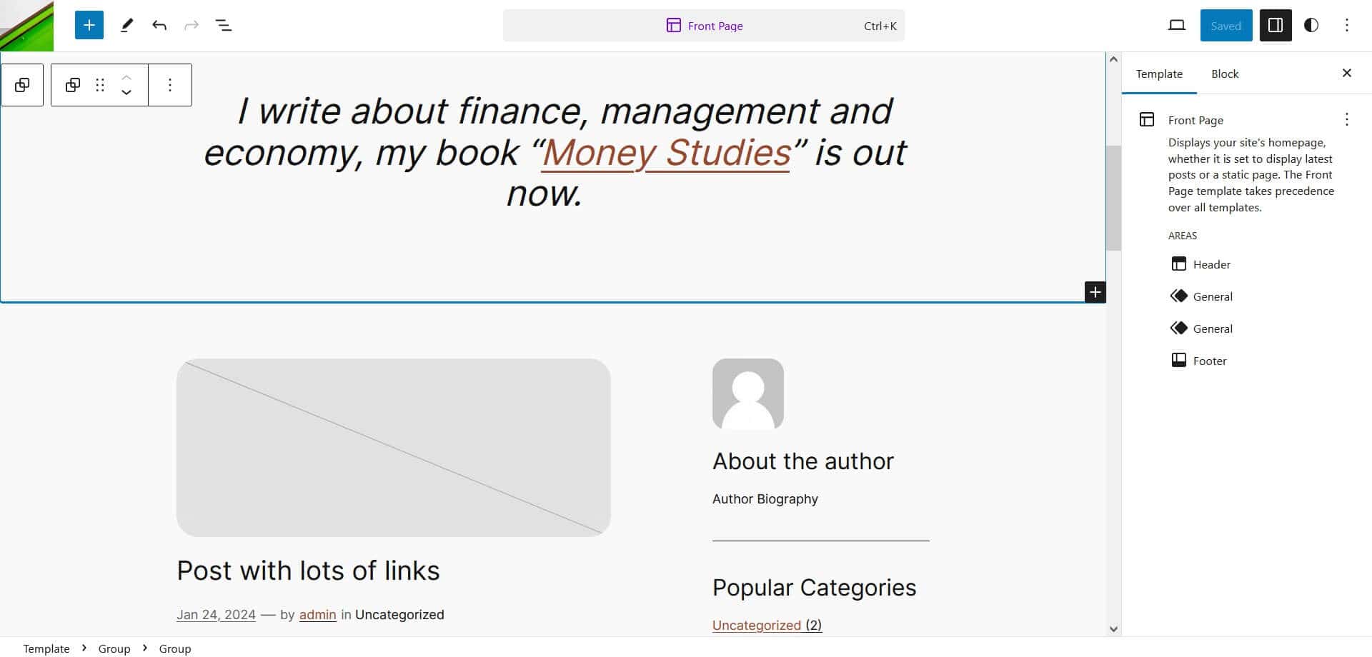
This template is added to the editor. Edit it to match your needs then save it and this design will show on your homepage.
Editing styles
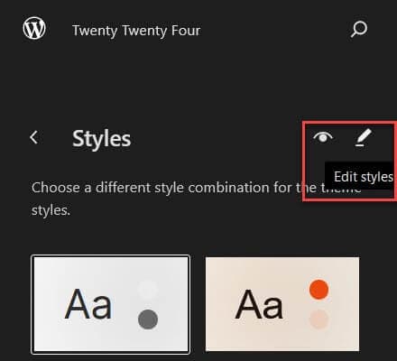
You can edit the typography, colour, or layout of the theme by going to Appearance > Editor > Styles. When you have chosen the style variation you want to edit, go to the Edit styles (pencil icon) option.
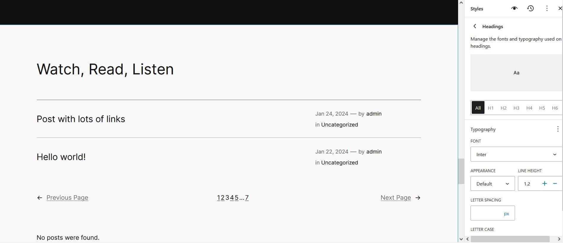
For typography, you can edit the following:
- Text
- Links
- Headings
- Captions
- Buttons
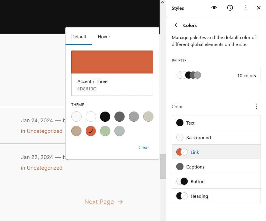
In the Styles section you can edit colours for:
- Palette (changes here update all instances of the colour in the theme)
- Text
- Background
- Link
- Captions
- Button
- Heading
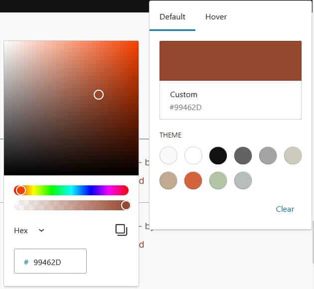
You can also change colours to your preferred scheme by clicking/tapping on the swatch and selecting your own colour from the panel.
In the Layout section you can adjust:
- Content size
- Wide size
- Padding
- Block spacing
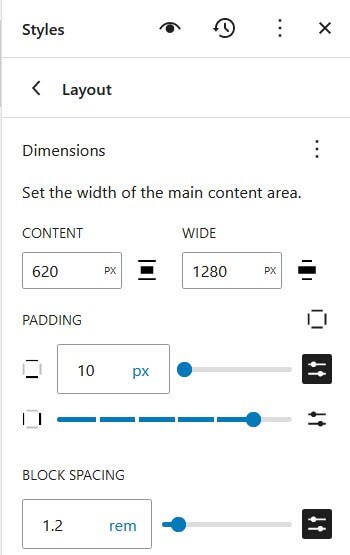
The main content area is set to 620px and the wide content 1280px by default. You can adjust these in this section.
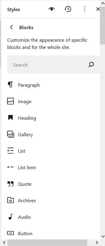
Finally, there is a Blocks section where you can customize the appearance of individual blocks.
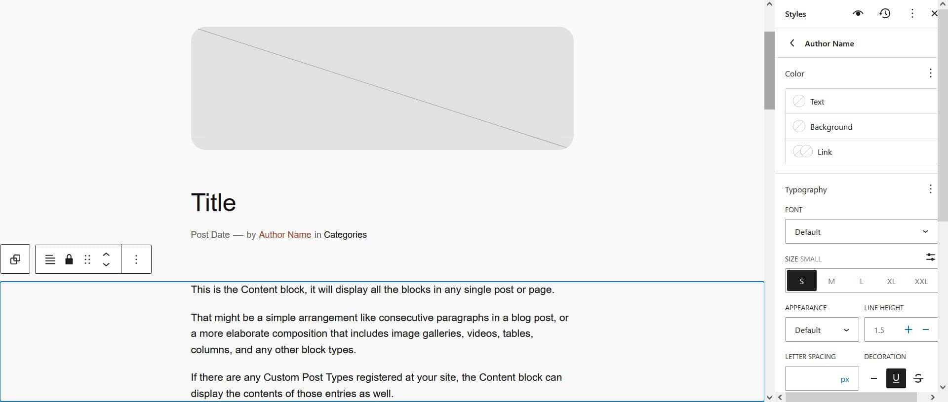
Here I’ve added an underline to the Author Name:
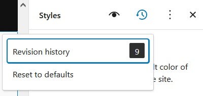
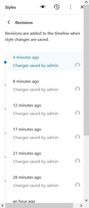
After you begin editing styles, you can access Revisions in the menu via the clock icon. You can view the history and restore an earlier version, or reset to defaults. Reset to defaults will undo all your changes.
Add prebuilt pages
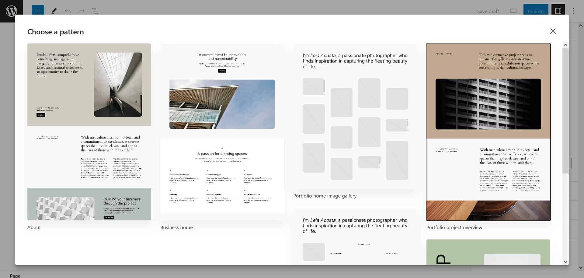
You can add one of the Pages patterns by creating a new page. The choice of patterns comes up automatically. Select the one you want and it will be inserted for you.
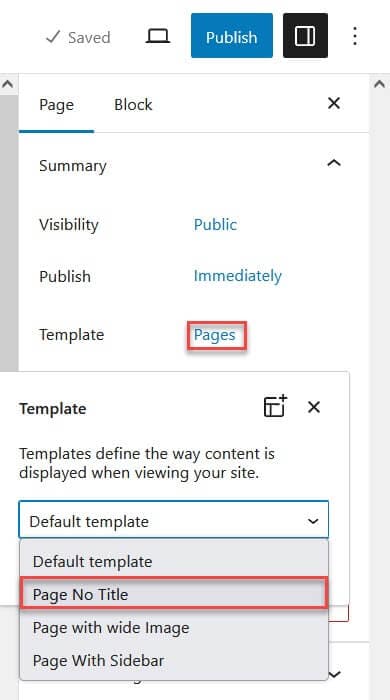
To change the template of a page to remove the page title, in the editor select the Template Pages then select Page No Title from the Default template dropdown menu. Save your changes.
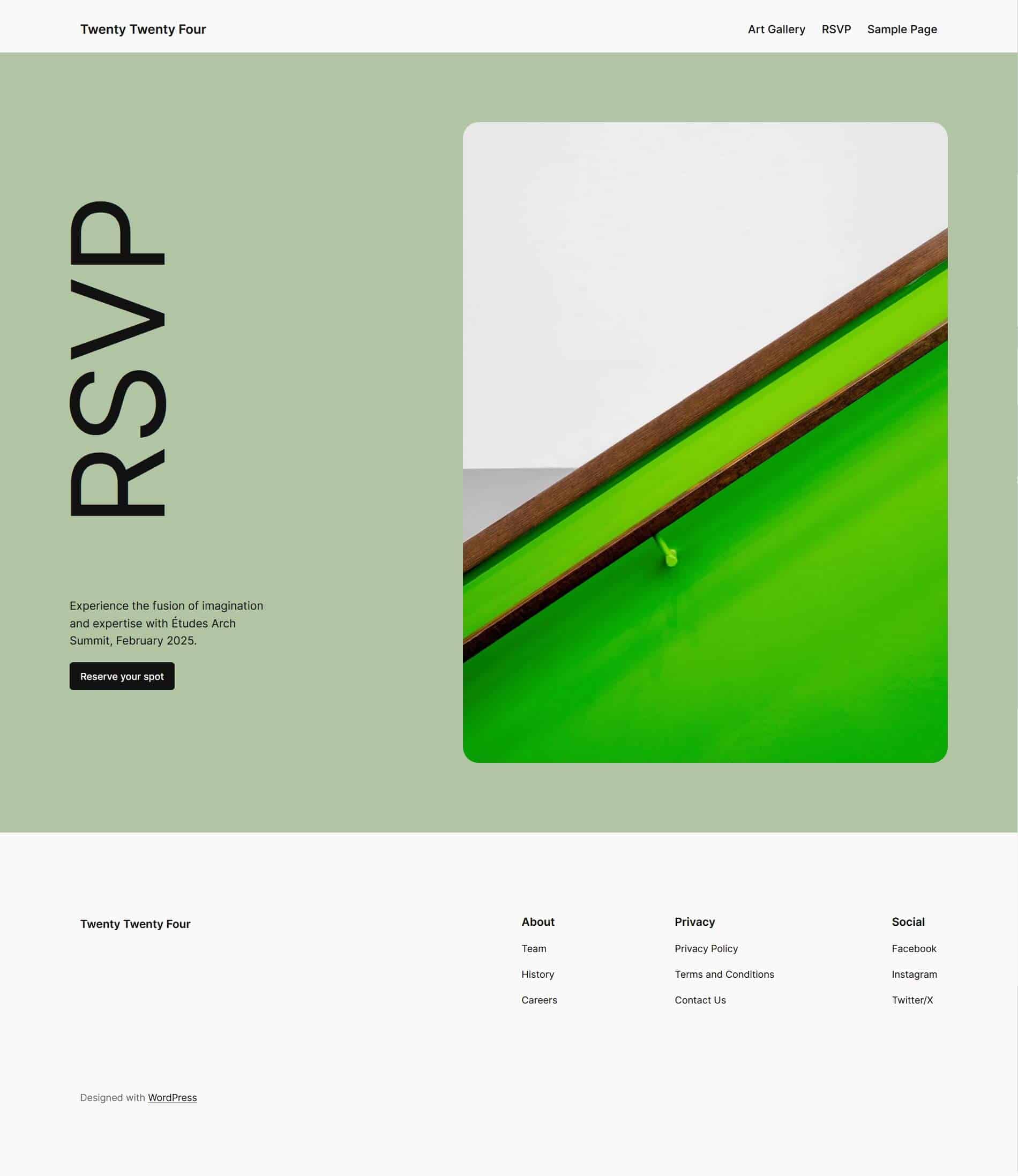
You should end up with a page without a title like this:
Add a featured image to a page
By default new pages in Twenty Twenty-Four which don’t use a pattern have a placeholder for a featured image. If you don’t enter anything in this area it won’t show when it’s previewed or published. But if you want to add one, here’s how.
Create a new page and select the Featured Image link.
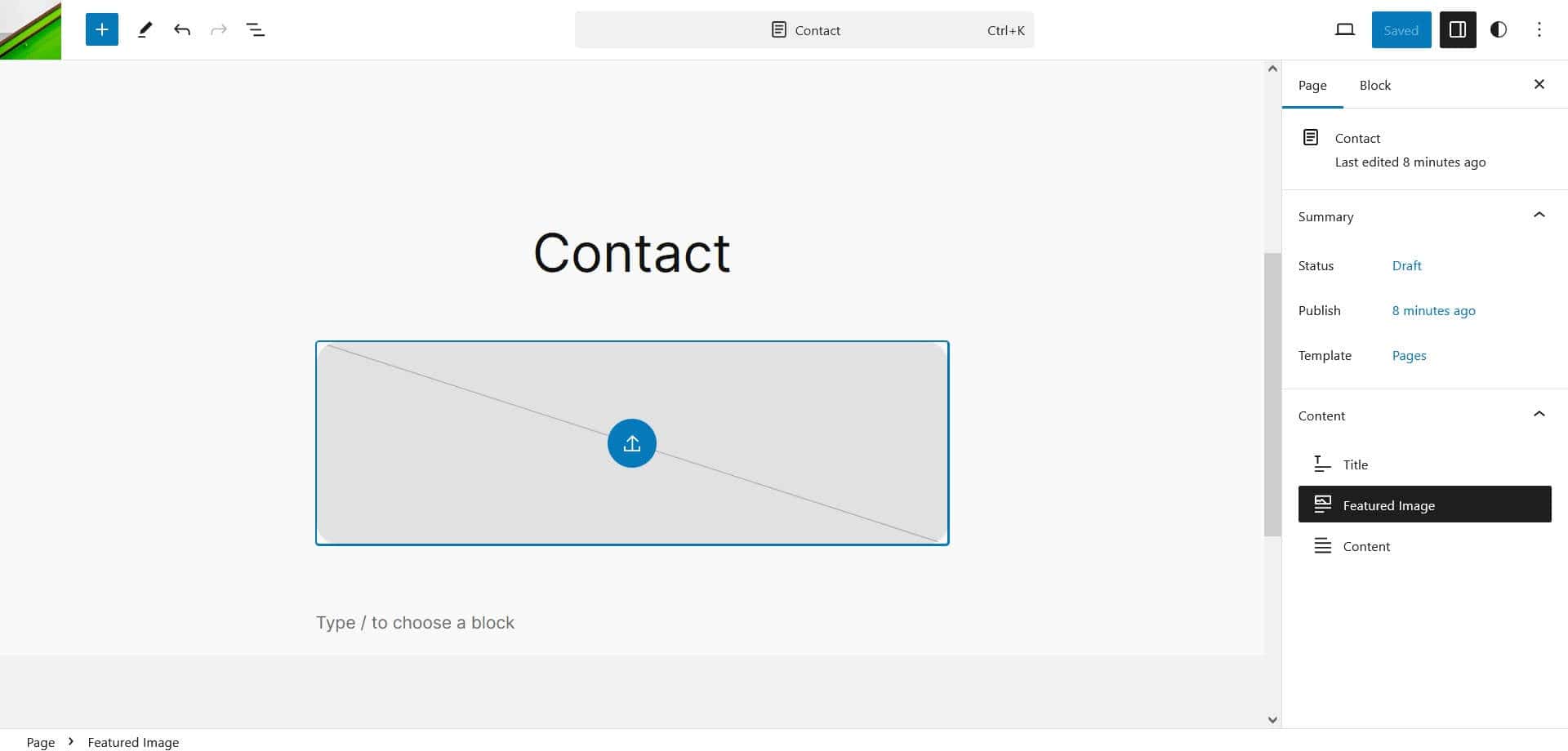
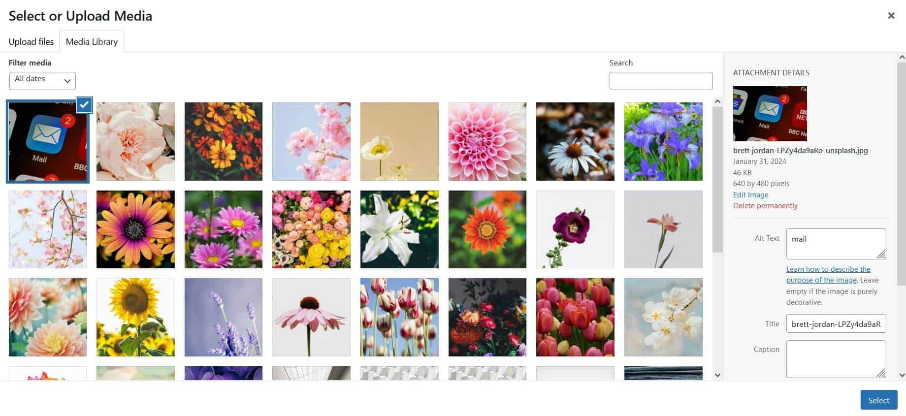
Click on the placeholder image and select or upload media. Press the Select button when you’re done.
Save the page.
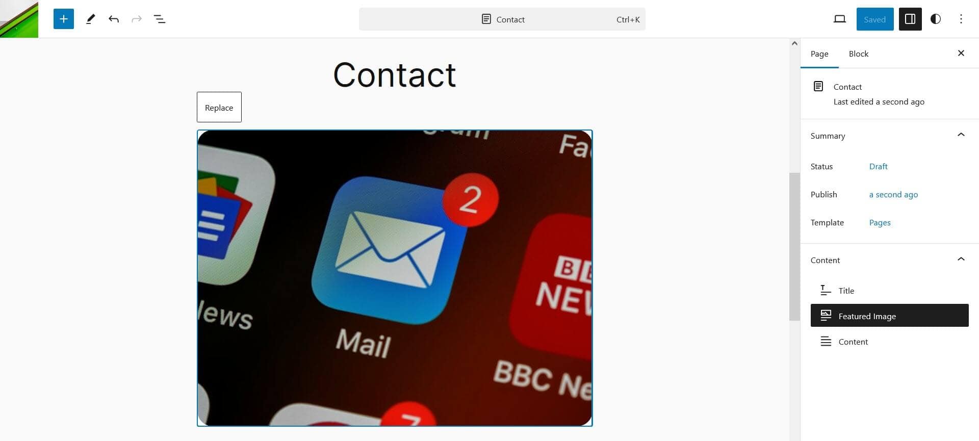
Featured images have a width of 620px, or whatever you have set your content width to. Their height is dependent on their aspect ratio.
Change the header and footer
If you want to make minor changes to the header or footer, you can edit them as you would anything else in the block editor. You’ll find them in the Patterns section, under Manage all template parts.
Add a logo to the header
To add a logo, go to Appearance > Editor > Patterns > Manage all template parts.
Select the Header and use the Edit link (the pencil icon).
Click on the logo placeholder image.

Click on the placeholder again, where the blue circle is.
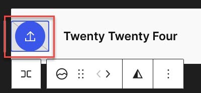
Pick or upload an item to the Media Library. Use the Select button when you’re done.
The logo will appear in the header. Edit if you like, then save your changes.

Replace the header or footer with another globally
Go to Appearance > Editor > Patterns > Manage all template parts.
Select the Header and use the Edit link (the pencil icon).
In the editor, toggle the block inserter on the top left (the plus button).

In the search box, type header.
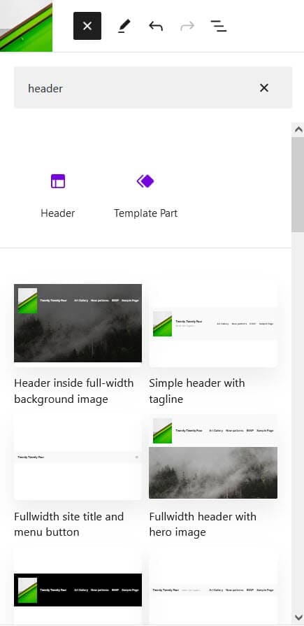
Select the header you want to insert it.
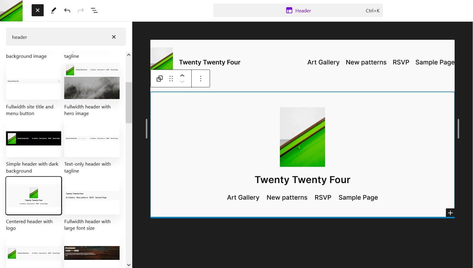
Close the block inserter (the x on the top left).
Using the List View, select the Group of the original header and use the three dots to open the menu. Then select Delete.
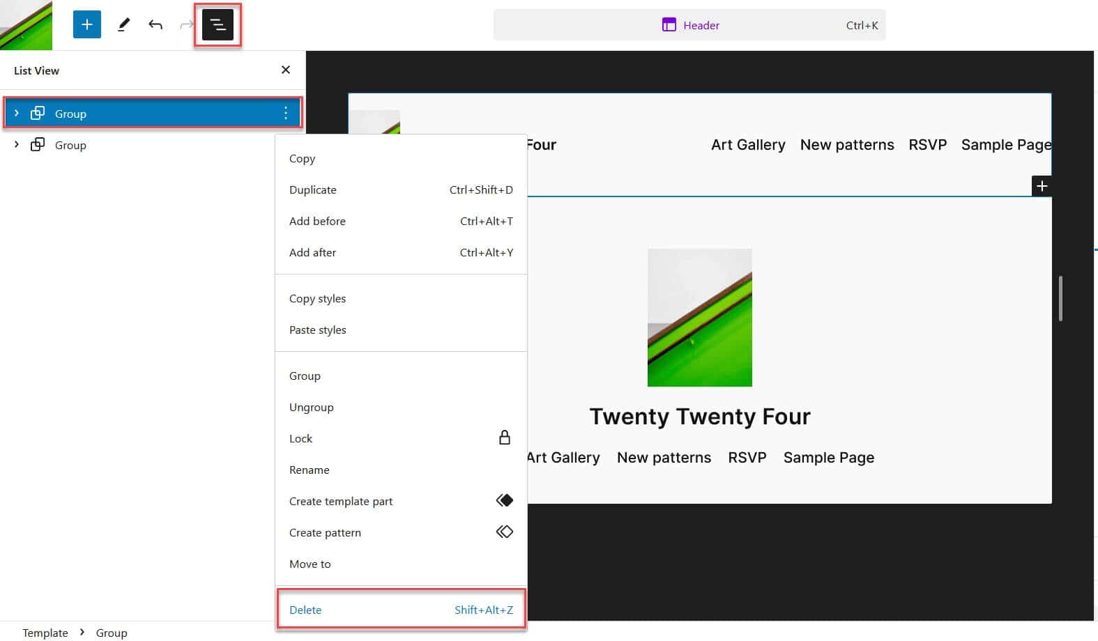
Save your changes. You can verify that the header is on all your site’s pages by visiting them.
The process is the same for the footer.
You can revert your changes by going to Appearance > Editor > Patterns > Manage all template parts > Header. Select the three dot menu and then Clear customizations.
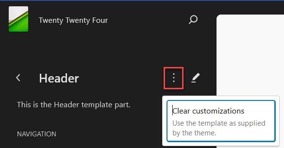
Change the header or footer only on a specific template
Go to Appearance > Editor > Templates and select the template you want. I’ve chosen Pages.
Select Edit (the pencil icon).
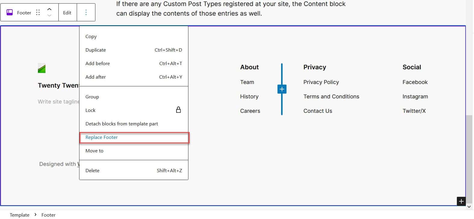
Select the area you want to change. I’ve chosen Footer.

The footer will be selected.
Use the three dot menu and choose Replace Footer.
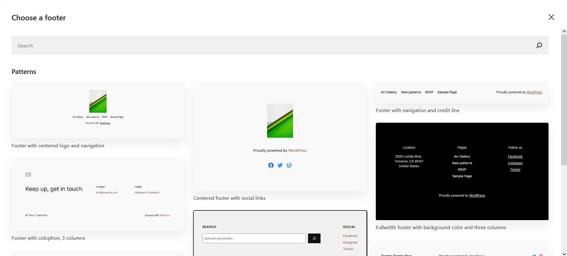
Choose a footer to replace it with.
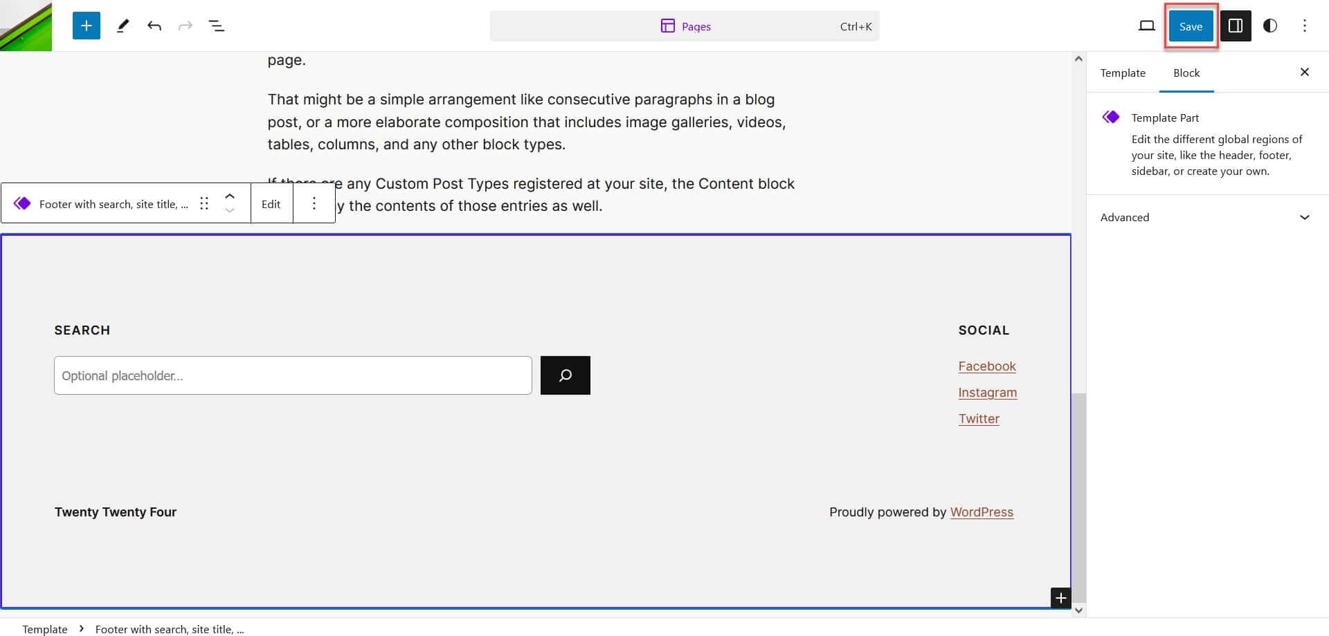
Save your changes. The footer will display only on pages using the Pages template.
Create and customize your own patterns
You can create brand new patterns yourself for your use, or you can copy and modify existing patterns. First, let’s learn how to customize an existing pattern.
Customize an existing pattern
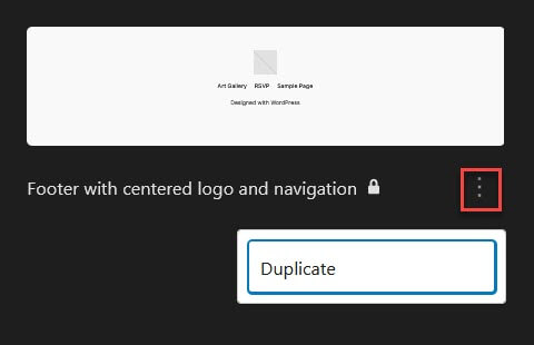
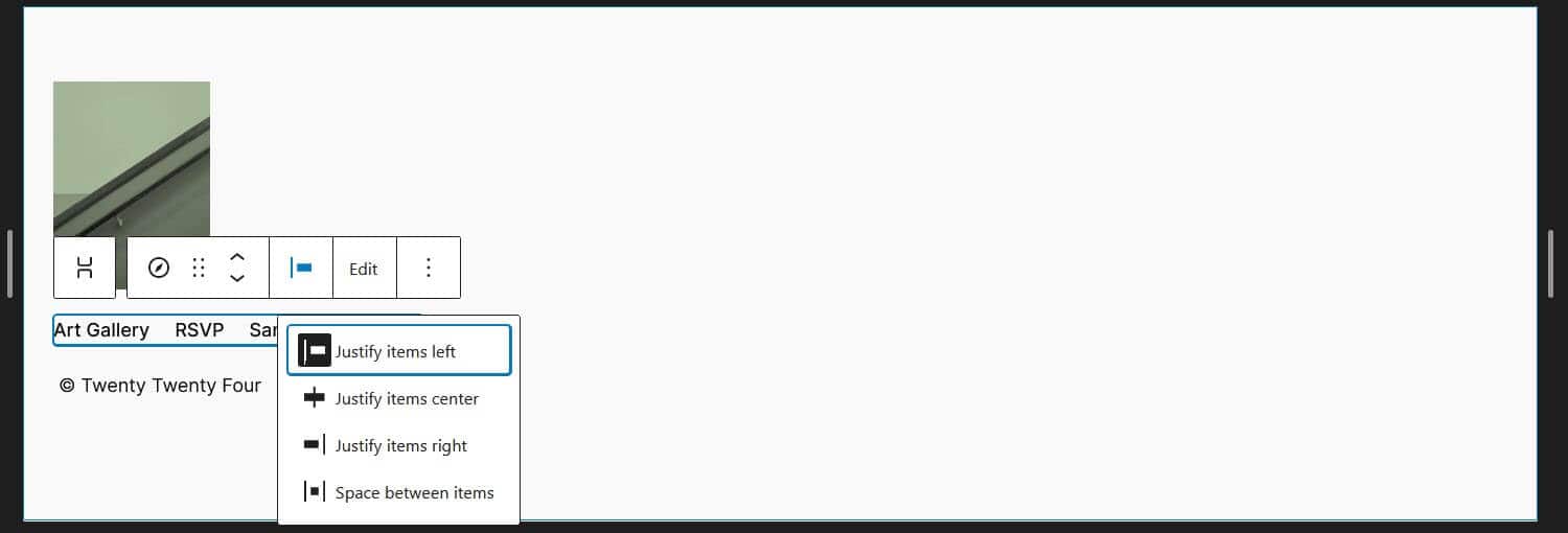
To copy and modify a pattern go to the list of patterns then click/tap on the three dots to the right of the pattern you want to use. I’ve selected the Footer with centered logo and navigation. Select Duplicate.
Then you can edit the pattern. I chose to left justify the content and add some left padding:
By default your pattern will be saved under My patterns. To rename it, select the pattern in the patterns library, find the three dot menu again and then choose Rename.
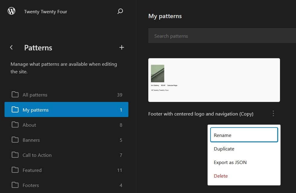
Type in the new name and save your changes.
Create a new pattern
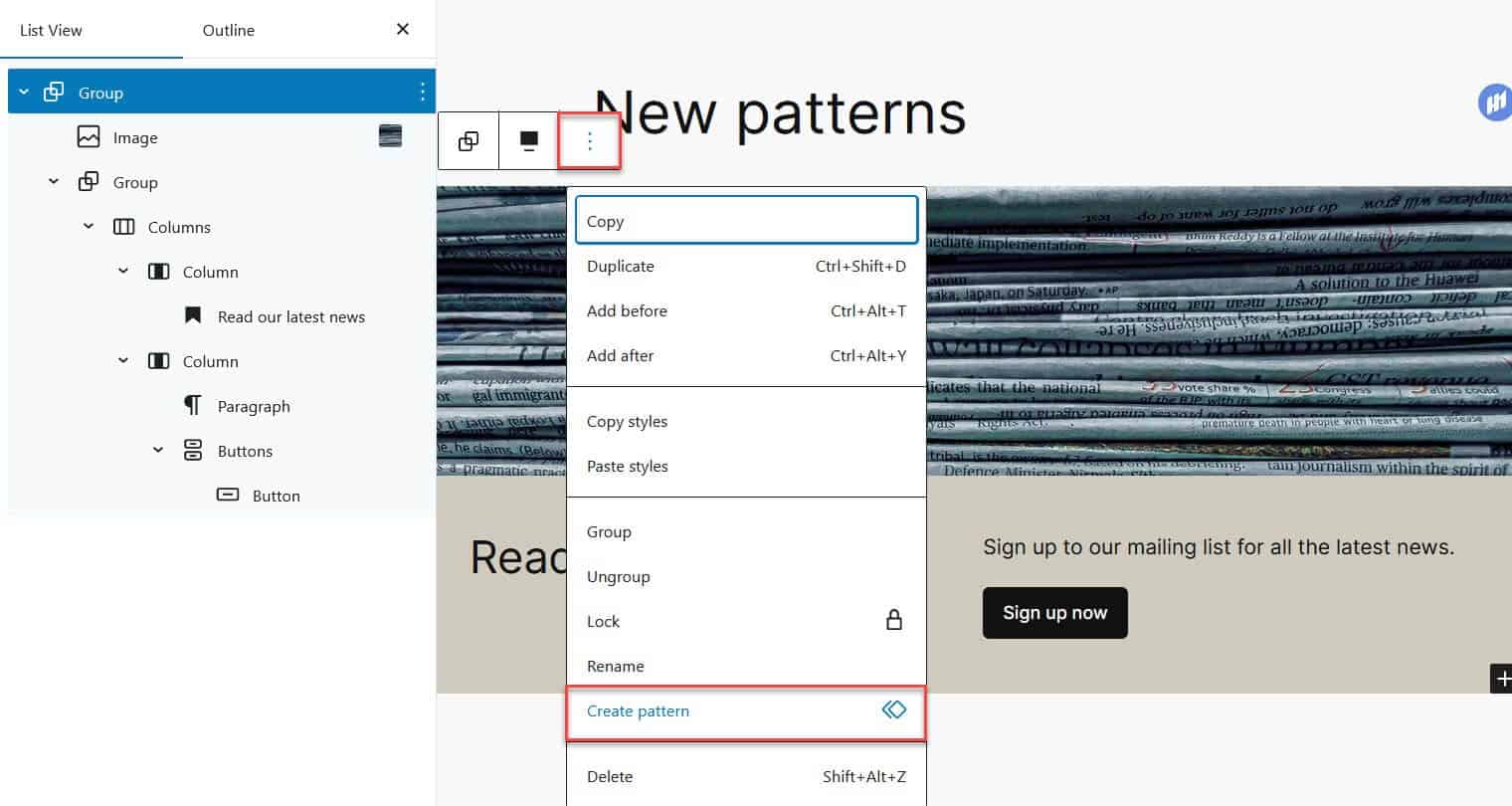
To create a pattern from scratch, add some blocks to a page then select them all and group them. Select the three dot menu by your group and then select Create pattern.
Fill in the name and category/ies of your pattern and Create it.
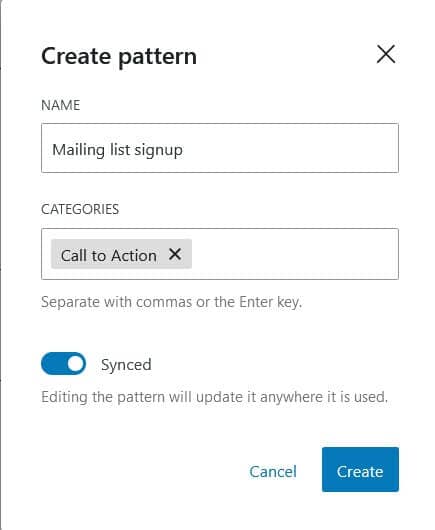
The Synced option means that wherever you use your pattern on your site, it will be replicated exactly. If you want to edit each instance individually, save it as an unsynced pattern by leaving this option off.
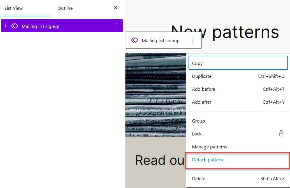
A synced pattern will have a purple background or icon indicating its status. To unsync it and make it editable in a post or page you can detach it by using the Detach option under the three dot menu. If you do this, the pattern will appear on the page as a collection of blocks which you can add to, edit or delete. Your synced pattern will still be available in the patterns library.
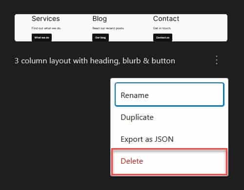
You can delete patterns from the patterns library by using the three dot menu for the selected pattern and choosing Delete. You will see a dialog box confirming that you want to delete the pattern.
Patterns you create are independent of the theme you use, so if you switch theme (say to Twenty Twenty Three) they will still appear in the patterns library but will adopt the style of the new theme.

You can even add your own patterns to another site. If you use the three dot menu for a pattern and select Export as JSON you can save it for reuse elsewhere.
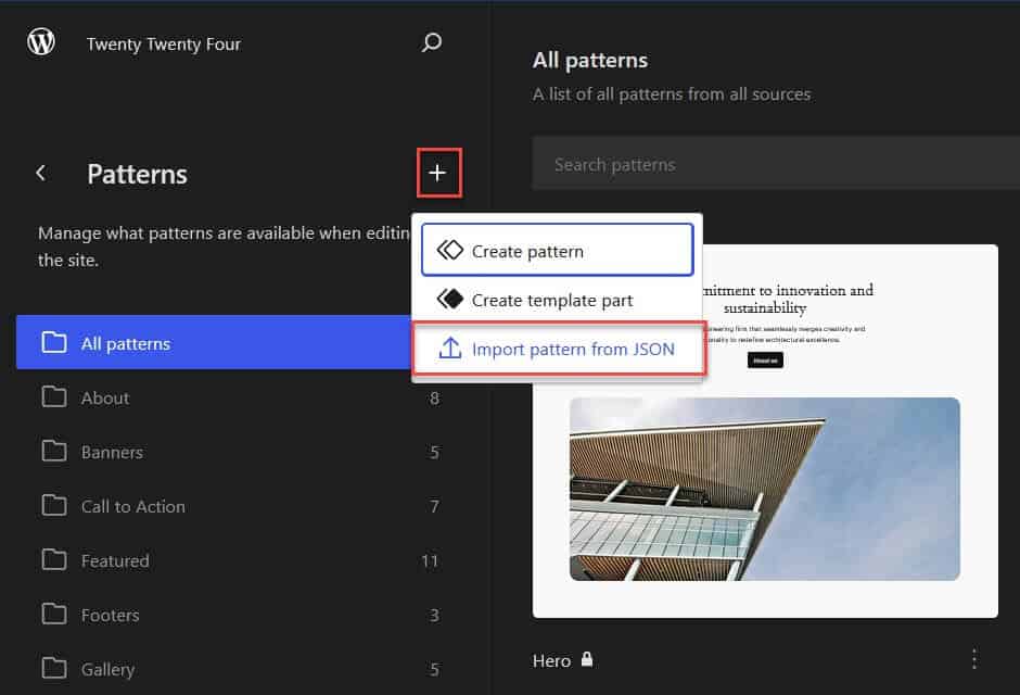
To add the pattern to a new site, use the plus button on the Patterns screen and choose Import Pattern from JSON. You’ll need to do this for each pattern you have saved.
Summing up
Twenty Twenty-Four is a powerful block theme that suits a variety of users – writers and bloggers, small business owners and creatives. It showcases the strengths of the block editor and patterns system. It looks like the most versatile WordPress default block theme to date.
If you’d like to see the theme in action, view a Twenty Twenty-Four theme demo
Will you use Twenty Twenty-Four theme? Let me know in the comments.


Hi Claire, an excellent post – very useful and informative.
Obviously the theme is geared up for use with the new WP editor (Gutenberg) but have you done any testing for sites that still use the classic editor?
Thanks, Graham.
No, I haven’t tested with the Classic Editor – something else to try!