What are accessibility overlays?
Accessibility overlays – also known as accessibility toolbars, accessibility widgets or accessibility menus – are additional code (typically Javascript) added to websites which offer a panel of tools to ostensibly make sites easier to use for disabled people.
Overlays typically have controls which may include increasing the font size, darkening contrast, changing the font and making focus indicators more visible. They are often, but not always, hidden from view initially behind an icon which may be a human figure in a circle or a wheelchair icon.


Some overlays now use AI to repair accessibility issues on web pages.
Overlays are made and marketed by a number of companies. According to stats from BuiltWith.com, popular overlay solutions include:
- AccessiBe
- AccessibleWP Toolbar
- Ally
- AudioEye
- EqualWeb
- One Click Accessibility / Pojo Accessibility
- UserWay
Who uses accessibility overlays?
Overlays are used by a range of websites, from big companies and ecommerce sites to nonprofit organizations.
Some big name users of overlays include:
- AMD
- Belkin
- Boden
- Boohoo
- Dolce & Gabbana
- Ferrari (online store)
- Fiverr
- Kodak
- Lenovo
- Payoneer
- Playmobil
- Salvation Army (Canada)
- Westfield
What are the advantages of accessibility overlays?
Fast and simple to implement
Most overlays are installed by adding a code snippet to a website, or installing an app or plugin. In addition, you may have to register an account and sign up to a plan on the overlay company’s website. After you have done that, you can begin customizing and using the widget on your website.
Provide quick fixes for some accessibility issues
Overlays can fix some accessibility issues that may occur on a website, such as providing a high contrast version which may be easier to read.
Another use of an overlay is to enable users to stop animated or moving content on a website. This is helpful because moving content can trigger vestibular disorders.
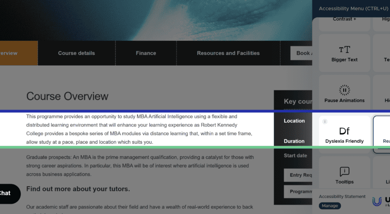
A feature some users may find useful is a reading mask, which makes most of the content greyed out so that the user can focus on one section at a time. This may assist people with visual or cognitive impairments.
What are the disadvantages of accessibility overlays?
They don’t guarantee full accessibility
One major problem with accessibility widgets is that they do not guarantee full accessibility compliance, though they are often marketed as doing so.
Full compliance with accessibility guidelines or laws is not possible because an overlay can only address a subset of accessibility issues, not the full list. For example, an overlay tool cannot fix missing form labels, create captions for videos or provide reliable meaningful alt text for an image. Overlays also do not change the underlying code of a website, so they are a sticking plaster for accessibility at best.
As a result, sites using overlays can still be sued by users for accessibility violations. One example is Murphy vs Eyebobs in 2021. The Eyebobs eyewear retail site used the AccessiBe overlay but this did not fix all of the site’s accessibility problems. Two accessibility issues that were highlighted in the lawsuit were that a modal dialog offering a discount for signing up to their email list was not properly described for screen reader users, and that the star ratings for products were also unavailable to these users.
In the settlement of the suit, Eyebobs agreed to the following:
- Create an accessibility coordination team
- Perform an accessibility audit
- Create an accessibility statement and keep it updated
- Train staff in digital accessibility
- Achieve accessibility compliance within three years.
Interestingly, the Eyebobs site no longer uses an overlay.
Another example is the online florist Bloomsybox. They bought UserWay’s overlay thinking it would protect them from accessibility lawsuits. Nonetheless, Bloomsybox got sued by a blind user who could not use their website. As a result, Bloomsybox filed a class action complaint against UserWay, and no longer use their product.
Some accessibility issues that aren’t fixed by overlays
Here are a few examples I found.
The dropdown menus on the Panaya website do not work with the keyboard, despite the presence of the One Click Accessibility overlay. They can only be used with a mouse.

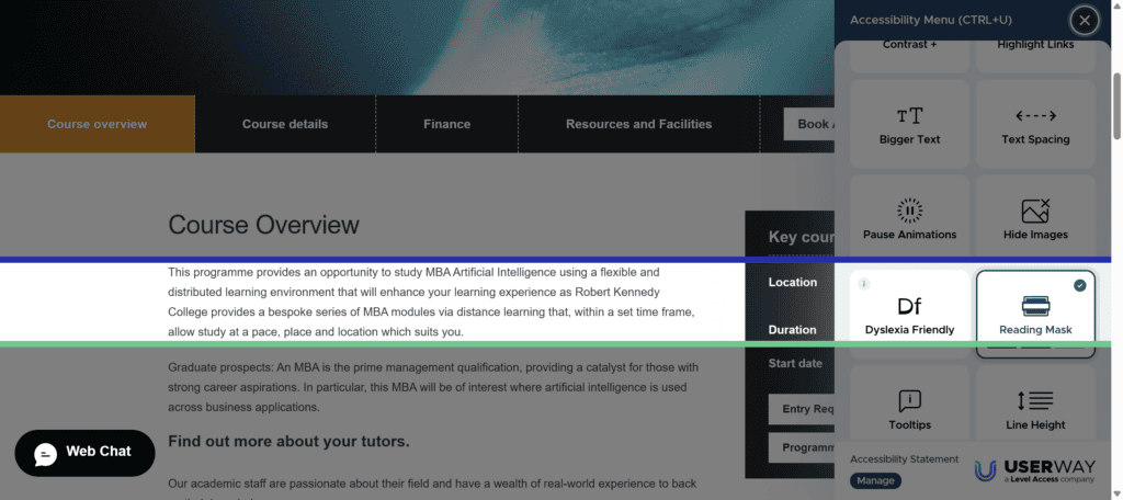
When using the keyboard to navigate through the US Sailing website, the About section of the mega menu isn’t dismissed when focus leaves it, so that it’s possible to navigate to links further down the page without them being visible to the user. The UserWay widget doesn’t prevent this from happening.
Also on the same website, there are 4 embedded iframes (for example, Instagram feeds), which do not have title attributes. This means that screen reader users won’t know the purpose of the iframe content and whether they wish to engage with it.
Black Butte Ranch uses the OneTap widget, but a keyboard only user can’t access it, or any other content below the Activities links. They are caught in an endless loop of Activities.

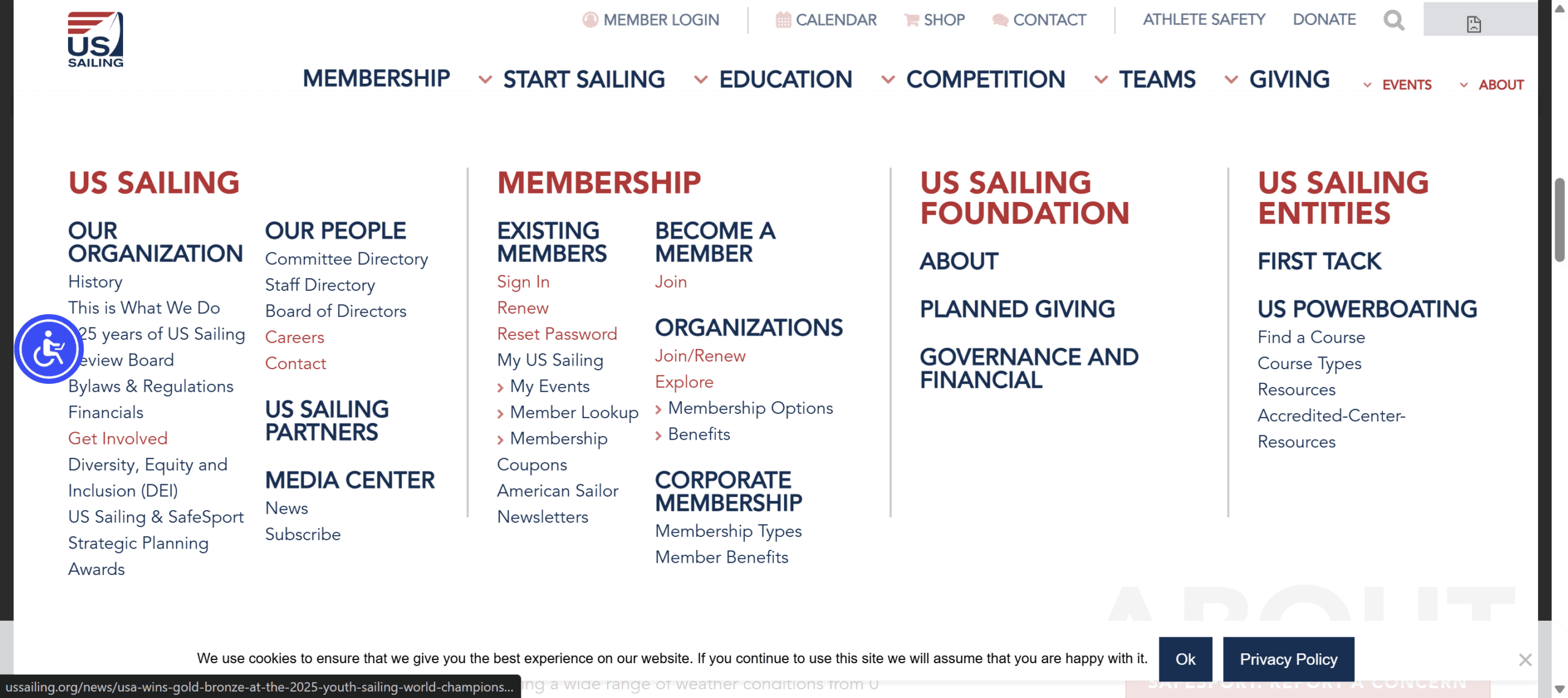
The keyboard focus style on Ditaly’s website is invisible, and enabling the Outline focus option in the Ally overlay doesn’t fix the problem.
Another issue with keyboard focus is on the Steinel site. Tabbing beyond the search icon (keyboard focus is shown on it in the screenshot below) takes you into a keyboard focus trap where you get stuck and can’t go forward or back. You are stuck in the search, with no way to progress further down the page. The only way out is by pressing Enter, which will take you to a search results page with 0 hits. This is not a good user experience.
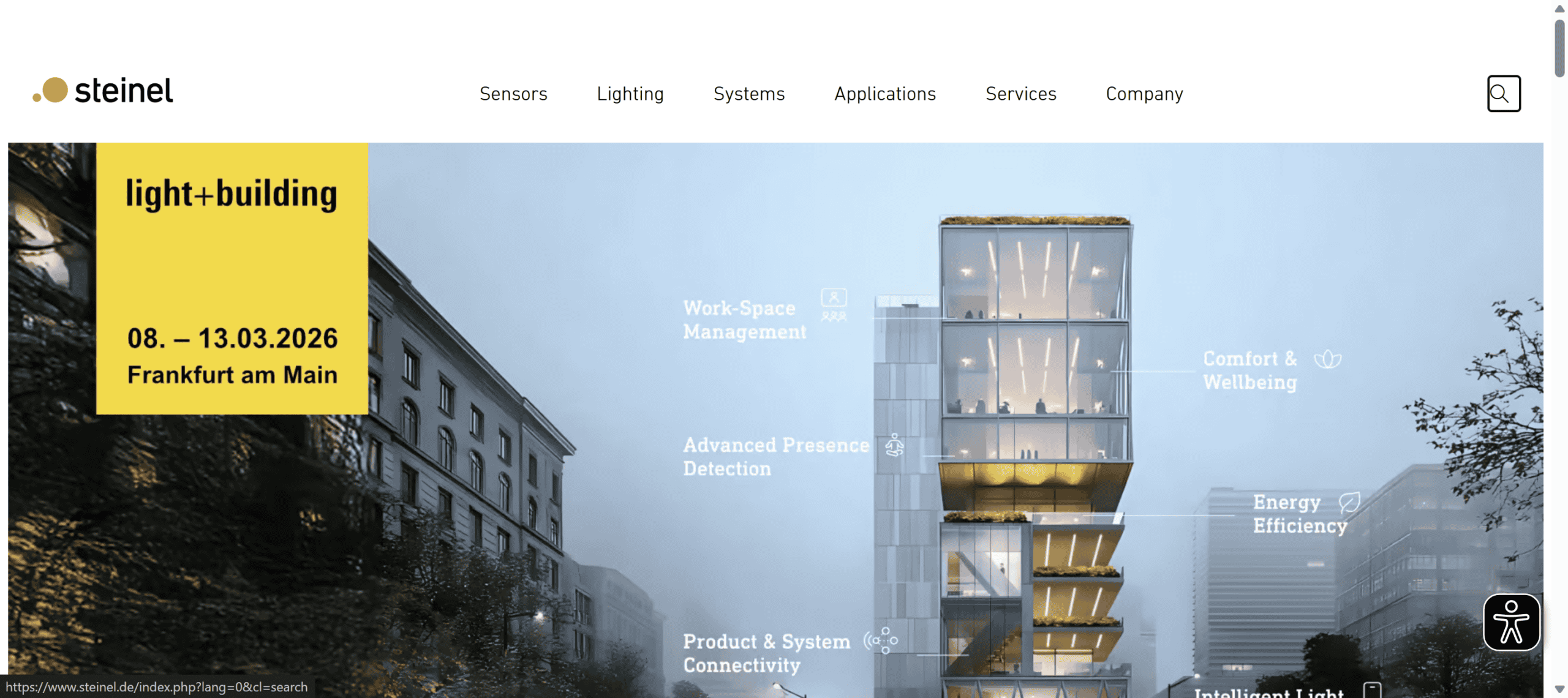
There is technically a workaround for this in the Eye-Able overlay, but first you have to find and enable the Keyboard Navigation option, which is hidden under More Functions. Then you can use other keyboard shortcuts such as H, G or K to navigate further down the page. But how many keyboard users would figure out how to do this?

On the Gallica Wine site, some of the images have the filenames as alt text. Even after enabling AccessiBe’s screen reader mode, the filenames are still read out for these images.

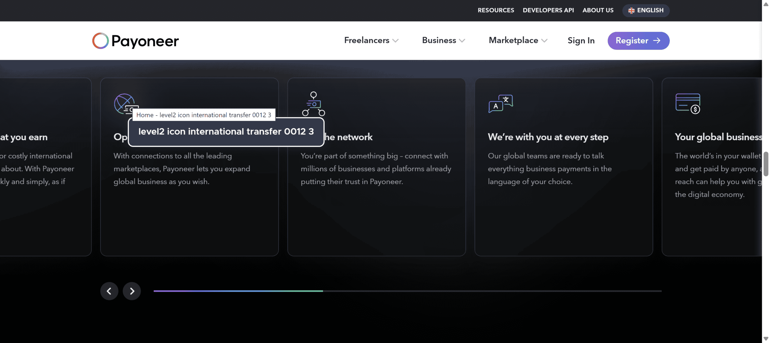
The alt text for the SVG icons on Payoneer’s home page is nonsensical e.g. “level2 icon multiple payment 0038 3”, despite the presence of the UserWay overlay. (In this case, the icons are decorative, so they should have null alt text instead.)
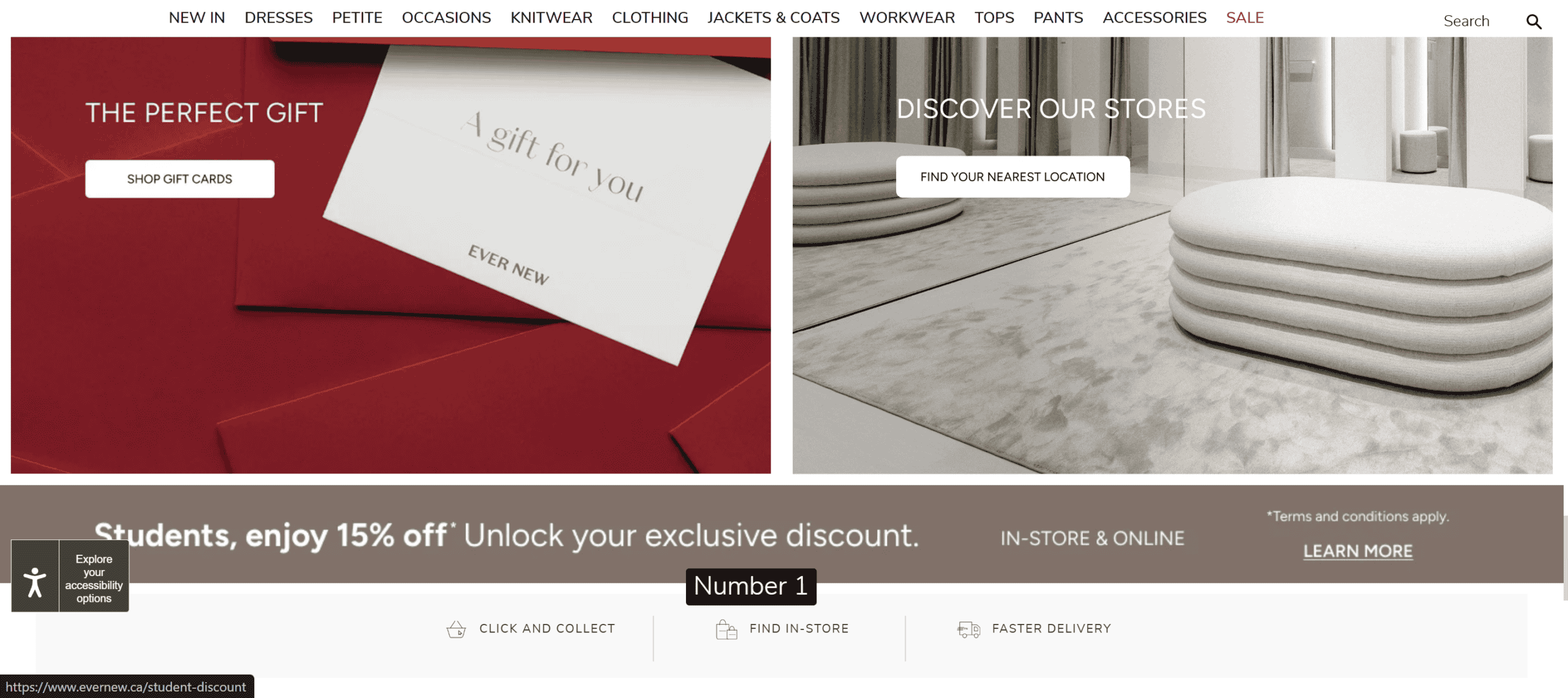
EqualWeb’s Image Descriptions feature shows the alt text for images as a tooltip next to the image, but it can’t change the text if it is poorly chosen. The alt text for the student discount banner on this ecommerce site is “Number 1”, which means that a screen reader using student will probably miss out on the 15% student discount.
The Partner form on Yotpo’s website does not work well with the NVDA screen reader. It’s not clear what the combo boxes in the Additional Information section are for, as the questions are not read out, just the possible answers. In addition, two of them have the exact same options – Main eCommerce platform you work with? and Additional eCommerce Platforms.
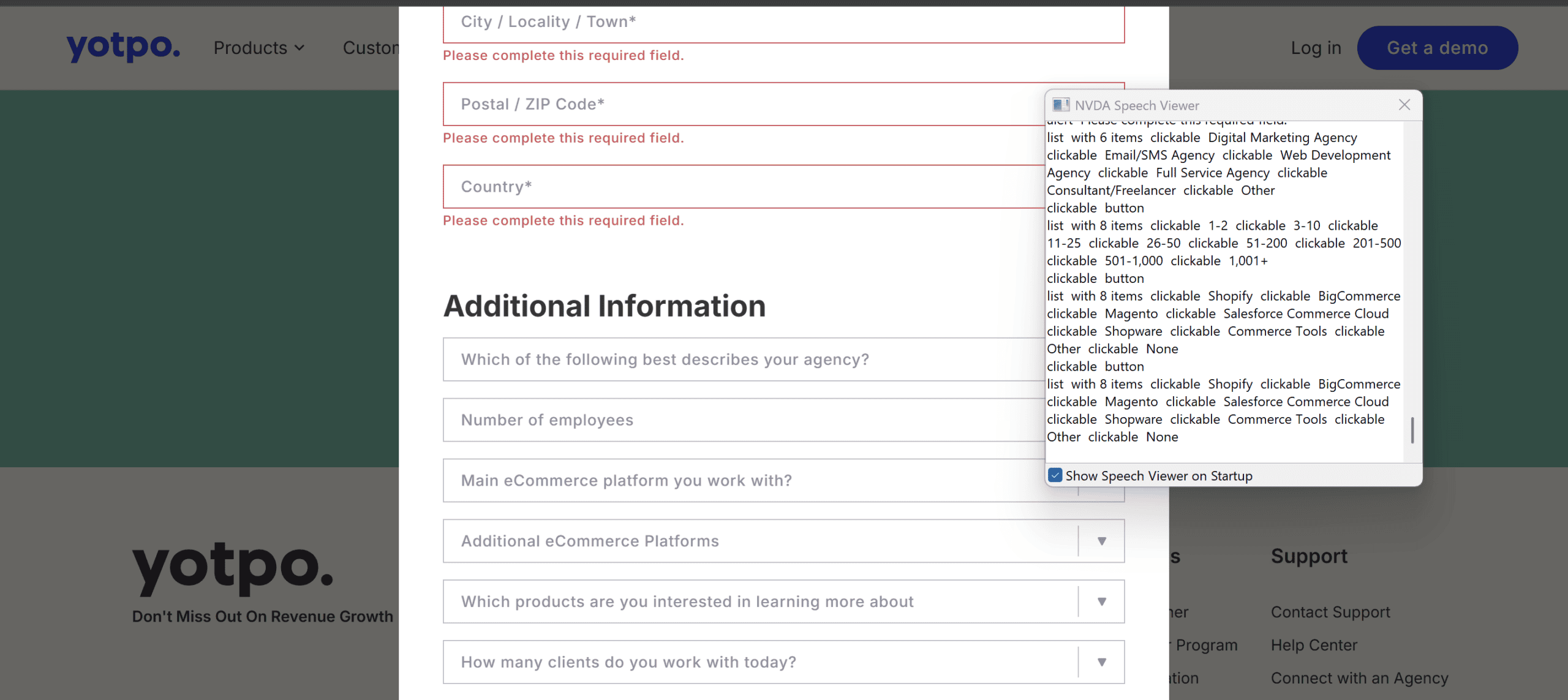
You might think that turning on the EqualWeb overlay’s Screen Reader Adjustment setting would fix this, but it actually makes it even worse. The combo boxes are now read as “Empty legend grouping clickable Open button” which is completely unhelpful.

The fundamental problem is with the code. The label for the <select> element has instead been marked up using a <span> tag, and the label is not properly associated with the <select> element.
OnSite LeadGen has a problem with their ROI calculator forms. The form labels are marked up as <div> elements, not <label> elements, and they are not programmatically associated with their controls. This means that only the numbers in the fields are read out to anyone using a screen reader, with no indication of what they represent. None of the tools in the AllAccessible overlay can fix this.

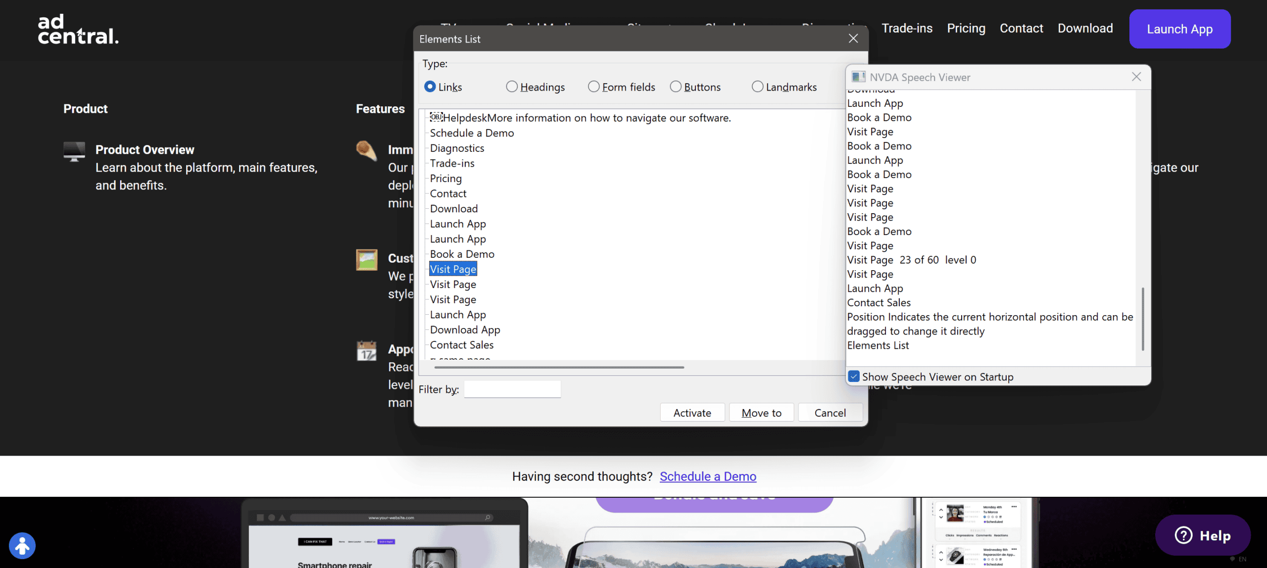
On the AdCentral website, some links have the same link text but different destinations despite the presence of an overlay. This is confusing for screen reader users, who won’t be able to tell where each link would point to.
Some sites still have plenty of accessibility issues, despite having overlays. For example, the SEIA site shows 61 errors when analyzed with the WAVE accessibility evaluation tool.

The Caddys site has 52 errors, 35 contrast errors and over 1000 alerts when tested with WAVE.

Some of these issues might be mitigated by using an overlay’s features, but not all.
Don’t load across all browsers
Some overlays don’t work across certain browsers. For example, Firefox has Enhanced Tracking Protection (ETP) built-in as a privacy feature. When enabled, this blocks third-party scripts and tracking cookies, which includes some overlay content.
While testing, I found that with ETP enabled, the AccessiBe and Acquia PageAssist overlay icons do not show at all on Firefox on desktop.
Also, the UserWay widget doesn’t load properly when activated on some websites using Firefox plus ETP.
AudioEye’s icon doesn’t show on Firefox with ETP compared to Chrome. There is an option to Deactivate AudioEye Toolbar but no icon is visible, and the button does nothing.
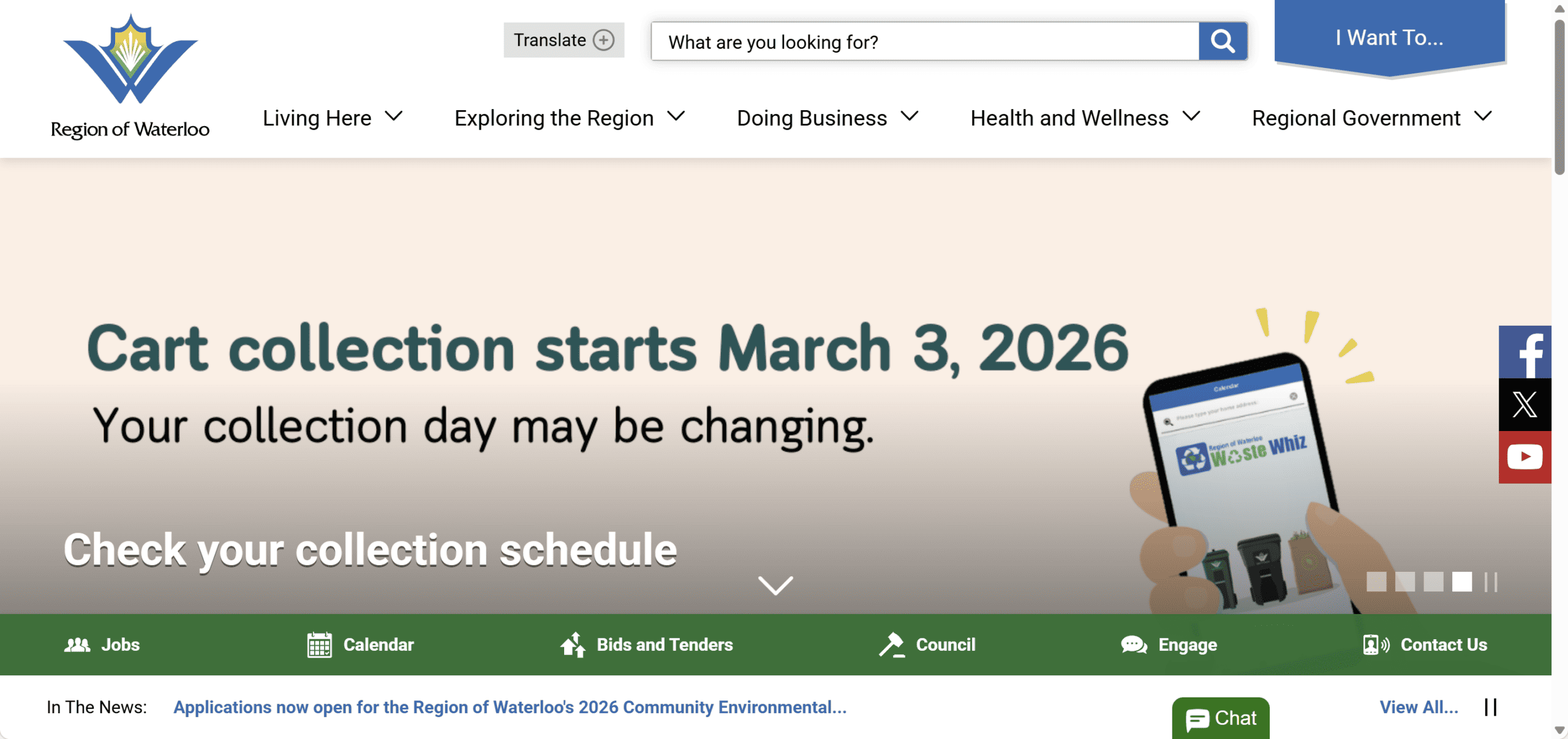
I also found a handful of websites that do not show overlay icons in Comet browser. One example is the Region of Waterloo site. In Chrome browser the purple overlay icon is in the bottom left corner, but it doesn’t show up on Comet.

Don’t work well on mobile devices
Overlays also do not work well on mobile devices, as they take up most of the screen real estate when being used.

Nielsen Norman Group reports that overlays on mobile sites are ignored by and found not helpful for screen reader users:
When we brought screen-reader users to websites with these accessibility menus, we waited to see whether they would discover them by themselves. Although participants did come across these menus as they completed tasks, not one user opened the menus of their own accord.
Our test led us to believe that they do not significantly improve the accessibility for users of screen readers. As one blind user put it, “I hate [accessibility menus] because […] I think they make companies feel like they don’t need to actually work on making something accessible […] it is not a substitute for actual accessibility testing and, to me, it feels like just a Band-Aid that can almost make it worse sometimes.”
Duplicate existing functionality
Many users use assistive technology to browse the web – this could be a screen reader, voice software, a specialized keyboard, a switch or a pointing device.

Operating systems have built-in accessibility features such as screen readers, high contrast colour schemes, or large cursors. Some overlays replicate this functionality so they are not really needed by users who have already activated them in the OS.
Another problem with overlays is that they can actually interfere with assistive technology.
Reddit user softwarediva says:
As both a user of accessibility tech and a software tester by profession, overlays are not worth the squeeze. I’ve had overlays disable my screen reader, reset my color preferences, and cover a good portion of my screen (unable to be minimized). All of those and others make it so difficult to interact with content that a lot of users will just not bother with those sites.
In a study of overlay use, a blind user who was used to using the JAWS screen reader said:
“It was some type of attempt by the software developers to build in some accessibility that includes voice, reading the screen or making their user experience more accessible that interfered with JAWS. I’ve noticed that on some PDF documents where it starts to read aloud the document and then there’s both that voice and the JAWS voice..[….] [the overlay accessibility features] were very different from JAWS, and that was not helpful because… it interferes with JAWS or it is difficult to navigate through to figure out how to use that overlay.”
Discoverability
Overlays typically have a link or button which opens the toolbar when activated, often showing a person or a wheelchair icon. Some overlays also offer the option to open the overlay tools when a user tabs through the web page.

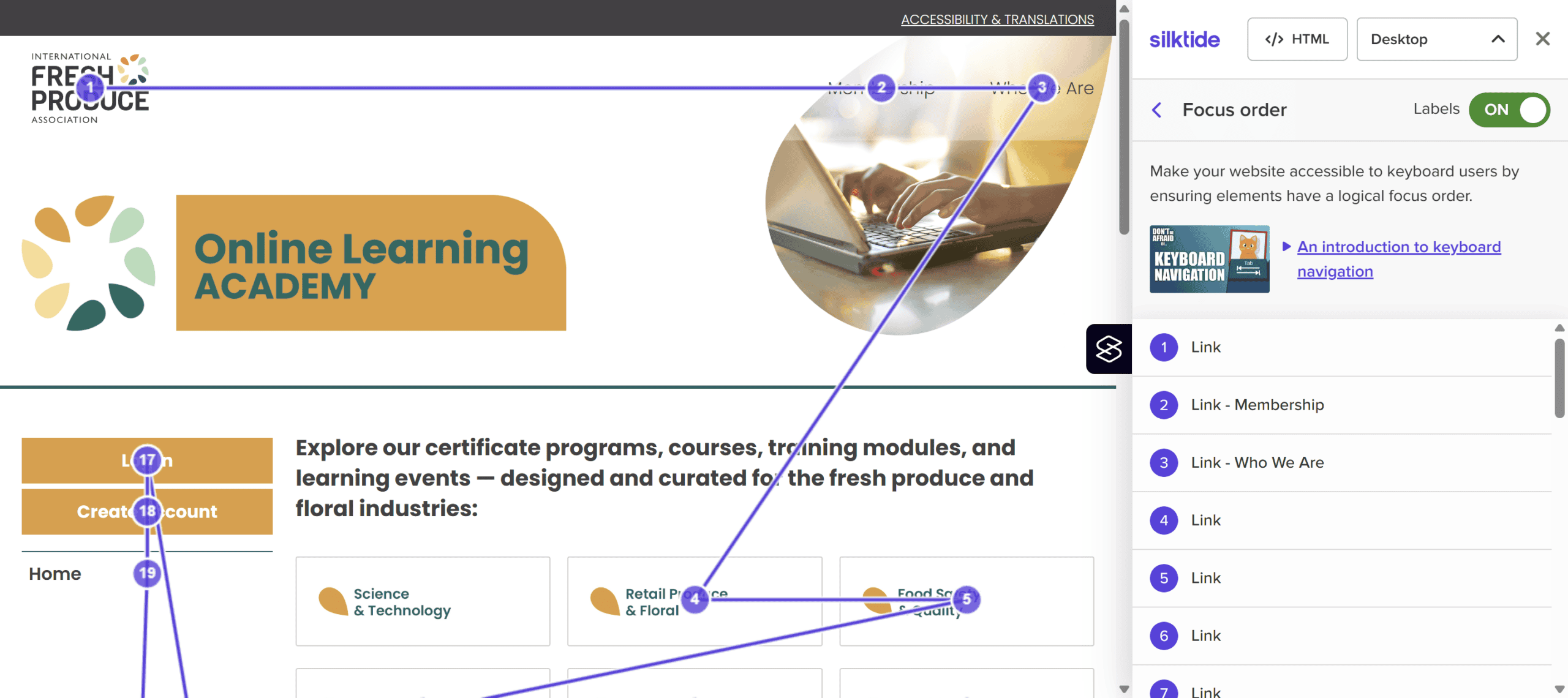
The focus order is the order in which actionable elements on the page (links, buttons and form controls) is accessed by using the Tab key. Most overlays insert themselves early in the focus order so that they are found by users who rely primarily on the keyboard to operate websites.
There are a few exceptions. The OneTap overlay trigger tends to be near the end of the focus order, so might not be discovered by keyboard users.

The Acquia PageAssist overlay button is also at the end of the focus order on most sites I tried.
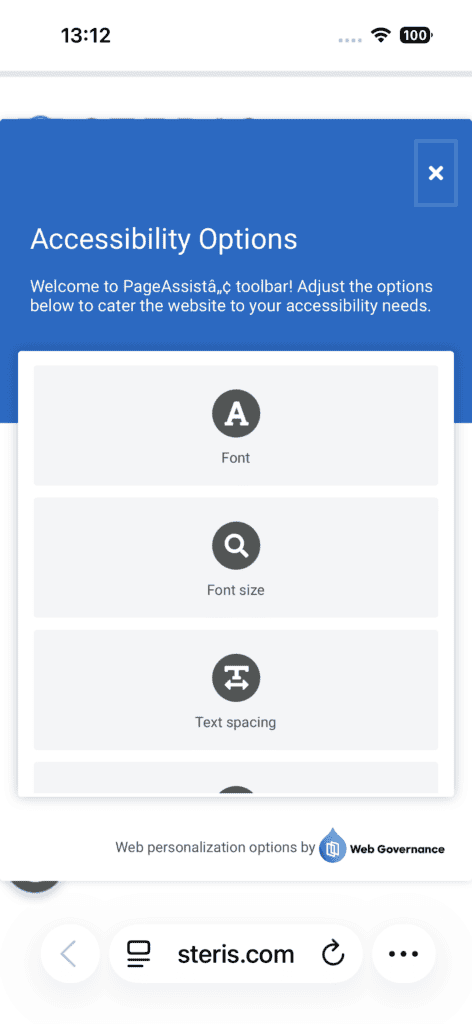
The AudioEye overlay tends to be accessed via a link to a site’s Accessibility Statement page, which is usually in the footer. To use the tools in the overlay a user needs to:
- Navigate to the Accessibility Statement page.
- Activate the Accessibility Help Desk button.
- Click on the icon or navigate to it and press Enter.
- Click on the Personalization Tools tab, or from the Report Issue tab, use the right arrow key to select the Personalization Tools tab and then select a tool.
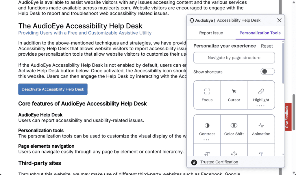
To me, this seems a rather complicated way of helping to improve accessibility, and a lot of people simply won’t bother.
Worst of all are the icons for the AllAccessible and Ally overlays; they are not keyboard focusable at all. This means the overlay will exclude any users who could not reliably use a mouse, which rather defeats their purpose!
In another case, a link to activate the overlay was not keyboard accessible, as shown below. The Accessibility & Translations link on this site is not in the focus order, as revealed by Silktide accessibility checker. So yet again, the toolbar can’t be used unless the user can use a mouse to open it.
Privacy concerns
Some overlays can detect the use of assistive technology, revealing that the user has a disability, and may also store this information in cookies without user consent.
For example, an overlay may ask or recognize if a user is using the keyboard or a screen reader, and it then automatically enables these profiles in the widget.

Some features of overlays don’t work well or have minimal impact
Some overlays have a “legible font” option which changes the font to a sans-serif version, but as most websites use sans-serif fonts anyway, it usually makes little difference.
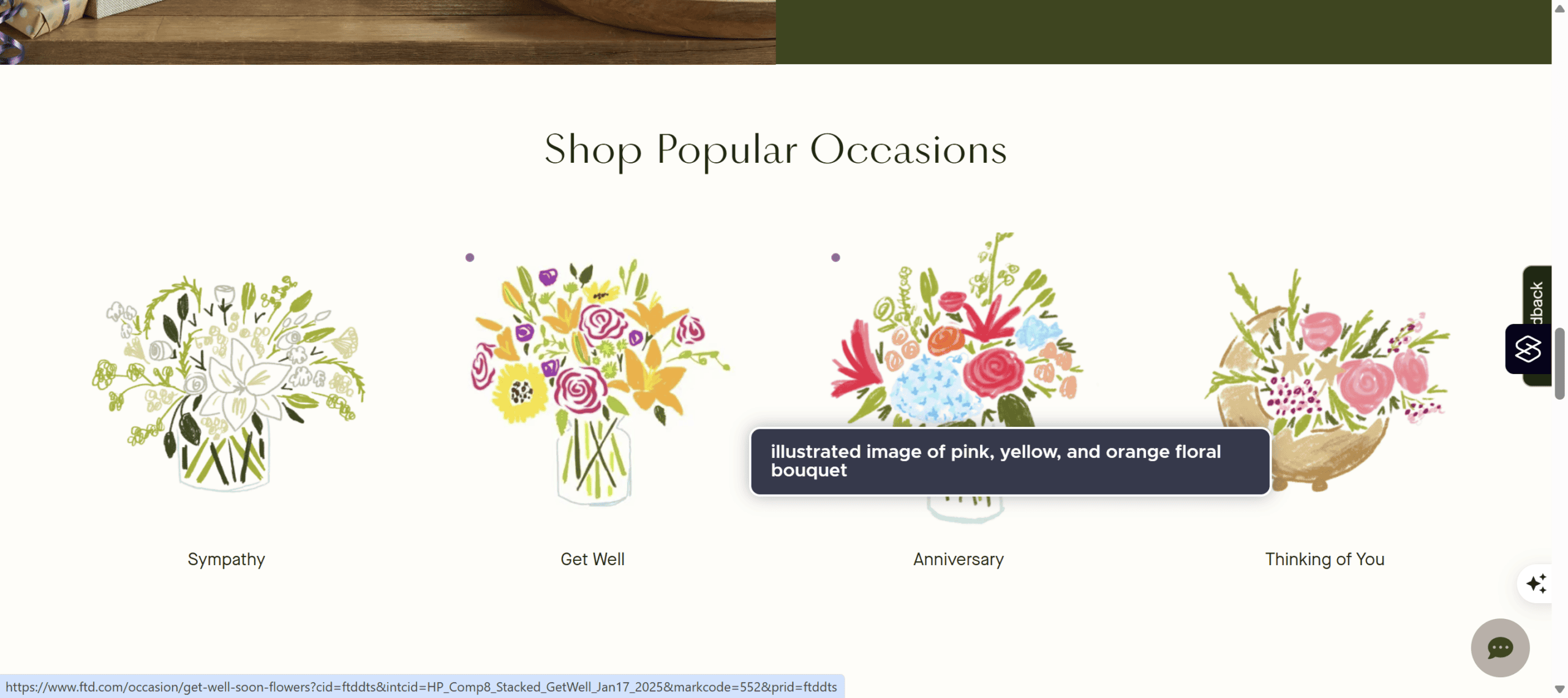
UserWay’s Tooltips option shows the alt text for an image. On the FTC site, however, the image is a link to a product category, so the alt text should reflect the destination of the link (Get Well Soon), not a description of the picture. Better still would be to combine the image and the link below it into one link, and have null alt text on the image.
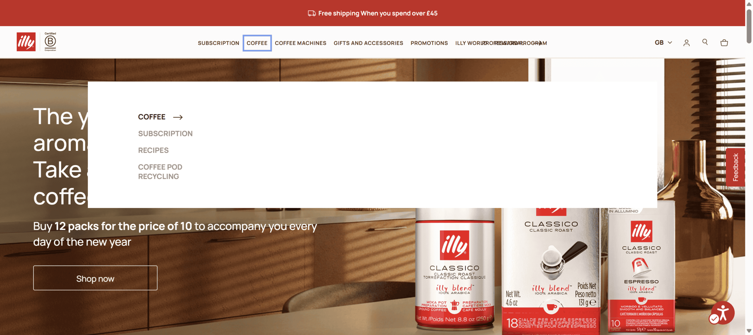
Illy GB’s site has a mega menu which is only visible to users navigating via the mouse, not the keyboard.
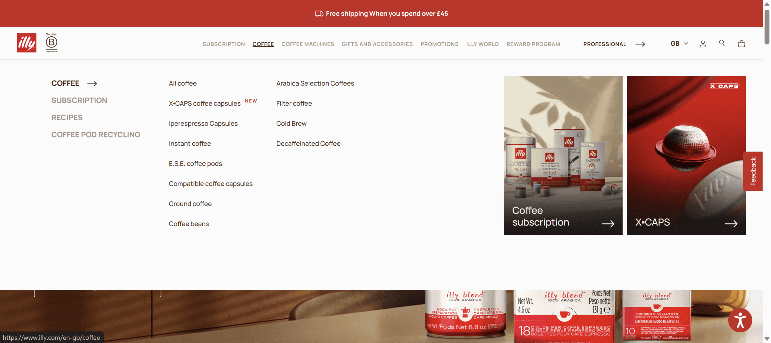
If the Keyboard navigation option is enabled in the AccessiBe overlay, the menu becomes visible, but it contains far fewer options than the regular mega menu.
An overlay’s screen reader option will read out page content when a user may already use a screen reader. If this option is toggled on by a screen reader user, the content will be read twice – not very helpful!
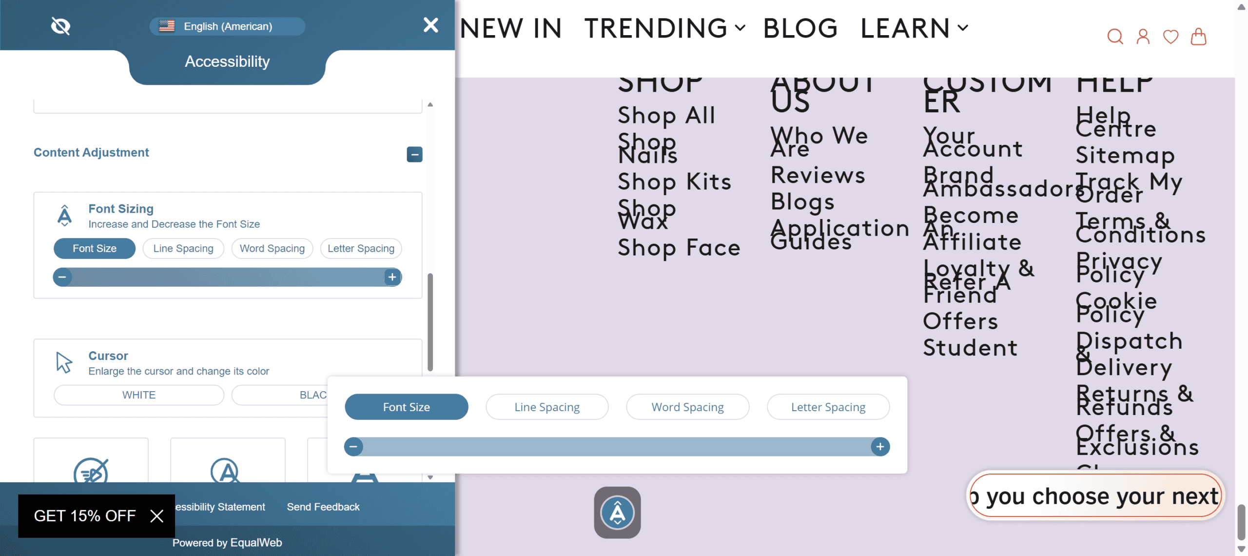
The Increase Text option on the overlay on Argos Multilingual’s site does not increase the size of the links in the footer.

On the Mylee website, increasing the font size to maximum makes the footer links overlap one another, which would force users to use the line spacing option to make them more readable. There is a problem with the button in the bottom right corner, though; the text on it is cut off.
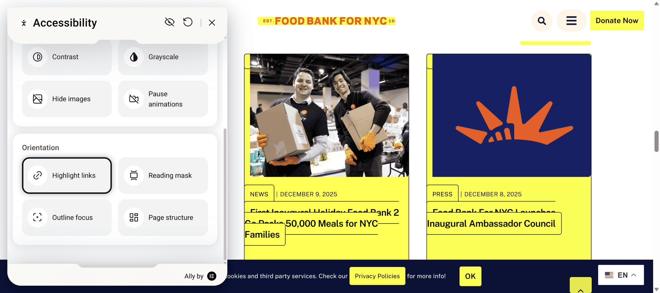
The Highlight links option on the Food Bank for NYC site makes some of the links in their blog section overlap, making them unreadable.
The overlay contrast options on Sinc’s website make the entire page black or white, rendering it completely unusable!

The High Contrast option also fails on the Printec Group website, and the accessibility toolbar completely disappears from view.

On Serco’s site, the Recite Me toolbar is broken and unresponsive.

It should look like this:

Settings are site-specific
If a disabled person uses an overlay on one site and activates a feature that they like (e.g. dark contrast), they will have to do the same for another site using the same overlay. Naturally, this is laborious to do for multiple sites.

Compare that with using a contrast theme in Windows 11, which will apply a dark mode across all websites and apps on their device.
Cost
Overlays can work out expensive as most require a monthly or yearly subscription for continued use.
- AccessiBe pricing starts at $59/month or $490/year.
- All in One Accessibility starts at $25/month or $250/year.
- Ally is free for a single site, then costs from $7.99/month for more features and usage on more URLs.
- AudioEye starts at $49/month.
- EqualWeb starts at $39/month or $390/year.
- Eye-Able has a free tier, then their plans start at €7/month plus 19% sales tax.
- Recite Me doesn’t give pricing, saying that “The cost of Recite Me assistive technology for your website will vary depending on the size, complexity, and volume of traffic your site receives.”
- UserWay’s Pro widget starts at $490/year.
- Web Accessibility Helper Pro is from $249/year.
The downside, of course, is that if you stop paying for the tool, it stops working.
Performance issues
Because overlays normally load via Javascript from third-party sites, they can slow down websites, causing performance issues. If there is any delay in loading the script, you as a user have no control over it.
I tested a number of websites using overlays and logged the time to load the assets required by the overlay. All I did was to open the overlay and close it again; I didn’t enable any options.
Here are my average load times for the overlays I tried, from best to worst:
| Overlay | Time to load (seconds) |
|---|---|
| One Click Accessibility | 0.544 |
| AccessiBe | 0.735 |
| EqualWeb | 1.063 |
| Ally | 1.176 |
| AllAccessible | 3.730 |
| Eye-Able | 5.383 |
| UserWay | 5.995 |
The fastest to load on average were One Click Accessibility and AccessiBe, the slowest were Eye-Able and UserWay. Do you really want your site to be 5 seconds slower to load?
AllAccessible tested WordPress sites using an overlay plugin. They found when the overlay plugin was active, the site was 1.1s slower (+61% slower) than without, and the Google Lighthouse score using the overlay dropped to 67 from 92 without.
Summing up: do overlays actually help accessibility?
Overlays promise much but have many shortcomings. They may be able to remediate some accessibility issues but certainly not all. They do not load in all browsers and even when they do, may not be noticed or activated. Their functions may not make any real difference for a user, as often they duplicate what their browser or operating system can already do. Furthermore, any settings that are useful are only applied to one site.
Other problems with overlays are the high and ongoing cost of using them, potential privacy issues and the risk that they will slow down your website.
Finally, when poorly implemented, overlays can actually make accessibility worse.
This video from Silktide sums up the arguments against using overlays:
For more information on overlays and their drawbacks, visit Overlay Fact Sheet, which is signed by over 1,000 people in the accessibility space.
Instead of using overlays, it’s much better to identify accessibility issues with a combination of automated tools and manual testing, and to fix any problems in the underlying code rather than remediating after the page load with Javascript.
In future posts I’ll look at alternatives to overlays, namely how to customise your technology setup to make browsing the web easier.
If you liked this post, please leave a comment!

Brilliant work… so thorough!
Thank you, Julia!
Yes, a lot of effort went into this post.
It shows!