Released with WordPress 6.7 on November 12, 2024, Twenty Twenty-Five is the new default theme for 2025.
You will need at least WordPress 6.7 and PHP 7.2 to run it.
At the time of writing, it has over 700,000 active installs according to wordpress.org.
You can test out the theme for free at WordPress Playground. Visiting the Playground gives you a newly installed WordPress site running Twenty Twenty-Five.
- Twenty Twenty-Five theme design
- Twenty Twenty-Five theme typography
- Twenty Twenty-Five theme menus
- Twenty Twenty-Five theme style variations
- Twenty Twenty-Five theme templates
- Twenty Twenty-Five theme patterns and template parts
- About (7 patterns)
- Banners (19 patterns)
- Call to Action (13 patterns)
- Contact (3 patterns)
- Featured (16 patterns)
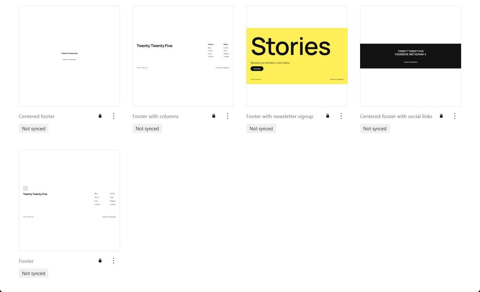
- Footers (5 patterns)
- Gallery (1 pattern)
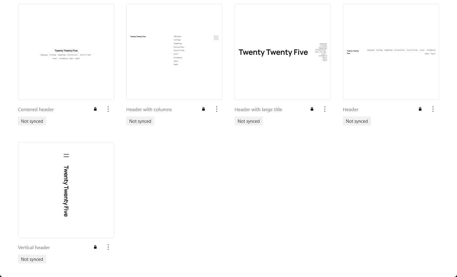
- Headers (5 patterns)
- Media (2 patterns)
- Pages (11 patterns)
- Post formats (3 patterns)
- Posts (4 patterns)
- Services (3 patterns)
- Testimonials (3 patterns)
- Text (3 patterns)
- Uncategorized (3 patterns)
- Template parts
- Twenty Twenty-Five theme translations
- Twenty Twenty-Five theme accessibility
- Customizing the Twenty Twenty-Five theme
- Create a child theme
- Add new Google fonts
- Show an excerpt rather than content on your blog page
- Create a template for a custom post type
- Enable the Photo blog templates
- Make the header sticky
- Improve the legibility of the Calendar block in dark style variations
- Create a landing page
- Add images with Openverse
- Use different text styles
- Use post formats block patterns
- Twenty Twenty-Five demo sites
- Summing up
Twenty Twenty-Five theme design
The designer of Twenty Twenty-Four, Beatriz Fialho, also worked on Twenty Twenty-Five. View Twenty Twenty-Five’s design on Figma to see her design.
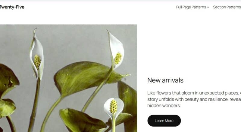
The theme is designed for a range of purposes:
- Bloggers
- Portfolios sites
- Magazine sites
- Businesses.
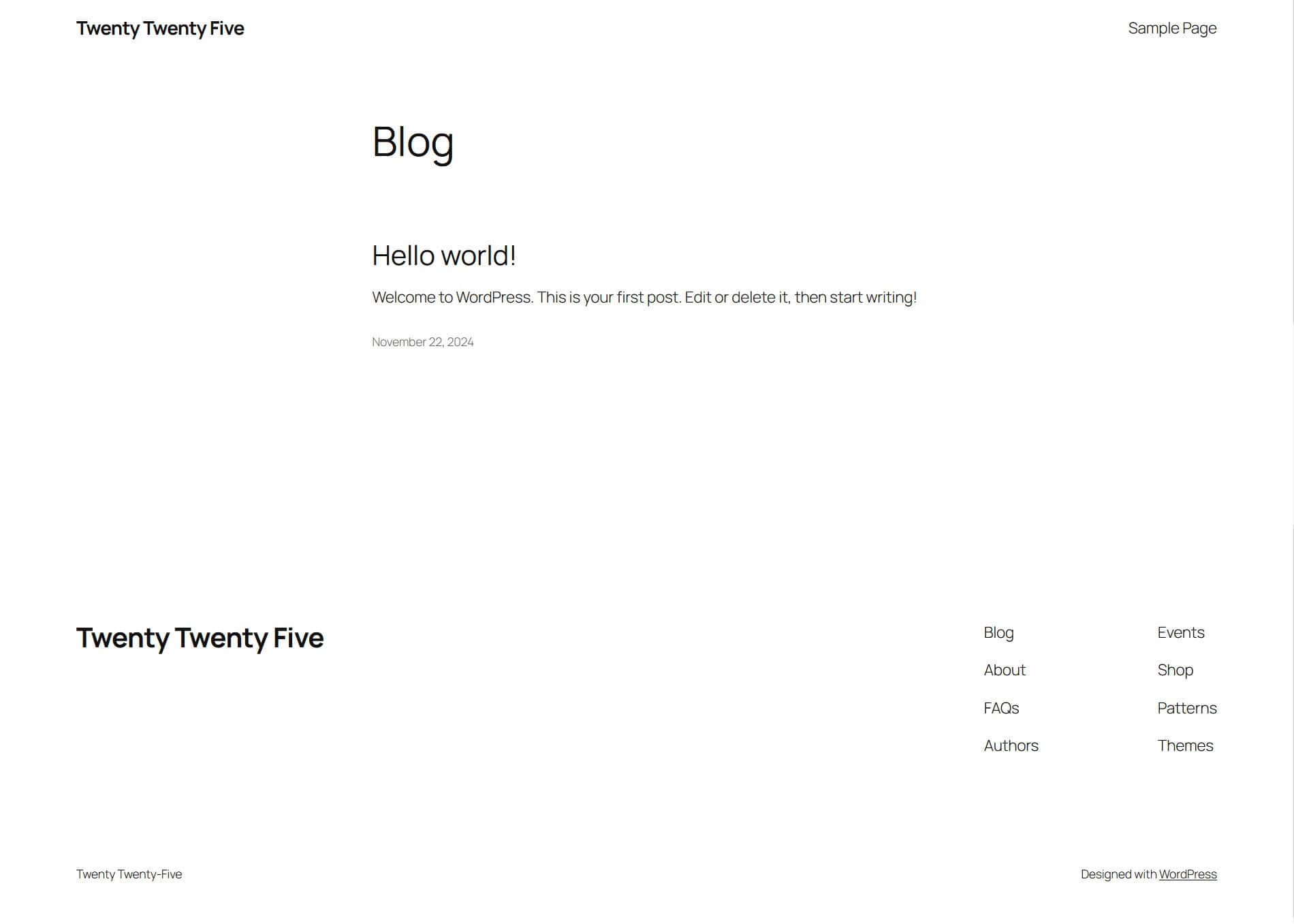
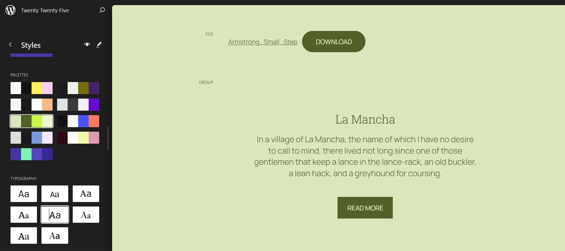
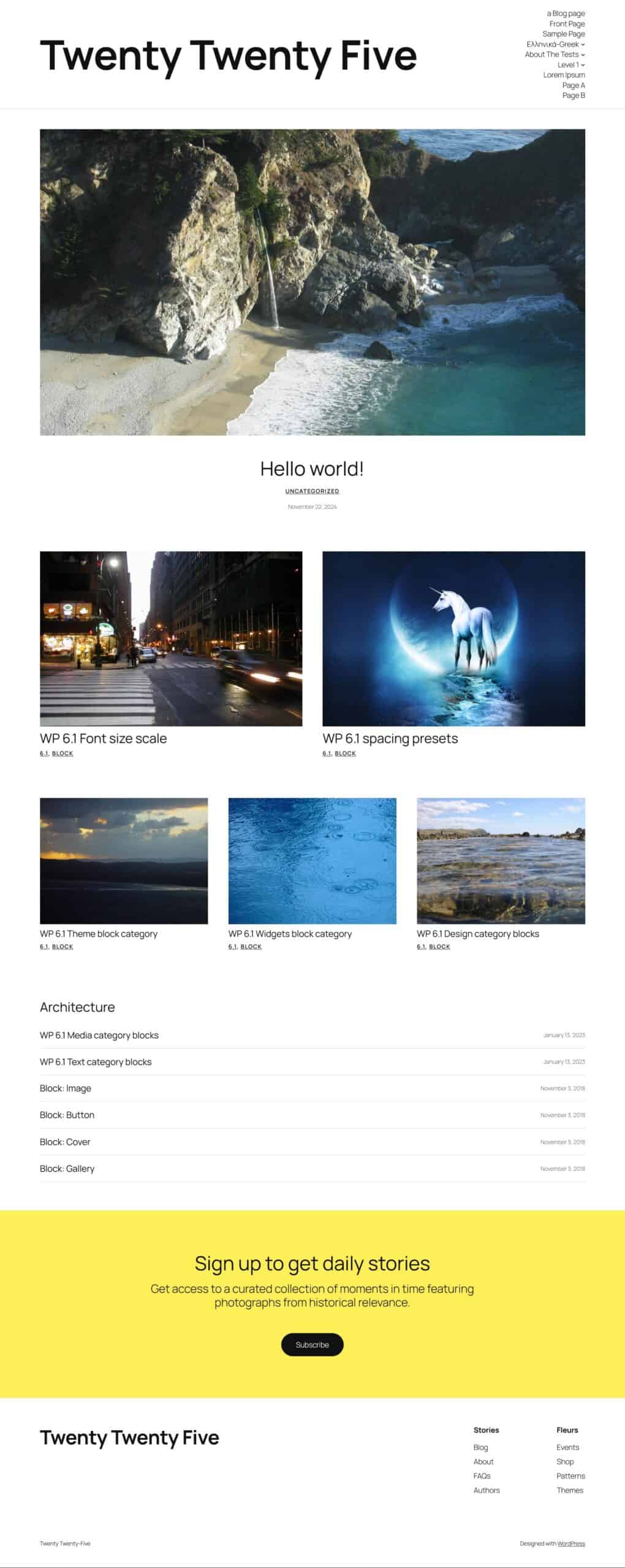
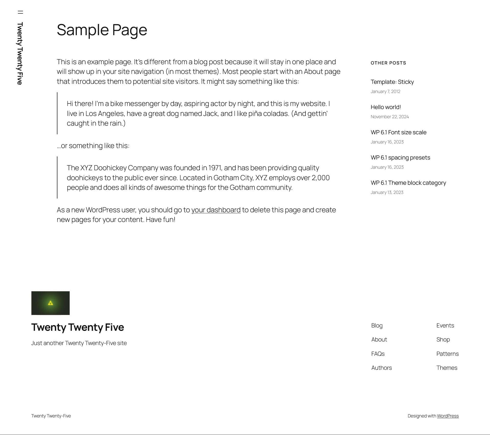
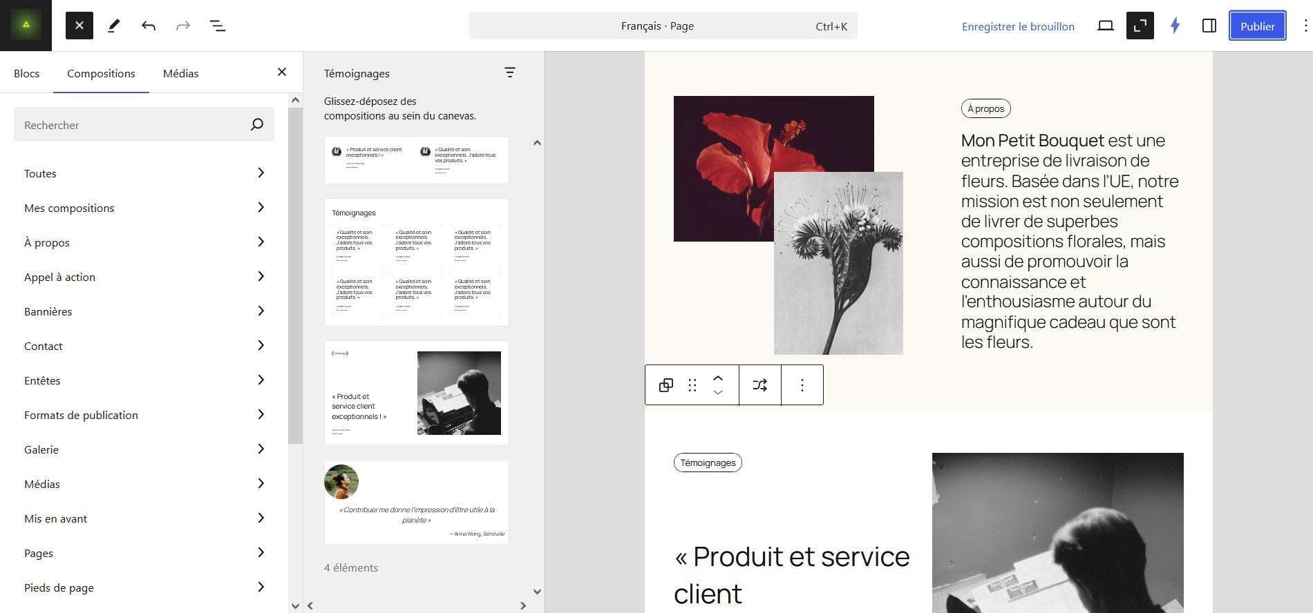
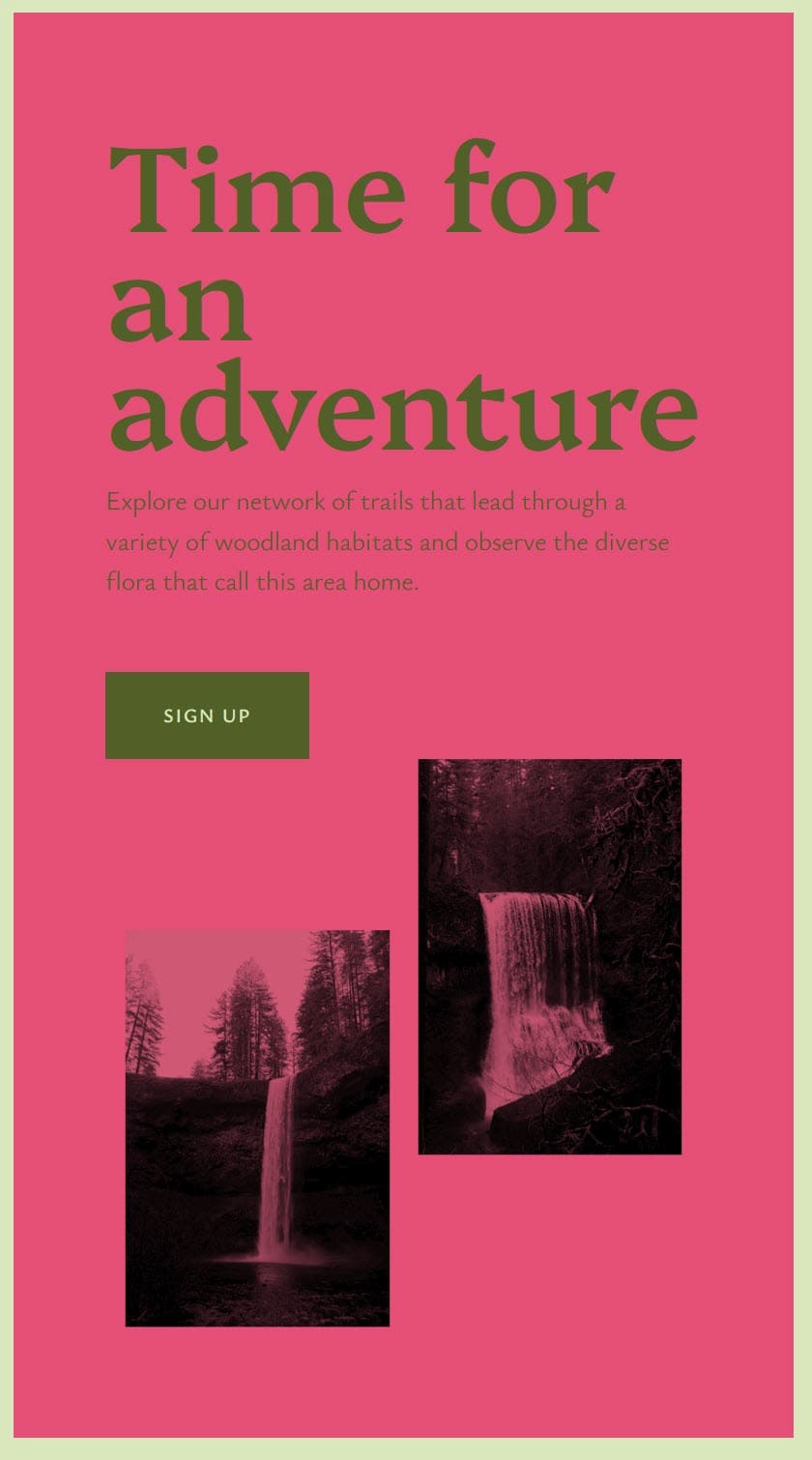
A fresh install looks like the following:
Twenty Twenty-Five theme typography
By default Twenty Twenty-Five uses the Google Fonts pairing of Manrope and Fira Code.
Other typography combinations you can choose from are:
- Beiruti and Literata
- Vollkorn and Fira Code
- Platypi and Ysabeau Office
- Roboto Slab and Manrope
- Literata and Ysabeau Office
- Platypi and Literata
- Literata and Fira Sans
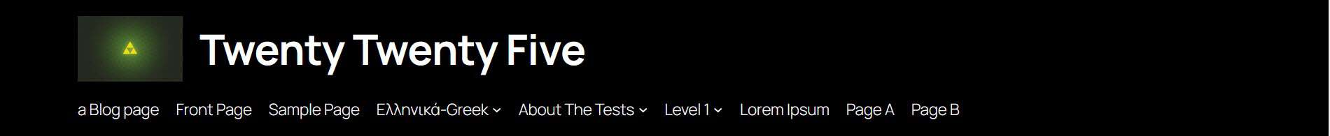
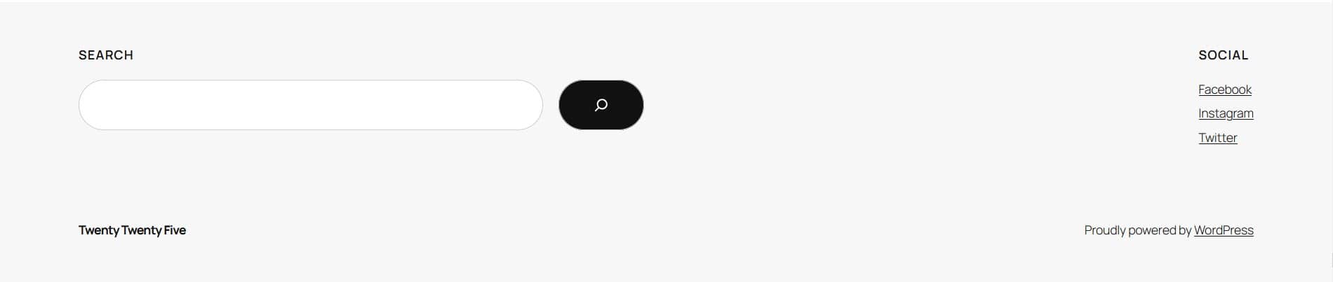
Twenty Twenty-Five theme menus
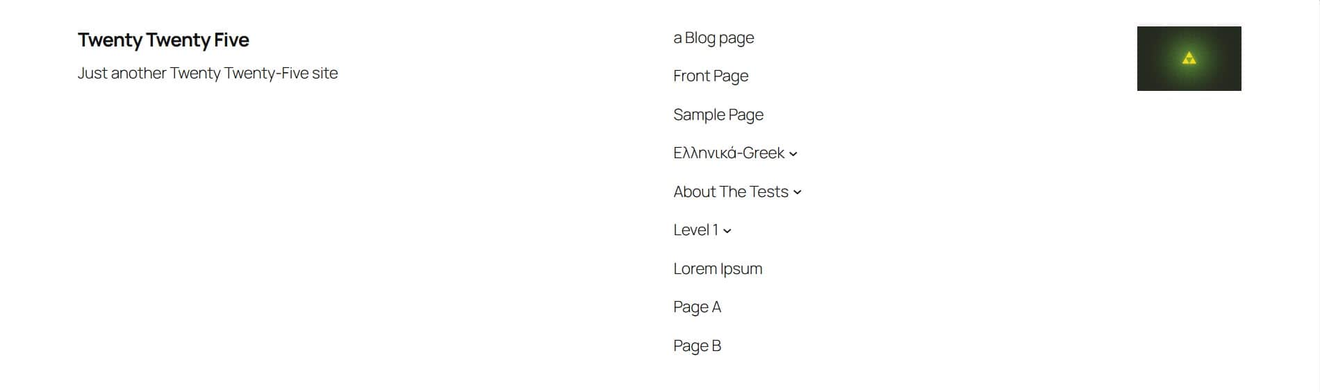
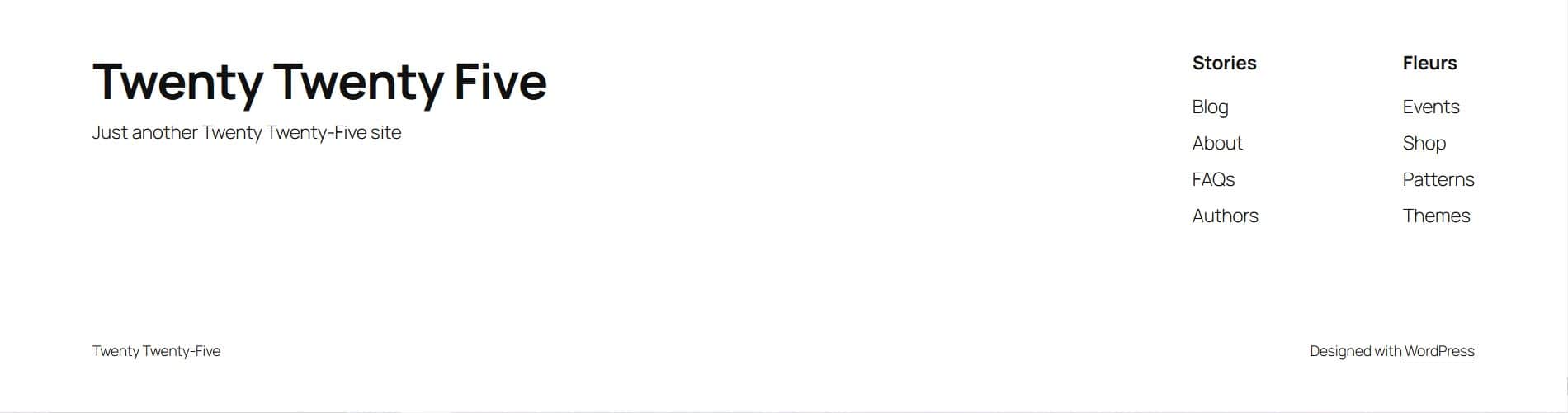
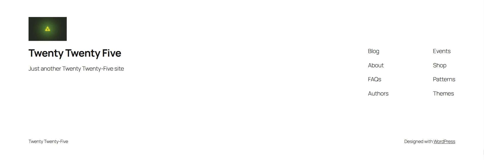
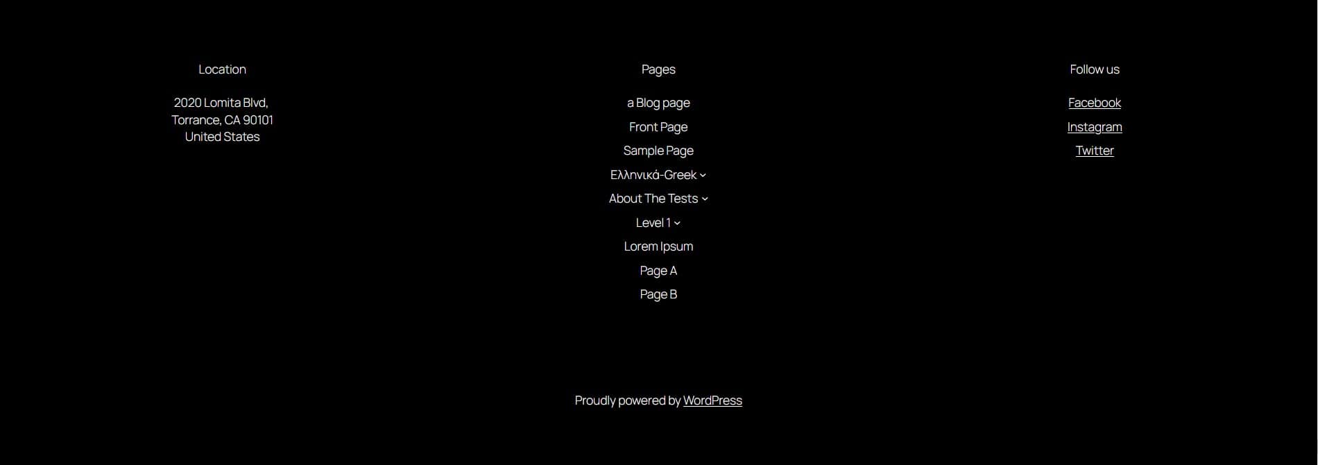
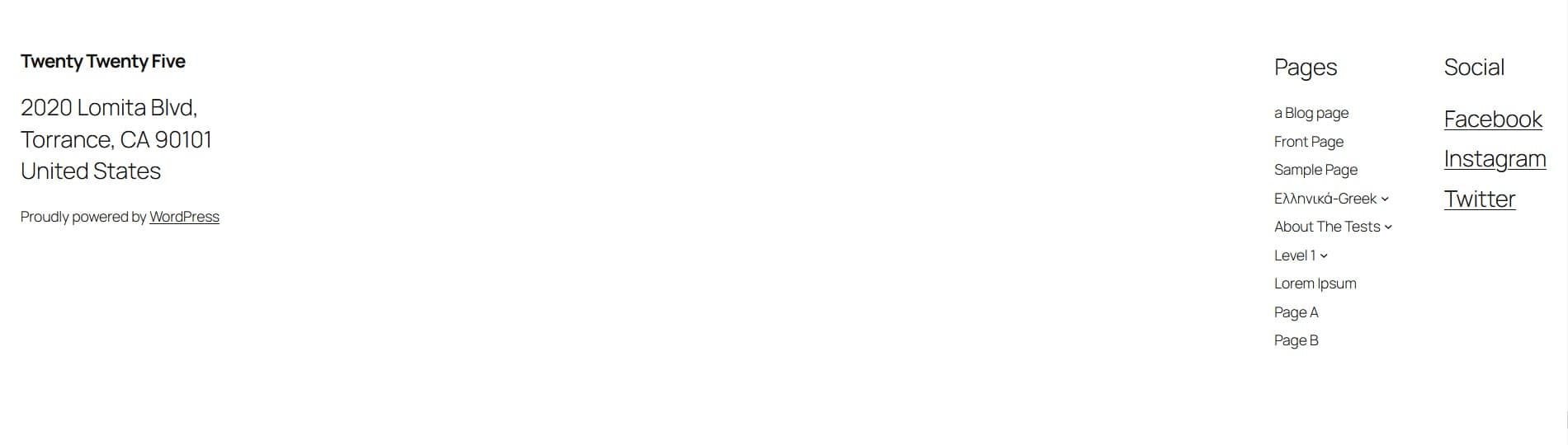
Twenty Twenty-Five installs with one header menu and two footer menus. A new install has just one page (Sample Page) in the header menu.
The two footer menus have a series of empty custom links (links without destinations). So you’ll need to edit or delete them. You can access the menu by editing any template and clicking on the footer.
To edit any menu item, click on it, then click on the Link symbol in the toolbar followed by the Edit link symbol (the pencil icon).
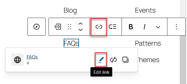
Change the link text and/or the link destination as required.
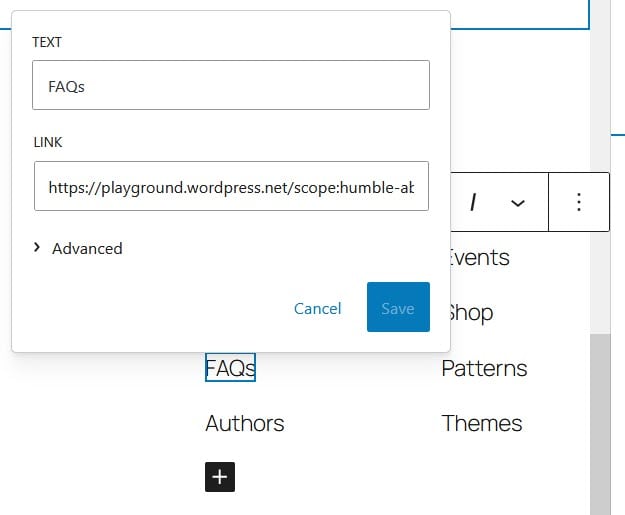
Save your changes.
To delete a menu item, click on it and open the three-dot Options menu in the toolbar.
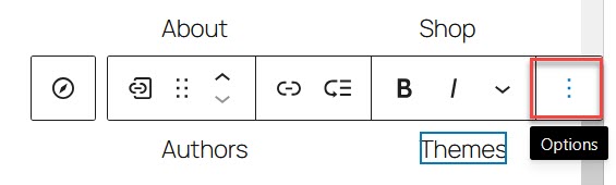
Scroll to the bottom of the menu and select Delete.
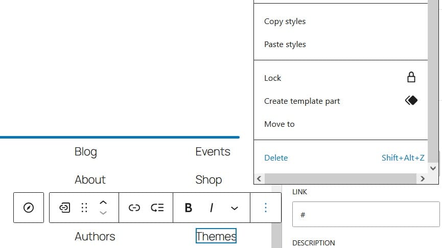
You can add new menu items using the plus button after selecting the parent Navigation block.

If you use the Page List as a menu, the menu will display all your pages. New pages are automatically added to the header menu, unless you edit it.
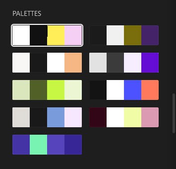
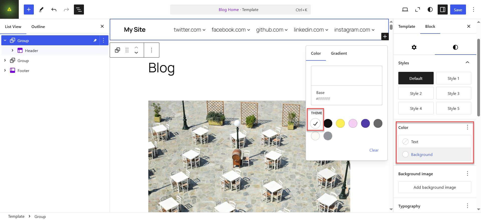
Twenty Twenty-Five theme style variations
Twenty Twenty-Five has nine style variations. They are:
- Default – the default black and white style.
- Evening – the dark black and white style.
- Noon – a cream and black style.
- Dusk – a warm grey and black style.
- Afternoon – a style with light and dark green.
- Twilight – another dark style.
- Morning – a warm grey and darker grey style.
- Sunrise – a maroon, pink and white style.
- Midnight – a purply blue and green style.
Each style comes with a palette of colours used. You can mix and match style variations and palettes.

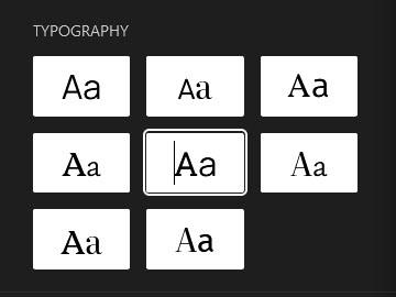
You can also change the typography here:
Twenty Twenty-Five theme templates
When newly installed, Twenty Twenty-Five has eight templates:
- All Archives
- Blog Home
- Index
- Page No Title
- Page: 404
- Pages
- Search Results
- Single Posts
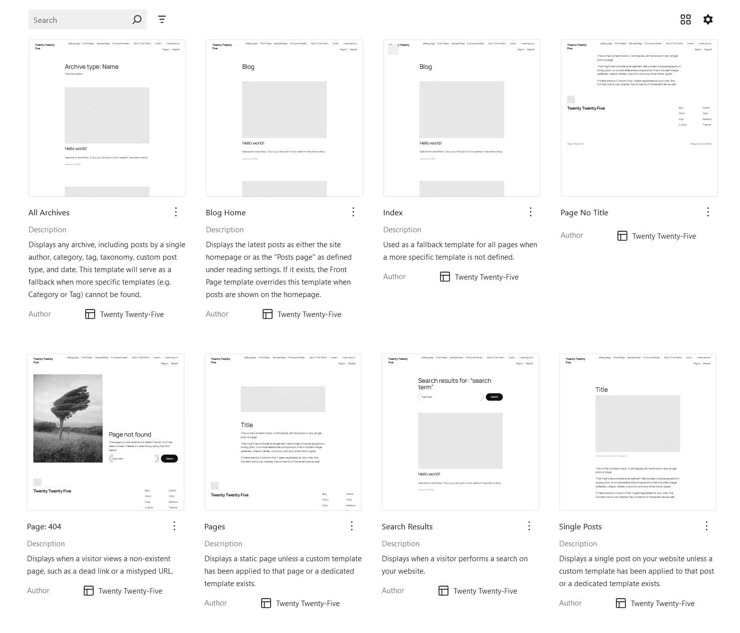
Adding or deleting templates
You add new templates with the Add New Templates button, where you’ll be presented with a list of templates you can create.
You can only delete templates you’ve created. To do so, click the three-dot menu next to the template name and choose Delete. Then select Delete again to delete it.

Editing and resetting templates
You can edit any template by clicking on it. From there you can edit the header, footer or content of the template.
At this time, it’s not possible to duplicate a template. If you edit a template and make a mistake, you can use the editor’s Undo button to revert the last change. It’s also possible to reset templates that you’ve saved changes to.
To reset a template, do one of the following:
In the block editor, when you are editing a template, choose the three-dot menu for the template in the settings sidebar and pick Reset from the flyout menu.
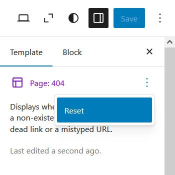
In the Templates section of Appearance > Editor, choose the three-dot menu for the template in the settings sidebar and pick Reset from the flyout menu.
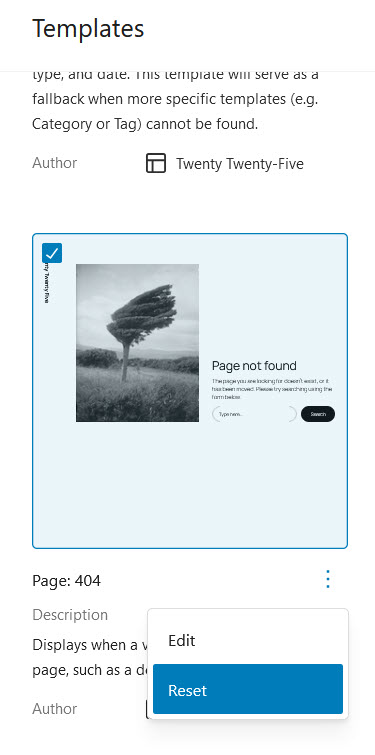
In each case you need to select Reset from the dialog box that appears.
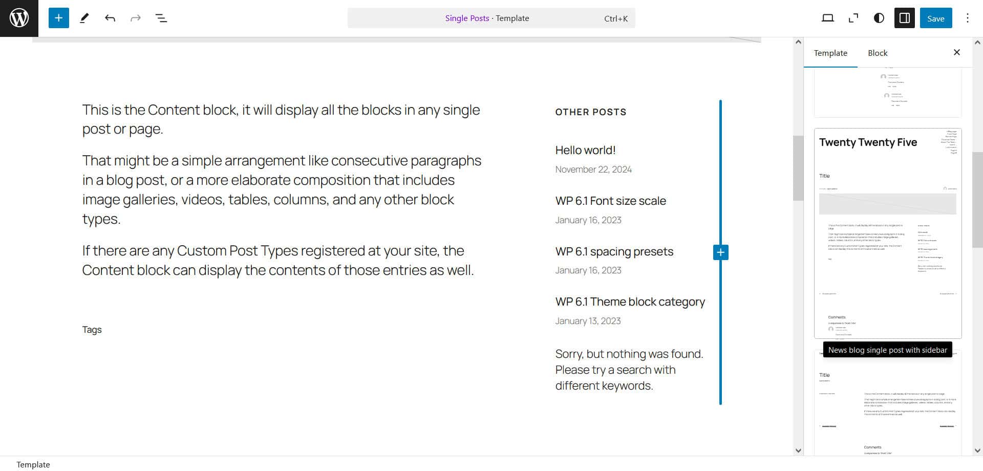
Changing the whole design of a template
You can change the entire layout of a template by clicking on the Design tab of the template (seen in the settings sidebar) and selecting an alternative.
For example, for the Single Posts template you can have a post with a sidebar by selecting the News blog single post with sidebar variant.
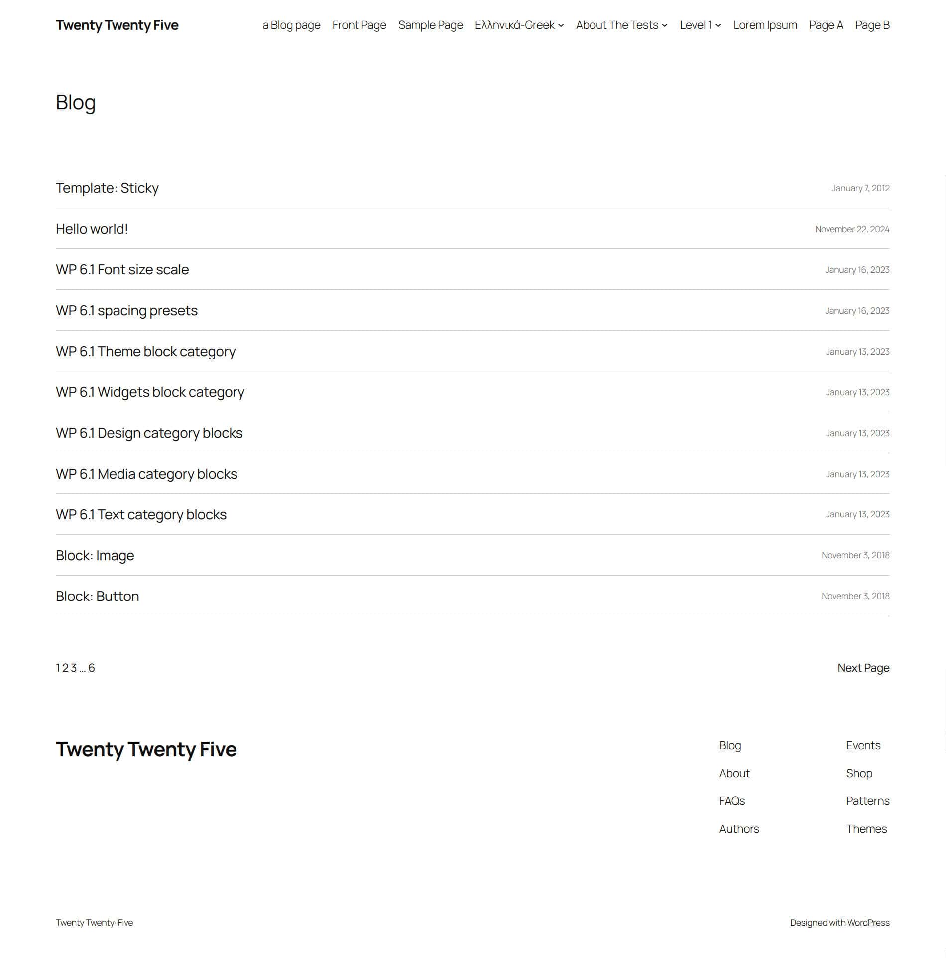
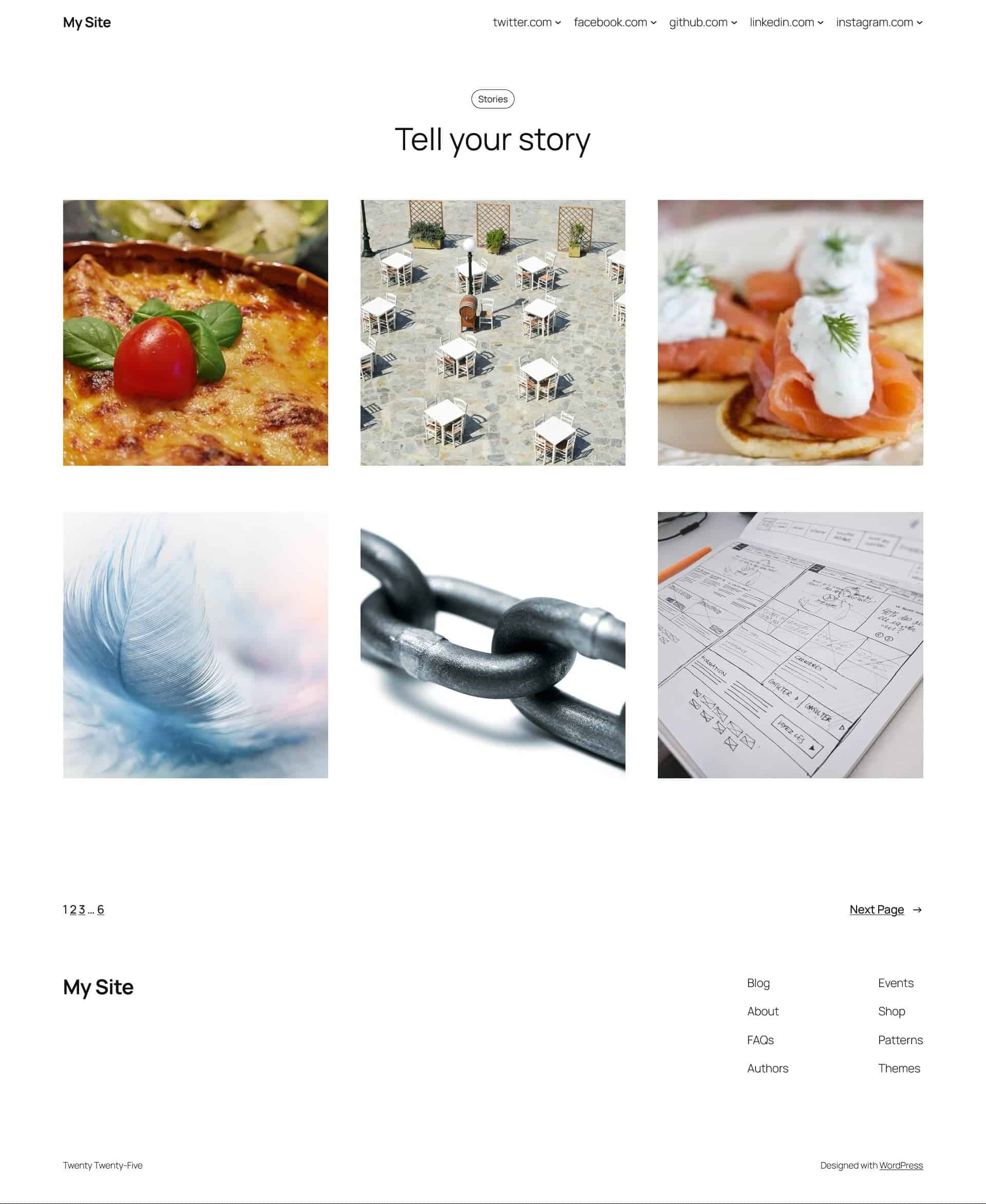
Blog Home layout variations
Here are the alternative layouts for the Blog Home template:


This design relies on featured images for your posts, so make sure you assign them to avoid gaps in the layout.

Other templates also have alternative design patterns. The only one that doesn’t is the Page No Title template.
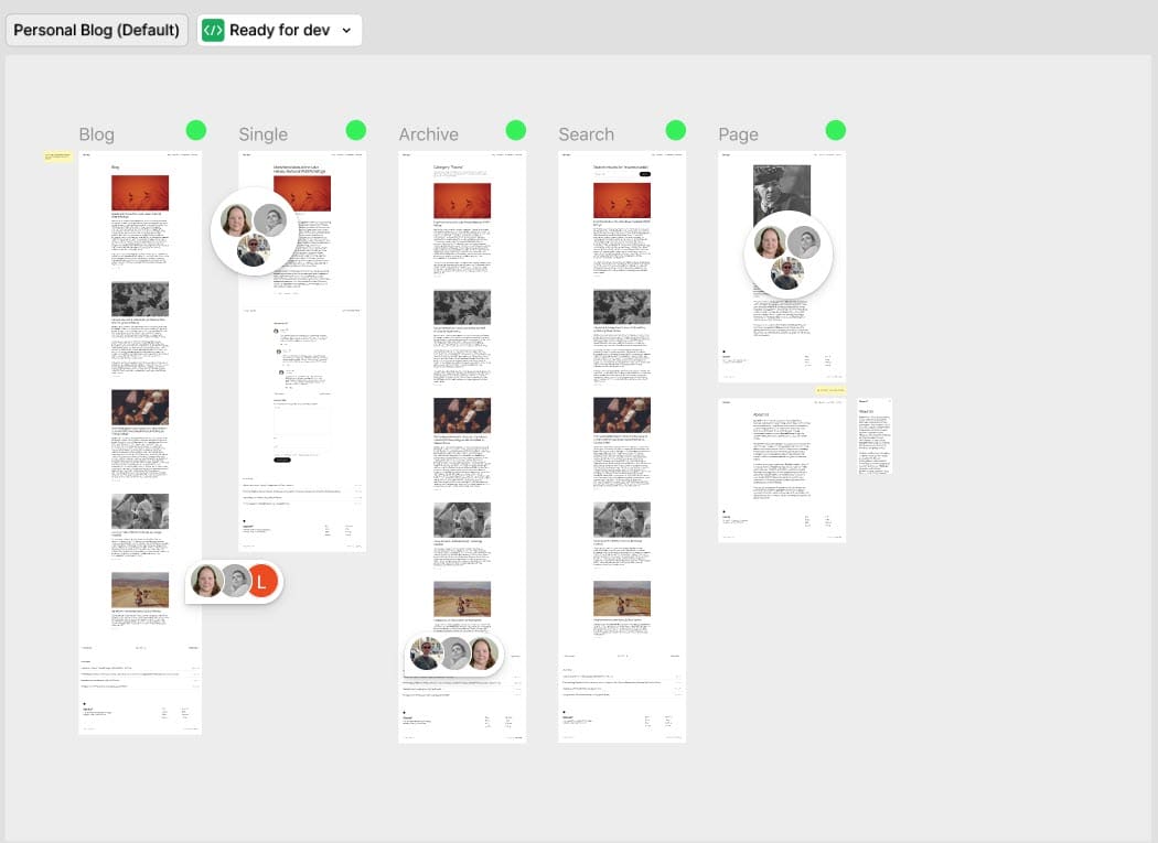
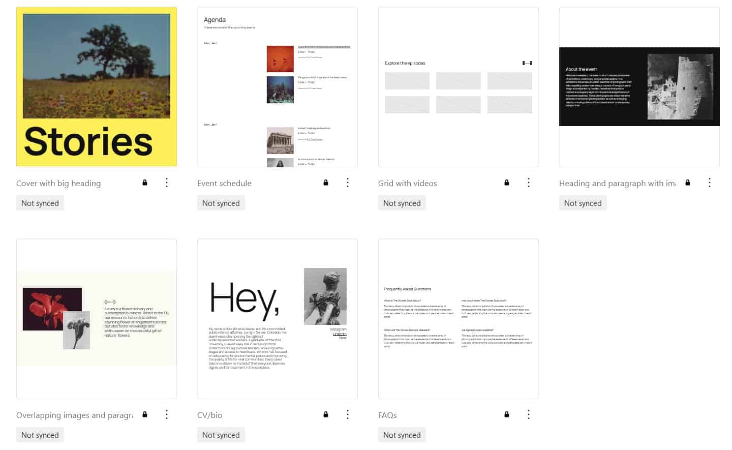
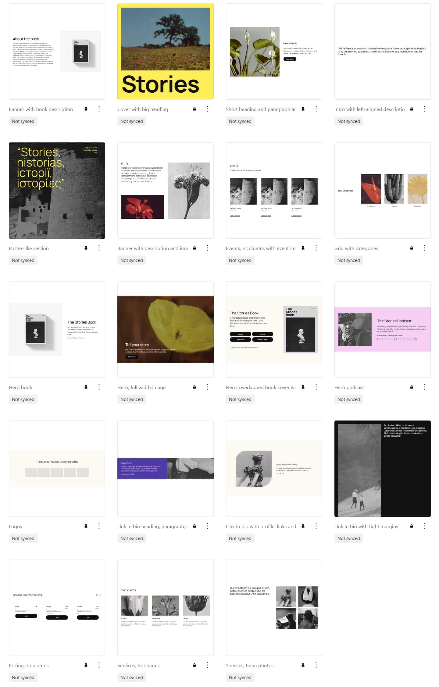
Twenty Twenty-Five theme patterns and template parts
Twenty Twenty-Five comes with a multitude of unique block patterns, 70 in all. These are grouped as follows:
About (7 patterns)
- Cover with big heading
- Event schedule
- Grid with videos
- Heading and paragraph with image on the right
- Overlapping images and paragraph on right
- CV/bio
- FAQs
Banners (19 patterns)
- Banner with book description
- Cover with big heading
- Short heading and paragraph and image on the left
- Intro with left-aligned description
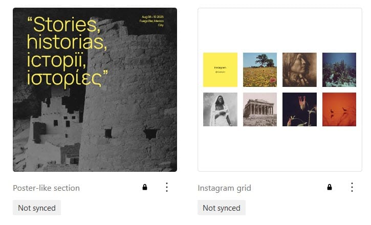
- Poster-like section
- Banner with description and images grid
- Events, 3 columns with event images and titles
- Grid with categories
- Hero book
- Hero, full width image
- Hero, overlapped book cover with links
- Hero podcast
- Logos
- Link in bio heading, paragraph, links and full-height image
- Link in bio with profile, links and wide margins
- Link in bio with tight margins
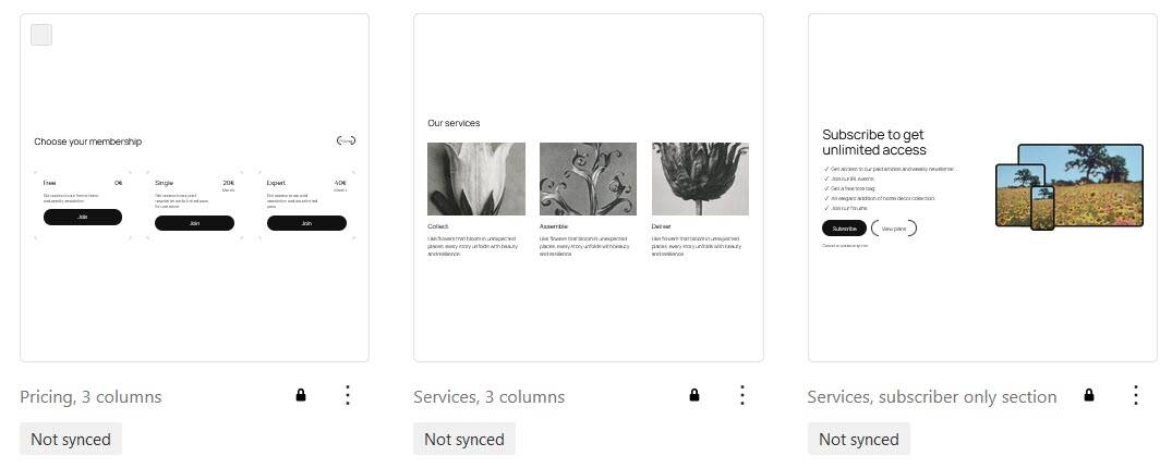
- Pricing, 3 columns
- Services, 3 columns
- Services, team photos
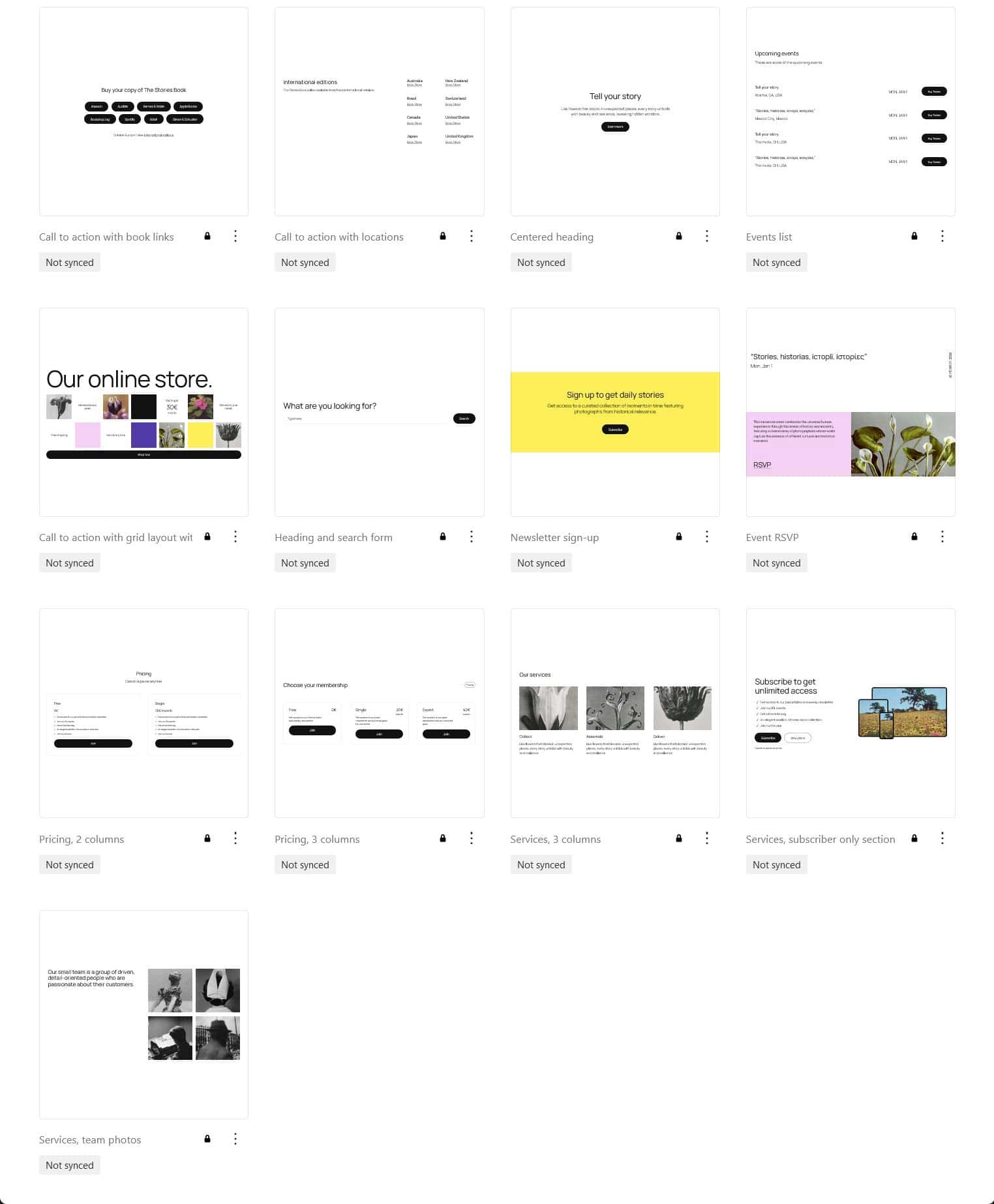
Call to Action (13 patterns)
- Call to action with book links
- Call to action with locations
- Centered heading
- Events list
- Call to action with grid layout with products and link
- Heading and search form
- Newsletter sign-up
- Event RSVP
- Pricing, 2 columns
- Pricing, 3 columns
- Services, 3 columns
- Services, subscriber only section
- Services, team photos
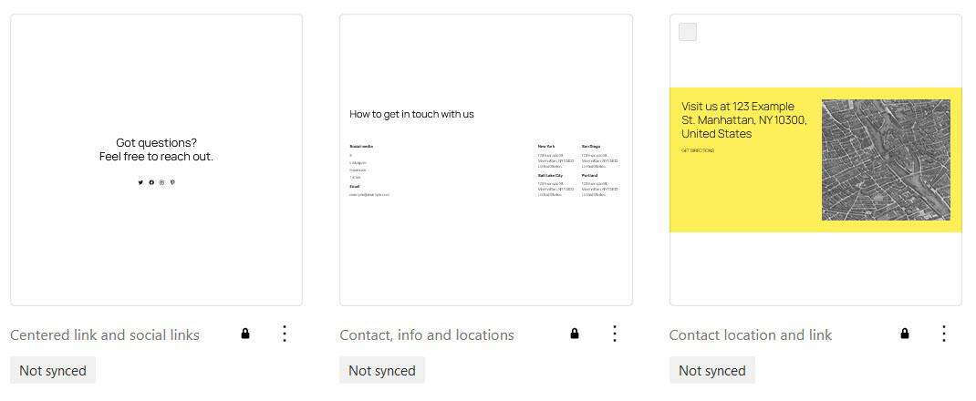
Contact (3 patterns)
- Centered link and social links
- Contact, info and locations
- Contact location and link
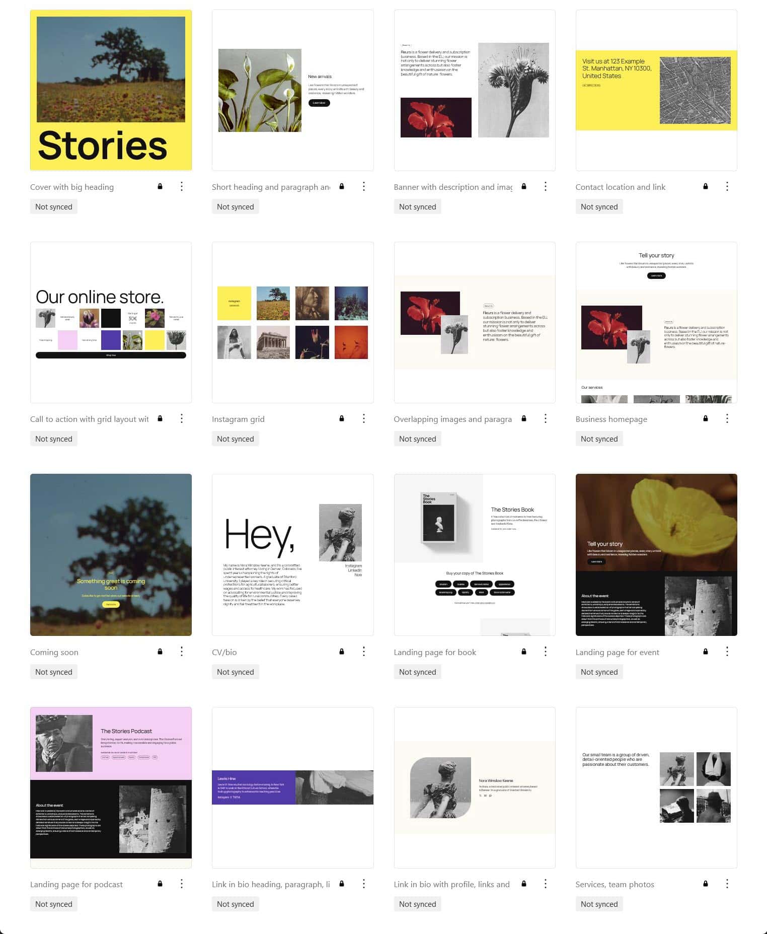
Featured (16 patterns)
- Cover with big heading
- Short heading and paragraph and image on the left
- Banner with description and images grid
- Contact location and link
- Call to action with grid layout with products and link
- Instagram grid
- Overlapping images and paragraph on right
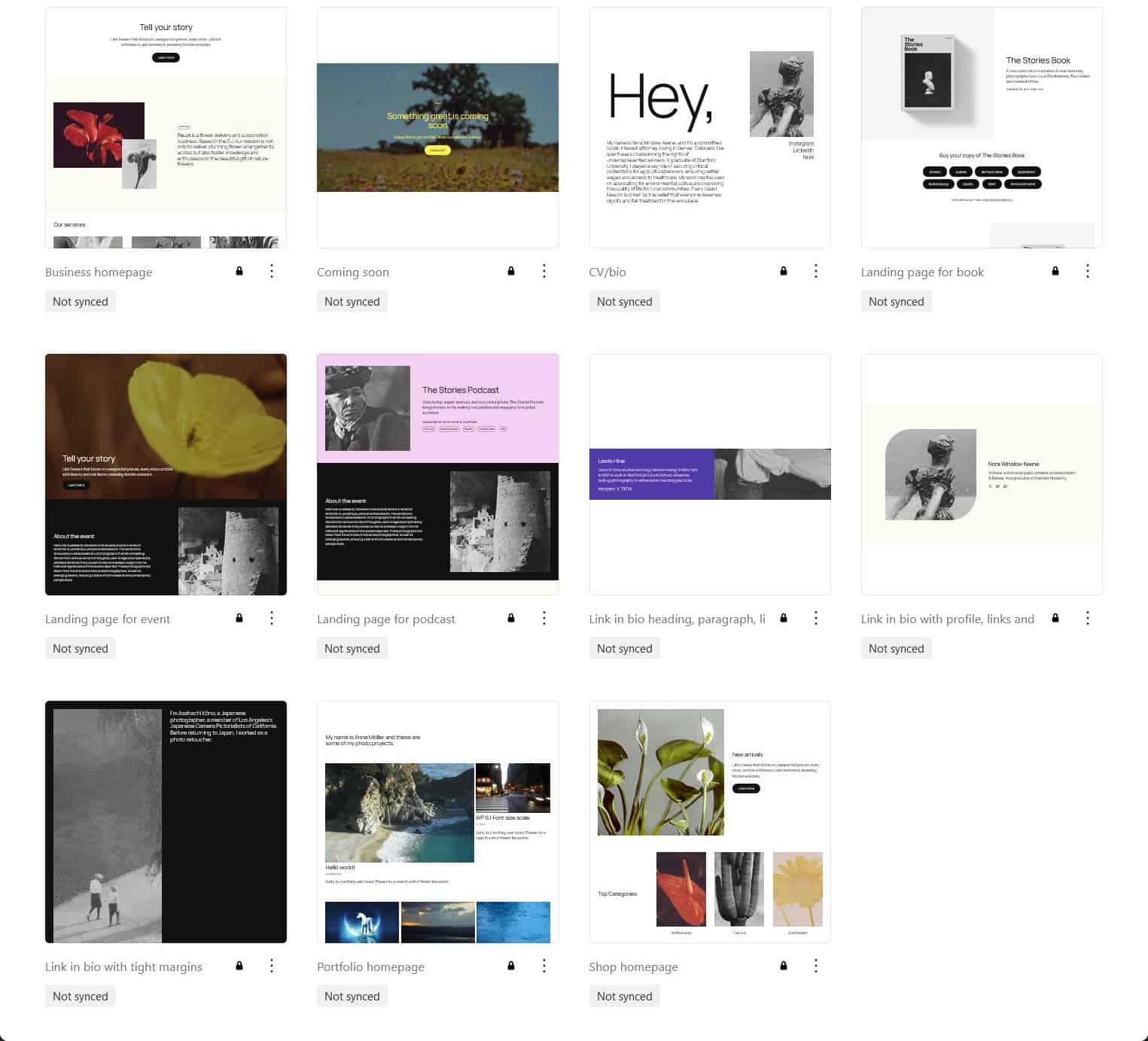
- Business homepage
- Coming soon
- CV/bio
- Landing page for book
- Landing page for podcast
- Link in bio heading, paragraph, links and full-height image
- Link in bio with profile, links and wide margins
- Services, team photos
Footers (5 patterns)
- Centered footer
- Footer with columns
- Footer with newsletter signup
- Centered footer with social links
- Footer
Gallery (1 pattern)
- Instagram grid

Headers (5 patterns)
- Centered header
- Header with columns
- Header with large title
- Header
- Vertical header
Media (2 patterns)
- Poster-like section
- Instagram grid
Pages (11 patterns)
- Business homepage
- Coming soon
- CV/bio
- Landing page for book
- Landing page for event
- Landing page for podcast
- Link in bio heading, paragraph, links and full-height image
- Link in bio with profile, links and wide margins
- Link in bio with tight margins
- Portfolio homepage
- Shop homepage
These are full page patterns and will show up in the editor when you create a new page.

Post formats (3 patterns)
- Post format name
- Audio format
- Link format
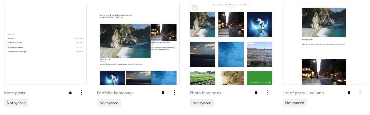
Posts (4 patterns)
- More posts
- Portfolio homepage
- Photo blog posts
- List of posts, 1 column
Services (3 patterns)
- Pricing, 3 columns
- Services, 3 columns
- Services, subscriber only section
Testimonials (3 patterns)
- 2 columns with avatar
- 3 column layout with 6 testimonials
- Review with large image on right

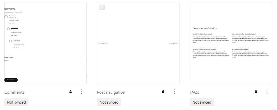
Text (3 patterns)
- Comments
- Post navigation
- FAQs
Uncategorized (3 patterns)
- Right-aligned blog, 404
- Photo blog page
- Page template for the right-aligned blog

Template parts
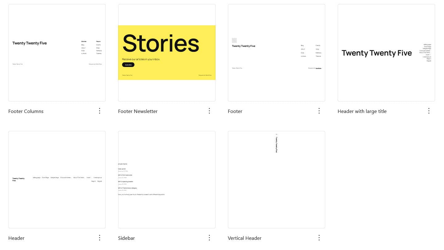
There are 7 template parts in Twenty Twenty-Five: 3 headers, 3 footers and one general (the sidebar).
- Footer Columns
- Footer Newsletter
- Footer
- Header with large title
- Header
- Sidebar
- Vertical header
Changing the header
You can change the header of a template by editing it and then selecting the header element and then choosing an alternative design from the Design tab.
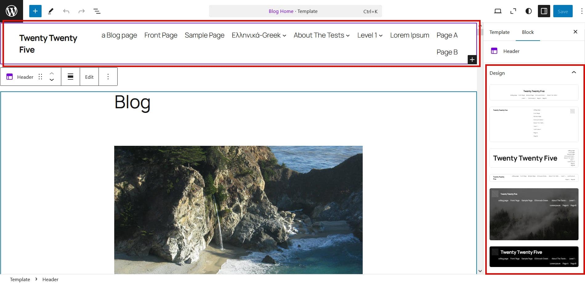
There are actually more designs to choose from than the three that come with the theme. You can select from the following:


Centered header with logo
You may have noticed that the vertical header isn’t in this list. You’ll find it in use in the Home page for the right-aligned blog, Right-aligned blog, 404 and also Page template for the right-aligned blog, an alternative Pages template layout.
Changing the footer
Changing footer is exactly the same as changing the header, except you select the footer template part.
You can choose from the following footers:


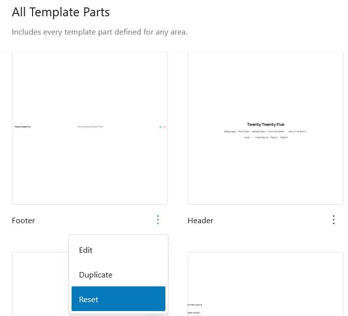
Resetting a template part
To reset a template part, select it from the list of template parts (under Patterns). Click the three-dot menu next to the template and select Reset and then Reset.
Twenty Twenty-Five theme translations
Twenty Twenty-Five currently has 26 translations including French, German, Spanish, Italian, Persian and simplified Chinese, so is suitable for multilingual users.
Where the theme has been translated and the language selected in Settings > General, any new block patterns added will be in the translated language.
Twenty Twenty-Five theme accessibility
The theme depends on the block editor, so its accessibility is tied to the editor. WordPress 6.7 brought 55 accessibility improvements to the block editor.
Link accessibility
There is a skip link in the header to skip the main navigation.
Links in the post or page body are underlined, while navigation menu links are not. There is a clear keyboard focus style of a black outline for all links in the page.
Colour contrast of palettes
Default
The Default palette uses the following colours:
#111111 & #FFFFFF black text and white background = Contrast Ratio 18.88:1 (AA and AAA pass)
#111111 & #FBFAF3 black text and light yellow background, seen in Group or Column block style 1 = Contrast Ratio 18.04:1 (AA and AAA pass)
#40464D & #DDDDDD black text and grey background, seen at the top of the calendar block = Contrast Ratio 7.02:1 (AA and AAA pass)
#40464D & #FFFFFF black text and grey background, seen in the body of the calendar block = Contrast Ratio 9.54:1 (AA and AAA pass)
#111111 and #EB4C77 seen in the Heading, Paragraph, Button with Two Images block = Contrast Ratio 5.24:1 (AA pass, AAA fail)
#111111 & #F6CFF4 black text and pink background, seen in Group or Column block style 2 = Contrast Ratio 13.62:1 (AA and AAA pass)
#111111 & #FFEE58 black text and yellow background, seen in Group or Column block style 3 = Contrast Ratio 13.62:1 (AA and AAA pass)
#F6CFF4 & #503AA8 pink text and purple background, seen in Group or Column block style 4 = Contrast Ratio 6.03:1 (AA pass, AAA fail)
Evening
The Evening palette uses the following colours:
#CBCBCB & #1B1B1B grey text and black background = Contrast Ratio 10.61:1 (AA and AAA pass)
#F0F0F0 & #353535 white text and dark grey background, seen in the Code block and the Group block Style 1 = Contrast Ratio 10.76:1 (AA and AAA pass)
#40464D & #DDDDDD dark text and light grey background, seen at the top of the Calendar block = Contrast Ratio 7.02:1 (AA and AAA pass)
#40464D & #1B1B1B grey text and dark background, seen in the body of the Calendar block = Contrast Ratio 1.8:1 (AA and AAA fail)
#F0F0F0 and #EB4C77 seen in the Heading, Paragraph, Button with Two Images block = Contrast Ratio 3.15:1 (AA and AAA fail)
#F0F0F0 & #442369 white text and dark purple background, seen in the Group block Style 2 = Contrast Ratio 10.9:1 (AA and AAA pass)
#F0F0F0 & #786D0A white text and mustard background, seen in the Group block Style 3 , also in the Footer with newsletter signup = Contrast Ratio 4.6:1 (AA pass, AAA fail)
#442369 & #D1D0EA dark purple text and lilac background, seen in the Group block Style 4 = Contrast Ratio 8.23:1 (AA and AAA pass)
#1B1B1B & #F0F0F0 black text and white background, seen in the Group block Style 5 = Contrast Ratio 15.11:1 (AA and AAA pass)
Noon
The Noon palette uses the following colours:
#191919 & #F8F7F5 black text and cream background, seen in headings = Contrast Ratio 16.42:1 (AA and AAA pass)
#5F5F5F & #F8F7F5 dark grey text and cream background, seen in body text = Contrast Ratio 5.96:1 (AA pass, AAA fail)
#40464D & #DDDDDD dark grey text and mid grey background, seen in the top of the Calendar block = Contrast Ratio 7.02:1 (AA and AAA pass)
#191919 and #EB4C77 seen in the Heading, Paragraph, Button with Two Images block = Contrast Ratio 4.88:1 (AA pass, AAA fail)
#191919 & #F1EEE9 black text and light beige background, seen in the Group block Style 1 = Contrast Ratio 15.19:1 (AA and AAA pass)
#191919 & #F5B684 black text and orange background, seen in the Group block Style 2 = Contrast Ratio 9.96:1 (AA and AAA pass)
#191919 & #FFFFFF black text and white background, seen in the Group block Style 3 = Contrast Ratio 17.58:1 (AA and AAA pass)
#F5B684 & #191919 orange text and black background, seen in the Group block Style 4 = Contrast Ratio 9.96:1 (AA and AAA pass)
#F8F7F5 & #191919 cream text and black background, seen in the Group block Style 5 = Contrast Ratio 16.42:1 (AA and AAA pass)
Dusk
The Dusk palette uses the following colours:
#3B3B3B & #E2E2E2 dark grey text and light grey background, seen in headings = Contrast Ratio 8.64:1 (AA and AAA pass)
#000000 & #E2E2E2 black text and light grey background, seen in body text and Quote block = Contrast Ratio 16.21:1 (AA and AAA pass)
#650DD4 & #E2E2E2 purple text and light grey background, seen in visited links = Contrast Ratio 6.32:1 (AA pass, AAA fail)
#40464D & #DDDDDD, dark grey text and light grey background, seen at the top of the Calendar widget = Contrast Ratio 7.02:1 (AA and AAA pass)
#3B3B3B and #EB4C77 seen in the Heading, Paragraph, Button with Two Images block = Contrast Ratio 3.11:1 (AA and AAA fail)
#E2E2E2 & #650DD4 light grey text and purple background, seen in buttons = Contrast Ratio 6.32:1 (AA pass, AAA fail)
#191919 & #DBDBDB dark grey text and light grey background, seen in the Group block Style 1 = Contrast Ratio 16.21:1 (AA and AAA pass)
#E2E2E2 & #650DD4 light grey text and purple background, seen in the Group block Style 2 = Contrast Ratio 6.32:1 (AA pass, AAA fail)
#E2E2E2 & #191919 light grey text and dark grey background, seen in the Group block Style 2 and the Group block Style 4 = Contrast Ratio 13.57:1 (AA and AAA pass)
#650DD4 & #F5EDFF purple text and lilac background, seen in the Group block Style 3 and the the Footer with newsletter signup = Contrast Ratio 7.19:1 (AA and AAA pass)
#E2E2E2 & #650DD4 light grey text and purple background, seen in the Group block Style 3, Style 4 and Style 5 button and the Footer with newsletter signup button = Contrast Ratio 6.32:1 (AA pass, AAA fail)
#E2E2E2 & #3B3B3B light grey text and grey background, seen in the Group block Style 5 = Contrast Ratio 8.64:1 (AA and AAA pass)
Afternoon
The Afternoon palette uses the following colours:
#516028 & #DAE7BD olive text and light green background, seen in headings and paragraph text = Contrast Ratio 5.28:1 (AA pass, AAA fail)
#516028 & #EBF6D3 olive text and light green background, seen in the Code block and the Group block Style 1 = Contrast Ratio 6.1:1 (AA pass, AAA fail)
#DAE7BD & #516028 light green text and dark green background, seen in the Button block, and the Group block Style 5 = Contrast Ratio 6.1:1 (AA pass, AAA fail)
#40464D & #DDDDDD dark grey text and light grey background, seen in the top of the Calendar block = Contrast Ratio 7.02:1 (AA and AAA pass)
#516028 and #EB4C77 seen in the Heading, Paragraph, Button with Two Images block = Contrast Ratio 1.91:1 (AA and AAA fail)
#C7F642 & #303D10 lime green text and dark green background, seen in the Group block Style 2 = Contrast Ratio 9.26:1 (AA and AAA pass)
#303D10 & #C7F642 lime green text and dark green background, seen in the Group block Style 2 button = Contrast Ratio 9.26:1 (AA and AAA pass)
#516028 & #C7F642 green text and lime green background, seen in the Group block Style 3 = Contrast Ratio 5.46:1 (AA pass, AAA fail)
#DAE7BD & #516028 light green text and olive background, seen in the Group block Style 3 button = Contrast Ratio 5.28:1 (AA pass, AAA fail)
#EBF6D3 & #303D10 light green text and dark green background, seen in the Group block Style 4 = Contrast Ratio 10.36:1 (AA and AAA pass)
#303D10 & #EBF6D3 dark green text and light background, seen in the Group block Style 4 button = Contrast Ratio 10.36:1 (AA and AAA pass)
#516028 & #DAE7BD olive text and light green background, seen in the Group block Style 5 button = Contrast Ratio 5.28:1 (AA pass, AAA fail)
Twilight
The Twilight palette uses the following colours:
#FFFFFF & #131313 white text and black background = Contrast Ratio 18.58:1 (AA and AAA pass)
#FFFFFF & #252525 white text and dark grey background, seen in the Code block and the Group block Style 1 = Contrast Ratio 15.32:1 (AA and AAA pass)
#40464D & #DDDDDD grey text and cream background, seen in the top of the Calendar block = Contrast Ratio 7.02:1 (AA and AAA pass)
#40464D & #131313 grey text and black background, seen in the body of the Calendar block = Contrast Ratio 1.94:1 (AA and AAA fail)
#FFFFFF and #EB4C77 seen in the Heading, Paragraph, Button with Two Images block = Contrast Ratio 3.6:1 (AA and AAA fail)
#131313 & #FFFFFF black text and white background, seen in the Group block Style 1 button = Contrast Ratio 18.58:1 (AA and AAA pass)
#131313 & #FF7A5C black text and orange background, seen in the Group block Style 2 = Contrast Ratio 7.24:1 (AA and AAA pass)
#FFFFFF & #4B52FF white text and blue background, seen in the Code block and the Group block Style 3 = Contrast Ratio 5.31:1 (AA pass, AAA fail)
#FF7A5C & #252525 orange text and grey background, seen in the Group block Style 4 = Contrast Ratio 5.97:1 (AA pass, AAA fail)
#252525 & #FF7A5C black text and orange background, seen in the Group block Style 4 button = Contrast Ratio 5.97:1 (AA pass, AAA fail)
#131313 & #FFFFFF black text and white background, seen in the Group block Style 5 = Contrast Ratio 18.58:1 (AA and AAA pass)
Morning
The Morning palette uses the following colours:
#191919 & #DFDCD7 black text and sand background, seen in headings = Contrast Ratio 12.85:1 (AA and AAA pass)
#5F5F5F & #DFDCD7 black text and sand background, seen in body text = Contrast Ratio 4.66:1 (AA pass, AAA fail)
#191919 & #D7D3CC black text and sand background, seen in the Code block and the Group block Style 1 = Contrast Ratio 11.78:1 (AA and AAA pass)
#40464D & #DDDDDD black text and grey background, seen in the top of the Calendar block = Contrast Ratio 7.02:1 (AA and AAA pass)
#40464D & #DFDCD7 black text and sand background, seen in the body of the Calendar block = Contrast Ratio 6.97:1 (AA pass, AAA fail)
#191919 and #EB4C77 seen in the Heading, Paragraph, Button with Two Images block = Contrast Ratio 4.88:1 (AA pass, AAA fail)
#191919 & #7A9BDB black text and blue background, seen in the Button block and the Group block Style 3 = Contrast Ratio 6.31:1 (AA pass, AAA fail)
#191919 & #F7E6FF black text and pale pink background, seen in the Group block Style 2 = Contrast Ratio 14.83:1 (AA and AAA pass)
#DFDCD7 & #191919 sand text and black background, seen in the Group block Style 3 button = Contrast Ratio 12.85:1 (AA and AAA pass)
#DFDCD7 & #182949 sand text and navy background, seen in the Group block Style 4 = Contrast Ratio 10.57:1 (AA and AAA pass)
#DFDCD7 & #191919 sand text and black background, seen in the Group block Style 5 = Contrast Ratio 12.85:1 (AA and AAA pass)
Sunrise
The Sunrise palette uses the following colours:
#DB9AB1 & #330616 pink text and maroon background, seen in headings and body text = Contrast Ratio 7.86:1 (AA and AAA pass)
#DB9AB1 & #4A1628 pink text and maroon background, seen in the Code block = Contrast Ratio 6.45:1 (AA pass, AAA fail)
#330616 & #DB9AB1 maroon text and pink background, seen in the Button block = Contrast Ratio 7.86:1 (AA and AAA pass)
#40464D & #DDDDDD black text and cream background, seen in the top of the Calendar block = Contrast Ratio 7.02:1 (AA and AAA pass)
#40464D & #330616 black text and maroon background, seen in the body of the Calendar block = Contrast Ratio 1.86:1 (AA and AAA fail)
#FFFFFF and #EB4C77 seen in the Heading, Paragraph, Button with Two Images block = Contrast Ratio 3.6:1 (AA and AAA fail)
#4A1628 & #FFFFFF maroon text and white background, seen in the Group block Style 1 = Contrast Ratio 14.61:1 (AA and AAA pass)
#FFFFFF & #4A1628 white text and maroon background, seen in the Group block Style 1 button = Contrast Ratio 14.61:1 (AA and AAA pass)
#330616 & #DB9AB1 maroon text and pink background, seen in the Group block Style 2 = Contrast Ratio 7.86:1 (AA and AAA pass)
#FFFFFF & #330616 white text and maroon background, seen in the Group block Style 2 button, the Group block Style 3 button and the Group block Style 4 button = Contrast Ratio 17.82:1 (AA and AAA pass)
#330616 & #F0FDA6 maroon text and yellow background, seen in the Group block Style 3 = Contrast Ratio 16.38:1 (AA and AAA pass)
#330616 & #C1E4E7 maroon text and blue background, seen in the Group block Style 4 = Contrast Ratio 13.16:1 (AA and AAA pass)
#FFFFFF & #4A1628 white text and maroon background, seen in the Group block Style 1 button and the Group block Style 5 = Contrast Ratio 14.61:1 (AA and AAA pass)
#4A1628 & #FFFFFF maroon text and white background, seen in the Group block Style 5 button = Contrast Ratio 14.61:1 (AA and AAA pass)
Midnight
The Midnight palette uses the following colours:
#79F3B1 & #4433A6 green text and blue background, seen in headings and body text = Contrast Ratio 6.72:1 (AA pass, AAA fail)
#79F3B1 & #372696 green text and blue background, seen in the Code block and the Group block Style 2 = Contrast Ratio 8.12:1 (AA and AAA pass)
#4433A6 & #79F3B1 blue text and green background, seen in the Button block and the Group block Style 5 = Contrast Ratio 6.72:1 (AA pass, AAA fail)
#40464D & #DDDDDD black text and cream background, seen in the top of the Calendar block = Contrast Ratio 7.02:1 (AA and AAA pass)
#40464D & #4433A6 black text and blue background, seen in the body of the Calendar block = Contrast Ratio 1.03:1 (AA and AAA fail)
#79F3B1 and #EB4C77 seen in the Heading, Paragraph, Button with Two Images block = Contrast Ratio 2.61:1 (AA and AAA fail)
#251D51 & #E8B7FF purple text and pink background, seen in the Group block Style 1 = Contrast Ratio 9.21:1 (AA and AAA pass)
#E8B7FF & #251D51 pink text and purple background, seen in the Group block Style 1 button and the Group block Style 4 = Contrast Ratio 9.21:1 (AA and AAA pass)
#79F3B1 & #5644BC green text and blue background, seen in the Group block Style 3 = Contrast Ratio 5.17:1 (AA pass, AAA fail)
#4433A6 & #79F3B1 green text and blue background, seen in the Group block Style 3 = Contrast Ratio 5.17:1 (AA pass, AAA fail)
Colour contrast summary
It’s worth noting that only the Default style variation needs to be accessibility-ready. If you’re unsure about the theme’s colour contrast, this is the best style variation to use.
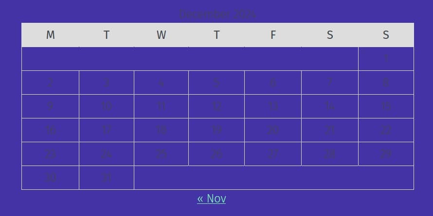
A number of the style variations – primarily those with dark backgrounds – seem to have issues with the colour contrast for the Calendar block. I suspect this is more of an issue with the block than with the theme.
I also found contrast issues with the following block where you can see the inadequate colour contrast. I wouldn’t recommend using it.
Landmarks and navigation
The theme is split into landmark regions, as shown below. Read how landmarks benefit screen reader users.

You can add a name to a Navigation block to make it distinguishable and more understandable for a screen reader user. You do this by:
- Adding a new navigation block. The block defaults to the “All Pages” navigation.
- Edit the navigation block.
- In the block settings, click on the Settings icon (the cog icon).
- Scroll down to the Advanced tab and click on it.
- In the Menu name field, change the name.
- Save your changes.
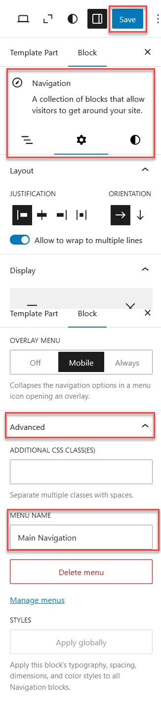
The navigation now has an aria-label with the name you just added. You can repeat this process for your other navigation blocks.
Customizing the Twenty Twenty-Five theme
Create a child theme
Classic themes relied on making child themes to save changes to the theme. The need for child themes is not so great for block themes because they save changes to the database. Have a read of Carolina Nymark’s article on block child themes to determine if you need one.
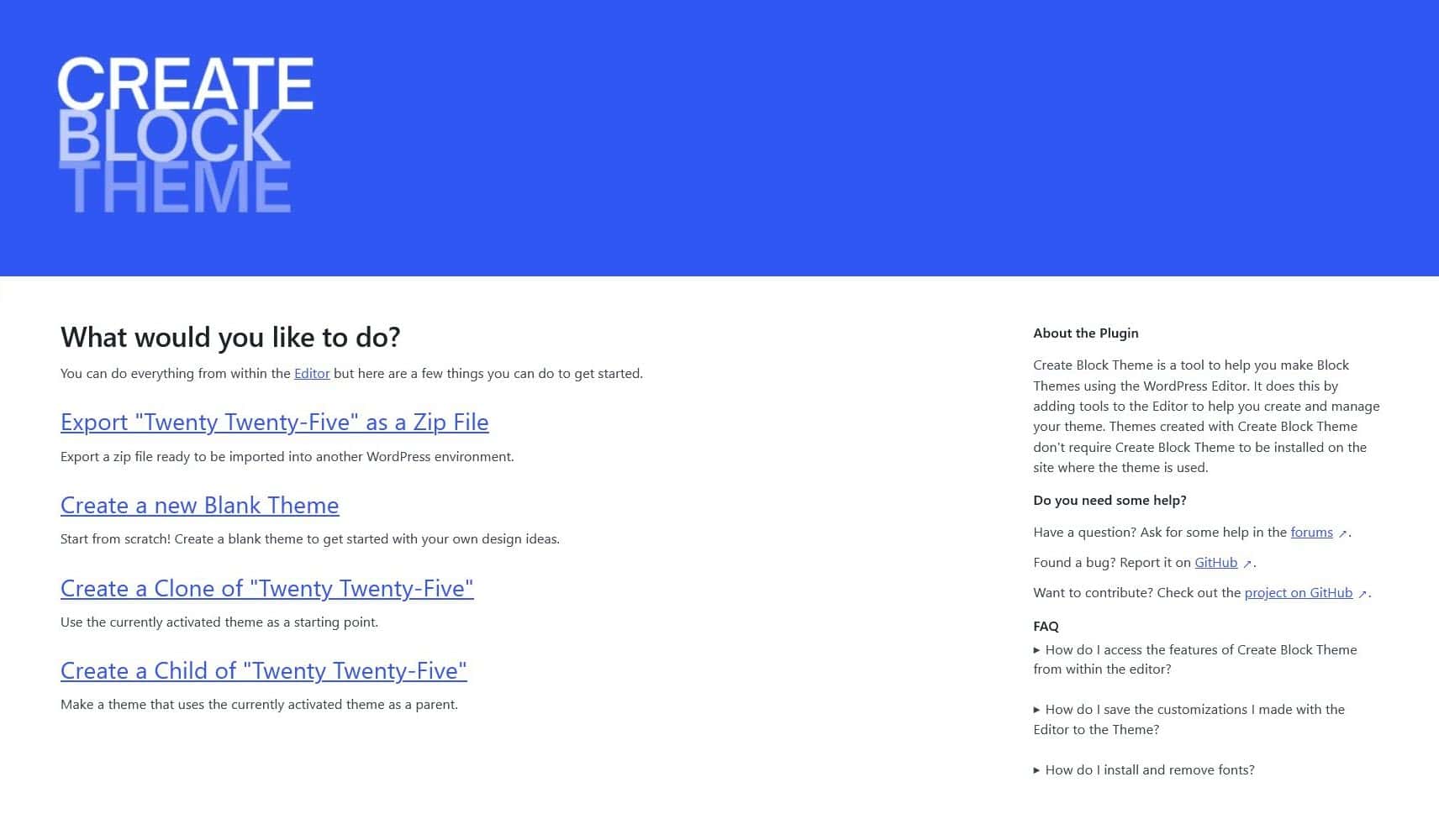
The easiest way to create a Twenty Twenty-Five child theme is to use the Create Block Theme plugin.
Once you have installed the plugin, go to Appearance > Create Block Theme.
Select the Create a Child option.
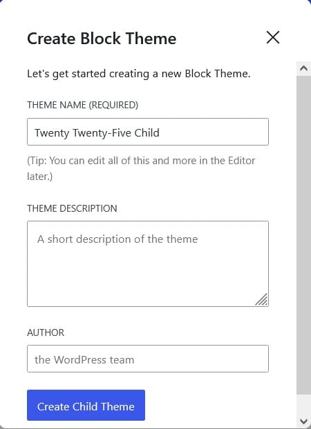
Complete the information and select Create Child Theme. You will be redirected to the Site Editor with the new theme already active.
Add new Google fonts
You can add new fonts by doing the following:
- Open the site editor at Appearance > Editor.
- Select Styles, then Edit styles (the pencil icon).
- In the Styles panel, select Typography.
- Choose the Manage fonts icon (to the right of the Fonts heading).
- Select Install Fonts.
- Click the Allow access to Google Fonts button.
- Find the font you want and select it.
- Choose the font variant(s) you want to use and select it or them.
- Select Install. You should get a message saying “Fonts were installed successfully.”
- Repeat steps 7-9 for any other fonts you want to install.
To use the font in your theme, exit the font dialog box and scroll down to the Styles panel’s Elements section. Select the element you want to apply the font to. In the example below, I’ve chosen Headings. In the Typography section choose the font you want from the combo box. You should see it immediately applied to the page. Don’t forget to save your changes!

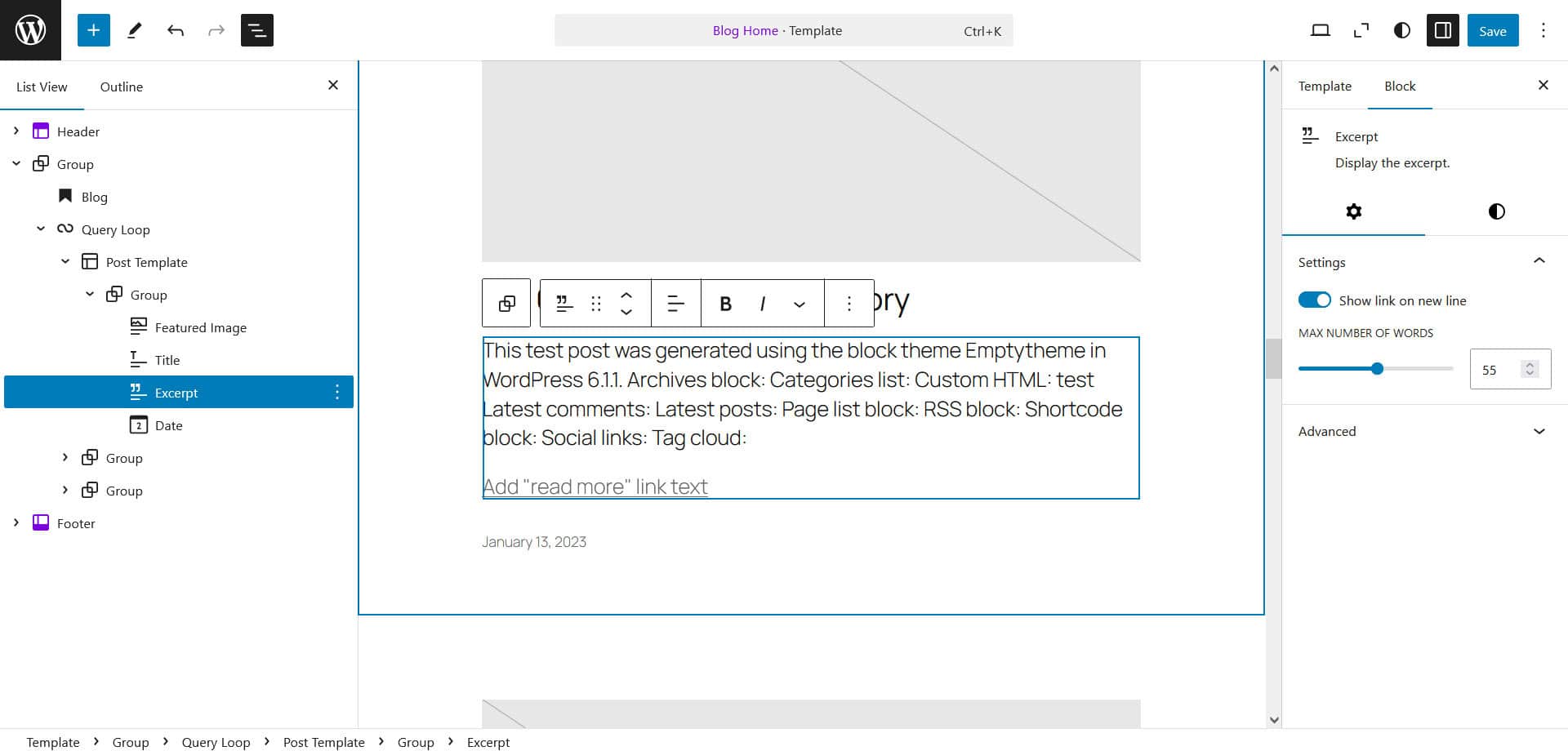
Show an excerpt rather than content on your blog page
By default the Blog Home template shows the full post content, but you can change this by finding the Content block in the Document Overview, adding an Excerpt block underneath it and then deleting the Content block.
Create a template for a custom post type
I created a Movie custom post type with the Advanced Custom Fields plugin and gave it a Genres taxonomy and a field group with 3 custom fields – Year, Rating and Quote. Using the Advanced Views Framework plugin I created a shortcode to add these custom fields to an instance of the Movie post type.
I used the Add New Template button from the Templates view and chose the Single item: Movie.

I started this template with the News blog single post with sidebar design and customized it. Here’s what the template ended up looking like in the List View.

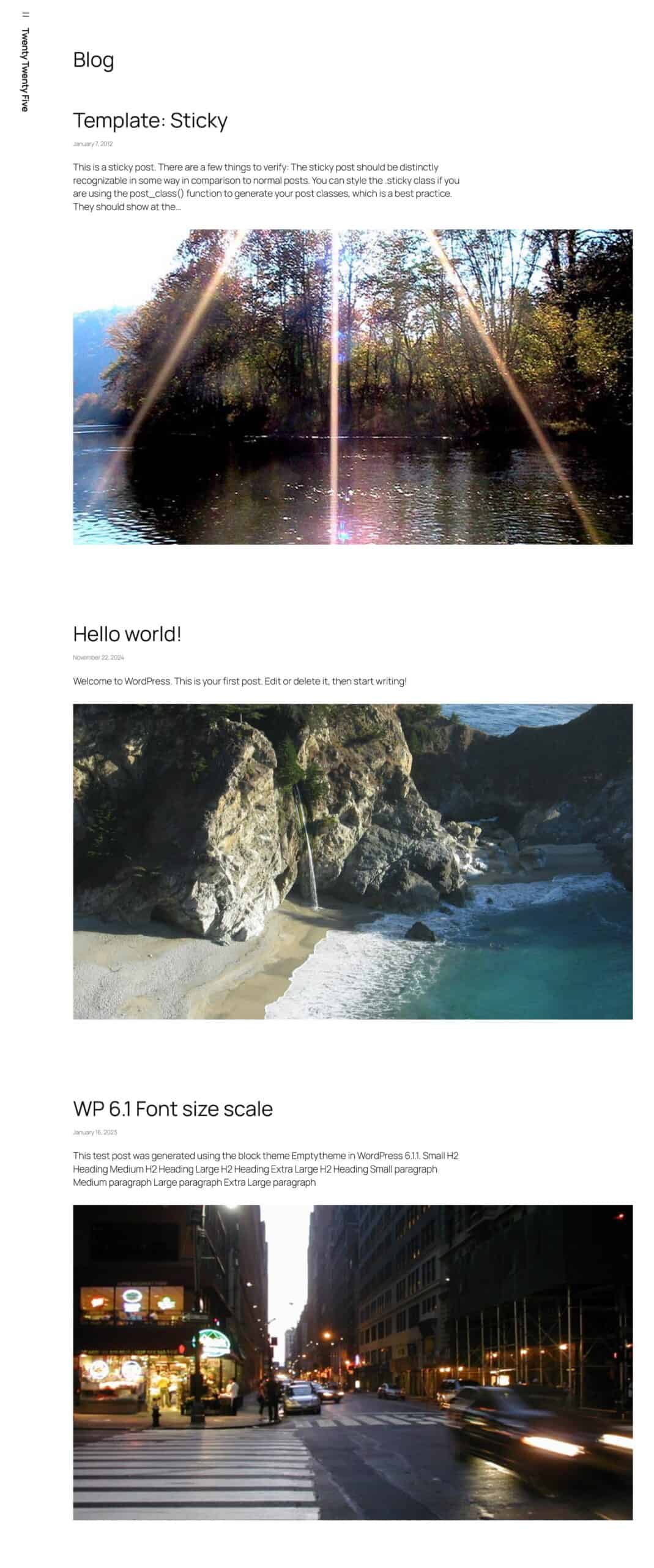
And on the website, a Movie looks like this:

Enable the Photo blog templates
To use the Photo blog templates you need to switch designs for both the Blog Home and Single Posts templates.
- Go to Appearance > Edit site.
- Select Templates.
- Select Blog Home.
- In the Settings sidebar, open the Design tab.
- Scroll down and select the Photo blog home pattern. It will replace the design for Blog Home.
- Save your changes.
- Repeat steps 1-6 but this time select the Single Posts template in step 3 and the Photo blog single post in step 5.


To make the most of these templates, give each of your posts a featured image. Otherwise there will be gaps in your photo grid and the posts won’t be visible.
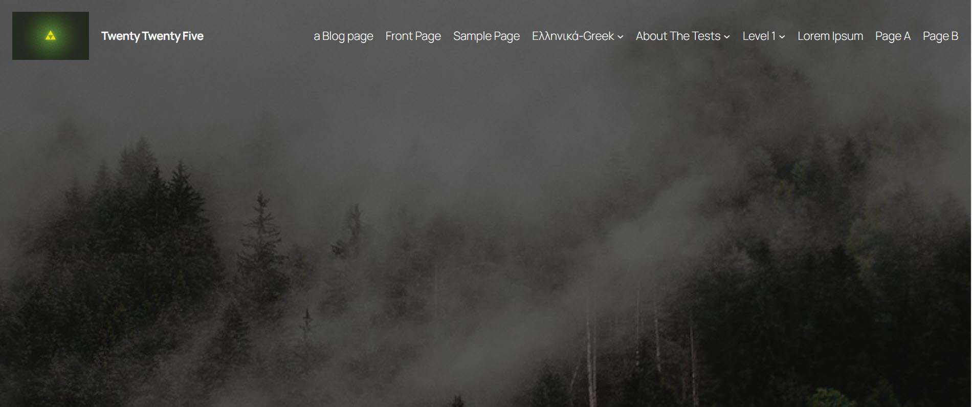
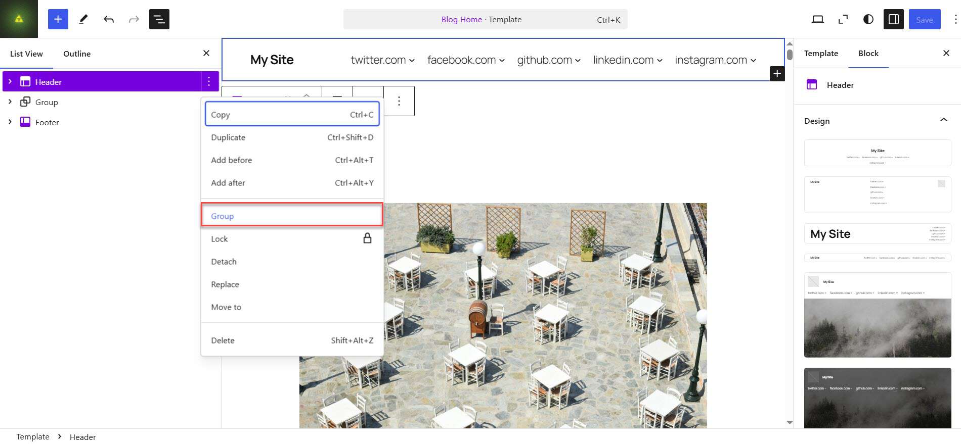
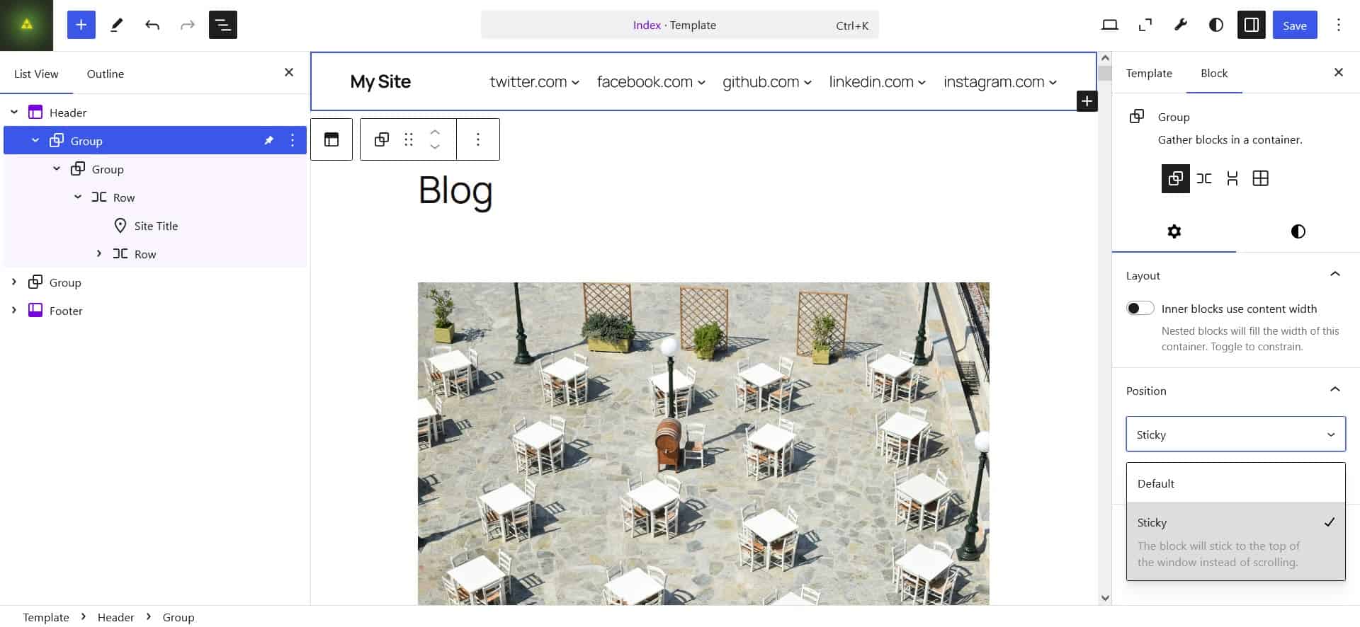
Make the header sticky
There are a few steps to making your header sticky i.e. on top of the screen as you scroll down.
- Open a template. I’ve chosen Blog Home.
- Select the Header, and in the three-dot menu, select Group.
- In this group block’s settings, turn off the Inner blocks use content width setting.
- Open the Position options, select Default and change to Sticky.
- Save your changes. The menu will now be sticky on this template’s page, but if you look at the page you will see it’s transparent when you scroll.
- In the block editor, select the group block Styles tab.
- In the Color section, set a solid background colour.
- Save your changes.

Repeat this process for the other templates you’re using.
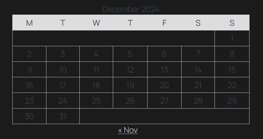
Improve the legibility of the Calendar block in dark style variations
To do this you need to Edit styles by selecting the pencil icon in the Styles menu.
Normally you would edit individual blocks to customize their styles, but that doesn’t work as expected in this case. The grey title and days of the week aren’t changed.
Instead, when editing styles, click on the three-dot menu next to the Revisions icon and select Additional CSS.
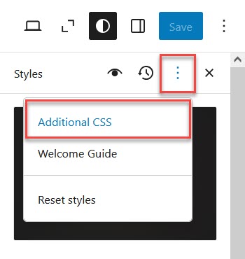
Then add this code:
.wp-block-calendar table:where(:not(.has-text-color)) {

  color: #fff;

}
Save your changes. You’re almost there, but the table heading contrast is now too low.

Now find the Block styles.

Select the Calendar block from the list.
Click on Text and change the colour to a dark one e.g. #1B1B1B.

This is better – but the link at the bottom has now disappeared.
Click on Link and change the colour to a light one e.g. #F0F0F0.

Save your changes.
Your Calendar block is now legible!

Create a landing page
To create a landing page from a pattern, add a new page and select the landing page pattern you want to use, for example Landing page for podcast.
Name your page.
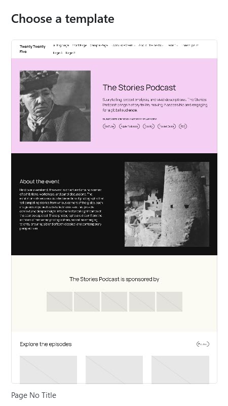
To hide the page title, select the Template Pages in the settings sidebar and then Swap template.
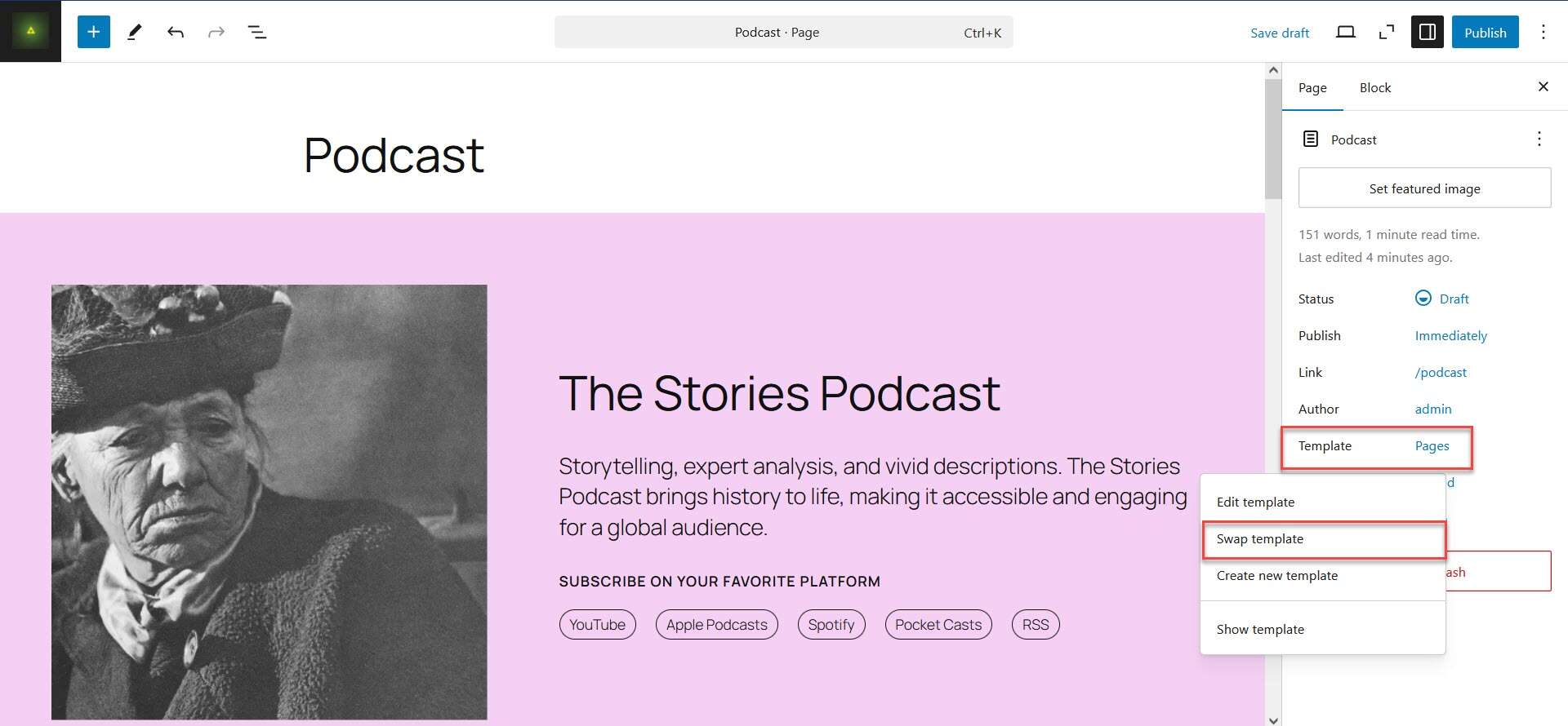
Select Page No Title.
Save your page.
Since you removed the title, remember to change the heading level of The Stories Podcast from h2 to h1.
To get the sponsorship section to show, you need to add logos to the placeholder image blocks and videos to the video blocks.
Save or Publish the page and view it.
Add images with Openverse
WordPress 6.7, which is required to use Twenty Twenty-Five, includes the Openverse Media Library, a free stock photos, images, and audio library. All images in it are either in the public domain or Creative Commons licensed.
To insert an image, use the blue block inserter button on the top left, then select Media and Openverse.
Search for the image you want to use and click to insert it.
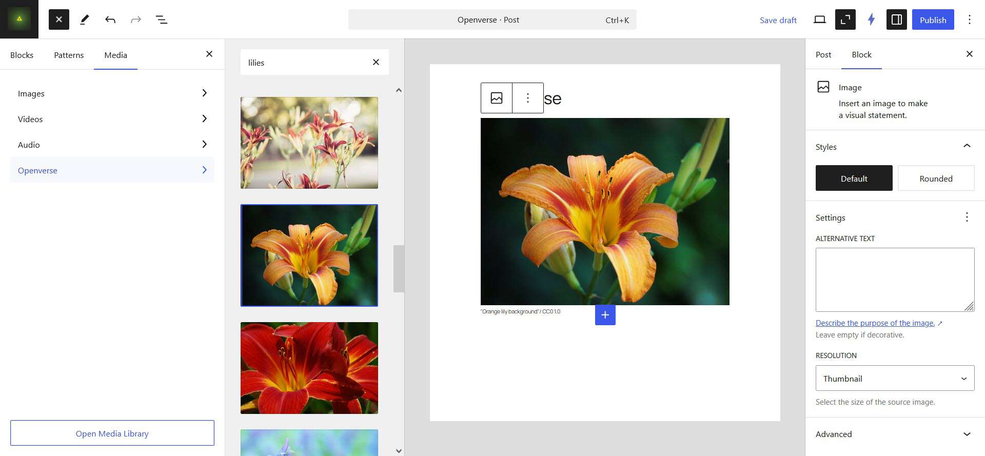
The image is added automatically to your Media Library as well as the page, and has a caption with a link to the image license. At the time of writing it seems that all the images you can choose from have the CC0 1.0 Universal license, which is copyright free. At a later stage you may be able to filter the content by other Creative Commons license types. You can do this if you go direct to the Openverse website.
The Openverse integration does not give the image alternative text, so you will need to add your own if necessary, and save your changes.
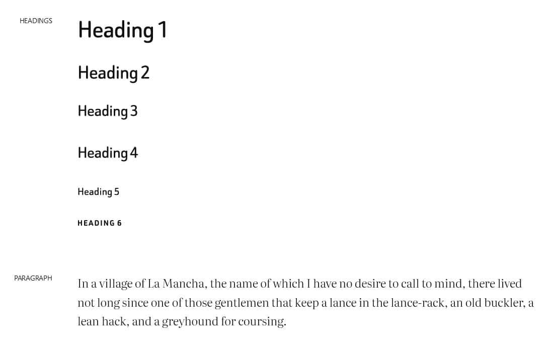
Use different text styles
Both Heading and Paragraph blocks have styles which you can apply in the block settings sidebar. Text has the Default style normally. The Display and Subtitle styles both enlarge the text, while the Annotation style makes the text smaller and puts a rounded border around it.

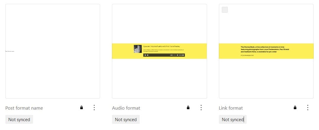
Use post formats block patterns
If you use post formats for blog posts, the theme has 3 block patterns for you to use.
The Post format name is a general block, while the Audio format and Link format blocks are for Audio and Link post formats respectively. The latter two blocks can have multiple styles.

Twenty Twenty-Five demo sites
You can view a demo site of the Twenty Twenty-Five theme on WordPress.com. Just select Demo site to view. You can switch between desktop, tablet and mobile views.

MotoPress have created another demo site at Twenty Twenty-Five – 2025 WordPress Theme Demo. What’s cool about this one is that it includes a style switcher, so you can view pages in the different style variations.

Summing up
In my opinion, Twenty Twenty-Five is the best default full site editing theme so far. It has a wide variety of uses and a decent number of block patterns. As it has been translated into several languages, it’s suitable for multilingual sites.
Have you tried Twenty Twenty-Five? Let me know in the comments.
Thank you for giving a complete explanation of the Twenty Twenty-Five theme, I have used the theme on several of my demo project websites, and the website was truly designed without plugins and without coding. Here are some demo project websites using the Twenty Twenty-Five theme:
https://gblog.my.id/
https://goshop.rgproject.id/
https://gomasjid.rgproject.id/
https://qurbanyuk.my.id/
WordPress with the Twenty Twenty-Five theme, Block Editor and its FSE features have changed the way I design WordPress websites to be easier without having to install any plugins and having to add coding
So I’ve built maybe 100 WordPress websites since around 2010 and have tended to always look for external themes and plugins to help me with the heavy lifting of my design and layout work. However, I can see different elements within native WordPress themes now that can begin to allow a creative and savvy designer to get away with skipping the bulkiness of some paid themes.
I especially am a huge fan of the pre-designed patterns for page sections as well as the demo sites. Those are massive steps in the right direction. I think there is a balance between man-power required to do WordPress upgrades with the ways in which WordPress.org can make money to help pay developers to work on it.
I would love to see a world where WordPress.org allows a commercial small business web designer like myself to be able to deploy websites clients are happy with without navigating large paid themes. This new theme and seeing these patterns makes me want to try building some demo sites to see how far I can take them out of the box with all these tools. At some point we need to move away from the gray on gray on gray on white on black editor pallette so it’s easier for someone to navigate and understand the interface more easily.
im using twenty twenty-five template for my new blog site. a problem im having when viewing on a mobile device the page can scroll sideways left or right. how do I fix this?