The UserWay web accessibility widget is an add-on for websites to help improve their compliance with accessibility standards.
One of its advantages is that it fixes accessibility issues out of the box, without requiring code rewrites.
The widget is free to download and use. You can demo it for yourself at UserWay.org.
It’s available as a Javascript code snippet which you can add to any site and is compatible with content management systems such as Wix, Squarespace and Shopify.
In addition, there is a UserWay WordPress plugin, which has 96 five star reviews at the time of writing. I wanted to see if it lived up to the hype.
I tested the UserWay WordPress plugin on a site with Twenty Nineteen theme installed, running WordPress 5.1.1.
How is the plugin configured?
It’s pretty simple. Once installed, go to Settings > UserWay and complete the form.
The information requested is:
- First name
- Last name
- Site URL
It’s a good idea to check UserWay’s licensing and privacy policy first, as you are prompted to when acquiring the widget on the UserWay site. UserWay say that they have adopted a Privacy by Design approach, which is a promising sign.
When you have completed this process, you will get a unique code.
You can then switch to your site, where you’ll see a button with an icon of a man in the top right hand corner.
Open the widget by clicking on the icon, tapping it or by using the CTRL+U keyboard shortcut.
What does the UserWay Web Accessibility Widget do?
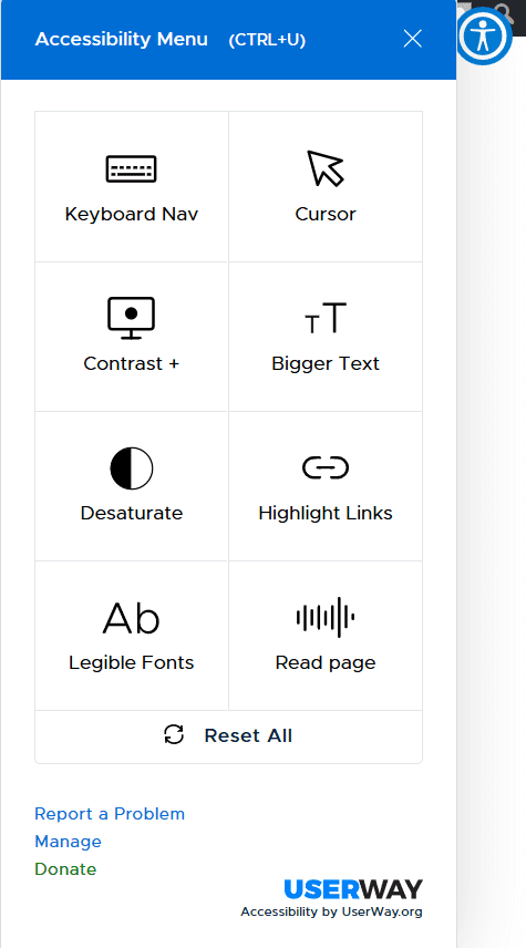
On desktop, the widget has 8 different functions. These are:
- Keyboard Nav
- Cursor
- Contrast +
- Bigger Text
- Desaturate
- Highlight Links
- Legible Fonts
- Read Page
On a mobile device, the first two options are not shown, since keyboard navigation and cursors only apply on desktop.
It’s possible to have more than one setting active at once. The “Reset All” button turns all options off.
Keyboard Nav
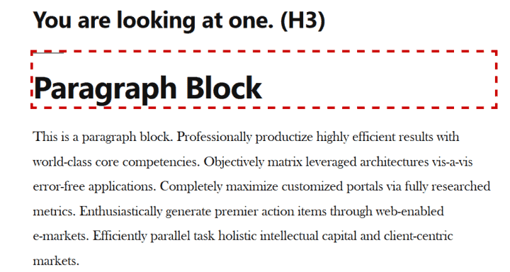
Toggling this setting adds a keyboard focus indicator of a thick red dashed line round elements on the page. Toggling again turns it off.
Like signposts, focus indicators are helpful for showing users navigating by the keyboard where they are at on a web page.
Keyboard navigation is via the Tab key down the page, and the user would focus on these interactive elements on the page:
- Links
- Form inputs
- Buttons
By jumping to these elements, the user can complete forms, submit them and activate links.
Many WordPress themes don’t have focus indication built in, so this can be quite helpful.
Twenty Nineteen theme does have focus indicators but they’re quite subtle: a light grey outline.
The odd thing about the UserWay keyboard nav implementation is that it also highlights headings. This might make sense if the headings were also links, but in my testing they were unlinked.
This decision hinders accessibility in a way, because:
- The user might assume the headings are links and try pressing the Enter key only to find that it doesn’t do anything – a source of frustration.
- The user has to tab through more items on the page to get to the parts that they can interact with.
Cursor
There are two options here, both of which could help users with sight problems who are still able to use a mouse.
Toggling the button once shows a big cursor.
Toggling the button a second time shows a reading guide, a black line with yellow borders to help readers keep their place on the page. This is an electronic version of a physical reading guide to assist with reading books and documents.
Toggling a third time turns the cursor setting off.
Contrast+
There are 3 contrast settings. A fourth press of the button reverts the page to its default contrast.
- Invert colours. This didn’t work too well when I tried it – the text showed as medium grey on black, which was unreadable!
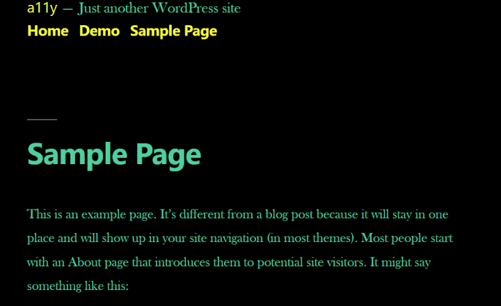
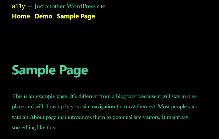
- Dark contrast. This showed the page with a black background with green text and yellow links.
- Light contrast. This looked very similar to the web page as built – the links were just a brighter blue.
Bigger Text
This option toggles the text on the page to be larger. The font size can be increased up to four times bigger. This could be particularly helpful on mobile if you want larger text on a site without changing your phone’s accessibility settings – or have simply mislaid your glasses!
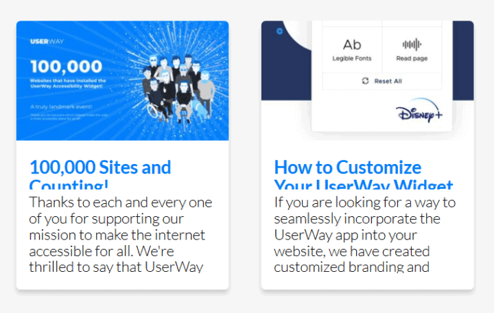
However, if the text is enclosed in a container of a fixed size, then the text will be cut off when increased in size. This is actually what happens in the blog section of UserWay’s home page when the text size is increased with the widget. The headlines of the blog articles and the excerpt are not fully shown.
Desaturate
Desaturate removes colours and renders the web page in greyscale.
Viewing pages with desaturated colours is said to help users achieve tasks faster due to soothing the eyes.
Highlight Links
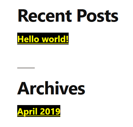
Toggling this button highlights all links in high contrast – underlined, yellow on a black background. (Assuming you’ve not changed the Contrast+ settings.)
This setting might be useful in cases where links aren’t clear e.g. if they are not underlined, or don’t contrast well with surrounding text, but personally I think it looks a bit jarring and the high contrast mode works better.
Legible Fonts
This option changes all the fonts on the page to the Arial font, overriding the default page fonts. It doesn’t change the font size, weight or style, e.g. bold or italic. If for any reason Arial is unavailable, the page defaults to a serif font.
Read page
This option starts reading the page from the top using an American female voice. Using the arrow keys skips to the next element on the page.
When text is read, keyboard nav mode is active and the text is outlined. It’s also shown with a yellow background.
Headings are read with “Header” following. Links have “link” afterwards.
This option should not be used by anyone who uses a screen reader to browse the Web, as both will run simultaneously, causing a conflict.
Dedicated screen readers are also much more customizable and usable; the UserWay one is very basic indeed.
Who is the widget intended to help?
The kinds of people the widget could help could be:
People with sight loss, who may be helped with the larger cursor, increased text size, clearer fonts and contrast settings.
People with motor control issues who use the keyboard, who may prefer the enhanced keyboard focus (though note the drawback of the focus on headings as mentioned above).
People with dyslexia, who might prefer the high contrast option or grayscale option to read content.
People with cognitive issues or learning disabilities, who may like to have the page read out to them for better understanding, or prefer a grayscale interface to reduce visual clutter.
What customization options does the UserWay accessibility widget have?
To customize the UserWay widget, open it and go to the Manage link.
Sign in with the email address you signed up with. You should have received a password by email from UserWay.
Once logged in, you can then customize a number of things, including:
- The position of the button to open the widget.
- The button size.
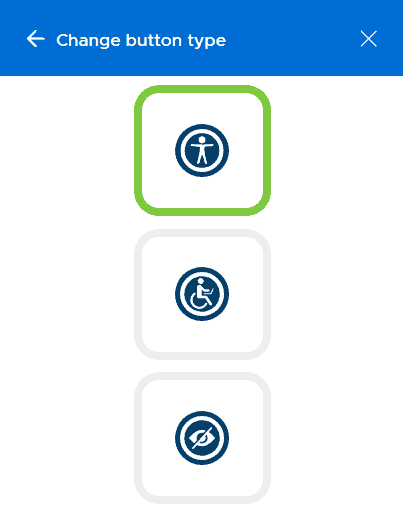
- The button type.
Universal access, wheelchair user and eye icons - The widget’s language – over 20 are available. The widget can also auto-detect page language.
The Remove UserWay Branding and Show Your Logo features are “white label”, meaning that you need to pay for a subscription to activate them. You can test these out with a free one day trial.
What kinds of accessibility issues can the UserWay widget not fix?
The UserWay widget helps mainly with the cosmetic aspects of a website i.e. what it looks like and ways of navigating it.
It doesn’t change many other things which can impair the accessibility of a page, such as:
- Missing or incorrect alt text for images.
- An illogical heading hierarchy.
- Link text that doesn’t make sense out of context (“Click here”, “Read more”).
- Links that open new tabs without warning.
- Form labels which aren’t linked to form inputs.
- Lack of captions on videos.
On a WordPress site, some of these things are controlled by the WordPress theme, some by plugins and some by the way content is entered.
So beware if you think the widget is an accessibility quick fix. There are still plenty of things to consider in order to have an accessible website.
Is it worth using the UserWay web accessibility widget on your site?
I’m a bit torn about this. There are benefits and drawbacks to using the widget.
Benefits
- The widget is easy to set up.
- No coding is required.
- It offers users more choice in accessing your website in a way that suits them, all in the one place.
Drawbacks
- The button to open the widget may simply be ignored by a user, meaning that they don’t experience any of the widget’s benefits. Hovering over the icon with the mouse shows an “Accessibility Menu” tooltip but keyboard only users won’t see that and might miss the button entirely. (You can increase the size of the icon, but that doesn’t mean it will be noticed!)
- The widget only remediates a small proportion of accessibility issues. Bolting it onto a site might lull the owner into thinking their site is fully compliant. Chances are there would be other accessibility issues outstanding which the widget doesn’t address.
- Other tools exist to solve the same issues, and they can work across more than one site. For example, the VoiceOver screen reader is built into iOS devices and works across all applications. The Chrome Focus Indicator add-on works on every site opened with the Chrome browser on desktop.
- In some cases UserWay and similar tools can introduce accessibility issues into sites. Steve Faulkner’s post, Bolt-on Accessibility – 5 gears in reverse has some illustrations of this.
Over to you
Have you used the UserWay web accessibility widget? What do your site visitors think?
Or find out more about WordPress plugins to help accessibility.




Great article Claire and good to be aware that there are quick solutions with a lot of good functionality available tackling accessibility issues.
Good you mentioned about the icon being rather non descript in itself. Something Userway will likely address I can imagine.
Cool plugin, fantastic of you to highlight this and a good option to enhance a site in a way.
Thanks for commenting, Alistair.
Perhaps the icon needs a label as well. (The Best Icon is a Text Label). 🙂
Good info but why Useway is free and other widgets cost from $400 and up??
What is the % of coverage from Userway?
Hi Beatriz
I don’t know what percentage of accessibility issues the Userway widget claims to fix, but there are many issues it couldn’t touch.
The widget may be free, but they charge $200 per page for an accessibility audit. A large website of up to 30 pages costs $4850 to audit.
That’s where they make their real money.