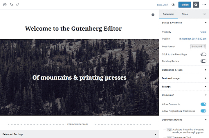
It’s been three months since I last looked at the WordPress Gutenberg editor, so I thought it was time to revisit.
The last version I tried was version 0.4.
It’s moved on quite a bit since then. We’re now on to version 1.4.

What’s new in Gutenberg?
Here are some of the changes I’ve noticed from my previous try-out:
Blocks have the Open Settings menu represented by three vertical dots, which opens up a submenu.
The small cog icon now does something! It opens up the inspector with a Block settings panel. This lives next to the Document settings in the sidebar.
There’s the option to change between visual and text mode in a block represented by a small HTML button.
Paragraph text blocks can now have text and background colours. These changes affect the whole block. There’s no way to recolour single words or text selections.
Text size can be changed with a slider or an increment/decrement control.
Images can now be resized as well as aligned. (The centre alignment seemed to be broken, though).
A number of new blocks including a Verse block and a Columns block which can have up to four columns.
A Classic Text block has also been added which simulates the current TinyMCE editor. Creating a new paragraph in this block does not create a new block.
A new control to enable sticky posts.
There’s a full range of post formats available from a dropdown menu.
Categories and tags can be added.
The number of revisions is shown. Clicking on that link takes you to the revision section to compare revisions.
There’s an Extended settings tab which promises support for meta boxes in a future release. Plugin authors like Yoast have been pushing for meta box support in Gutenberg.

Post information – word count, block count and headings
A new popup exists with the i button. Pressing this shows you information about your post.
You can see the word count, block count and headings count.
If you have added at least two headings (the title is ignored) a Table of Contents is generated.

This is a good feature as it:
- encourages proper heading nesting
- provides a quick way to navigate to a heading block.
Clicking on a heading listed in the Table of Contents takes you directly to that heading block in the editor.
The H6 in the example is marked as an incorrect because it follows an H2. If you use an H2, the next nested heading should be an H3.
Accessibility issues
I raised a number of accessibility issues with Gutenberg in my previous post.
Have the developers improved them?
Keyboard navigation

Keyboard navigation is still a mess. The tab order is still not logical and varies from block to block.
I could not find any skip links.
The focus indicators of buttons and links have improved, though. Though they’re not to everyone’s taste!
Post visibility section
There are some new problems with this section. The Public, Private and Password protected radio buttons appear in a popover section which is toggled by pressing the Enter key.
The problem is that moving from Public to Private with the down arrow key opens a modal dialog.
As a sighted user I can see the text “Would you like to privately publish this post now?”
However, VoiceOver reads out the site URL and then “You are currently on a text element”, with no indication of what to do next.
Only if the dialog box is dismissed with the Esc key is the Private radio button read out.
Keyboard accessibility of the Insert Blocks panel
I was disappointed to discover that this issue has still not been fixed. I still cannot access the Blocks and Embeds tabs with the keyboard alone. I just end up cycling through the recent blocks.
This is a high priority issue for me.
Search functionality of the Blocks panel
The search function now works better than it did. Searching for “button” does give the option of a button block!
However, you still have to make an educated guess to know what to search for.
There’s still no feedback for block names which don’t exist.
Date picker control for the Publish date
The date picker is still not accessible. This has been marked as a high priority issue on GitHub (react-datepicker is not accessible).
I’m not sure what the status of this issue is. The Gutenberg team were set to abandon the React JavaScript library due to a Facebook licensing issue. They’d started looking at other JS frameworks. Now Facebook have updated their license terms, React may be back on the table.
Publishing a post
The user experience has improved a bit. There’s now no popup when you activate the Publish button.
There’s no audible feedback when you publish a post. The best I got from VoiceOver was “Press update, dimmed, button.” which indicates something, but is not as clear as the visual feedback.
Sighted users see Post published! View post. This notice is overlaid on the content which looks weird if you scroll.
Andrea Fercia has highlighted the need for Gutenberg audio feedback in this thread.
What new accessibility issues have arisen?
Accessing the Block settings from the keyboard
When you activate the Show inspector button on a block, the sidebar opens and the Block tab is visible. The keyboard focus remains on the button.
The problem with this is that if you want to go directly to the block settings you have to do it via a mouse.
If you tab all the way down the page, you’ll get to the Block settings panel eventually. Unfortunately, you will get the settings for the last block on the page.
If you want to edit image settings, it’s not much help if you get the paragraph settings.
It’s possible to move the block you want to edit to the bottom and move it back up again when you’re done. But this is way too inconvenient.
Also, if the sidebar is already open, the inspector button should be greyed out or there should be a hint that activating it does nothing.
Colour contrast
Adding foreground and background colour controls for blocks has raised the chances of users selecting colour combos which would fail WCAG 2.0 colour contrast guidelines.
The colour contrast issue has been discussed on GitHub here. Some of the potential solutions are:
- Limiting colour choices to ‘safe’ options.
- The user selecting a background colour and Gutenberg suggesting a suitable text colour with sufficient contrast.
- A warning message showing if there’s an inaccessible choice of foreground and background colours.
It’s hard to see how this section would be of use to screen reader users. What does “Color: #cf2e2e” mean to the average person?
Andrea Fercia agrees, and he’s suggested some further colour picker improvements.
The information button pop-up
For all the useful info this section provides, there are still some problems with it.
The information button is not properly labelled as there is nothing to tell a screen reader what it does. VoiceOver just reads “Button”.
If you haven’t added any headings to your post (the title is ignored) focus goes to the section telling you the word count, block count and headings count.
However, if you have added two or more headings focus goes to the Table of Contents. A screen reader user cannot access the word count area above. Using Shift+Tab to move back moves the cursor but doesn’t shift focus there.
What else is happening around Gutenberg accessibility?
Joen Asmussen has suggested having a range of keyboard shortcuts in menus and tooltips. The regular post editor has these, so why not Gutenberg?

Tammie Lister has asked for suggestions on improving the Gutenberg UI for people with colour blindness.
So, where are we now with Gutenberg?
The Gutenberg developers have added a lot more functionality.
In terms of accessibility:
- I like the Table of Contents but it still has some access issues for screen reader users.
- Choosing text/background colours will be popular with many, but we need to guard against inaccessible combinations.
- The Block settings are useful but are difficult to reach with the keyboard.
I can see Gutenberg proving challenging to use for anyone reliant on the keyboard (too much tabbing). It’s demanding on a cognitive level as well.
I’m still not sure Gutenberg fulfils the brief of:
The goal of this new editor is to make adding rich content to WordPress simple and enjoyable.
WP Tavern has pointed out that if you want a distraction-free writing experience, Gutenberg actually detracts from that goal.
What do you think? Will you embrace Gutenberg or do you like to stick to what you know? Leave your thoughts in the comments.


Thanks for the update Claire. It’s been a while since I’ve looked at Gutenberg – especially around the accessibility issues, and it’s disappointing to see that some of the long-standing issues still have not been fixed yet.
Let’s hope we see some movement on these issues soon.
From an accessibility perspective, the whole Gutenberg experience emphasizes once again how important it is to think about accessibility from the start. It’s vital to design the interactions with keyboard and other users in mind. Retrospectively fitting accessibility to complex functionality can be really hard and can also lead to a less than cohesive experience for some.
Totally agree with you, Graham. Much easier to get accessibility right from the beginning as opposed to the sticking plaster approach.
I joined in the Make WordPress Accessible discussion on Slack yesterday and there was a consensus that the keyboard navigation issues should be grouped and treated as high priority. The suggestion about keyboard shortcuts to get to different areas sounds promising. We just need to find ones that work across different language keyboard layouts.
Thanks for writing this post. I haven’t looked at Gutenberg in a while, and this gives me a heads-up that I’ll probably want a strong drink handy when I finally do look at it.
That might be a good idea, Amanda! Thanks for commenting.