Joomla Monster is known for creating accessible Joomla templates. They kept getting requests for WordPress themes, so decided to set up a new company to develop them. PixelEmu launched in 2015.
You can see their commitment to accessibility in this video:
I was kindly given a copy of the PixelEmu School theme to try out, and to review from an accessibility point of view.
Creating an accessible site is important, particularly in the education sector, where no-one should be excluded.
School Theme setup
The theme is dependent on a number of plugins. For example, custom post types are registered through the PE School Plugin. Most of the plugins are from the WordPress repository. Revolution Slider is a premium plugin bundled with the theme.
One of the required plugins is the Display Widgets plugin, which controls widget display on different pages. When I came to install it I found it was unavailable from the WordPress plugin repository. I contacted PixelEmu support and they provided a copy of the plugin swiftly.
Hopefully, the plugin will be either:
- restored to WordPress.org
- forked and maintained by someone else
- replaced by a similar plugin
as the theme is heavily dependent on it. Many of the page layouts e.g. the homepage are built using widgets.
I imported the demo content successfully. Note that imported demo images are just placeholders.
No event content was imported. I found demo events at Modern Tribe’s Event Calendar demo contentpage. If you want the events to display on your calendar, change the dates as they date from 2015.
Full PE School documentation is available.
What features does the School theme have for schools?
This theme is aimed at all educational institutions. The demo comes with three styles:
- Default – suitable for a school/college/university
- Language school
- Kindergarten
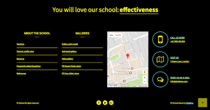
Here’s what the home page looks like with default content. Note that I added images to the slider to replace the placeholders.
![]()
The theme uses the following custom post types:
- Programs – used to generate timetables
- Members – can be used for teacher profiles
- FAQ – questions and answers
- Testimonials
You can also add Events if The Events Calendar plugin is installed.
PixelEmu School Theme Accessibility – what’s good?
Colour schemes

There is a choice of 5 colour schemes:
- Default
- Night (similar to Default, with a grey background). Intended for tired eyes!
- White on black
- Yellow on black
- Black on yellow
The latter 3 are high contrast colour schemes – the most suitable for an accessible site.
You can modify the colours for the Default scheme in the Theme Options > Colour section. You can also add your own custom CSS in the Advanced section.
Layout switcher
The layout switcher changes the page display for the user from narrow to wide. I prefer the fixed layout, as it’s easier to read paragraphs in narrower columns.
The content and column widths can be set in Theme Options > Layout.
Font resizer
The font resize buttons resize the font size to 3x smaller or 3x bigger than the base font size.
Font size
The base font size is set 14 px. This value is changeable in Theme Options > Fonts. Personally, I would recommend a font size of 16px or more.
The font type and colour are also changeable, should you desire.
Dropdown menus
The dropdown menus are keyboard accessible. You need to make sure Max Mega Menu is enabled for them to work correctly.
Read my post on mega menus if you want to know more about them.
Keyboard focus style
The focus style (the outline you see round links as you use the tab key) is set to a red dashed border, same as the hover style.

The colour is changeable in the Theme Options, WCAG 2.0 section.
Skip links
Skip links are designed to let keyboard and screen reader users skip past items on a web page, like the navigation. This saves a lot of tedious tabbing every time a new page is loaded – the user can go straight where they want to.
A Skip Menu is built-in but needs to be enabled in Appearance > Menus. Make sure it is set to display in Skip Content Menu.
I added a new link to my menu and called it Skip to Content. The URL was set to #pe-content-beginning.

This is what a skip link looks like to a keyboard user:

Breadcrumbs
Breadcrumbs help users find where they are in the page hierarchy. They’re set on single posts and single custom post types (Theme Options > Blog > General).

It would be nice if breadcrumbs were an option on all pages.
Accordion and tabpanel components
Both the accordion on the FAQ section and the tabpanel for the homepage are keyboard accessible.

Contact form
If you created your contact form via the demo, remember to change the data in two places – Email recipients and Email address. Otherwise, the form won’t go to you but to PixelEmu!
From an accessibility point of view, the contact form does the following things right:
- When invalid or missing data is submitted, the form shows error messages above the form.
- It also reads out to a screen reader user which (if any) form fields are invalid.

If you want to modify the fields on the form (Name, Email, Subject, Message) that isn’t possible. In this case, you could create your contact form using a contact form plugin.
Translation ready
Did you know that English is only the sixth most common native language?
School theme is translation ready. You need to provide the translations yourself. Having a multi-language site makes it accessible to a wider readership. The theme docs help you get started translating the site, plus you can read this guide to WordPress multilingual.
What could be better?
Tab order
Tab order is logical for the most part. I was slightly surprised that the focus jumped from the increase font size button to the search icon when I could see the Login and Signup links before search.
For some reason, I couldn’t tab to the Off-Canvas widget area (represented by the hamburger icon) either.
Title attributes on the navigation
The main menu items have title attributes which act as tooltips on desktop.

I think this is a redundant feature, as explained in this article: I thought title text improved accessibility. I was wrong.
The WCAG 2.0 technique for title attributes on links says:
Because of the extensive user agent limitations in supporting access to the title attribute, authors should use caution in applying this technique.
Timetables page
I found that the timetables weren’t marked up as expected for a screen reader user. In VoiceOver’s Tables menu each was read out as “3 columns, 6 rows”. Not that helpful.
Instead of the table header being the day, the tables would have been better marked up with the following:
Caption: Day of the week (Monday, Tuesday etc.) timetable
Table headers: Column 1 Time, Column 2 Subject, Column 3 Room.
The relevant WCAG 2.0 technique is H51: Using table markup to present tabular information.
Focus style
As previously noted, the red dashed focus style is very clear.
There were very few places it didn’t show. One was on the single Event page, on the Google Calendar and iCal Export buttons.

Read more links
The Read More links could have screen reader text. This would be easy to implement.
Link underlines
The Default and Night colour schemes don’t underline links, which is awkward as the link colour is often hard to differentiate from the surrounding text. Though links are underlined on hover, how would you know where to hover?
I couldn’t find an option to enable link underlining in Theme Options.
However, the high contrast colour schemes do underline links.
Here’s a comparison. Can you see the links in the first image?


Accordion and tabpanel components
Ideally the focus would jump to the opened content when a screen reader user opens a new tab or accordion.
Content designed for mouse users
Some of the content in the demo theme is aimed at mouse users, so isn’t available to screen reader users or keyboard only users.
Examples of this are:
The Gallery grid modal – captions pop up on hover, but the gallery items are not focusable otherwise. Funnily enough, if you click on them with a mouse you can dismiss them via the close button using a keyboard.
Animated gallery – the pop ups only occur on hover.

Easy slider Gallery Grid style – the links and buttons are focusable but not visible except on hover.
Revolution Slider
I’m not a huge fan of sliders. They look cool, but sliders pose issues for screen reader users in particular.
The demo slider setup at least has focusable controls – the three dots and the left and right arrows – meaning it can be controlled by the keyboard alone.

It would be better to not have the slider autoplay. How to disable Revolution Slider autoplay.
Of course you could choose to disable the slider altogether by removing it from the Header widget area. 🙂
So, what’s the verdict on PixelEmu School theme?
I applaud the PixelEmu development team for the thought and effort that they’ve put into this theme. It’s rare to find WordPress theme developers who put accessibility at the forefront of their products and have implemented solutions to problems that are often overlooked.
I would rate this theme an A-. It’s not perfect but gets many accessibility requirements right. Giving the user choices is a really important feature. The selection of font size and colour schemes enables users to browse the site in the way that suits their needs.
Some theme components, like the galleries, are not as accessible as they could be. But they are optional.
Most of the improvements I’ve suggested are relatively minor things that the developers can address in future releases.
Remember too that using an accessible theme is only half the battle. It’s still important to enter content in an accessible way.
Have you used this theme or would you use it? Let me know in the comments.
A great review, thanks for sharing Claire.
I’m not so found on themes that are reliant on a whole heap of plugins, part of my issues with Divi are based on the fact that it needs plugins to work, it’s not straight out of the box working.
Thanks Sarah.
I’m a bit torn on the whole themes vs plugins issue. I tend to fall on the plugins side.
I can see why folk like one theme that does everything but using such a theme means putting all your eggs in one basket. If you drop the basket (or the developer does) or you want to swap it for another, what then?
On the other hand, relying on plugins means you’re at the mercy of the plugin developers. If they disappear or go out of business and your theme is dependent on them, you have a problem.
What plugins do you find that Divi needs to work? As far as I know, it only needs the Elegant Themes updater for theme updates.
Hi, thank you for the review! We appreciate your opinion and will take into account suggested improvements to the next theme update.
That’s good to hear. Thanks for giving me the opportunity to review the theme.