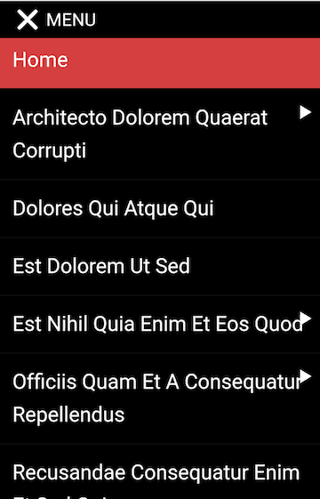
Most WordPress themes built now have a responsive mobile menu built-in.
The hamburger icon (3 stacked horizontal lines) has become the symbol of a menu toggle. Though hamburger icons are not universally recognised.

But there are a few older themes, like Twenty Eleven, which although they are responsive, don’t have a dedicated mobile menu.
Twenty Eleven is used on over 200,000 sites at the time of writing, a considerable number.
Twenty Eleven on mobile uses the same desktop menu, sized down. While it looks okay on desktop, on mobile it looks clumsy.


What’s the solution? One option is to switch theme, but you might not want to do that.
Another method is to use a free mobile menu plugin from WordPress.org.
Let’s look at what we want our plugin to do first.
How should a mobile menu behave?
In my opinion, a good mobile menu should:
- Only show on mobile devices, not desktop. Definitely, the menu should be seen on a smartphone – tablets are more debatable.
- Have a button that opens/closes the menu which is clearly labelled “Menu” or similar. The button should not obscure any other site functionality.
- Open the menu from one direction when the button is toggled. My preference is for the menu to open below the button. Some menus open from the left or right, and have a separate close button at the top of the opened menu.
- Show all menu items and submenu items, and have them tappable. The submenu items can be hidden initially until toggled on, but the parent menu items should be clickable if they are pages in their own right.
Testing WordPress mobile menu plugins
I tried out 3 plugins on a new install of WordPress with Twenty Eleven. I added a number of pages with the FakerPress plugin – excuse the Latin names!
I created a menu (Menu 1), organised the pages so that some were submenu items and assigned it to the Primary Menu.
WP Responsive Menu
Download and configuration
Download: WP Responsive Menu – over 70,000 installs
The settings page is at WPR Menu from the Dashboard.
In the General tab:
Select menu should have the name of your menu (e.g. Menu 1) and it should be highlighted in green.
You need to make sure that in Elements to hide on mobile the class or id of the menu is entered. For Twenty Eleven that’s#access. Otherwise your desktop menu and mobile menu will both show, which you don’t want.

The menu will show on devices 600px in width and smaller (that’s a small tablet). To change this visit the Appearance tab and change the number in the Display menu from width(px) box.
Features and pros
- Menu background images.
- Optional search field in menu.
- Customizable font size, style and colours.
- Uses swipe gestures.
- Can add a logo.
The preview mode is extremely helpful, and it reloads each time you save a change to reflect the new state.
Most of the presets are decent choices. However, the default background colour is red – you’ll almost certainly want to change this to match your theme. I also prefer the menu items not to be in uppercase, so changed them to Capitalize.

The menu can open from multiple directions – left, right, top and bottom.
Cons
A number of the options are in the Pro version only. Fonts, Icons and Social Icons are obviously off-limits to free users. Other options have a light grey background, and when you hover to use them you’ll see you can’t.
The mobile menu position is at the top of the page. You can’t change this other than moving it a distance below its usual position, which makes it overlap other elements.
There’s no documentation, though some of the options have tooltips.
The plugin authors are not so responsive(!) on the WordPress forums.
Any page with submenu items (e.g. Sample Page), when tapped upon, will open up the submenu items below. But there’s no way to access these pages themselves as they act as toggles.
If I want Sample Page and its submenu page to be accessed by a tap, I have a problem! This would be really bad if you have a crucial page in that position e.g. Services – your mobile viewers couldn’t reach it. One way around this would be to use the Keep submenus open option but – alas – that’s not a free feature.
Strange issue when testing with my Android phone: the submenu font size is different from the main menu, even when they are set to the same pixel size.
Responsive Menu
Download and configuration
Download: Responsive Menu – over 100,000 installs
Go to Responsive Menu in the admin.
In the Initial Setup tab, make sure that:
- Menu to Use specifies the name of your menu e.g. Menu 1.
- Original Menu to Hide specifies
#accessfor Twenty Eleven. - Breakpoint 768 means that the menu will show on tablets in portrait mode and any smaller devices. Learn more about device breakpoints.
To avoid the problem we just saw with parent menu items not being accessible, choose Auto Expand All Sub Menus. That’s in the Sub Menus tab, Animations section (or you can search for it).
Features and pros
- Menu background images.
- Optional search field in menu.
- Customizable font size, style and colours.
- Can include menu descriptions.
The menu button itself can be customized quite extensively – you can change colours, text, add an image and more. You can also fix it to the screen as you scroll.
The plugin developer, Peter Featherstone, monitors the forums very well and responds to all posts.
Responsive Menu documentation is available, though it seems to be aimed more at the Pro user.
Cons
Lots of options – maybe too many for the beginner.
Like the previous plugin, a number of the features are only for Pro users. (There is a helping hand of a Hide Pro Options checkbox near the bottom right of each options page.)
The menu only slides in from the left.
Limited choice in the menu button positioning. The button goes in the content area, and can be placed on the left or right.
As you can see from the screenshots, whether I placed the button on the left or right, there was some overlap.


The menu button can be repositioned from the side or top by entering a pixel width. That’s a bit hit and miss since it can look different on different devices.
Another possible solution if you go for the left button position is to use the Push Button With Menu option. This moves the button right, out the way of the menu, when the menu is open.
The header bar looks like a better feature, but you need to pay for it.
SlickNav Mobile Menu
Download and configuration
Download: SlickNav Mobile Menu – over 6,000 installs
In the Dashboard, look for Settings > SlickNav Menu.
Setup:
Add Menu to Replace: in this case, I needed #menu-menu-1 – found by trial and error.
Pixel Width to Switch to SlickNav: 600 by default, or adjustable.
Menu Position: body by default i.e. at the top of the screen (this can be changed later).
Allow Parent Links: check this to make them clickable.
Show Child Links On Open: check this for all submenu links to be visible when the menu is open.
Features and pros
- Demo at WP Beaches
- Accessibility features – keyboard accessible and uses ARIA markup.
- Translatable if you have a multiple language site.
- Can include a logo.
- Can combine multiple menus into one mobile menu.
- Menu colour and font customization.
The menu sits at the top of the page and can be aligned left, right or centre (Menu Button Position).

The menu position can be changed with some tech know-how: you need to input a class for where you want to put the menu on the page (perhaps where the desktop menu lives). If you can’t find a suitable class in your theme, you could create a child theme and add the relevant code where you want it.
The plugin has mostly five-star reviews.
Cons
No documentation.
While the keyboard accessibility is good, keyboard focus is not so clear.
Using the same menu on Twenty Sixteen, you can see that when you tap the link, it opens up the link. When you tap the arrow, it opens up the submenu, and there’s an outline around it. This isn’t quite as obvious on SlickNav Menu.


If included, the search icon is a bit close to the search placeholder text. The search box is also missing a form label…
I got randomly weird small text again on some of the links – I swear I didn’t change them!
Verdict on these WordPress mobile menu plugins
None of these plugins is perfect – they all do some things well and some not so well.
The features I like best are:
- The preview mode (WP Responsive Menu)
- The choice of direction the menu enters from (WP Responsive Menu)
- The facility to have all submenus open when the menu is opened (Responsive Menu, SlickNav)
- The ability to position the menu where you want on the page (SlickNav)
For me, SlickNav Mobile Menu just edges ahead for positioning and accessibility.
What do you think? How do you think a mobile menu should look and behave? Let me know in the comments.


You definitely should check WP Mobile Menu with 50k active installs.
https://wordpress.org/plugins/mobile-menu/