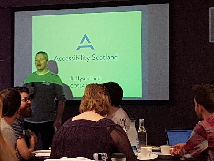
 Accessibility Scotland 2017 took place on Friday 22nd September in Edinburgh.
Last year’s conference focused on web accessibility.
This year’s event took a much broader approach. What could we learn from inclusive design in the non-digital world?
As well as websites, we had speakers discussing the inclusive design of:
- Products
- Buildings and Places
- Transport
- Games
- Media
Special thanks to graphics.coop for sending me to the conference. I’m now working there 2 days a week and accessibility is a part of the work I do.
Accessibility and possibility – Graham Pullin
Diversity is our world’s greatest asset, and inclusion is our biggest challenge – Jutta Treviranus
Graham works for the University of Dundee and talked about his work in interaction and product design.
Previously he worked for design consultancy IDEO.
He helped design the Simply mobile phone aimed at users aged 40-59. The key considerations in the design were:
- Clear and legible typography
- Ability to use the phone one-handed (people often took their glasses on and off while using the phone)
- Overcome users’ fears of getting lost or social embarrassment
Graham talked about some research projects with people-centred design.
Objects for Grand People
The Objects for Grand People project focused on designing for only one person.
The video shows student Mike Vanis, who designed a product for his grandmother Despina who worked as a seamstress in Athens. The finished product (Social Sewing) was an intercom in the shape of a sewing machine to allow Despina to chat to her friends when sewing.
Acoustic Poetry
Mike went on to create Acoustic Poetry, a tool to allow deaf people to record soundscapes and have them described by poets.
Prayer Companion
The Interaction Research Studio designed the Prayer Companion for nuns. They are segregated from the outside world with limited contact. The device brings news and ideas to them for prayers of intercession.
Businesses supporting inclusive design
The Inclusive Fashion and Design Collective (now rebranded as The Disabled List) has a mission to make products both inclusive and fashionable.
As founder Liz Jackson says:
It’s easy to find stylish eyeglasses, but why should other assistive products (such as canes, orthotics, and braces) be ugly and stigmatizing?
As it turns out, there is no money in disability for fashion and there is no money in fashion for disability.
Our friends at Eone created a tactile timepiece for a visually impaired friend—but 98% of Eone’s consumers have no visual impairment whatsoever.
Some of the best ideas are born of constraints.
Ghetto Film School’s duct tape typography reflects their trade and spirit.
Virgin Trains had a little fun with the announcement in their toilets:
Euan’s Guide: using the accessibility of digital technology to connect people, places and possibilities – Kiki MacDonald and Paul Ralph
https://twitter.com/wojtekkutyla/status/911164501059358720
How Euan’s Guide started
Kiki explained that the genesis of Euan’s Guide came from her brother Euan wanting to visit an accessible venue as a powerchair user. He needed a place that:
- Was welcoming
- Had doorways he could get through
- Offered an accessible loo
Not being able to find anything suitable, Euan decided to start collating information on accessible venues to share with others. Thus Euan’s Guide, dubbed the ‘TripAdvisor for disabled people’ was born.
From starting with a team with no experience of building a website, Euan’s Guide has grown to host over 6,000 reviews.
All sorts of places are reviewed: railway stations, post offices, shops, banks and toilets are featured as well as eateries and leisure venues. Anyone with access issues is welcome to write about their experience. The site is highly trusted: many people visit places on the basis of a single review.
Building to accessible web standards
Paul found Euan’s Guide through Twitter and became part of the team the next day! As a powerchair user, he has seen the rise of tech and its importance in empowering disabled people.
Paul stressed that following web accessibility standards was not always enough. User experience was more important, which requires testing from disabled users.
It’s important to talk to your potential audience and ask what their expectations of accessibility are.
An inaccessible website sends out the message: “These guys don’t care.”
Accessibility and inclusive design are often bolted on later, and the results are never as good.
https://twitter.com/madmurdo/status/911185569367117824
Paul joked about making an I-Spy book of inaccessible web design, where you could score points for spotting:
- Images with no description
- Buttons with poor colour contrast
- Keyboard traps
Build in accessibility because you want to, not because you have to – Paul Ralph.
Accessible features can sometimes help some and hinder others. His friend Ian loves the tactile paving next to pelican crossings. For Ian, who has a visual impairment, they indicate where he can cross the road. Paul hates them because they rattle his powerchair!
Similarly, with websites:
- Paul likes long web pages as they keep interactions to a minimum.
- Ian doesn’t like long web pages as they are harder to navigate.
- Paul likes dropdown menus as they help him understand a site cognitively.
- Ian doesn’t like dropdown menus as they can be verbose when read out.
What can web designers and developers do?
Don’t design with specific impairments in mind, but look for interactions and functions that might prove challenging.
Build access and inclusion into all you do.
Try to involve disabled users from the start.
Test and tweak constantly.
To find accessibility testers, try Shaw Trust, Ability Net or your local community. Make sure they are paid.
Don’t assume your tests will all go fine.
Users don’t always do what you expect!
Put your accessibility information clearly on your website. Sticking it on the homepage is better than burying it away.
Design for Everyone – Susan Fulton
Susan is a chartered surveyor with a Masters in Accessibility and Inclusive Design.
Susan subscribes to the social model of disability. Instead of seeing disabled people as a problem to be fixed (as the medical model does), the social model asks disabled people: What about the current environment do you find difficult?
Selwyn Goldsmith was a pioneer in inclusive design. His early work led to dropped kerbs becoming standard for road crossings.
In 1990 in the USA the Americans with Disabilities Act (ADA) was introduced.
In the UK, building standards began to consider disabled people from 1990 when part T of the building regulations came in. Slowly more accessibility elements have been added.
Good and not so good environment design
We need better standards for emergencies (link to PDF).
The Ford Focus was designed by young designers wearing a “third age suit” to simulate older people’s experience. It turned out to be not just the most accessible car but one used by a wide variety of people.
Some disabled people require extra space and facilities to use bathrooms safely and comfortably. Standard disabled toilets are not adequate. Changing Places toilets are the solution, but there’s a lack of them nationwide.
Comparing ticket machine design, the first in the photo has a confusing layout of buttons. The second clearly labels each section and leads the user through the buying process. It also works better for people with a narrow visual field.

Accessible lockers have been thought out with features like:
- Raised height so wheelchairs can be manoeuvred nearby
- Space for prosthetic limbs
- Large print and braille instructions

What are the barriers to inclusive design?
- Timescales
- Lack of input from end users during the project
- No access consultants in design teams
Another problem is that most students of architecture and the built environment get very little instruction on inclusive design.
Open discussion
In the next session, we split into teams and took a discussion topic at each table.
My table talked about web accessibility issues.
We talked about accessible tabs and accordions and how screen reader users would expect them to work.
We chatted about focus rings and wondered if there was a way to distinguish between keyboard and mouse interactions. There are some new CSS styles coming in that relate to keyboard focus.
We decided that the best way to test our designs was to recruit real screen reader users.
Accessible Everyone – Mike Crabb
Mike Crabb works at Robert Gordon University as part of their UX Research Group.
Mike mentioned that disability can be permanent, temporary or situational, but each type had a different experience. Being blindfolded is not the same as being blind!
Accessibility can be split into the usual categories:
- Vision
- Cognitive
- Physical
- Communication (including different languages).
Plus some interesting ones such as:
- Emotional (anger and despair)
- Socio-Economic (gender, cost, inclusion)
- Intersectional (multiple dimensions)
Mike asked a large number of people what conditions they associated with the first four categories and got four word clouds of answers.
Interesting research on accessibility issues
Eye Health Week Ads
Channel 4 recently partnered with RNIB to show a special ad break. The adverts were shown as they would appear for people with different types of sight loss.
Dynamic Subtitling
Dynamic subtitling is similar to regular subtitling except that the subtitles are placed in closer proximity to the speaker. The technique has actually been around for over a century.
Mike and a team from the BBC tried dynamic subtitling with an episode of Sherlock and received mixed feedback. Some loved it and others hated it. The positives were increased awareness of body language and social cues, finding it easier to concentrate and more aesthetically pleasing.

Board Games
Board game accessibility is another area Mike is interested in.
Recently Mattel released a new version of the Uno card game for colour blind people. That allows potentially another 350m people to play.
Meeple Like Us does accessibility-focused reviews of board games. They rate them according to the categories above. They’ve managed to have an influence on the development of new games.
Other Research
Some of Mike’s students have recently become involved in accessibility-related research projects.
Mike Crabb’s slides: Accessible Everyone
Why Inclusive Design Is Like Cooking Curry – Heydon Pickering
Heydon’s talk was the one I was most looking forward to, and it didn’t disappoint. Kudos to him for continuing despite back pain!
So what do curry and inclusive design have in common?
1. Research
Designing inclusively may conflict with what the market research says. But we have to take into account individual preferences.
There’s no point in adding cinnamon to the curry if the consumer is allergic to it – or worse!
Substituting ingredients/components can help.
Swap infinite scroll for a load more button.
Swap a carousel for literally anything else.
2. Document
Cookbooks = pattern libraries.
A bad recipe will make a bad curry, and a bad pattern library will make a bad website.
The Inclusive Components site has some accessible design patterns.
At the time of writing there are 5 components:
- A Theme Switcher
- Tooltips & Toggletips
- Menus & Menu Buttons
- A Todo List
- Toggle Buttons
Check them out – there’s solid reasoning behind the design choices.
3. Beware of third parties
Those ready-made sauces that help you make curry in 15 minutes have one problem. You can’t separate out any ingredients you don’t like.
Development tools are similar: they speed up development but can be heavyweight and underperforming.
4. Order is important
It should be Content > HTML > CSS > JS.
Not any other way round.
5. There’s no magic bullet
You can make a curry without chilli, and you can make a website without ARIA.
6. Offer choice
This is one of the inclusive design principles.
That table of the fancy visualization that you put in for people with a visual impairment? Don’t hide it – other users might like it too.
7. Eat your own dog food
If you don’t do it, why should I?
Practice what you preach.
He’s created the Infusion documentation builder.
It has all the features Heydon likes:
- Printable
- Works offline
- Contains a style switcher to switch to white on black – good when he gets migraines.
8. Embrace diversity
There are lots of curries out there… why stick to mince and potatoes?
Embracing diversity makes good financial sense.
9. It’s okay to make mistakes
It doesn’t have to be perfect; just a little bit better than yesterday – Léonie Watson
10. Get inventive
Create new dishes, solve some design problems.
View the slides from Heydon Pickering’s talk
Verdict on Accessibility Scotland 2017
It was an excellent conference. I enjoyed learning about different aspects of accessibility and universal design – something that applies to every area of life.
Looking forward to 2018 already!

Leave a Reply