Design is constantly changing and evolving as new trends come and go yearly.
That couldn’t be more true in the web design field where the ease of sharing and iterating makes design change move exponentially faster.
Every year it’s fun to take a look at what happened with design in the previous year, and what’s coming next.
The folks at Coastal Creative put together this Design Trends 2016 infographic to summarize what we should expect in the year ahead.
Design changes don’t follow the calendar year strictly, but with this infographic we have a better sense of what’s coming up next.

If you reuse this graphic, please include attribution to CoastalCreative.com.
What are the Design Trends for 2016?
Continuing Trends
The Rise of Flat Material Design
Flat design is two-dimensional design with an emphasis on simplicity and minimalism. Solid colour and simple icons are its hallmarks.
Material design is described by Google as:
a visual language for our users that synthesizes the classic principles of good design with the innovation and possibility of technology and science.
It uses grid layouts, animations, lighting and shadows.
Most of Google’s websites and apps using the material design palette and components. Developers are able to use material design in their own projects.
Examples:
Holm Marcher & Co.
Background and Fullscreen Videos
Background fullscreen video has become more common on websites as broadband speeds have improved. It tends not to be used at the smallest screen sizes.
Videos work best if they have no sound by default, and sufficient contrast between the video and any overlaid text.
See best practice for video background usage.
Examples:

Mobile Apps and Social Sites Will Dominate
Data shows that we’re spending about 3 hours a day on mobile devices, excluding voice calls. A whopping 86% of that time is spent on mobile apps, with only 14% on the mobile web.
Out of the time spent on mobile, 17% is spent on gaming, with nearly 30% on social networks and messaging apps. With the number of mobile devices expanding each year, including the emergence of wearables, this trend can only continue.
Examples:
Lander App – build landing pages
Responsive Design with Better Performance
Responsive design has become the answer to designing sites for increasing numbers and types of mobile devices. The website adapts to the size of the device used (e.g. TV, desktop, tablet, phone, smartwatch).
Improved techniques for responsive images reduce the bandwidth used, as it’s inefficient and wasteful to download large images to smaller screens.
Examples:

New Trends
Correct Typography – Fit the Theme
As the number of typefaces increases – and you can create your own font – putting the right ones together in harmony becomes an art in itself.
Read this guide to pairing fonts.
Examples:
Increased Minimalism – Stripping It Back
According to the Nielsen Norman group,
A minimalist web-design strategy is one that seeks to simplify interfaces by removing unnecessary elements or content that does not support user tasks.
Simplicity is the object, but there needs to be a focus on usability: can the user do what he or she needs to do? If not, the user interface fails.
Featured of minimalist web designs are:
- Few colours
- Lots of white space
- Limited use of design elements
- Bold typography
Read:7 pillars of minimalist web design
Examples:
Storytelling – Designing Personality
People love stories. They engage us on an emotional level, and stories activate multiple areas of our brains. This means that they are more likely to be remembered.
Websites can be a good medium to tell stories.
Every story has 3 elements:
- Exposition
- Complication
- Resolution.
In a retail site that could equate to:
- Introduce the brand and the type of audience it’s after.
- Explain the problems faced by that audience.
- Provide the solution to those problems in the form of products, and invite users to buy them.
Read: How to design a foolproof website with storytelling
Examples:
Card Based Interaction Design
Card-based designs feature images or text in square or rectangular blocks.
They are often used in grids, with an even, ordered look. Cards can also be placed in a masonry layout with columns, where the individual cards are often not of equal size.
Cards can be a good choice for blog posts, portfolios or image galleries. They can be more effective than sliders, where often the information is hidden and not revealed to the user if they don’t interact with it.
Windows 8 is based on a card layout.
Examples:
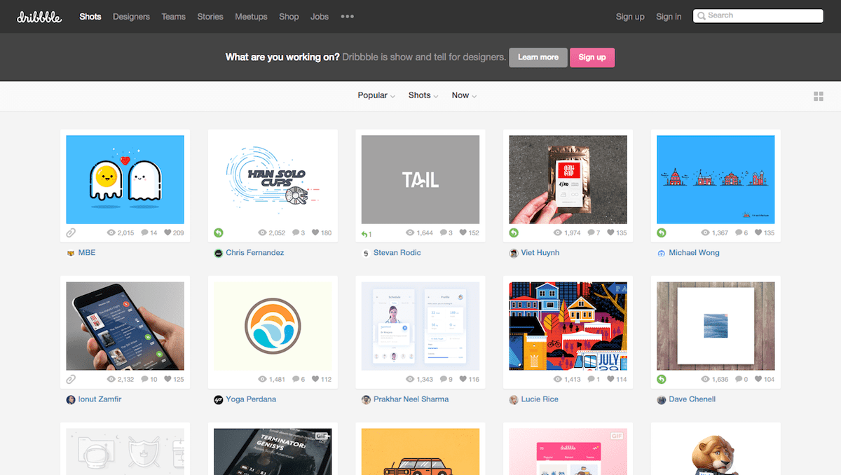
Dribbble – a site for designers to showcase their work

Pinterest– a collection of visual pinboards (uses masonry layout)
Sitepoint – resources for web designers.
What do you think of these design trends for 2016?
Did you find this post helpful? If so, please share!

This is great information. One can always use resources when thinking about new designs.
Excellent, thanks Claire.
I think IT elementary school ticks most of the boxes (no video though), and a few extra besides 🙂
A couple of memos to self:
(1) Make the reader’s part in the story (in my case self-directed learning) a little more obvious with signposts and goals
(2) Reconcile the desire for less clutter (more white space) and the cards/tiles design template…I’m working on a bigger search feature and maybe splitting the school and the table of IT elements somehow, a design challenge indeed!
Yes, I like the card-based design. I have to think about how I might incorporate it more, if it’s appropriate. I think you’ve nailed it!
Storytelling is a good idea as well, particularly in case studies.
PS Get a Gravatar! 🙂 http://www.abrightclearweb.com/how-to-get-more-visible-online-with-a-wordpress-avatar-image/
Ah, yes, I have a few gravatars (and new members of the school staff coming soon http://itelementaryschool.com/meet-the-team/) but I get confused as to who’s making comments 😉
I couldn’t agree with you more. These are the winning formula for your logo. If you really want to make your company stand out from other, these are the things that must be considered in designing a good logo.I believe that simplicity of a logo is the most valuable because it is easier to understand and remember.If your logo is simple and memorable, it will last your business for decades.
Impressive web design trends!Just want to add one, flat design is also a key to have a great website. It’s the simplicity makes it compelling for visitors, it perfectly fits for modern frameworks.